Choose a Fuel Card
Custom website design
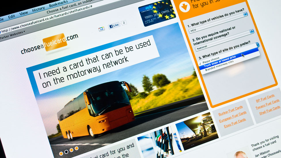
A custom website design that provided a seamless user experience.
Challenge
The Choose a Fuel Card project required a range of different skills including branding design, custom website design, website development and database integration.
Solution
As part of the initial website design process, we included the design of the logo and an appropriate colour palette. In this case, our research led us to use orange, an uncommon colour in the sector and which transmits a sense of low cost and value.
For over 25 years, we’ve been helping clients in a wide range of sectors
elevate their digital presence with effective website design.
Take a look here to find out more.
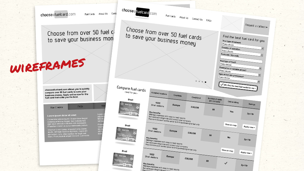
The use of high-fidelity wireframes was essential in allowing us to make sense of all the initial data, as well establishing the best layout and structure of the custom website design – making sure the user journey was as easy as possible was most important.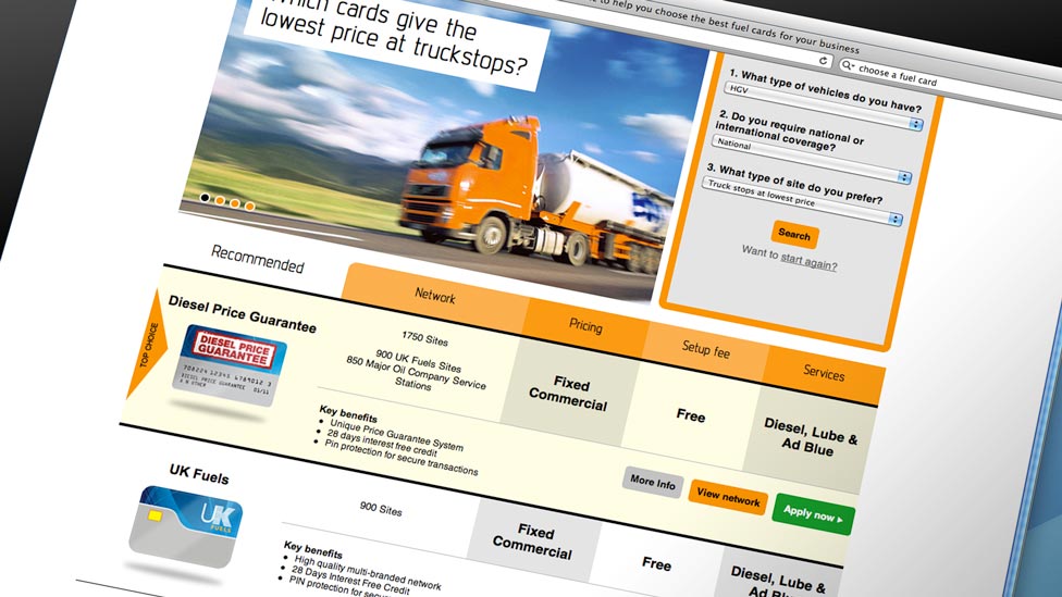
The website design and relevance of the product comparisons needed to be well planned and executed, so we created a specific step-by-step multiple choice user interface that enabled users to easily find the most relevant fuel cards.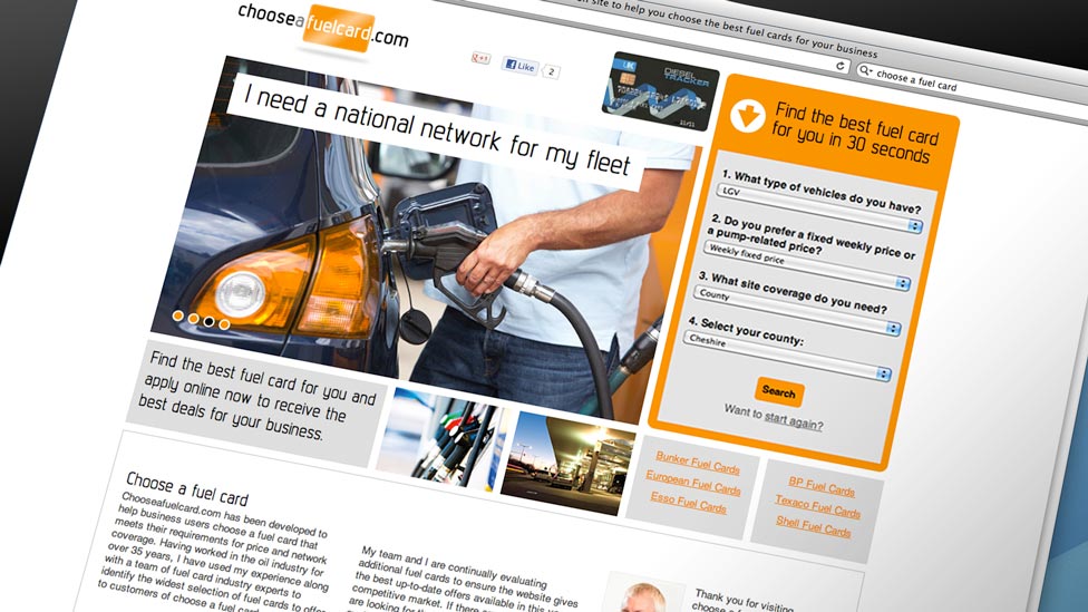
During the user experience (UX) testing, the multiple choices were refined and limited to four drop down lists, each question in the process generated and displayed in real time, based on the previously chosen answers.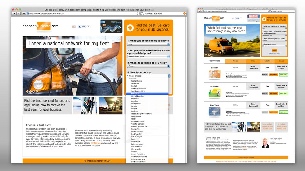
A bespoke database was developed to hold the details of all the fuel cards. Making use of AJAX technology, including jQuery, the custom website design enables users to drill down to the most relevant fuel cards for them in a seamless motion where the page is updated without any unsightly page reloads.