DAI
Brochure design and translation
DAI
Brochure design and translation
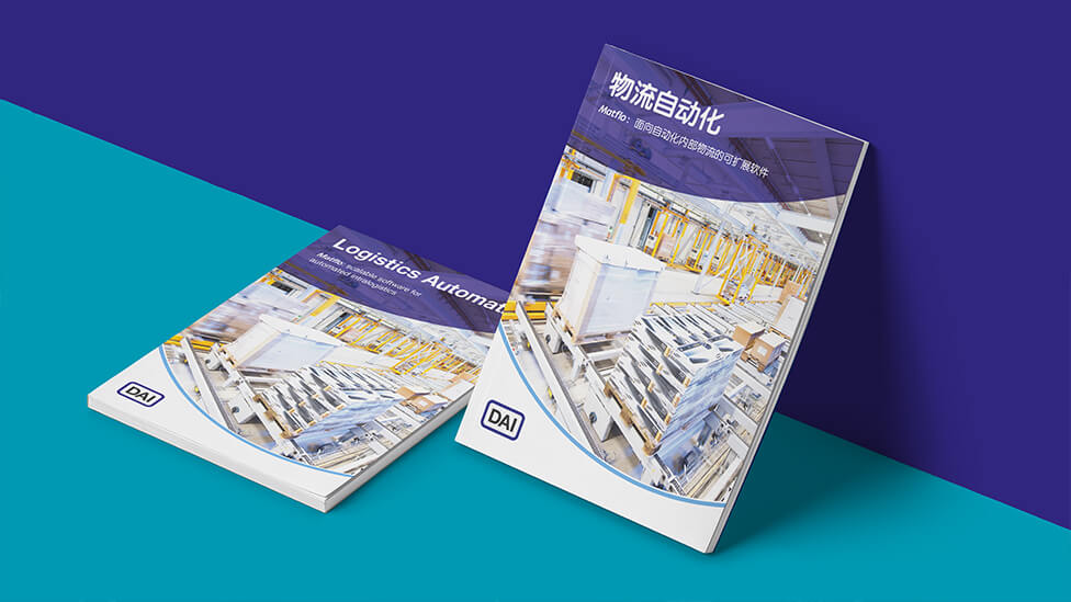
We helped DAI rise above competitors at Intermodal Asia with a brochure design and translation into Chinese that helped them communicate industry leadership, and extra care and respect for their audience.
Background
Every year, global container transport and logistics decision makers gather in Shanghai, one of the most dynamic logistics markets on the planet, at Intermodal Asia. The event serves as a platform for professionals from over 90 countries to network and discover the latest innovations, solutions and products. With over 200 industry-leading exhibitors and more than 8,000 industry professionals attending the event, DAI was aware of the importance of maximising their presence at the show.
When doing business, communication is vital to success, and localising promotional materials to the market you’re targeting will help you rise above competitors. This approach demonstrates extra care and respect for your target audience, it shows you speak their language – literally – and will go a long way to generate trust, and sales.
Challenge
With this in mind, our client asked us to manage the Chinese translation and delivery of one of the brochures we had already produced for them in English.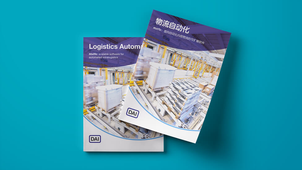
Solution
Taking account of the differences between English and Chinese, the way the brochure design and translation are structured allows the Chinese characters to breathe, making for a piece that reads naturally to the target audience.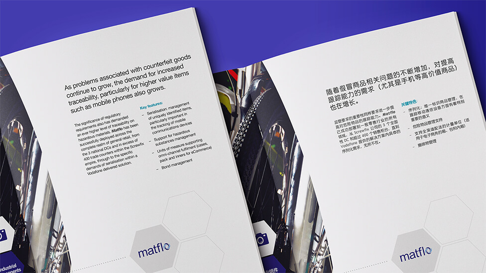
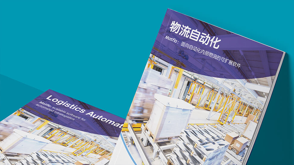
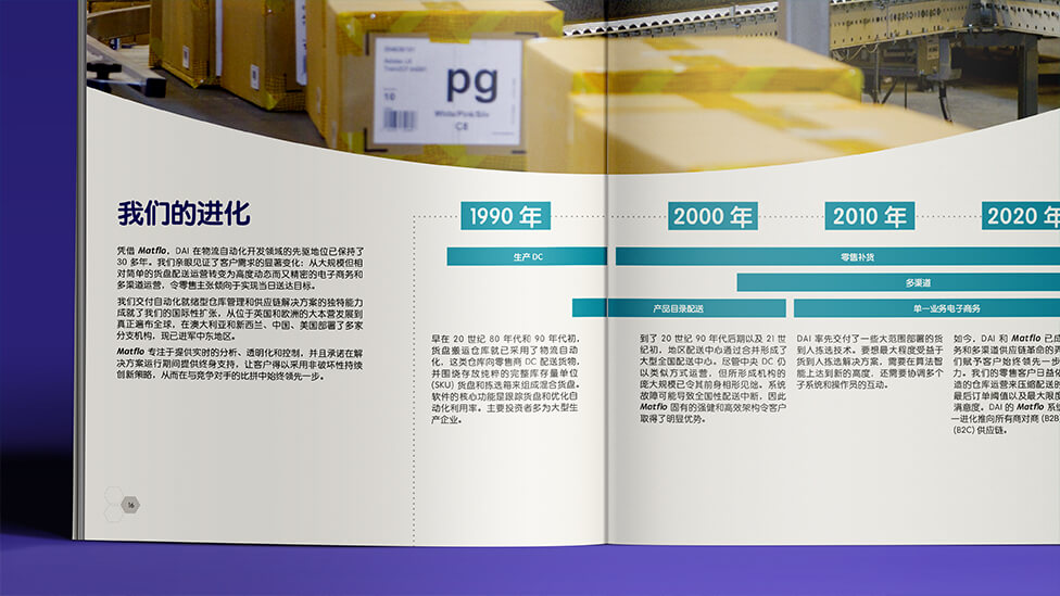
Some of the people photography was also localised to the Asian markets, helping make a connection between DAI and its regional audience. From a design perspective, hexagonal shapes help structure content and hint at an effective supply chain.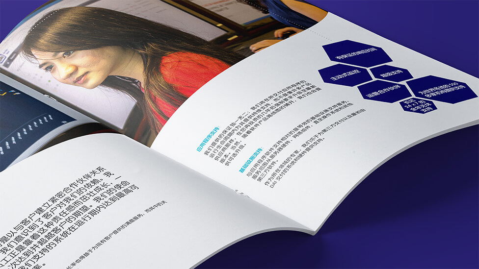
The hexagon also provides an interesting way of presenting the clients and industries DAI’s software supports. To give the shape, and the concept it represents, more prominence within the pages, we introduced a contrasting curved line.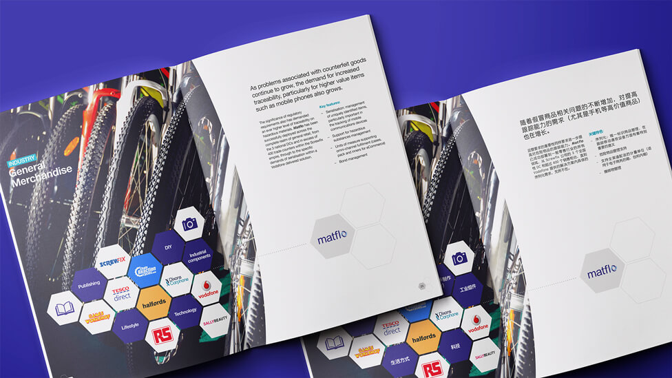
The brochure design and translation are rounded up with playful icons and illustrations that add movement and dynamism to the pages, a perfect reflection of the industry our client operates in.