Marketing Effectiveness – 3 ways to increase website traffic
Marketing Effectiveness – 3 ways to increase website traffic

Whether your goal to increase website traffic is about improving your sales figures, generating brand awareness, or creating differentiation against your competitors, there are many different ways to achieve your goal.
Here we share just 3 ways to increase website traffic and significantly improve your overall performance.
1 – 81% increase in monthly website traffic, by targeting opposing styles
The aim – To create differentiation amongst competitors by raising awareness of Thomson Reuters’ Eikon, a market data analysis software tool that allows fund managers to tailor the product to their specific trading style
The primary challenge was the lack of organic traffic to the product’s microsite, due to the short campaign timeframe and restrictions on the client’s existing web platform.
By tapping into the complex psychology of hedge fund managers with opposing investment styles, we developed a sophisticated digital strategy that captured the imagination of both audiences.
Some rely on algorithmic models and historical data; others let their instincts and knowledge of the market guide their decisions: Man vs Machine.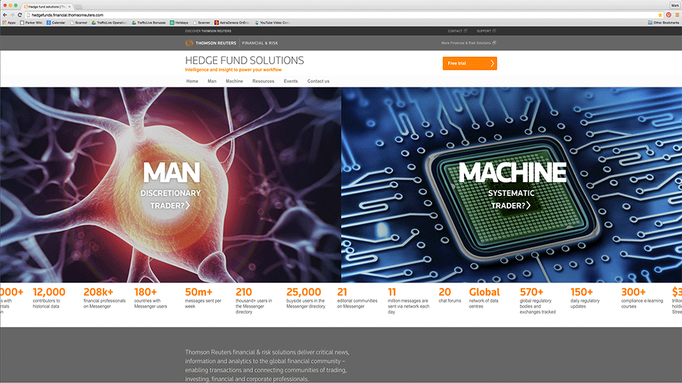
Target Group Index (TGI) analysis revealed key data about where and how hedge fund managers consume media. Armed with these insights, and shifting from the company’s proposition-focused marketing towards a more integrated offering, we outlined a customer-centric approach, with the microsite as the central anchor.
The strategy was rolled out into a strong awareness and media campaign to increase website traffic. Designed to be very focused over the short campaign period, it immediately engaged hedge fund managers by providing useful insider information.
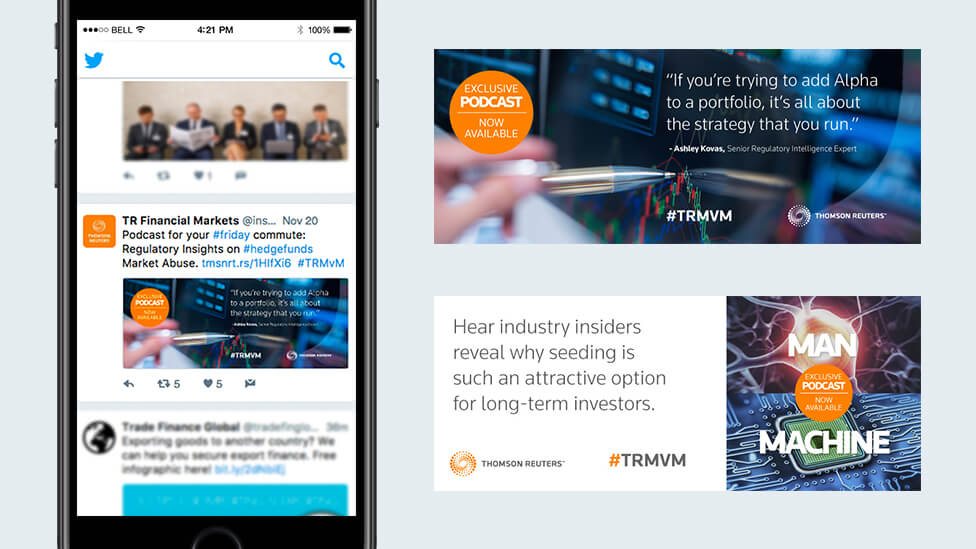
Different channels helped increase website traffic: podcasts, direct mail, email, programatic digital banners and social media content.
Microsite – We developed two distinct online user experiences. With the home screen presenting two clearly defined options, the microsite immediately appeals to both trading styles.
Direct Mail – Over 6 weeks, 4,000 hedge fund managers were targeted with 3 direct mail pieces.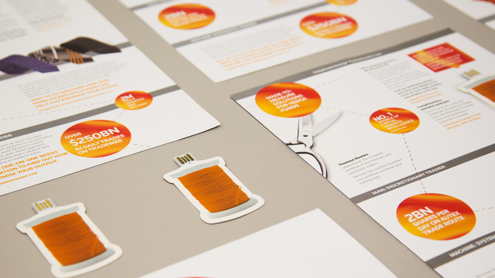
Designed with a tailoring theme that nods at the customised trading experiences offered by Eikon, the mailers were released every two weeks, with the initial one including a bespoke web key that linked directly to the Man v Machine microsite.
All DM pieces highlighted the release of the latest podcast available online.
Podcasts – Housed on the microsite, we produced six episodes of the Man v Machine podcast, where trading experts speak about key industry issues.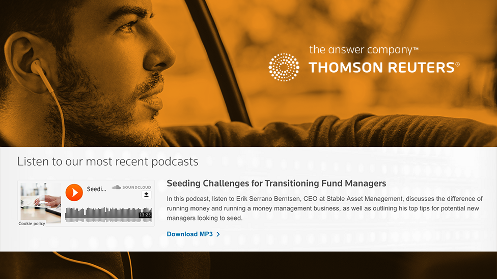
Email – To achieve maximum impact, weekly emails were sent out between scheduled direct mail drops. The emails also promoted the release of the latest podcast content and linked directly to the microsite.
Programmatic digital banners – Targeting hedge fund managers through prospecting and retargeting on relevant industry websites.
Social Media – Weekly Twitter and LinkedIn content promoting the podcasts, with data and quotes from the latest episode available to generate maximum curiosity and high click-through rates.
In summary – Challenge overcome by rolling out campaign elements in a way that allowed them to link directly to the microsite, without having to search organically. Every aspect of the campaign, from direct mail to social media, heightened interest and provided the target audience with a direct way to access the Man v Machine site.
Result – An 81% increase in monthly website traffic.
2 – 62% uplift in sales, by changing the way you communicate with your audience
The aim – To reimagine Exodus’ existing holiday brochures to drive incremental web traffic, helping retain existing customers and attracting new ones
The primary challenge was to turn the traditional holiday brochure format into an engaging travel magazine, a piece that would immediately transmit the sense of adventure and authenticity of an Exodus experience, making adventure travel seem more accessible to everyone, rather than just a select few.
As a strong driver of sales, driving traffic to the Exodus website from the printed brochures was one of the main aims of the project.
Working in close collaboration with our client, we created a genuine window into the world of Exodus that feels different – and more inspiring – than competitor materials.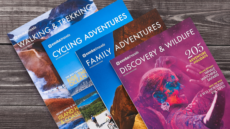
The magazines were curated, edited, written and designed with the same care as any leading travel magazine to truly engage and excite Exodus customers at the earliest point in the booking process and customer journey. We needed them to be noticed as different, more inspiring.
A new cover style and voice were created, unique to Exodus. Inspired by magazine formats, we created engaging content that jumps off the page.
A mix of first-person features from Exodus travellers and location experts sit alongside striking photography, and specially commissioned features and illustrations.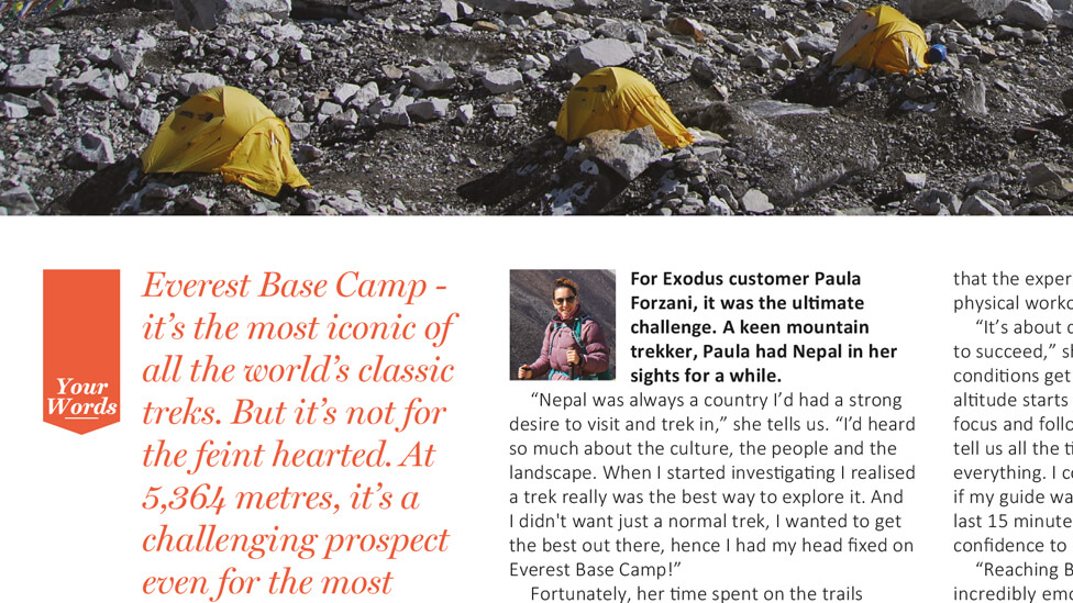
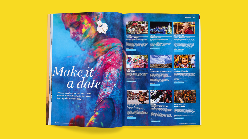
Different ways of presenting the content keep readers interested, page after page.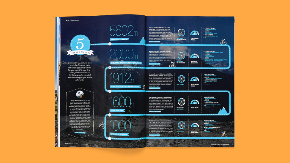
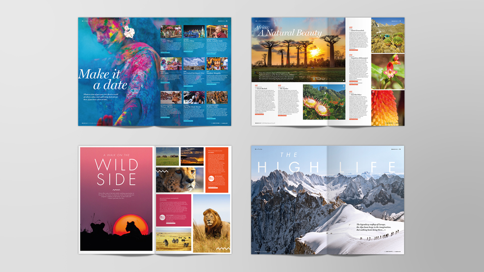
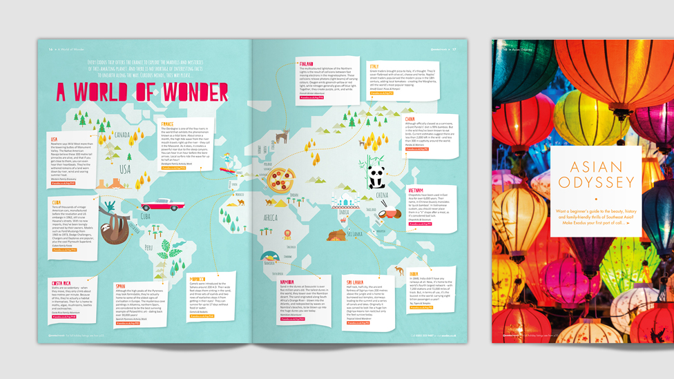
As full lifestyle pieces, the magazines also include more practical content that was useful for customers when planning their adventure – for example, essential kit to pack or levels of fitness required. 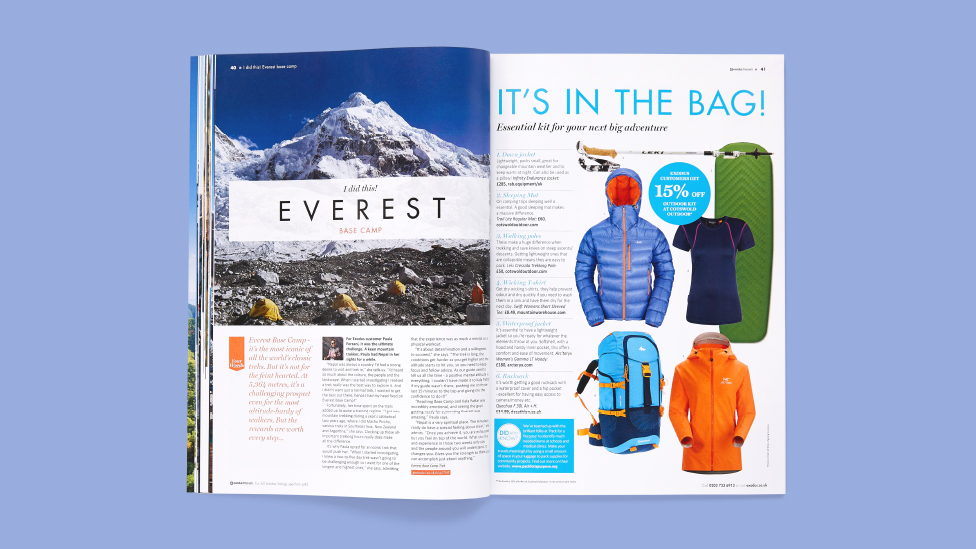
And not forgetting the role of the magazines as effective sales tools, listings pages are given a consistent visual treatment to maintain engagement levels high.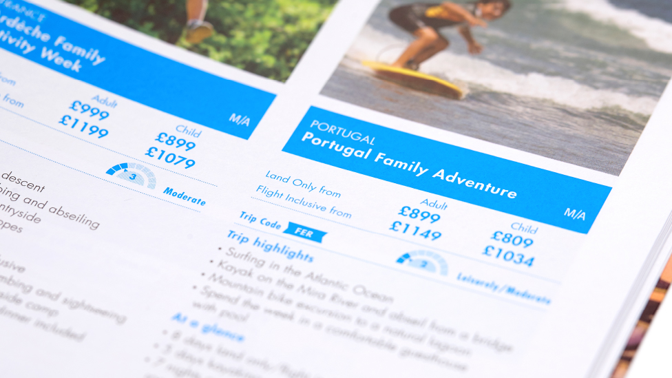
In summary – Thanks to engaging content and new ways of communicating, we helped Exodus maintain their market-leading position, attract a new audience, and drive incremental website traffic.
Result – In the 4 weeks after each brochure launched, our client saw an average 24% increase in web traffic, and overall travel bookings increased by 62%.
3 – 133% uplift in average online users over time, by providing valuable resources and improving the user experience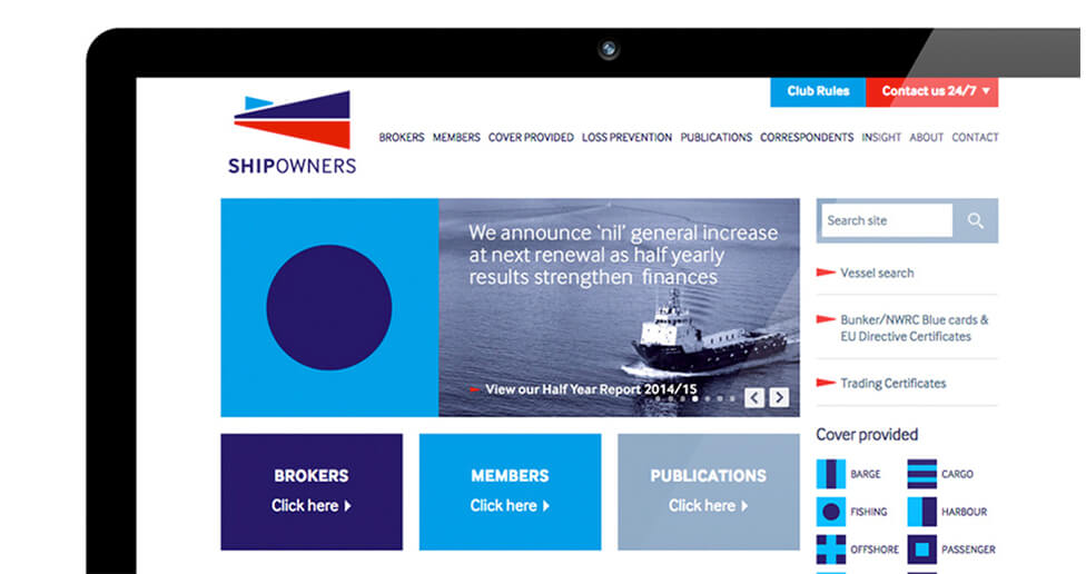
The aim – To create a digital space that would appeal to The Shipowners’ Club multiple audiences
The primary challenge was to integrate the vast amount of online resources available to a huge network of 600 insurance brokers and 33,000 vessels insured worldwide, whilst also appealing to the diverse audience.
We provided a CMS development solution that makes the information easy to manage for our client, and easily accessible for users.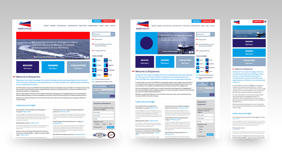
The design is simple yet bold, with visually stimulating colours and a clean layout. The palette – taken directly from the company logo – helps reduce visual noise, allowing audiences to focus on the content available.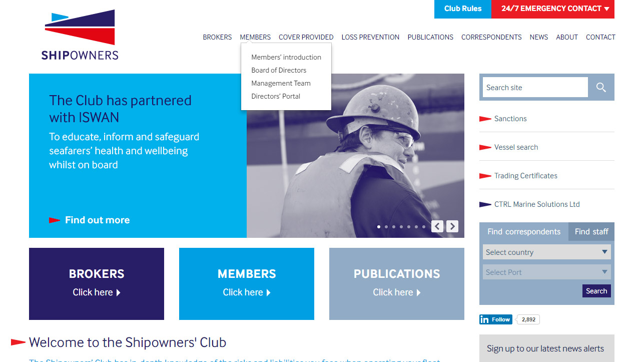
The website includes a publications library, which allows visitors to review materials by vessel type and subject. The inclusion of a toolbar with extended search functionality helps pull results from documents, databases and other content across the website.
In summary – The space became a resource for individuals in the maritime insurance industry and helped vessel owners secure information efficiently.
Result – Uplift in average online users of 133%.
These are just 3 ways to increase website traffic, see the many other ways we can help you reach your goals.

