TruSupporter
Certificate design

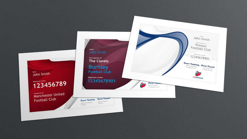
We created a certificate design that truly reflects the TruSupporter brand, contributing to an immediate sense of belonging amongst members.
Background
As part of the process to become a member of TruSupporter, every new member receives a unique and personalised certificate when they register on our client’s website.
Challenge
We were briefed with creating a design that would reflect our client’s brand and which would be consistent with other pieces of collateral. The certificate would also have to be easily customisable before it reached the print stage.
Solution
For our design we were inspired by bank notes and passport design for the final treatment, so we developed a complex pattern derived from the various shapes within our client’s logo. This approach to the design gave the certificate a strong brand visual and an authentic high quality look and feel. Choosing a modern font and typography treatment help maintain legibility as well as adding emphasis to each member’s unique number.
One important consideration our client had stipulated at the start of the project was the ability to customise the certificate’s design quickly and easily. The reason behind this was to ensure that every member received their certificate in a short space of time, which would support our client’s efforts to establish a relationship of trust with each of their members from the start. We achieved this with the use of a layered Adobe Illustrator file that contained a number of editable fields; this ensured the colour and various data elements could be updated with ease.