Brochure Design – 2 of our designers share 4 considerations
Brochure Design – 2 of our designers share 4 considerations

If you’ve been reviewing your collateral and have decided it’s time for a new brochure design, the first thing to do before you appoint a design agency is to ask yourself what goal you want the brochure to help you achieve.
You may want to give a general overview of your company, or go into more detail with financials, promote your whole product range or launch a new product. Or maybe you want to use it as a tool to generate internal employee engagement or attract the best external candidates at recruitment fairs.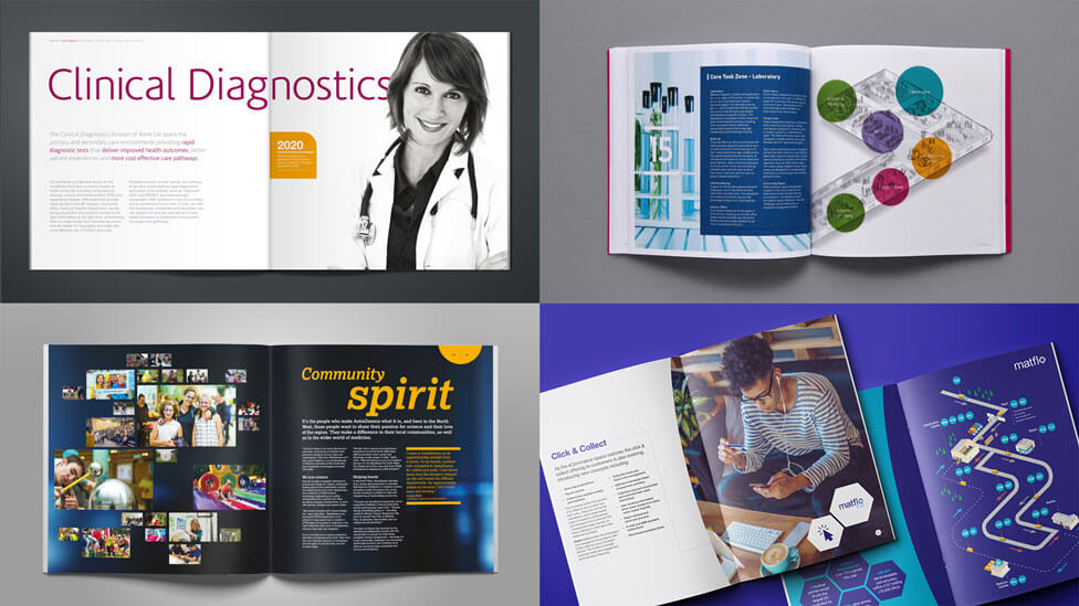
We had a chat with our Design Director Paul Ellis and Art Director Tom Hubbard to draw on their experience delivering striking and effective brochure design ideas. Here they share 4 key elements to consider when it comes to brochure design.
1 – Focus on content
Written content: informative, engaging and action-orientated
One key consideration at the start of any brochure design project is written content. For this part of the process we strongly recommend that you dedicate some time to think about what to include, and how it should be structured, which may depend on your business priorities.
Never forget the audience(s) you’re targeting – perhaps you need different versions of your new brochure, with different copy or even a different tone of voice. Is your aim to create brand awareness and attract new audiences, or inform your existing customers of any new developments? How about a call to action – what do you want your audience to do after going through your brochure? You may want them to go over to your website, email, call you, or to engage with you on social media.
Visual content: make it memorable
Another vital part of content within your brochure design is images, and the kind and quality of images you use can make or break your brochure.
When considering images, remember that they should capture your audience’s imagination immediately. Whether you need us to organise a professional photoshoot or search in stock image libraries, we’ll help you choose a set of images that will have audiences turning the pages of your brochure, eager to find out more.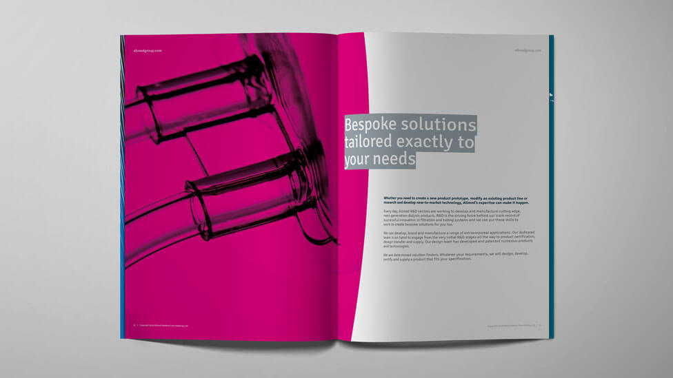
With written and visual content, if you already know what you like and don’t like, you can share some examples with us. If you don’t know yet, we can help by proposing a few brochure design options so we can establish early on a realistic approach to what you want.
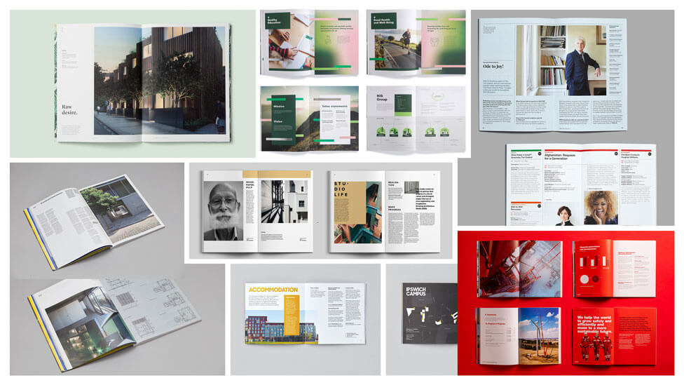
Regardless of content and design, everything needs to link together: your new brochure design needs to be a cohesive piece of work, visually and also from a narrative perspective. It’s at this point when we’ll consider your brand guidelines (if you have them) for visual treatment. If you don’t have formalised brand guidelines, we’ll get into a process of exploring various styles with the help of mood boards to see what will work for you visually, and also what won’t work.
2 – Size and format matter
Do you want to surprise your audience or would you rather rely on tried and tested traditional brochure formats?
The format of your brochure – conforming to A sizes or not, landscape or portrait, coffee table size, etc – can make such a statement that it can change your audience’s perception of you as a business, and make you rise above your competition as soon as your target audience set eyes on your brochure.
But don’t forget that the further you move away from traditional brochure formats, the bigger impact it will have on costs. And as a rule of thumb, it’s always good to remember that one page in Word may not necessarily translate into one page in a brochure.
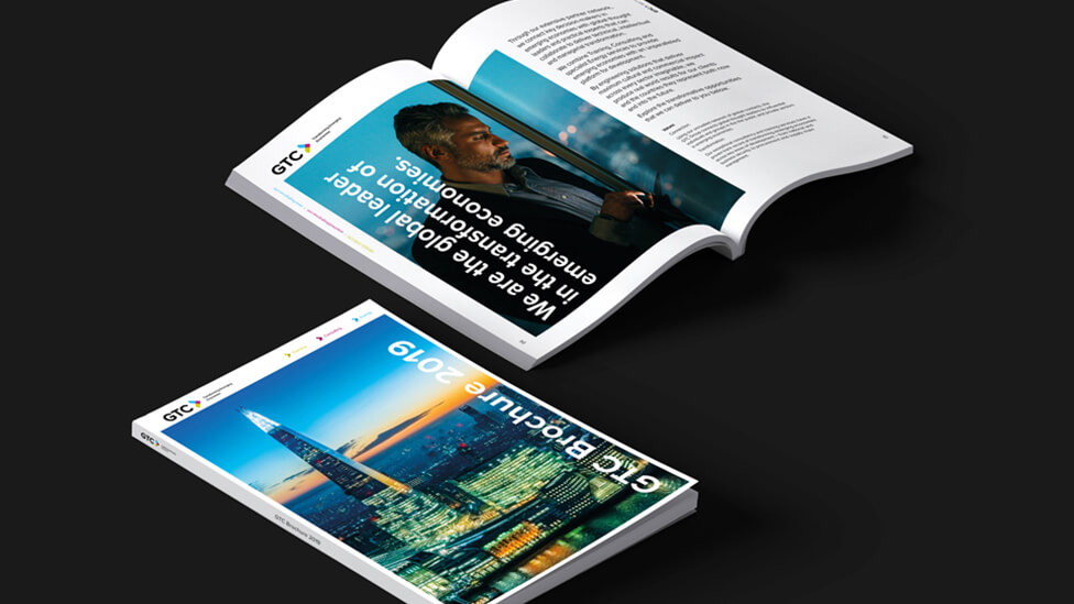
Cut-outs, pull-outs or a cover case can really help lift your brochure, although they can often add complexity to the job, which often translates into more time and budget needed.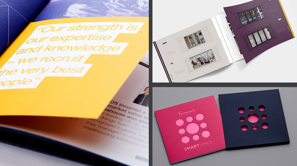
To save costs, and depending on what you’re trying to achieve with your brochure, we may recommend adding a sleeve where you can insert, for example, data sheets. This will avoid having to reprint the whole brochure following changes such as different product specifications.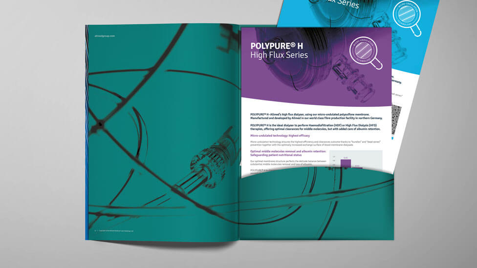
3 – Focus on design
The concept stage
After we’ve agreed on format, size of the brochure, and what visual and written content you’d like to include, we can move on to what we call ‘the concept stage’.
This is a key part of the process in which we’ll develop a few options to illustrate where we feel the style of the brochure is going, always with your ultimate goal front of mind. This is a very collaborative process between client and brochure design team, with feedback being shared by both parties before we arrive at the chosen design. It’s at this point when we can finalise pagination to show you the flow of content and start completing print costs.
The design stage
With the concept approved, we can move on to organising written and visual content. When browsing through a brochure readers inhale the information, skim reading a few points to take away, so information needs to be broken down; it needs a rhythm, striking a balance between top level and more detailed information.
To achieve this we may start playing with colours, number and size of images, whether they’re in colour, black & white or we apply a colour treatment to them. Typographically, we’ll consider the fonts used, their size, even orientation on the page. Whatever content you want to highlight in your new brochure design, we’ll think of ways to make it more interesting for your readers, to make it jump off the page.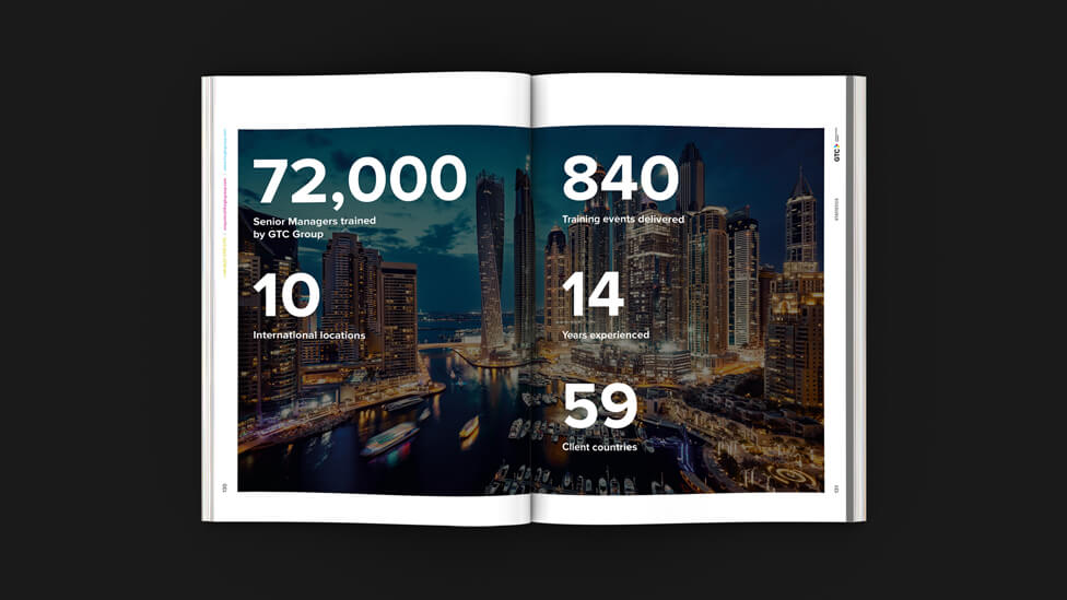
Depending on the size of your brochure, we may design
key spreads or templates for you to approve before we deliver the first draft of the brochure.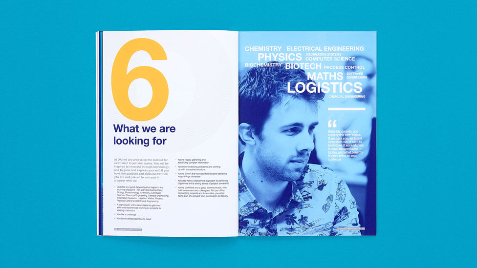
The artwork stage
Once the different page design and layout options, content and pagination have all been approved, our designers will pass the baton to our production team to progress the approved designs to artwork stage.
This stage is where content is organised on every page and set to print-ready specifications. And what do we mean by “print-ready”? Without going into too much detail in this article, one of the key factors to consider when preparing a document for print is, for example, image resolution: an image that displays correctly on a website won’t necessarily appear to have the same quality in a printed brochure, as image files need to have a higher resolution to print correctly, and not appear pixelated.
Before we can finalise the artwork, we’ll ask you to choose what print finish you prefer, and we’ll be on hand to guide you through this part of the process and make recommendations based on your budget. We can also carry out a quality control exercise, thoroughly checking and proofreading the brochure before it reaches the printing stage.
4 – Printing, last but not least
Printing should never be an afterthought.
After working closely with you from the start, and with all artwork now checked and approved, it may perhaps be time for you to sit back and wait for the printed brochures to land on your desk.
While you can leave everything in our hands, we often like to invite our clients to come to the print house with us to sign off initial print proofs of the brochure. With the wide range of options available when reaching the printing stage (uncoated paper stock, gloss finish, silk stock, soft touch laminate, recycled, uncoated or FSC-certified paper, even adding an antimicrobial layer, and more), we like to make sure that, following a series of recommendations from our production team, you’re entirely happy with the quality of your print proof before the printers hit the button on the whole run.
Something else we will have asked you to confirm before reaching the printing stage: the type of binding. The binding you choose will have an impact not just on durability, but on the concepts of quality and excellence you’ll want to transmit to your audience. Another consideration: will your brochure be handed out or mailed? If you’re reaching your audiences by post, don’t forget additional mailing costs, which will depend on the number of pages, the weight of the paper, and the volume being mailed out, amongst other factors.
And after all these tips on what to consider when it’s time for a new brochure design, you may want to go back to the start and think “when do I need it for?”, as the answer may have a significant impact on all the points above.
Sound like we could help you with your next brochure project? Get in touch, we’d love to hear from you.