Website Design – Benefits of responsive web design
Website Design – Benefits of responsive web design

How do you prepare your online presence to be functional and look great across all devices?
Mobile devices are quickly becoming the preferred medium to view websites. Products such as iPhones, Android phones, iPads and other tablets are usually close to hand and always on so users can browse the internet at their convenience, whether they’re getting comfy on the sofa or shopping in the supermarket. This presents many opportunities for business owners to tailor their websites to be used on mobiles and tablets, allowing users to more readily access key information and carry out necessary tasks.
It has been predicted that by the year 2015 over 80% of internet users will be using a mobile device to browse.
So how can you prepare your online presence to be functional and look great across both desktop computers, and mobile devices?
The answer: Responsive websites
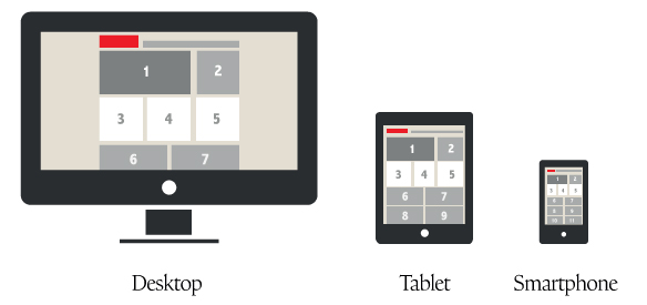
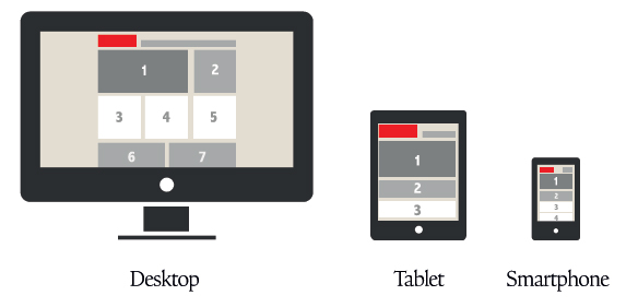
Responsive websites are flexible depending on the device on which they are viewed meaning that there is no need for two separate websites – the desktop version will simply restructure itself when viewed on a smaller device (try viewing this website on a mobile or just try reducing your browser window width to see our responsive design in action). One of the benefits of responsive website design is that menus, images and text content can be designed to reflow on the mobile device. This means that the user will not need to ‘pinch and zoom’ to read the website as they would need to do with a normal desktop website viewed on a mobile.
This responsive web design process also gives us the opportunity to prioritise content, making sure important information is displayed at the top of the page and other content below, as the user scrolls down the page.
Attention is also given to the overall usability of the mobile experience, with clear, legible font sizes and bigger areas for links and buttons (because the user will be tapping links instead of using the mouse to click them).
A ‘mobile-first’ approach can also be applied where appropriate, which allows the mobile version of the website to load very quickly. This is because any desktop-only content (such as large images) will be ignored by the mobile device (and not downloaded).
Non-Responsive Website Design Structure
- Tiny viewable elements
- Users need to zoom in
- Poor navigation
- Dissatisfactory experience for the user
Responsive Website Design Structure
- Suitably sized text/images
- No need to zoom in
- Easy navigation
- User-friendly experience
- Flexible
The Benefits of Responsive Website Design
Most smartphone users will have come across websites which are not practical to use on a mobile device – you need to zoom in and move around the page to find what you’re looking for, the buttons are small and the whole experience dissatisfactory. The main benefits of a responsive website design are:
1. Easier navigation
By building your website as a responsive layout it will be easier and more enjoyable for mobile viewers to use, with tailored menu systems and appropriately sized elements. This could be the deciding factor for potential customers between your business and a competitor.
2. Money-saving
It will also be a better investment for your business as it will last longer, adapting to new viewing technologies. When a responsive structure is employed from the start of a build it can save development costs down the line, and is more economical than building a mobile version and desktop version of your website.
3. Time-saving
What’s more, if your website uses a content management system you will only need to update information once, whereas with separate mobile and desktop sites you would need to carry out the changes twice.
4. Search Engine Optimisation
By using one adaptable framework for your website all link-building and other activity is kept in one place, meaning it is an easier task to manage your search engine optimisation. If you are using an analytics tool it will also mean all your traffic is registered to one website rather than multiple accounts, leading to a more holistic online marketing approach.
5. Additional Features
Mobile browsers such as Safari tend to be more advanced than the most common desktop browsers such as Internet Explorer. Additionally mobile devices make great use of their in-built technology such as cameras, compass, geolocation GPS and accelerometer. The benefits of responsive website design in relation to this is that your company can use these features to enhance the mobile user’s experience even more.
Where to start
If you are looking for a new responsive website or to update your existing website to a responsive design, our experienced web team can talk you through how your site would work.
If you would like to find out more about responsive website design and how it could benefit your business get in touch with one of our team today.

