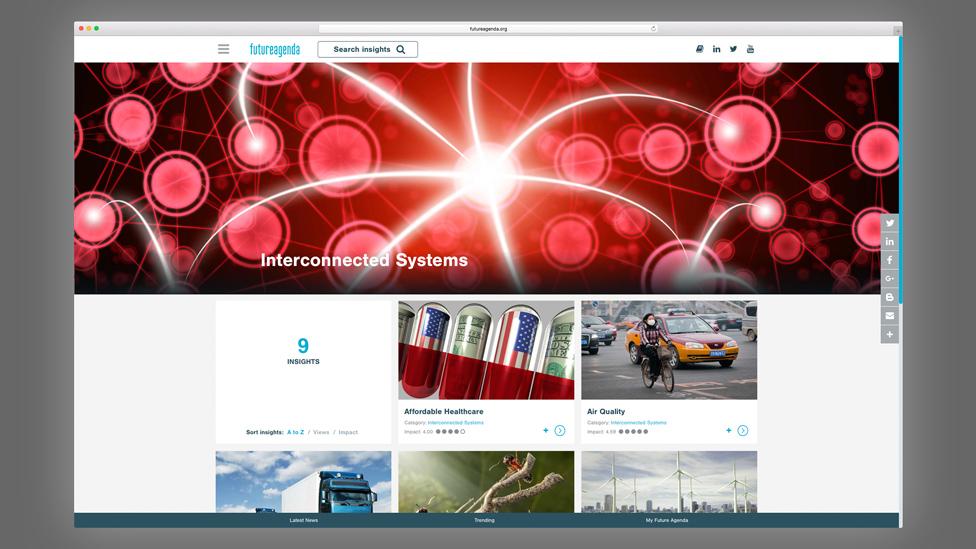
We designed and developed a nonprofit website design that allowed Future Agenda to share the latest research findings with their audience and continue to debate and action.
Background
Future Agenda, the world’s largest open nonprofit foresight organisation, explores key issues facing society over the next decade. The programme – first run in 2010 and again five years later – brings together views on the future decade from many leading individuals and organisations. Building on expert perspectives on over 20 topics, our client addresses key issues through the use of workshops and associated events.
Challenge
Our client asked us to produce an engaging website design to help them share the latest insights with their audience – made up of businesses, government bodies, academics and students. The aim of the website was for visitors to use it as a resource tool, or simply to read up on a variety of topics they may be interested in, such as Future of Health, Digital Money and other big issues and emerging challenges for the next decade.
Solution
The nonprofit website design presents content grouped by topic, and includes built-in search functionality that suggests relevant topics and provides the five most popular insights.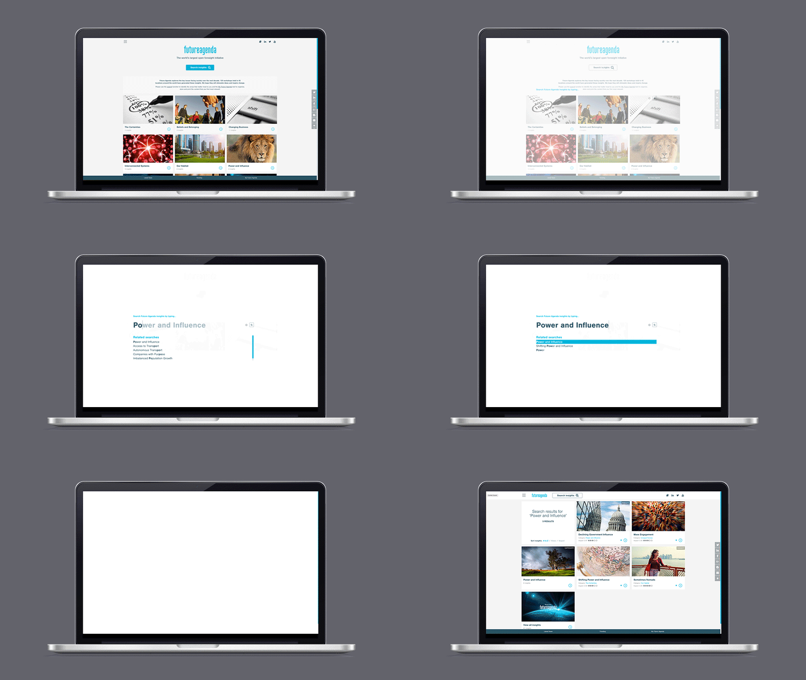
All results are presented in a clean and effective way to further enhance the user experience. Users can collate insights for offline use, and can organise them using a drag and drop interface. These insights can then be downloaded as a customised, self-contained document. A ratings system also allows users to vote on how impactful or relevant insights are to them. This means that insights can be sorted based on how impactful the topic is seen to be by the audience, as well as by date and alphabetically.
A fully bespoke and streamlined CMS (Content Management System) allows for easy updates whilst delivering the web pages at high speed. This has the benefit of fast perceived page loads for the user and higher rankings in Google.
We used card-based design to help organise the content in a clear way within a grid layout. This approach also allows us to showcase impactful images to introduce a particular topic.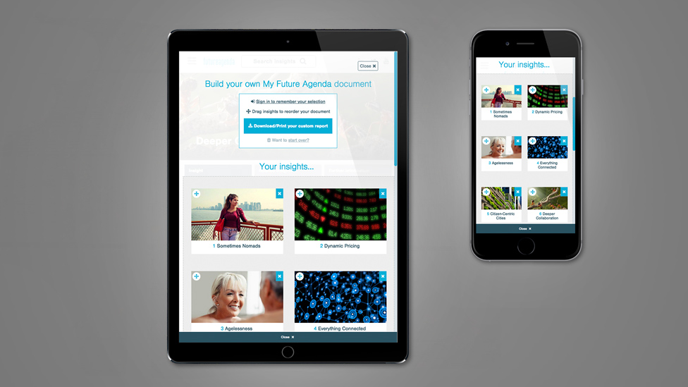
The fully responsive website was accessible via desktop, mobile devices and on the latest web browsers. The design also incorporates other UX features such as parallax scrolling, retina (HD) images, and custom web font typography.
Looking for help with your project?
Feel free to give us a call to start a conversation,
our doors are always open.
Related projects
CuraTeQ
Healthcare website design
Heat Pump Life
Interactive website design
H&T Presspart
Branding strategy & development
