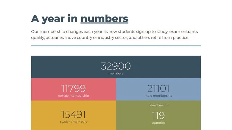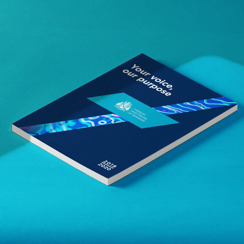
A cutting-edge performance report design with a strong sell that follows a You said / We listened theme and structure.
Background
Headquartered in London’s Chancery Lane, the IFoA is an elite membership organisation. Its members, tens of thousands all over the world, have huge demands on their time.
The IFoA is passionate about offering the best possible member experience, having undertaken a research programme to gain a better understanding of what members’ priorities are, which is part of this report. As it was being compiled, the Covid pandemic swept across the world, and so our client saw its publication as an opportunity to express their admiration to the actuarial community for stepping up to assist governments, organisations and communities worldwide.
Challenge
The design needed to be a highly engaging piece of communication to IFoA members, and a sales tool to be put in front of would-be members. Our client wanted a succinct and fresh design that would showcase their story and not take up too much of members’ valuable time. Equally, the new performance report design was required to swiftly present the positive impact of the IFoA to new members.
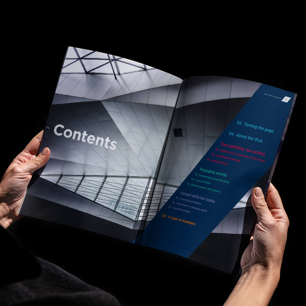
Apart from a fresh and exciting design approach, our client was keen to write copy to fit the design, rather than work a design around an approved story and narrative. Part of the brief was to ensure that the design assets created for the report could also be translated into animated GIFs for social media.
Adhering to a set, conservative budget was also essential, with no room for overspend.
Solution
With such a discerning audience, we didn’t take anything for granted, and every item of content is backed up by a deeply thought-out rationale to get a place in the report.
Before receiving final copy, we agreed punchy headlines and word counts, which allowed us to create a series of page templates and to set up workable grids.
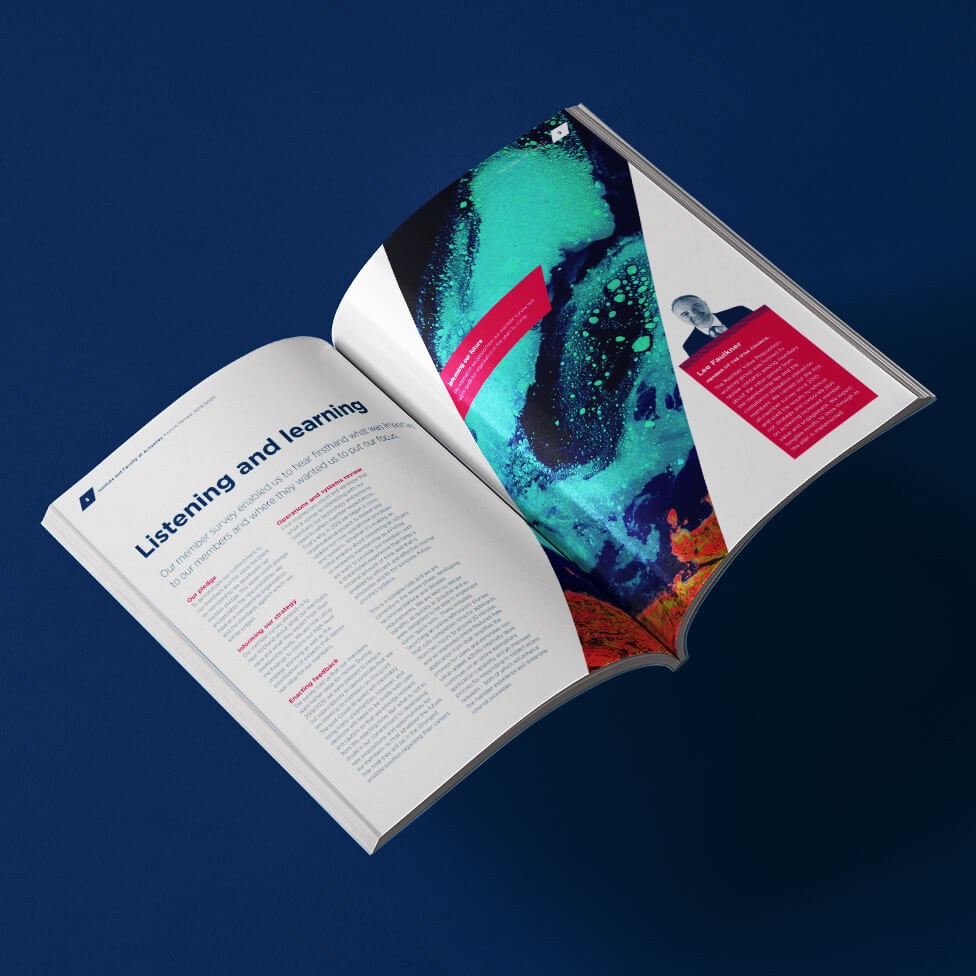
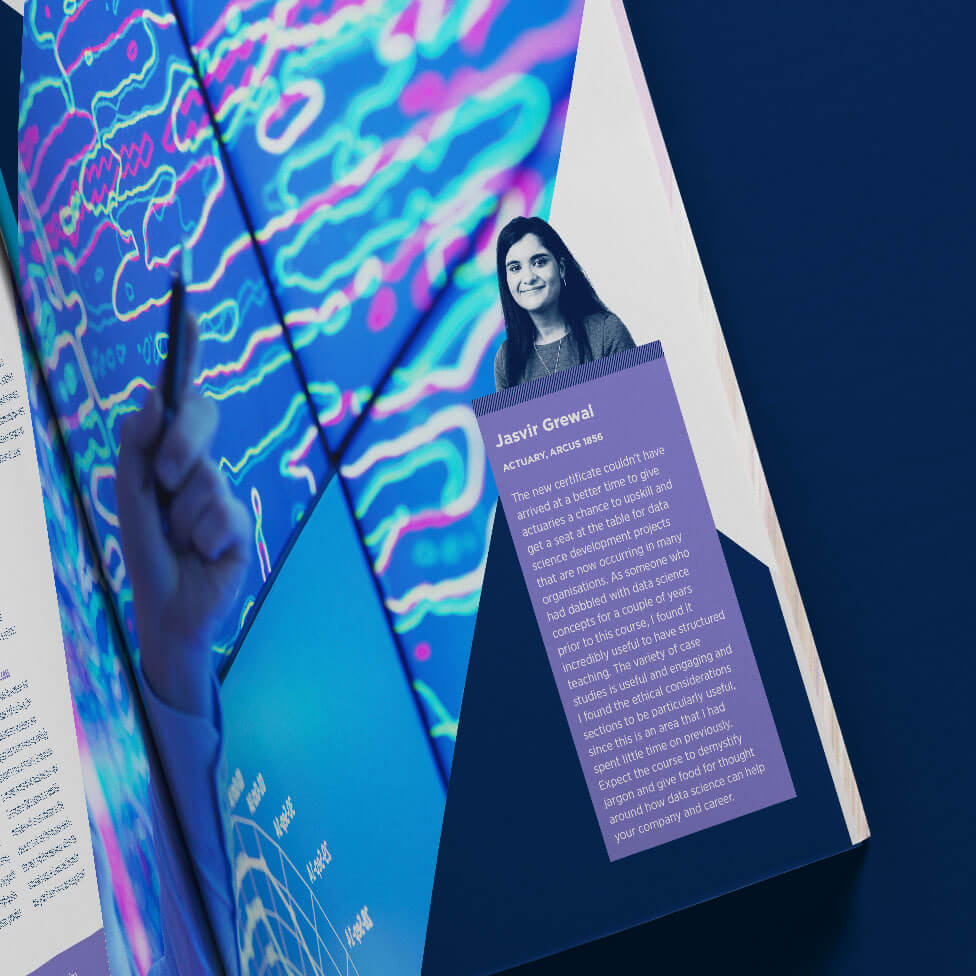
The report design is driven by the theme of You said / We listened, a Q&A format that we visually translated into a slash device that cuts across pages or sections to structure content. The slash also helped when progressing through the design as we initially only had headlines and word counts to work with. This also allowed us to be exciting in our approach to imagery when cropping – perspective and juxtaposition helped us tell the IFoA story and keep the report flowing.
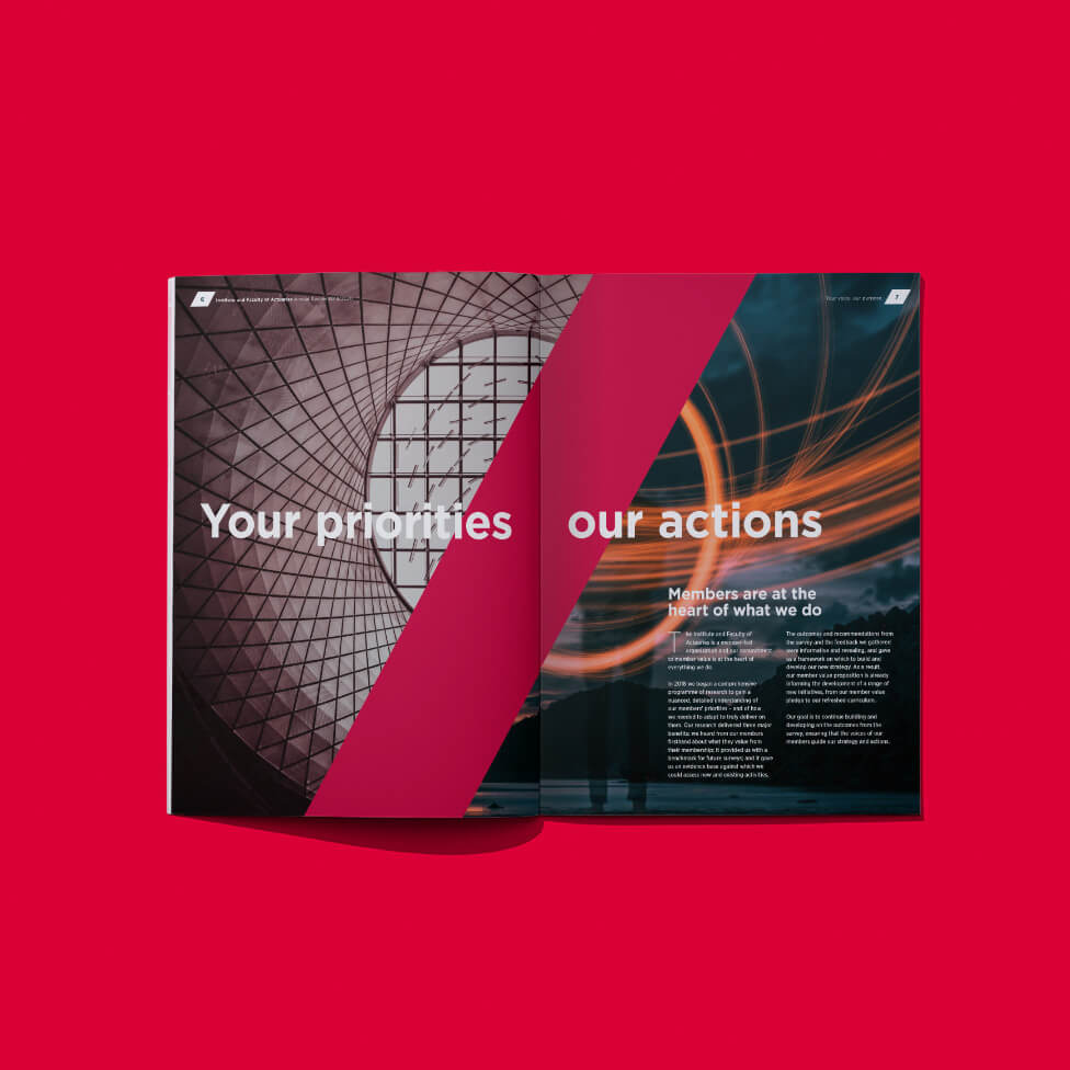
Imagery was incredibly important in this report, with some provided by our client (where we may have applied a colour tint for visual consistency or to overcome any quality issues), and others were sourced by us, rights-managed and on budget.
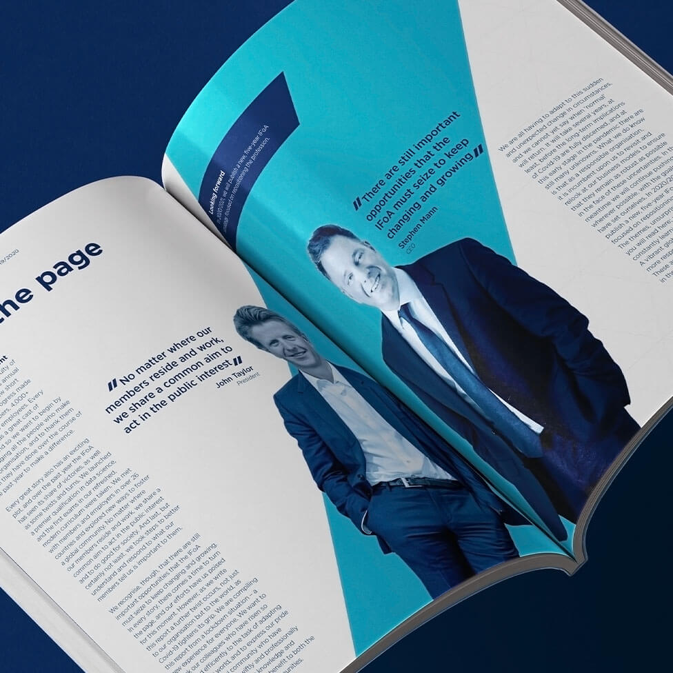
The design is bold and confident, with highly stylised stats pages, and we used a lot of the secondary colour palette to aid with structure and digestibility.
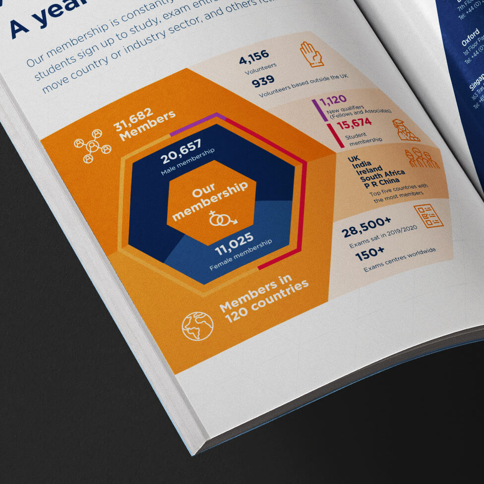
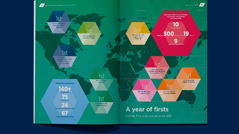
Much of what actuaries do – analyse risk, patterns and trends – is about the effect their work has on others, not necessarily a tangible product, but of key importance, so we put this across with the use of abstract imagery.
Looking for help with your project?
Feel free to give us a call to start a conversation,
our doors are always open.
Related projects
H&T Presspart
Sustainability report design
EITI
Multilingual report design

United Utilities
Annual performance report
