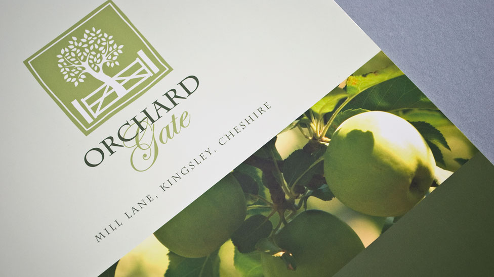
A residential property brochure design that helped promote a unique new development in a beautiful rural location.
Challenge
To help promote a unique courtyard development of six character properties set within a beautiful rural village location, our brief was to design a residential property brochure that transmitted the unique character and essence of Orchard Gate.
Solution
The nature of the site lent itself to a rustic design, so we maximised the use of colours and textures from the orchard itself to create a unique identity and marketing pack.
We started by designing a logo incorporating the iconic tree and gate symbol: the design has a natural feel and is complemented with a sophisticated combination of a script-style font and a traditional serif typeface. Very classic in feel, the residential property brochure design uses a balance of lifestyle and architectural photographs, which were planned and shot by our professional photographers.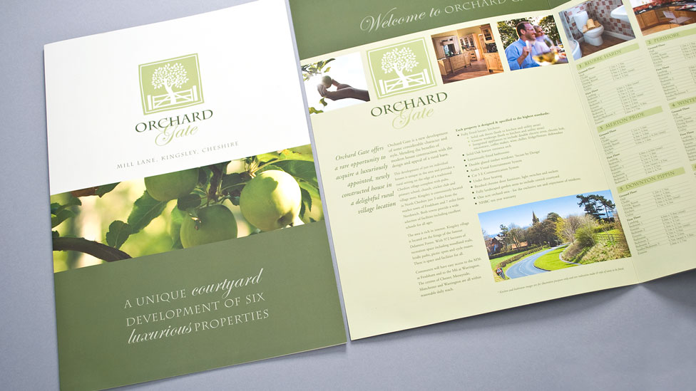
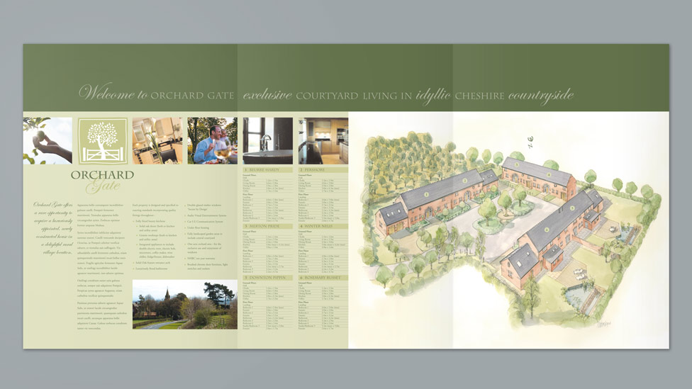
We commissioned a bespoke watercolour impression to illustrate how the development would look on completion and to reinforce the country setting of the homes. We also created illustrated floor plans and a microsite to support the marketing effort.
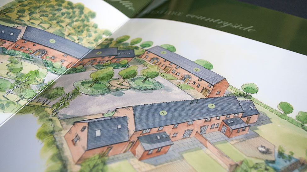
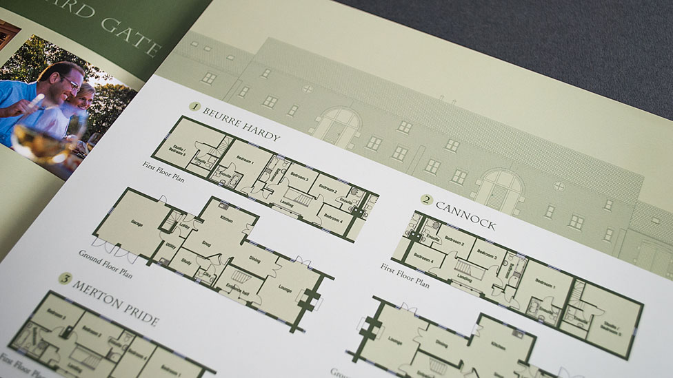
The residential property brochure was an A4 6-page format, allowing extra room for specifications and floor plans, and the final printed copies were treated with a gloss laminate to saturate the colours and really bring the photography to life.
Take a look at other examples of brochure design.
Looking for help with your project?
Feel free to give us a call to start a conversation,
our doors are always open.