In-store Opticians
Retail interior design
In-store Opticians
Retail interior design
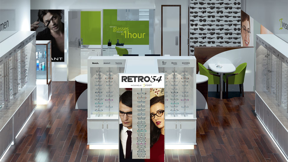
A departure from the norm for our client, these retail interior design concepts for in-store opticians offer a premium experience that generates curiosity amongst busy supermarket shoppers.
Background
Retail giant Tesco has over 200 in-store opticians throughout its network of supermarkets across the UK. Having worked with Tesco and its franchise partner for a number of years on their store design and interiors, we were approached to create a brand new concept store design.
Challenge
The new design had to signify a real departure from traditional opticians. To keep footfall traffic high, the new stores had to offer a more premium experience than what audiences were accustomed to within a supermarket environment.
Solution
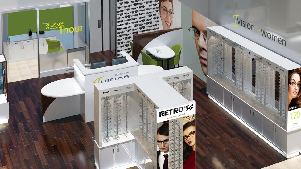
We started by developing a range of logo and brand concepts based around different names for the concept store. Settling on a shortlist of three, we went on to produce a series of highly detailed, photorealistic computer-generated images of the new retail interior design.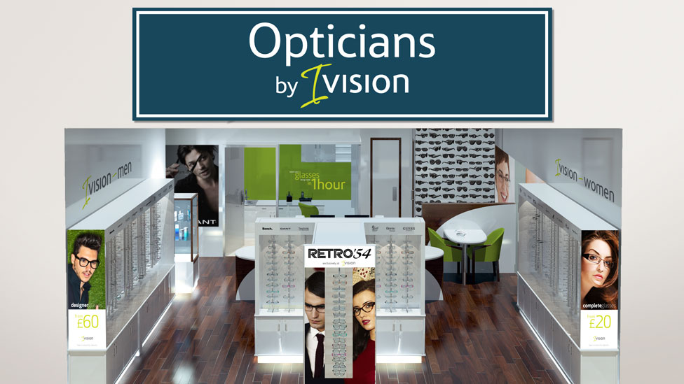
We proposed a predominantly white colour palette for wall fixtures and fittings throughout the store, to give a clean, clinical and highly professional appearance.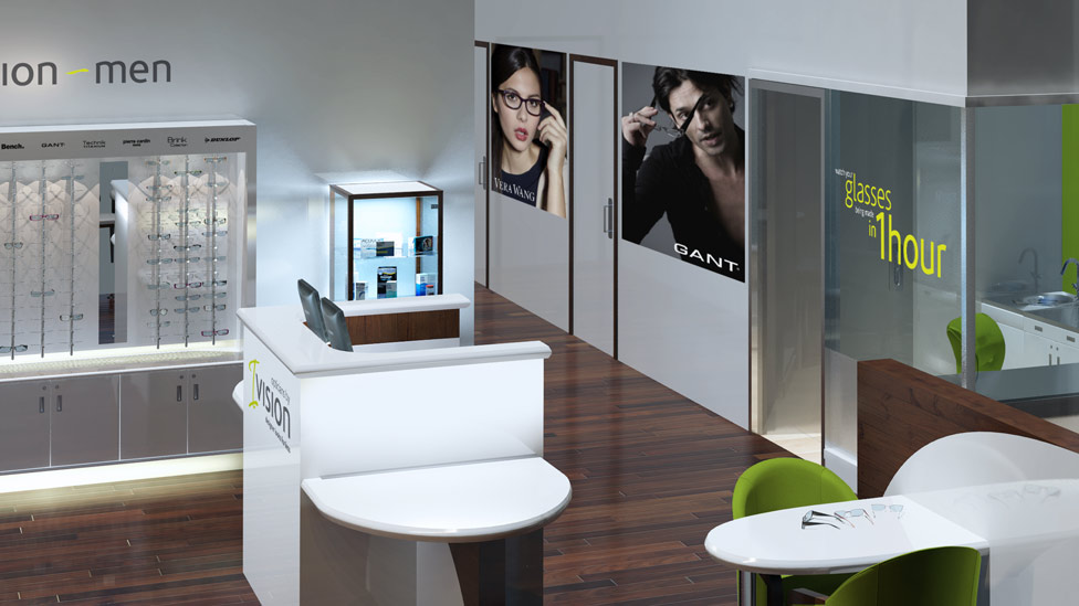
In contrast, accents of colour add a splash of warmth and friendliness, attracting shoppers in.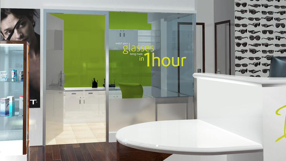
Selecting a dark cherry wood for the floor covering adds another contrasting element to the clinical white in fixtures and fittings, and contributes to the upmarket and quality mood of the experience.
We also designed a range of stylish and aspirational point of sale graphics, branding and signage to complete the retail interior design.