A2Dominion
Company annual report
A2Dominion
Company annual report
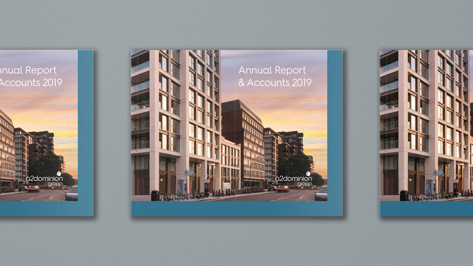 This clean and contemporary company annual report design relies on a highly visual approach to transmit a message of quality and professionalism.
Background
A2Dominion’s vision is to improve people’s lives through high quality homes and services. And they do it by reinvesting all of their profits into building more new homes and supporting the communities where they build.
With close to 40,000 homes across London and the South, A2Dominion’s portfolio of affordable housing is wide-ranging: private and social rented homes, NHS and temporary accommodation, student properties, supported housing and homes for older people. Once built, our client stays on as landlord, maintaining a long-term relationship with customers.
Challenge
To carry out a design refresh which would help differentiate the piece from the previous year’s company annual report, while still acting as a strong visual representation of our client’s business – professional and of high quality – and really capture the attention of a target audience made up of investors, business partners, local authorities, governmental and regional bodies, housing associations, financial institutions, regulators, developers and contractors.
Solution
To make the report design clean and contemporary, we maximised the use of space and strong images to lead the written content.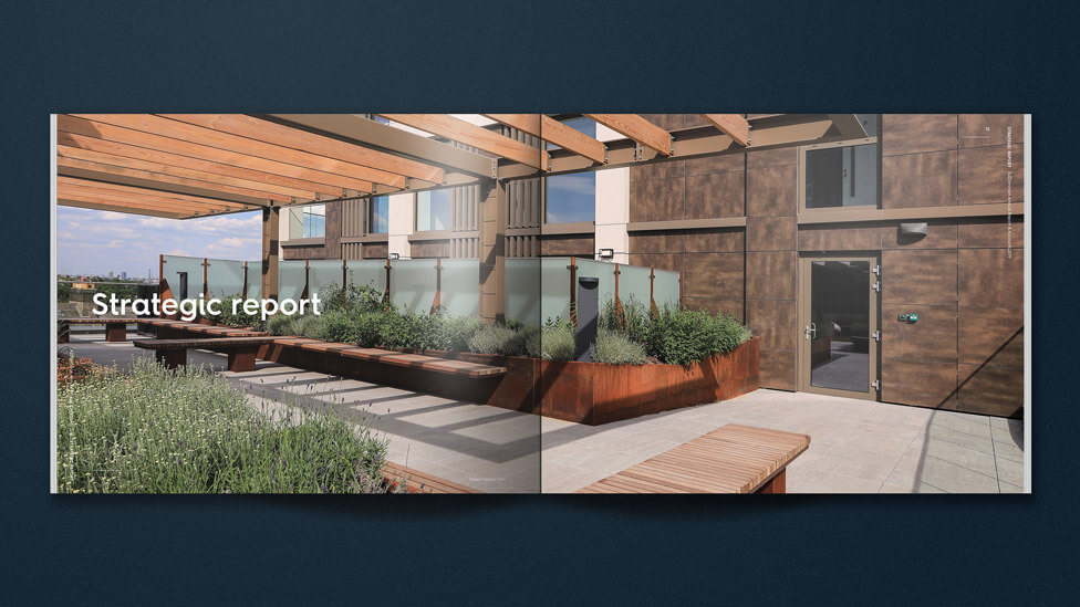
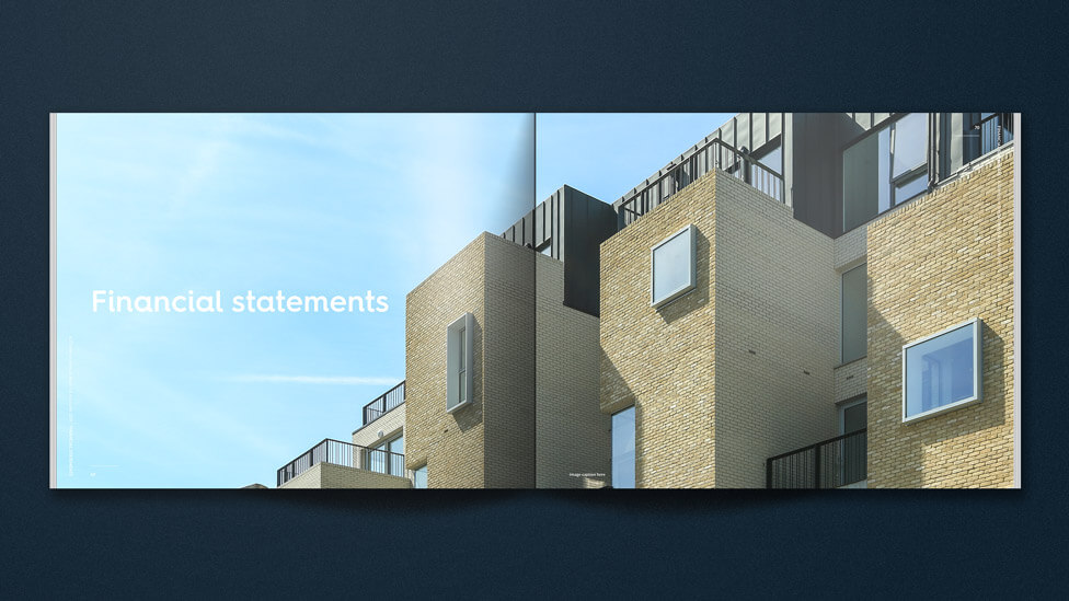
Images of A2Dominion’s property portfolio and the communities our client supports act as focal point around copy that is allowed to breathe on the page, turning the annual report into a highly impactful piece of corporate communications.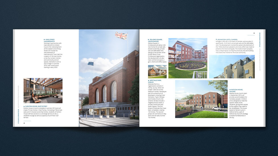
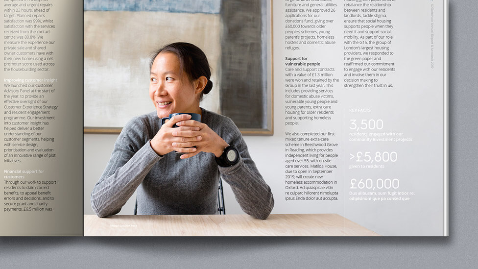
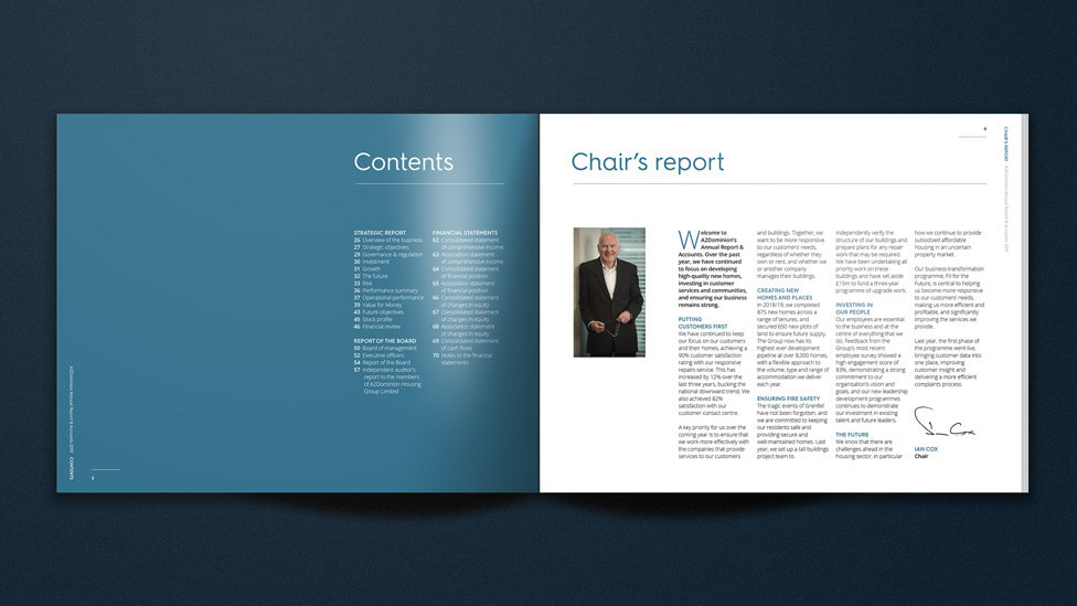
A variety of content layouts keeps readers engaged and interested at every page turn.
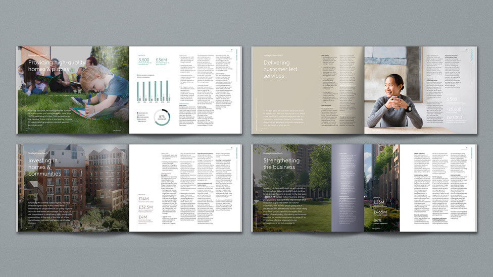
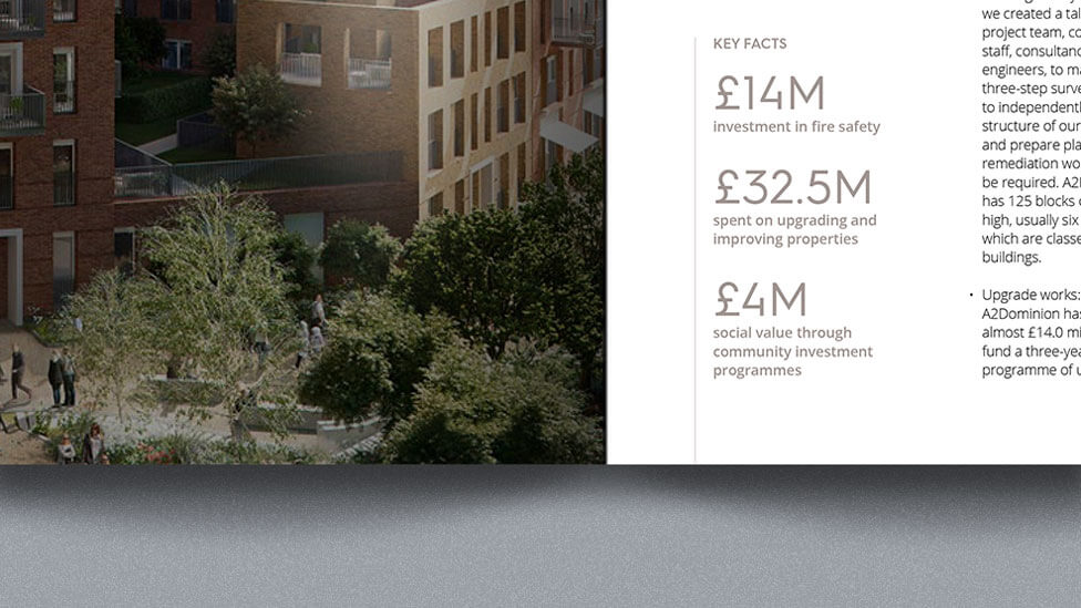
To highlight specific key messages, some of the company annual report’s pages include columns of text superimposed on imagery.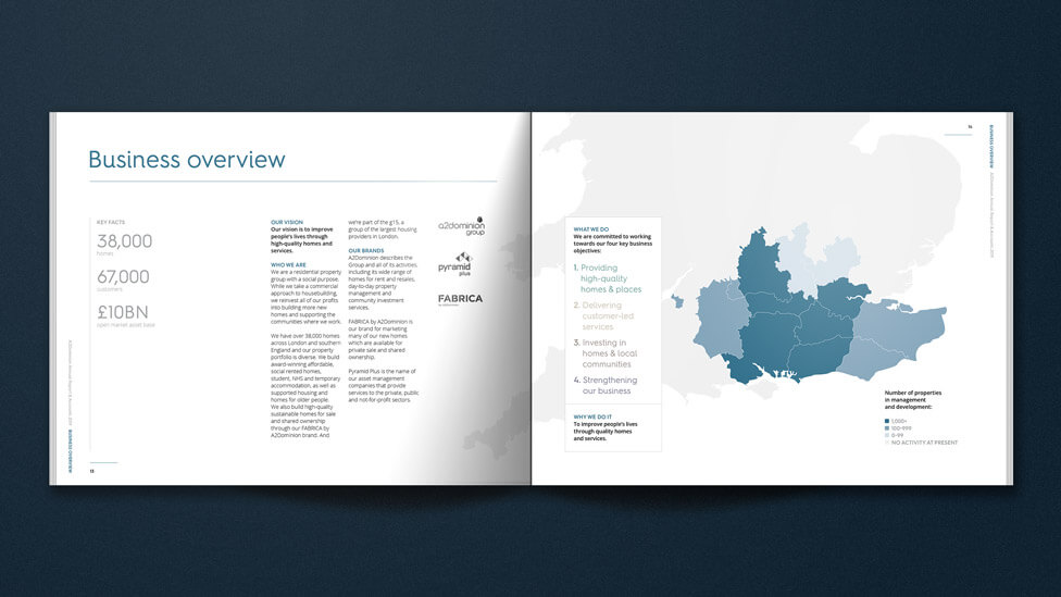
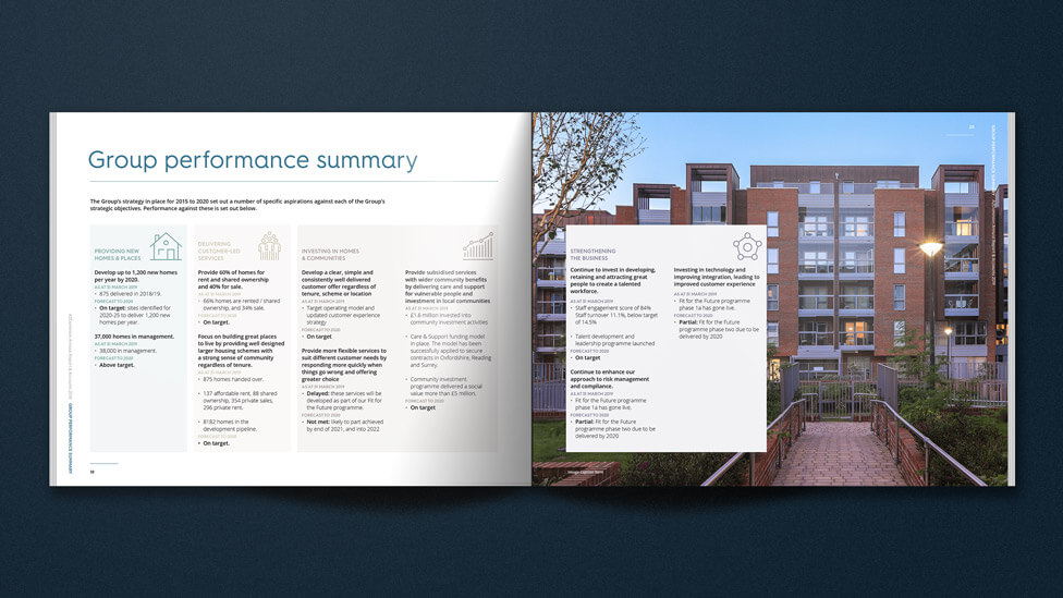
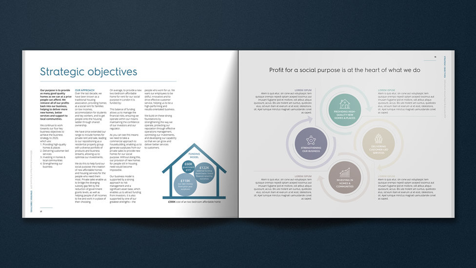
The design is clean and exudes confidence: a quick skim-read, aided by the simple icon style we developed, is enough for the message to reach the audience. Infographic-style layouts communicate key performance statistics in a highly visual manner, helping to embed the information in the audience’s mind, whilst also helping break up content on the page.
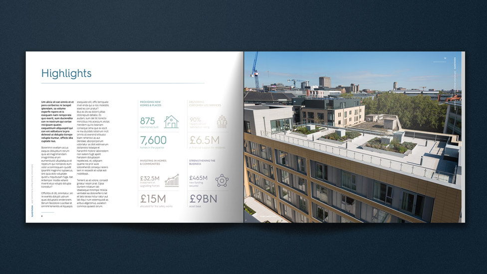
The highly visual style is carried through to the less photography-focused company objectives pages, where colourways from our client’s brand guidelines help categorise their 4 strategic goals. Still playing with the senses, we moved away from a more traditional A4-size format and instead opted for an appealing custom size that helps create differentiation with other corporate materials.