LEO Pharma
Pharmaceutical stand
LEO Pharma
Pharmaceutical stand
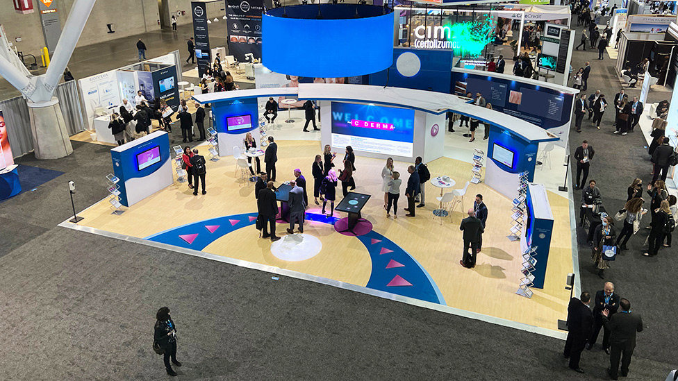
An open and welcoming pharmaceutical stand that attracted delegates thanks to colour, light, gamification, and a focus on patient stories and the science behind our client’s recently approved product.
Background
With headquarters in Denmark and founded in 1908, LEO Pharma is a global leader in medical dermatology which has been dedicating years of research and development to advance the standard of care to benefit people who suffer from skin conditions.
Challenge
Attending the AAD (American Academy of Dermatology) annual meeting in person for the first time since the pandemic hit, our brief was to bring to life a stand design we had started to develop for the same show two years earlier, pre-Covid. Held in Boston’s Convention Center, the AAD meeting attracts thousands of dermatologists every year, offering the latest advances in diagnosis, prevention and treatment of dermatologic disease, a forum where our client would be able to promote its leadership and expertise in the field.
Solution
Maximising budget and repurposing elements that had been designed and built two years before, we delivered an open and welcoming pharmaceutical stand that attracted delegates thanks to a combination of colour, light, gamification, and a focus on patient stories and the science behind the new product being launched, all whilst adhering to the strict rules for pharma industry exhibitions in the US.
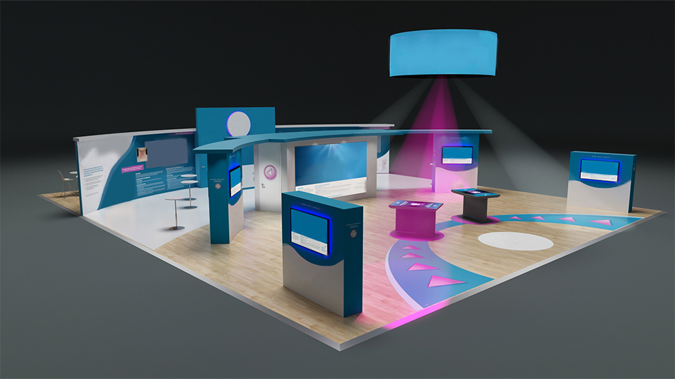
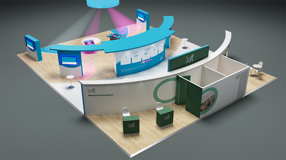 The exhibition stand design succeeds at bringing together the LEO Pharma branding, the branding of the new product being promoted*, as well as non promotional areas, all in a cohesive way from both design and structure perspectives.
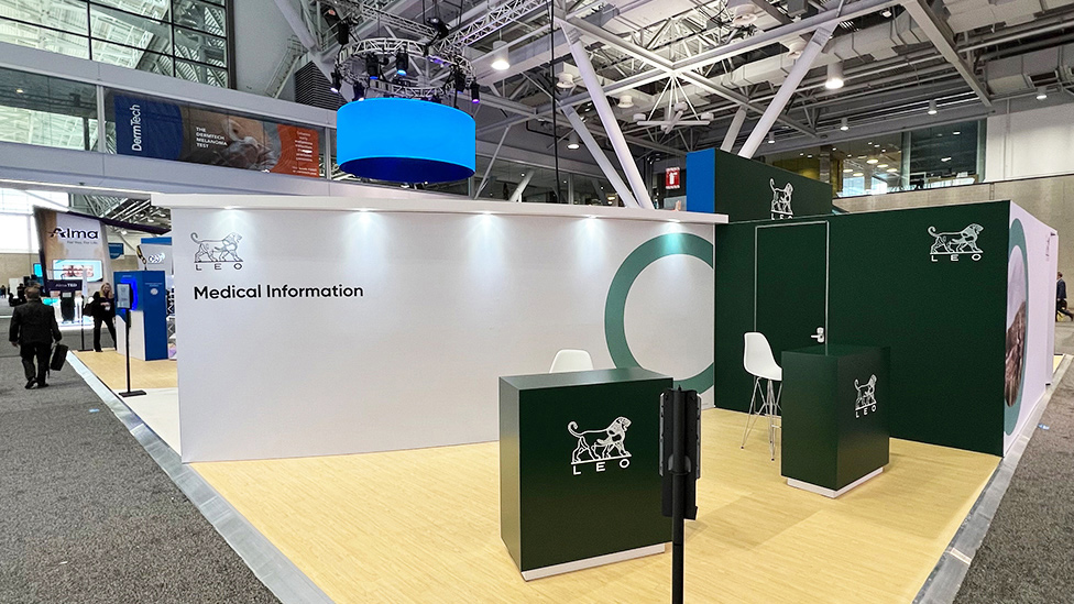
Mixing the benefits of custom-built exhibition design with modular elements, the pharmaceutical stand is split into two distinct zones: the main area – in blue – is a totally new design, whereas the non promotional sections – in green – are part of the original design we had created pre-pandemic.
Working in close collaboration with LEO’s brand agency, we established what messaging and graphics to apply to the stand. Originally planned to only feature in a central area of the stand, following the approval of the new product by the FDA (American Food and Drug Administration), the design evolved to maximise and allow it to take over the whole stand.
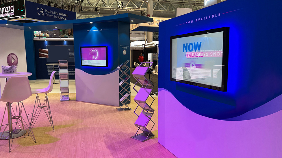
The pharmaceutical stand tells different stories through a series of features that hook delegates in, and keep them informed and engaged: a curved wall, an LED video wall, looping content, touch screens, and podiums with interactive content for delegates to explore the product, amongst other features.
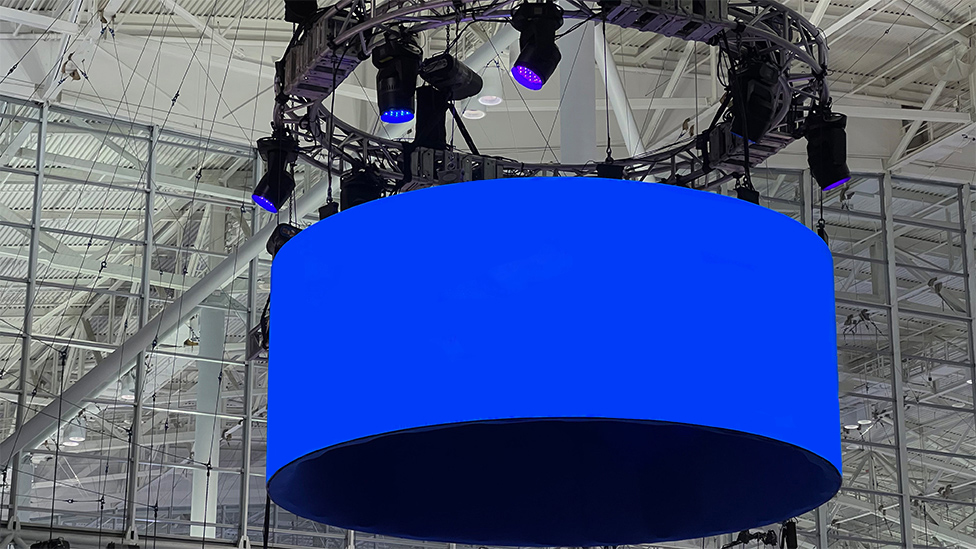
A big, full circle LED screen suspended from the ceiling is visible from everywhere across the hall, and the raised platform floor with a slanted edge, not common in the US, gives the LEO stand a point of difference against other exhibitors; delegates get a sense of “stepping up”, the area almost feels like a stage, immediately creating a memory that sticks in the mind. The raised floor surface also serves a practical purpose, as it allowed us to conceal cabling underneath.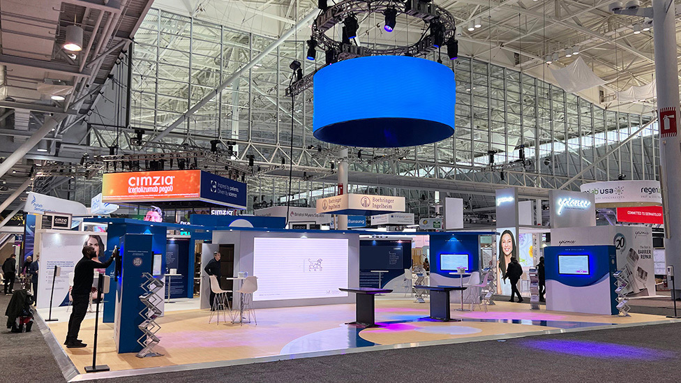
 An arrow shape graphic, which can also be interpreted as a Play button, is a visual constant in the stand, injecting energy into the concept of progress and Start Now, as well as serving as a directional cue to attract visitors to the gaming area.
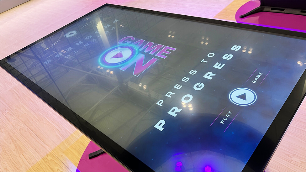
Interactive touchscreen tables allow delegates to find out more about the product through an electronic reaction game, in the style of whac-a-mole, where visitors can play against each other, a simple and fun way for LEO reps to start a dialogue with delegates.
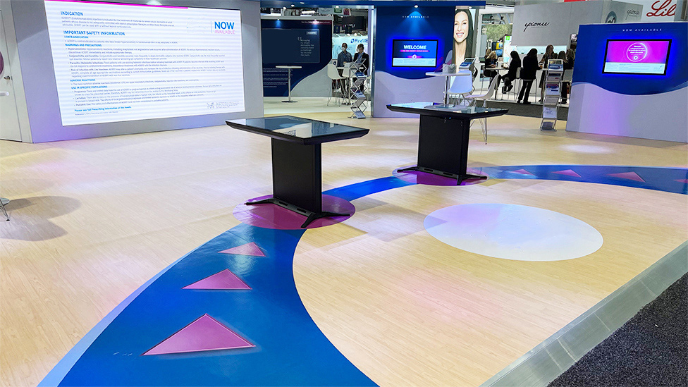
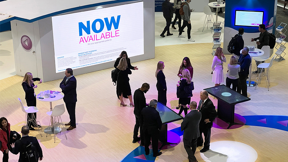
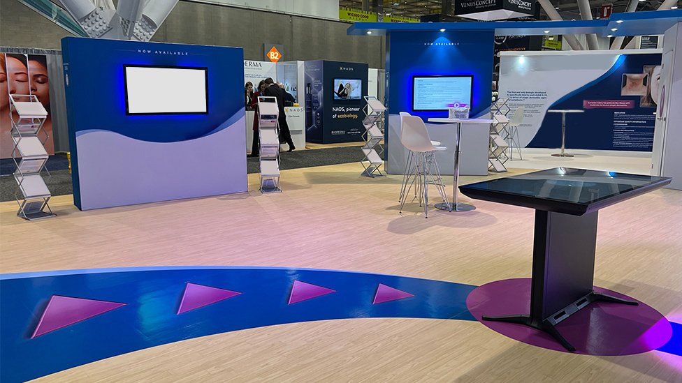 Curved walls and different floor surfaces help differentiate areas within the stand and direct the delegate journey, with an opening inviting visitors to walk through to discover what’s beyond the wall.
Inherited from the original pre-pandemic design, the design of the wall relies on a B-matrix system, a metal substructure that supports fabric graphics that can be easily replaced depending on what messages are being promoted.
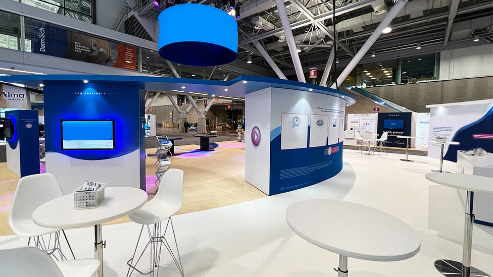
Going through to the other side, delegates can find a series of patient stories that immediately engage as well as product info, on AV screens or panel graphics.
Integrated spotlights give an attractive glow and draw attention to patient stories and product information.
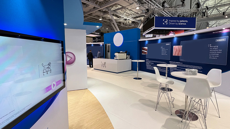
Also included in this area of the pharmaceutical stand is a coffee bar with barista service, one of the draws to increase dwell time by encouraging further networking opportunities.
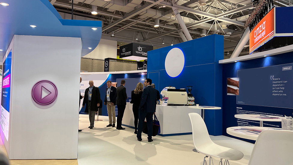
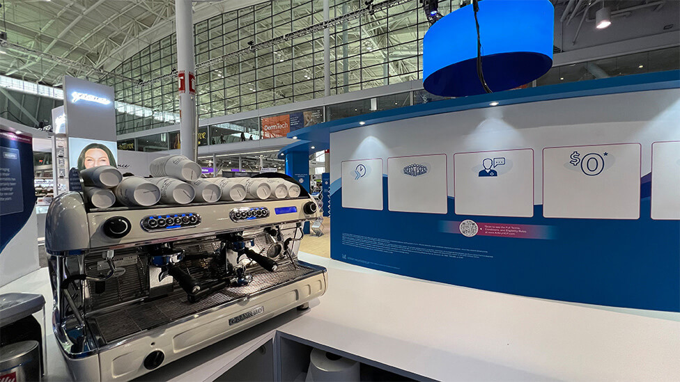
The printed graphics also include a QR code, an easy way for our client to maximise budget and the life of the stand by giving delegates the opportunity to find out more once they’ve moved on.
Light plays a major role throughout the stand: moving head spotlights change pattern to give sparkle and movement to the space, as well as filling the space with colour tones from the product brand, almost turning it into an immersive experience.
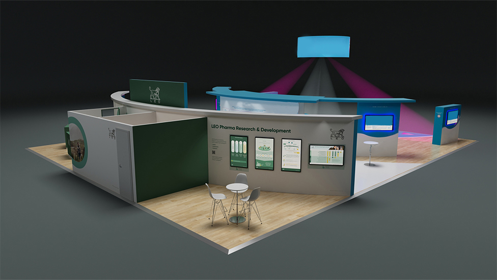
Adding another layer of depth to the delegate journey, the area at the back, in LEO Pharma green, is dedicated to non promotional zones: Medical Information and Research & Development. Following local line of sight regulations, these areas are not visible from promotional areas, whilst still seamlessly integrated within the stand.
In the R&D section, touch screens add a sense of interactivity.
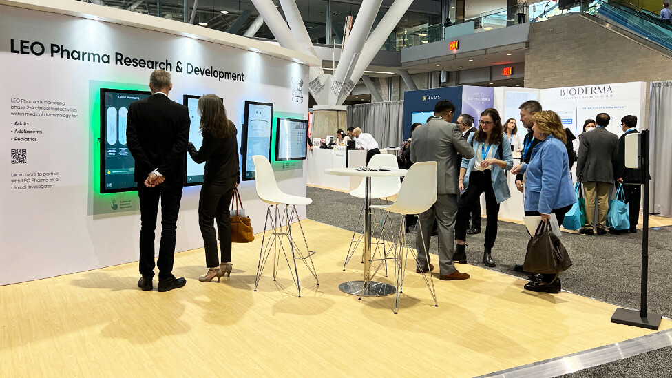
The Medical Information area includes two kiosks and a private meeting space, as well as space for storage and laptop charging station.
From a logistics point of view, this project was varied and complex:
- all design and project management of the 50ft x 60ft stand was done in the UK
- to comply with US laws, we hired local labour crews for the build and derig, as well as for the AV installation and on-site support during the show
- we did a full pre-build in our North America workshop to ensure compliance from a medical and legal point of view, and iron out any issues
- every stage had to be signed off to ensure compliance with the laws of the State of Massachusetts; for this part of the process we supplied photo-realistic CGI renders
- we did a full walk-around video of the pre-build, and sent it to the LMR (Legal & Medical Review) team for approval. Once approved, the stand was transported from the workshop to Boston
- once the AAD conference finished, we organised for the stand to be sent into storage for future use or repurpose, as messaging and some of the design elements can be easily altered
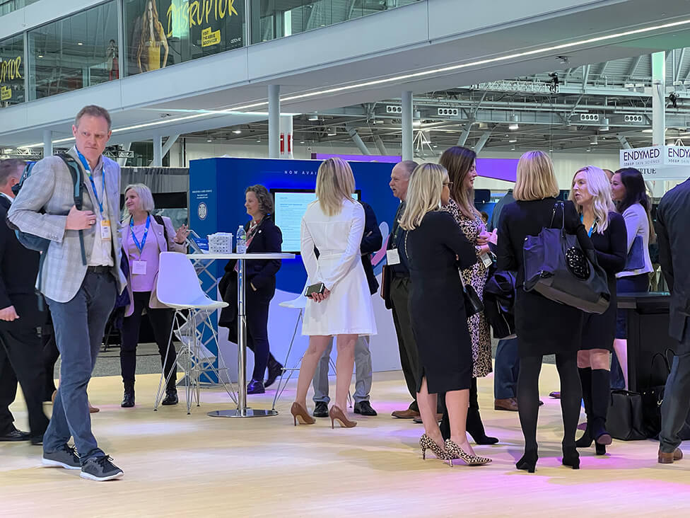
Away from the main booth, at the back of the exhibition hall, we designed and fitted out four separate meeting rooms, complete with furniture, refreshments, planting, graphics and AV screens.
(*) – To comply with regulations around the promotion of pharmaceutical products, all references to specific product names have been omitted from copy and images.