Pascall+Watson
Custom trade show booth
Pascall+Watson
Custom trade show booth
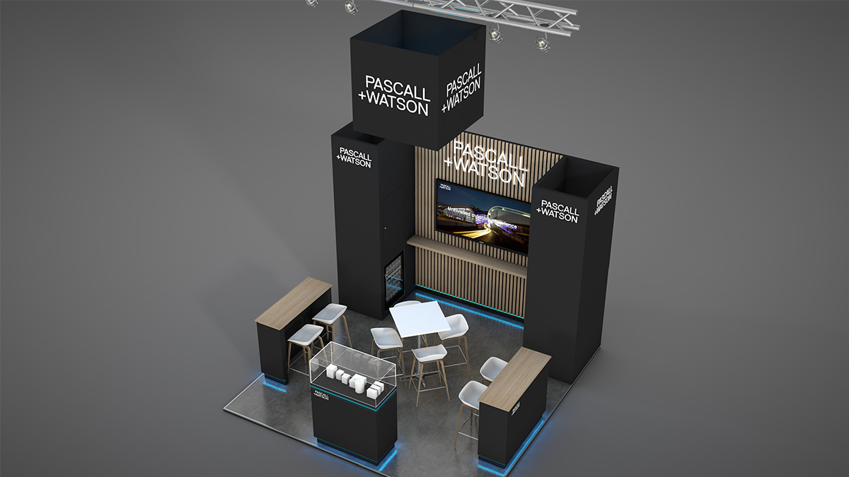
A custom trade show booth that elevates the success of the previous year’s stand to new heights.
Background
Established in 1956, Pascall+Watson are architects and designers committed to environmental and social responsibility. With studios in the UK, Europe, and the Middle East, the firm goes beyond just creating buildings; they craft spaces that make a lasting impact on those who inhabit them and the communities they serve.
Challenge
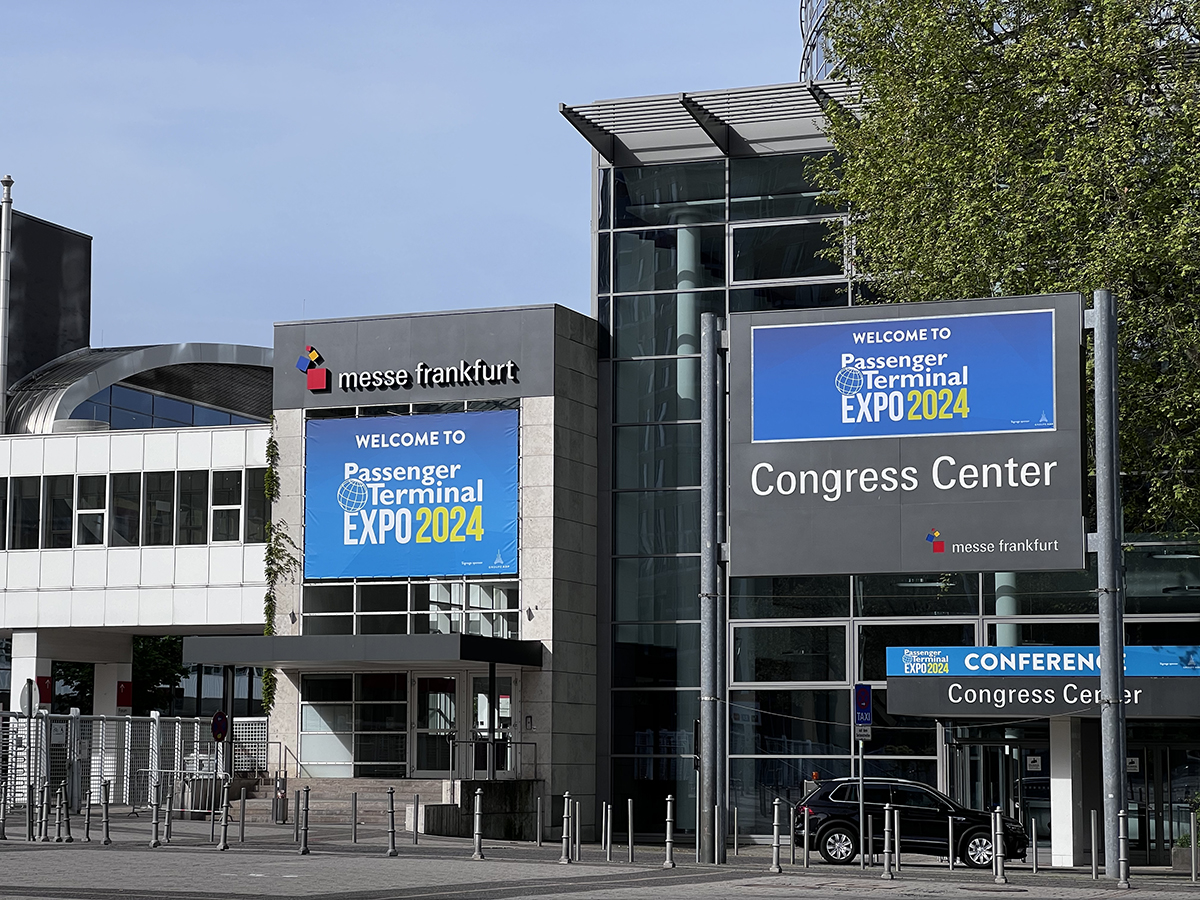
Travelling to Frankfurt to showcase their latest innovations at the Passenger Terminal Expo, the premier event for airport design and operations, Pascall+Watson had booked a 4m x 4m plot and came back to us for help with the design of an exhibition stand after the success of the previous year.
The footprint was the same size (16m2) as last year but a different shape (4m x 4m vs. 6m x 3m) and there were slightly different needs. Whilst ensuring there would be a degree of familiarity, the design needed to be evolved, with more meeting space than last year and displaying two architect models instead of one. The new custom trade show booth would also need to maximise space for storage and feature a welcome counter, a big TV screen to play promotional videos and a chiller cabinet for refreshments.
Solution
We utilised the full 4-metre height allowed by the organisers to deliver a design that stands as an imposing structure dominating the space. A suspended branded cube guarantees visibility across the hall. Located towards the back of the exhibition hall and next to the entrance to the conference centre, the stand design makes the most of its location to absorb the high footfall.
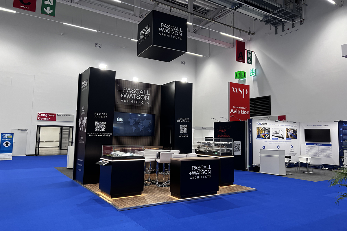
Echoing the fit-out of Pascall+Watson’s London studio, the look is sympathetic to their brand, a clean and sophisticated presence that towers physically and aesthetically above neighbouring stands.
A table and 4 chairs in the centre of the space encourage meetings, with two 4-metre high black columns providing high level branding. The introduction of the inviting natural wood of the feature slatted wall, flooring and countertops offers a contrasting warmth to the branding’s colour palette.
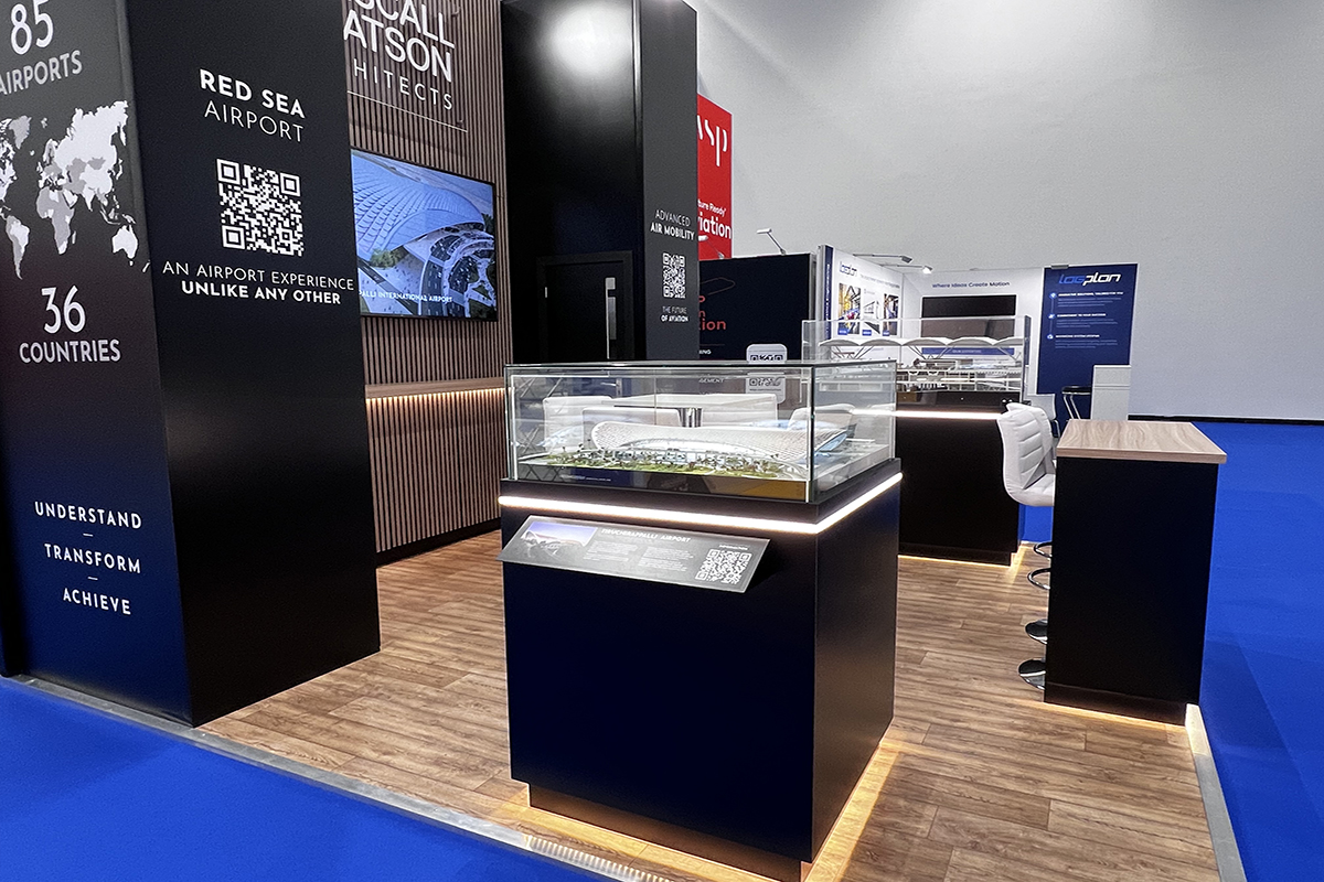
With space for two chairs underneath, the welcome counter doubles up as another meeting area. We also suggested adding multiple sockets under the counter to allow delegates to use it as a charging station, maximising dwell time.
A vinyl world map graphic captures all the different locations Pascall+Watson practise from, with foamex 3D cut letters adding a subtle touch that nods at our client’s focus on attention to detail in everything they do.
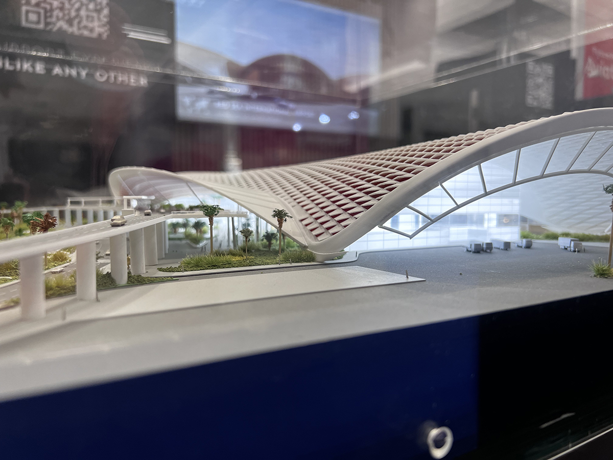
As requested as part of the brief, the stand includes two architect models of Pascall+Watson projects, which we positioned towards the perimeter to act as two bookends that attract people to the stand from both angles.
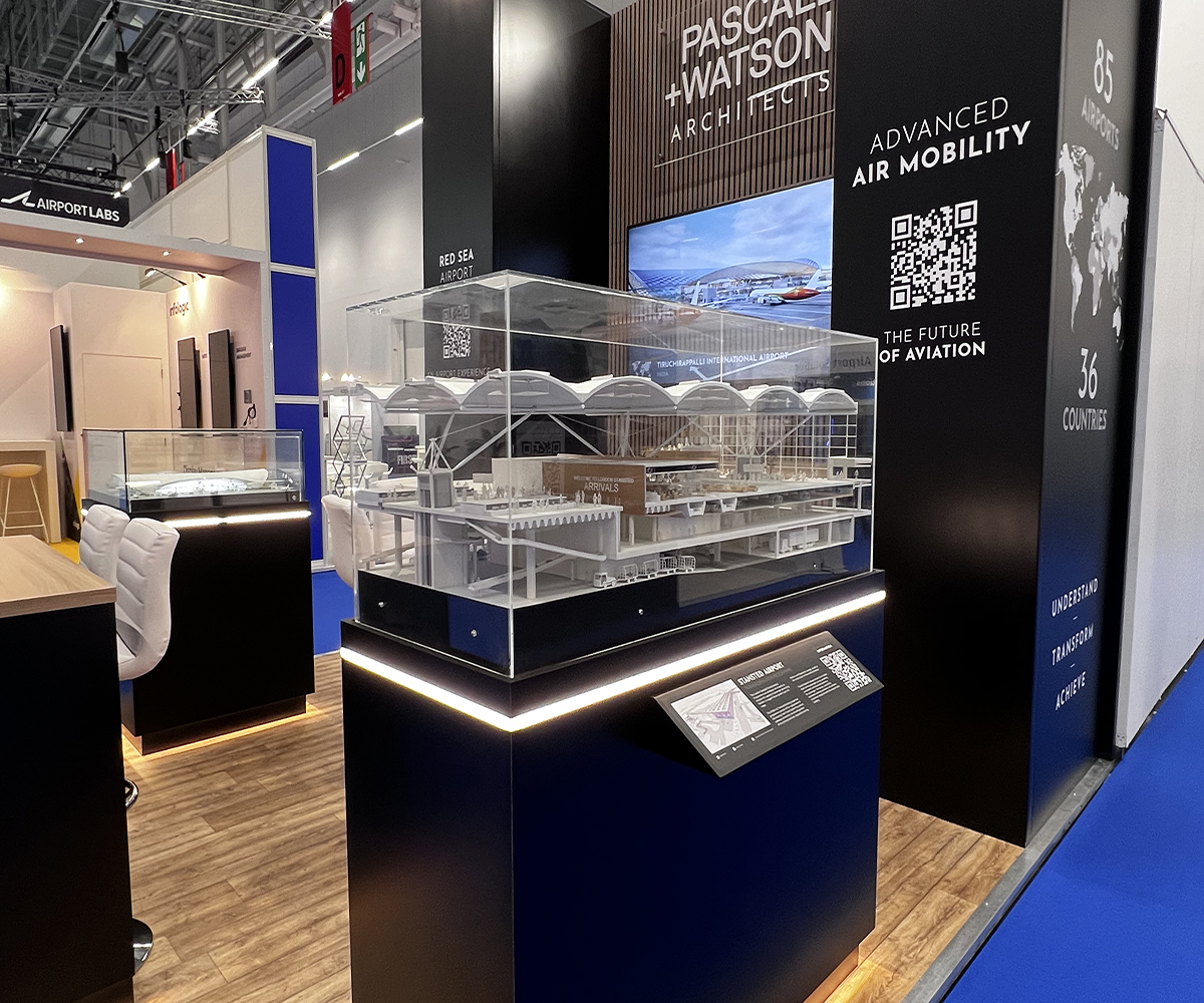
We custom built two museum-style display cabinets, with integrated strip lighting underneath the glass and
halo lighting around the inset kick plate at the bottom to add an extra element of luxury that made inspecting the detailed models irresistible.
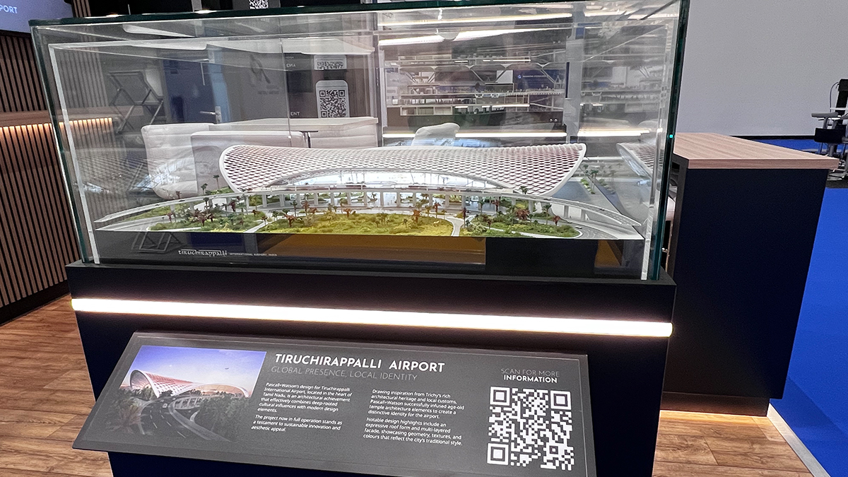
QR codes link through to Pascall+Watson services
The two column structures provide more than visual stature: the column on the left hand-side houses a glass-fronted, built-in fridge and a lockable storage unit. More storage space is available in the column on the right-hand side in the form of a set of shelving units.
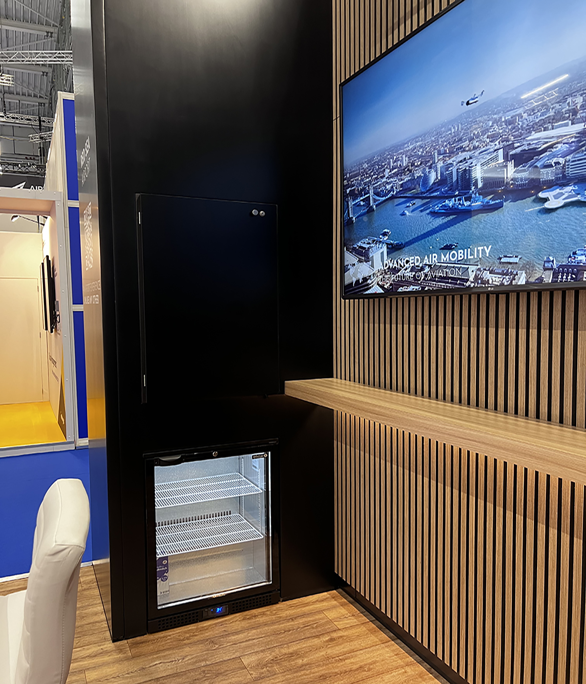
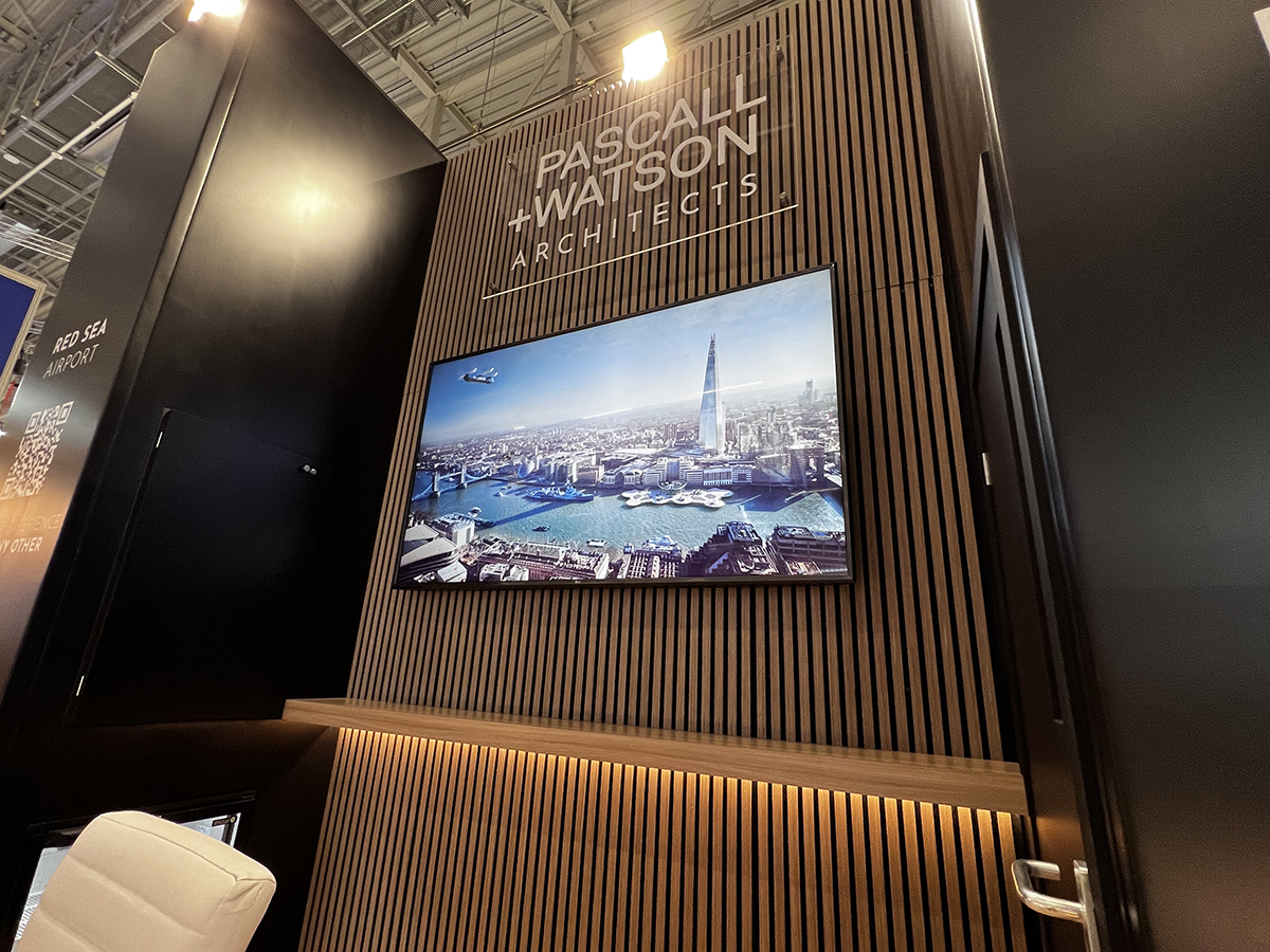
We continued to maximise the small plot size by adding a shelf to the slat feature wall that invites delegates to lean on it and turn it into a relaxed meeting area. In the background, looping video content played on a 75-inch screen that we placed at a height that would guarantee the content could still be seen even when informal chats were taking place.
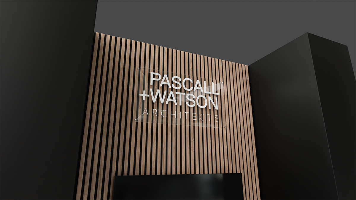
The space is crowned by a Pascall+Watson logo, which had recently evolved with the addition of the word “Architects” and needed maximum exposure. We gave it prominence in the space by printing it on a sheet of polished acrylic which we installed a few millimetres off the wall. Reflections of lights from in and around the stand on the acrylic surface made the logo a key feature of the stand.

“Thanks for everything during the last few months. Everyone at the office is so impressed with how amazing the stand looks, we’re all really happy with it and the event was a success!
Looking forward to working together again next year in Madrid.”