This clean and contemporary company annual report design relies on a highly visual approach to transmit a message of quality and professionalism.
Background
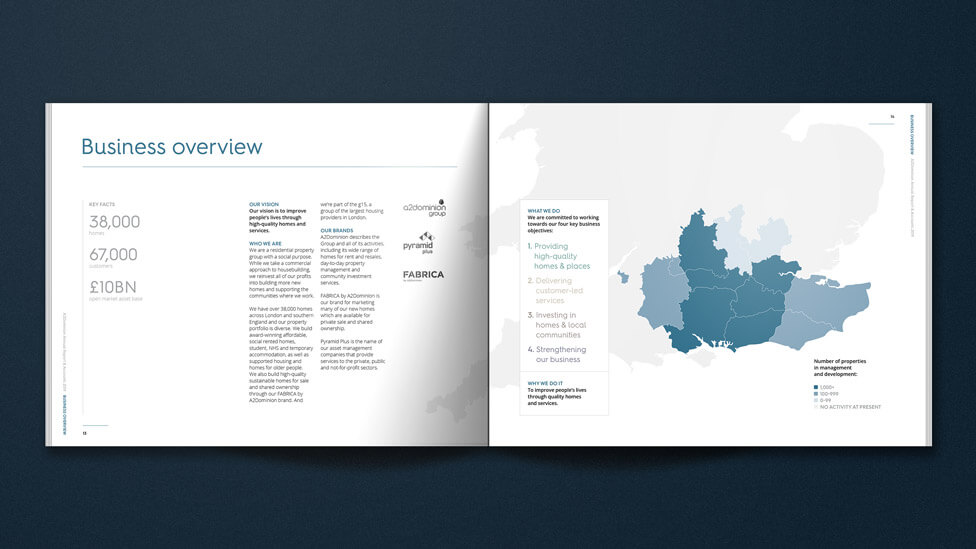
A2Dominion’s vision is to improve people’s lives through high quality homes and services. And they do it by reinvesting all of their profits into building more new homes and supporting the communities where they build.
With close to 40,000 homes across London and the South, A2Dominion’s portfolio of affordable housing is wide-ranging: private and social rented homes, NHS and temporary accommodation, student properties, supported housing and homes for older people. Once built, our client stays on as landlord, maintaining a long-term relationship with customers.
Challenge
The task was to implement a design refresh that would clearly differentiate this year’s company annual report from the previous edition while maintaining a strong and cohesive brand identity. The updated design needed to serve as a visual reflection of the company’s values, industry position and professional standards, ensuring it was recognisable, polished and high quality. One of the key considerations was ensuring the annual report remained visually distinct from previous versions, without straying too far from the established brand aesthetic. The balance between continuity and change had to be carefully managed to ensure that the report remained a credible and authoritative corporate document, while also offering something fresh and engaging for its diverse audience.
The target readership included a broad mix of stakeholders, each with different priorities and expectations. Investors required clarity in financial reporting and corporate strategy, while business partners, developers and contractors needed insights into collaborative opportunities and the company’s operational strengths. Meanwhile, local authorities, governmental and regional bodies, housing associations, financial institutions and regulators would be looking for evidence of compliance, corporate responsibility, and strategic vision. The challenge lay in ensuring that the visual and structural updates enhanced the overall readability and engagement of the report while still delivering a professional, data-driven and insightful piece of communication. It needed to command authority and build trust while making complex corporate, financial and strategic information accessible.
The refreshed look had to be bold enough to feel modern and engaging, but measured enough to maintain a sense of stability and credibility. It was key that the report was structured effectively, allowing the audience to navigate complex data and key insights with ease.
Solution
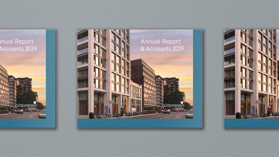
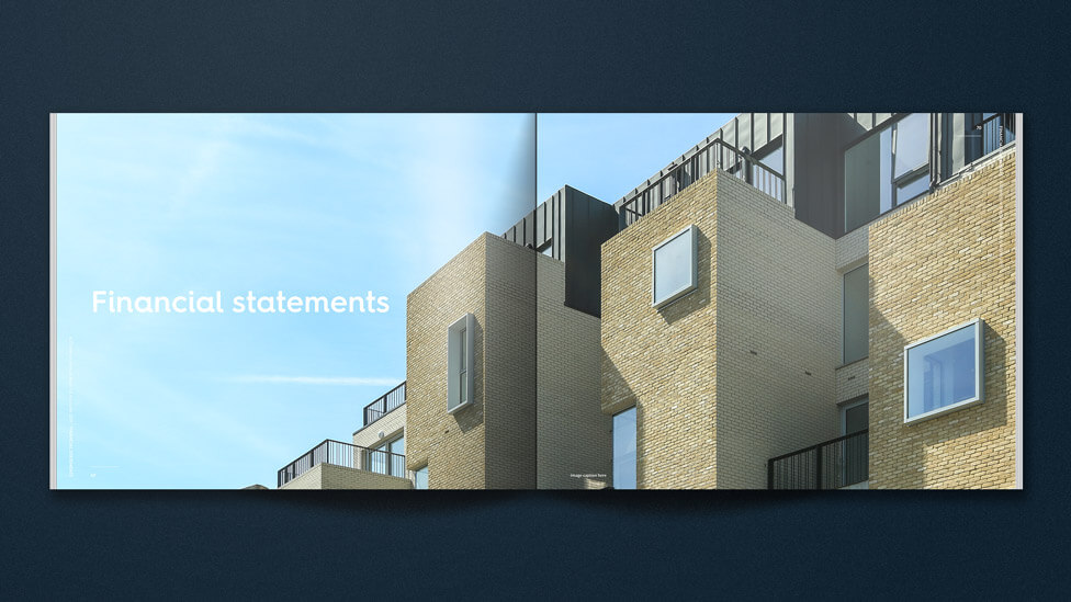
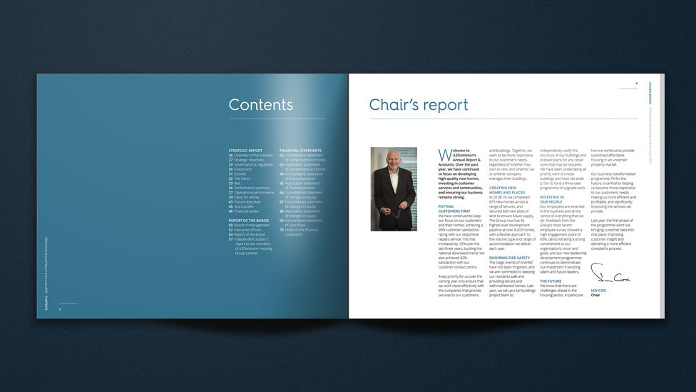
To achieve a clean and contemporary look for the report design, we maximised the use of white space and placed strong, impactful imagery at the forefront, ensuring that written content was structured clearly and complemented rather than overwhelmed by visuals. This approach gave the report a polished and professional feel while maintaining a modern, engaging aesthetic.
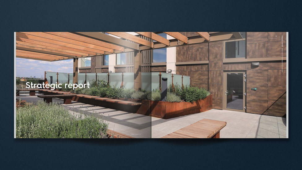
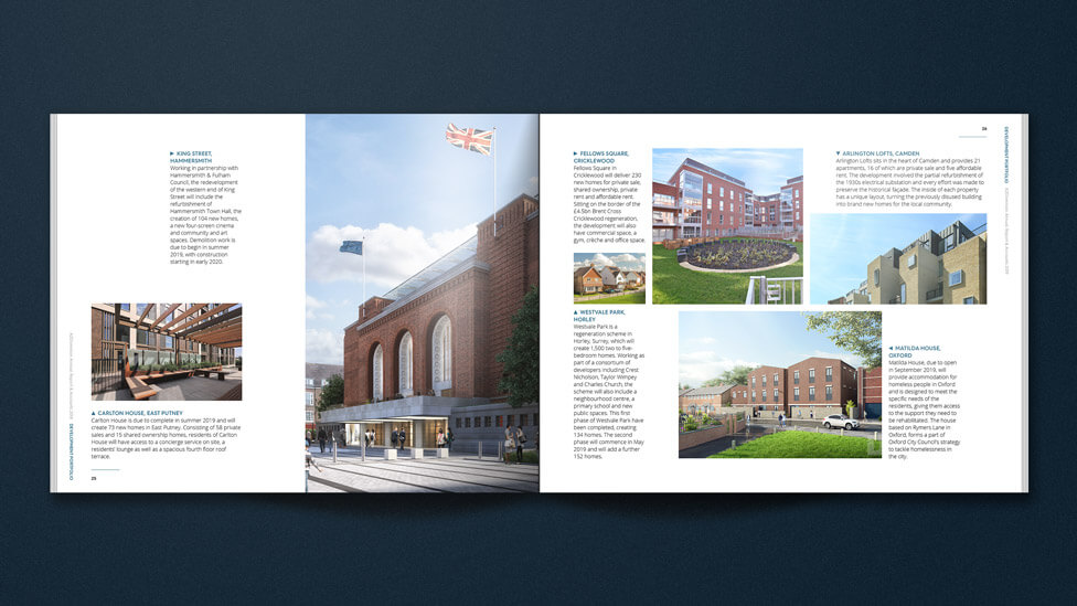
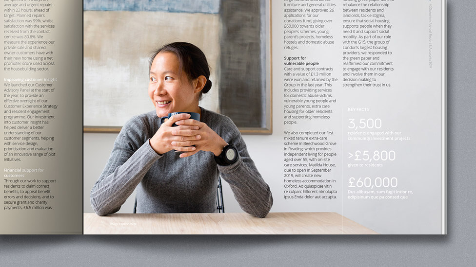
High-quality photography played a pivotal role in bringing the company annual report to life. Striking images of A2Dominion’s property portfolio and the communities they support served as visual anchors, drawing attention to key messages and reinforcing the company’s commitment to housing and community development.
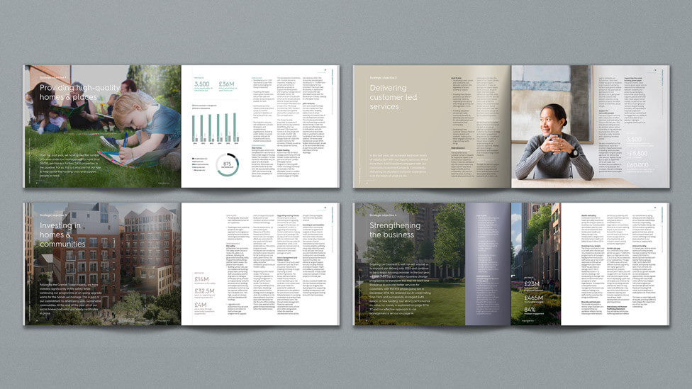
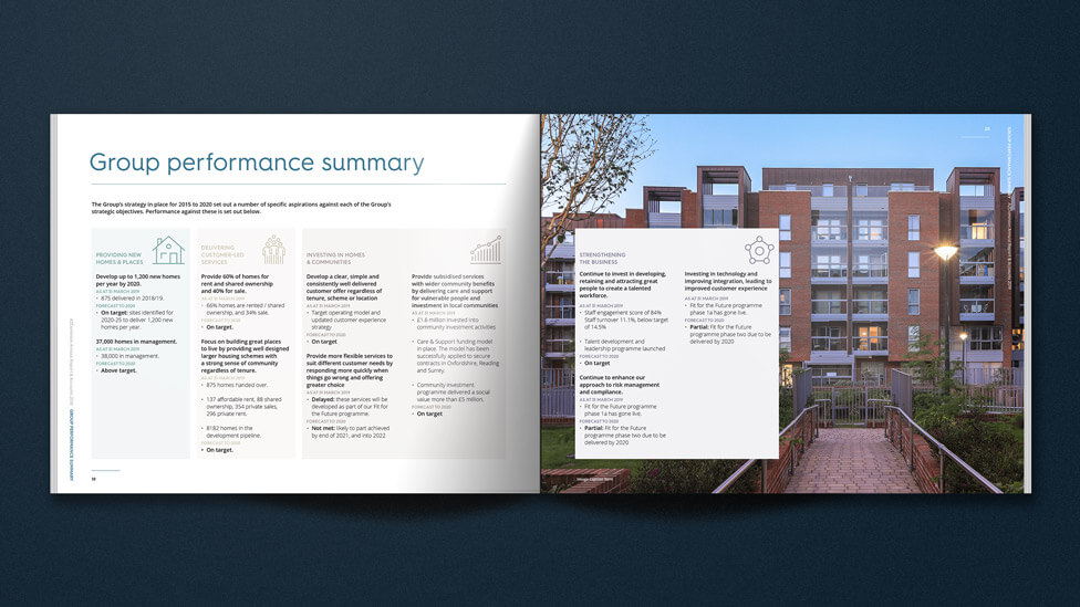
A variety of content layouts kept the report dynamic and engaging, ensuring that each page turn offered something visually fresh and interesting. The use of differentiated page structures helped maintain reader interest while allowing the report to flow logically from one section to the next. This strategic use of layout variation prevented the content from feeling monotonous while ensuring that the most important insights stood out effectively.
To bring attention to key themes and messages, we introduced text columns superimposed on imagery for select pages. This subtle layering technique enhanced visual appeal, allowing the text to integrate seamlessly with supporting images. These elements were positioned strategically to ensure that key financial and performance insights remained highly visible and easy to read, without sacrificing design clarity.
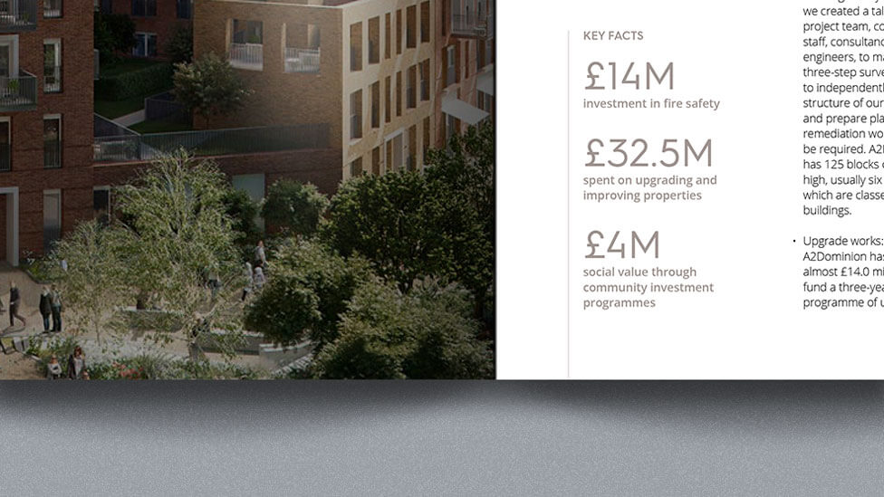
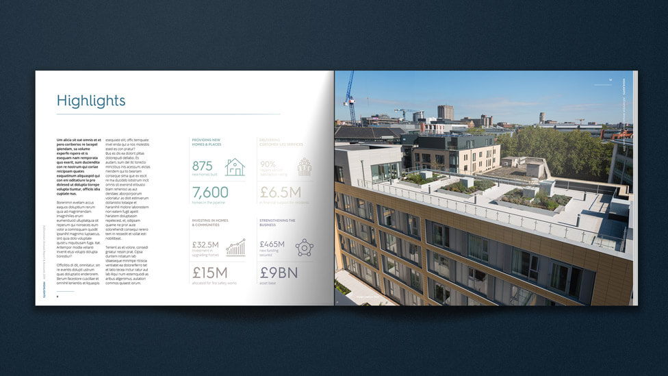
The overall design aesthetic is clean and exudes confidence and clarity. The simple yet bold icon style we developed helped streamline quick skim-reading, ensuring that core messages were absorbed at a glance. Infographic-style layouts transformed key performance statistics into highly visual, memorable data points, embedding essential information in the reader’s mind. These graphical elements also served the dual purpose of breaking up large sections of text, improving overall readability and engagement.
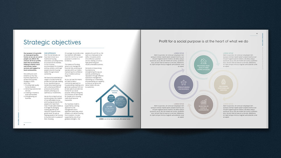
The highly visual style is carried through to the less photography-focused company objectives pages, where colourways from our client’s brand guidelines help categorise their 4 strategic goals. To further differentiate the report from other corporate materials, we moved away from the conventional A4 format and opted for a custom size that added an element of tactile appeal. This decision helped distinguish the report from similar publications, making it feel like a premium piece of corporate communication while subtly reinforcing A2Dominion’s forward-thinking approach.
Looking for help with your project?
Feel free to give us a call to start a conversation,
our doors are always open.
Related projects

United Utilities
Annual performance report

EITI
Multilingual report design

EITI
Annual progress report design
