Some of our clients embrace a unique approach, and BrightHR was no exception. They wanted a company report design that would clearly reflect the impact of their innovation and forward-thinking business strategy, ensuring that their distinct approach stood out to investors and stakeholders.
Background
BrightHR specialises in online people management software and has built its reputation on a bold and innovative approach that challenges industry norms. Their vision is to create positive disruption in a sector that often relies on traditional and often outdated methods. By introducing a fresh, dynamic and engaging solution, BrightHR provides businesses with a platform that is not only fun and interactive but also highly functional, simple to use and fully customisable. Their software is designed to empower users, making HR management an intuitive and engaging experience, rather than a routine administrative task.
Challenge
A key part of this project was ensuring that the new brand identity and strategy – which we had developed in close collaboration with BrightHR – was successfully translated into all formats. This launch was not just about introducing a software solution; it was the first public expression of the new brand identity, setting the tone for how BrightHR would position itself in the industry moving forward.
The challenge lay in striking the right balance between a playful and energetic approach and maintaining the credibility and professionalism required in the HR sector. To send the right message to investors and communicate the strength of the company’s business proposition, we needed to create a report design that would make an immediate impression, while striking the right balance between playfulness and profitability. It was crucial that the visual approach not only captured BrightHR’s energy and innovative spirit but also reinforced its credibility as a profitable business with a compelling growth strategy.
Solution
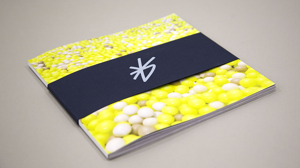
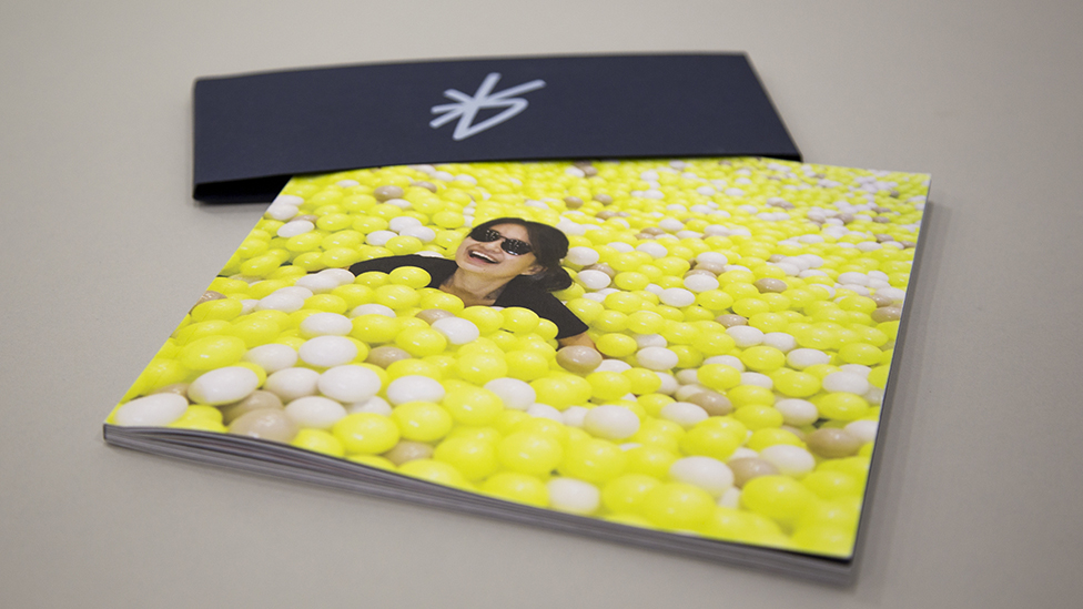
We developed a visual approach to highlight the business plan and make it really stand out. The clean design and straightforward format made the information inviting and easy to comprehend. By partially concealing the cover image with a belly band, we introduced an element of intrigue, sparking curiosity and encouraging readers to physically interact with the report. Once removed, the belly band revealed a smiling woman, fully engaged and having fun, subtly reinforcing BrightHR’s brand identity as a company that champions employee happiness and workplace positivity.
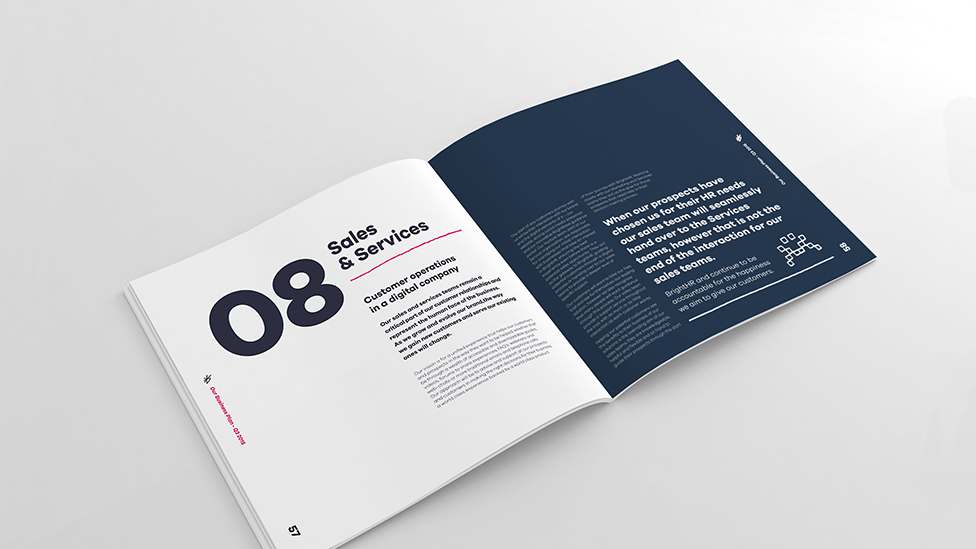
From cover to cover, the company report design radiates BrightHR’s passion and enthusiasm, using vibrant brand colours, energetic imagery, and a warm, inviting font. These elements worked together to bring a sense of fun and accessibility to the report, ensuring that even the most complex information felt digestible and engaging. The result was a dynamic and inspiring piece of corporate communication that reflected the vitality and confidence of the BrightHR brand.
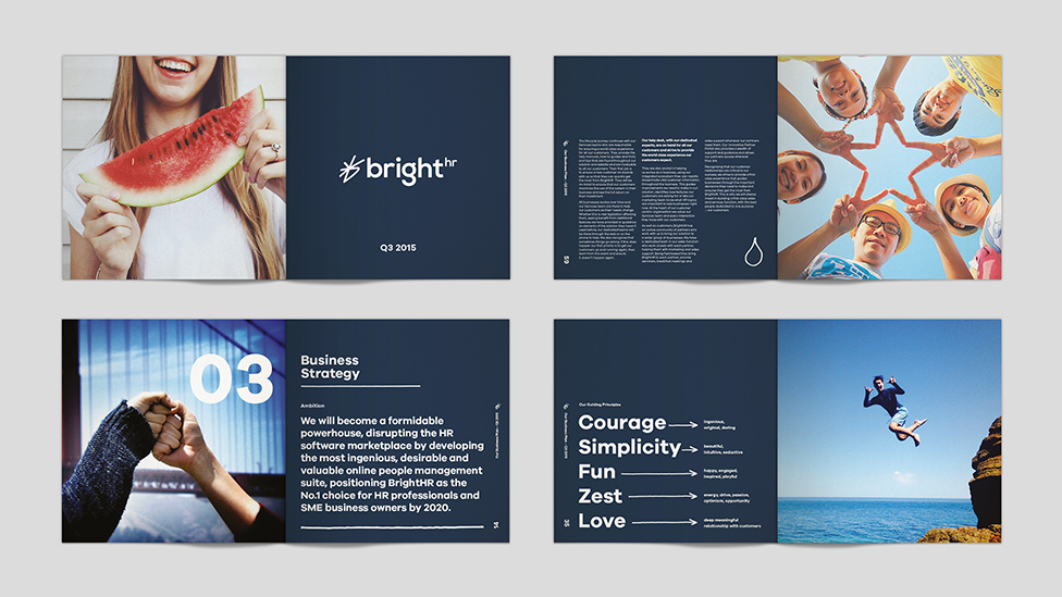
Since a custom photo shoot was not within scope, we carefully curated unique stock images from multiple sources. Our goal was to select visuals that authentically captured the company’s culture and energy, ensuring they seamlessly aligned with BrightHR’s vibrant identity. The final selection of images helped reinforce the company’s ethos of Brilliance – a core pillar of its branding – while making the company report design visually engaging and relatable.
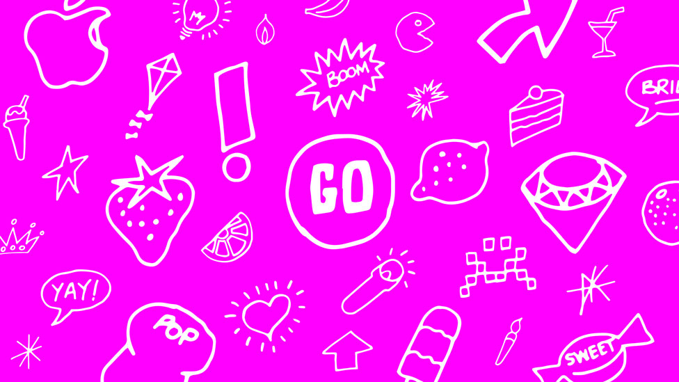
A standout design feature was the effective use of ‘moodles’, a playful visual device we developed specifically for BrightHR. These illustrative elements helped highlight essential concepts, adding character and personality to the report while maintaining a cohesive and professional aesthetic. The use of moodles reinforced BrightHR’s distinctive brand personality, ensuring that key takeaways remained memorable long after the report had been read.
The company report was met with positive feedback, successfully conveying the business strategy and key objectives to the Board. Investors and stakeholders responded well to the clear, structured layout, which made critical financial and operational insights easy to digest while keeping engagement levels high.
Looking for help with your project?
Feel free to give us a call to start a conversation,
our doors are always open.
Related projects

EITI
Multilingual report design

Dee Valley Water
Corporate report design

IFoA
Digital performance report
