This sleek and sophisticated digital anniversary report design delivers an engaging user experience, guiding readers through EITI’s 20-year journey in a way that captures attention and sustains interest. The design is structured to encourage exploration, making it easy for the audience to follow the organisation’s progress and impact over the past two decades.
Background
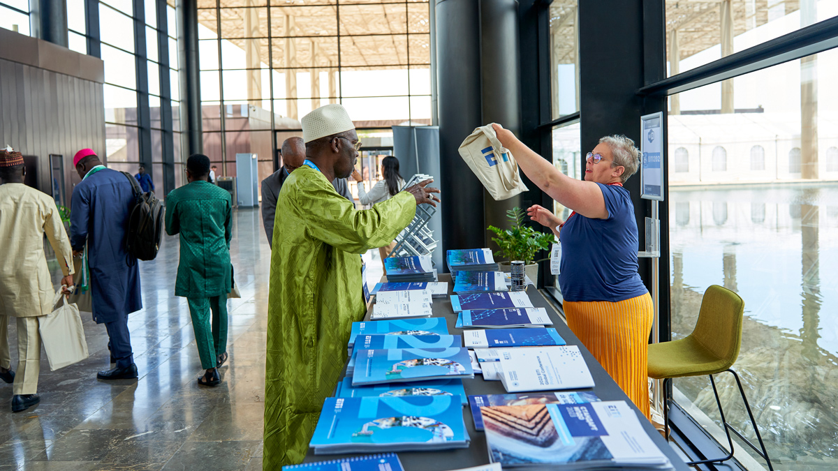
Commemorating 10 years since Senegal joined the EITI and 20 years since it was established, our client marked the historic occasion with a flagship conference in Dakar, Senegal’s capital. This was the first time the conference – held every three years – took place in Africa, where half of the EITI’s implementing countries are located.
The conference was the forum chosen to share the commemorative report we had designed, which was handed out to delegates attending the conference.
Challenge
We were also tasked with creating a digital anniversary report design, ensuring that it effectively complemented the printed version for a cohesive and visually consistent experience across both formats. This required a careful balance between maintaining the look and feel of the physical report while adapting specific elements for a digital and interactive environment.
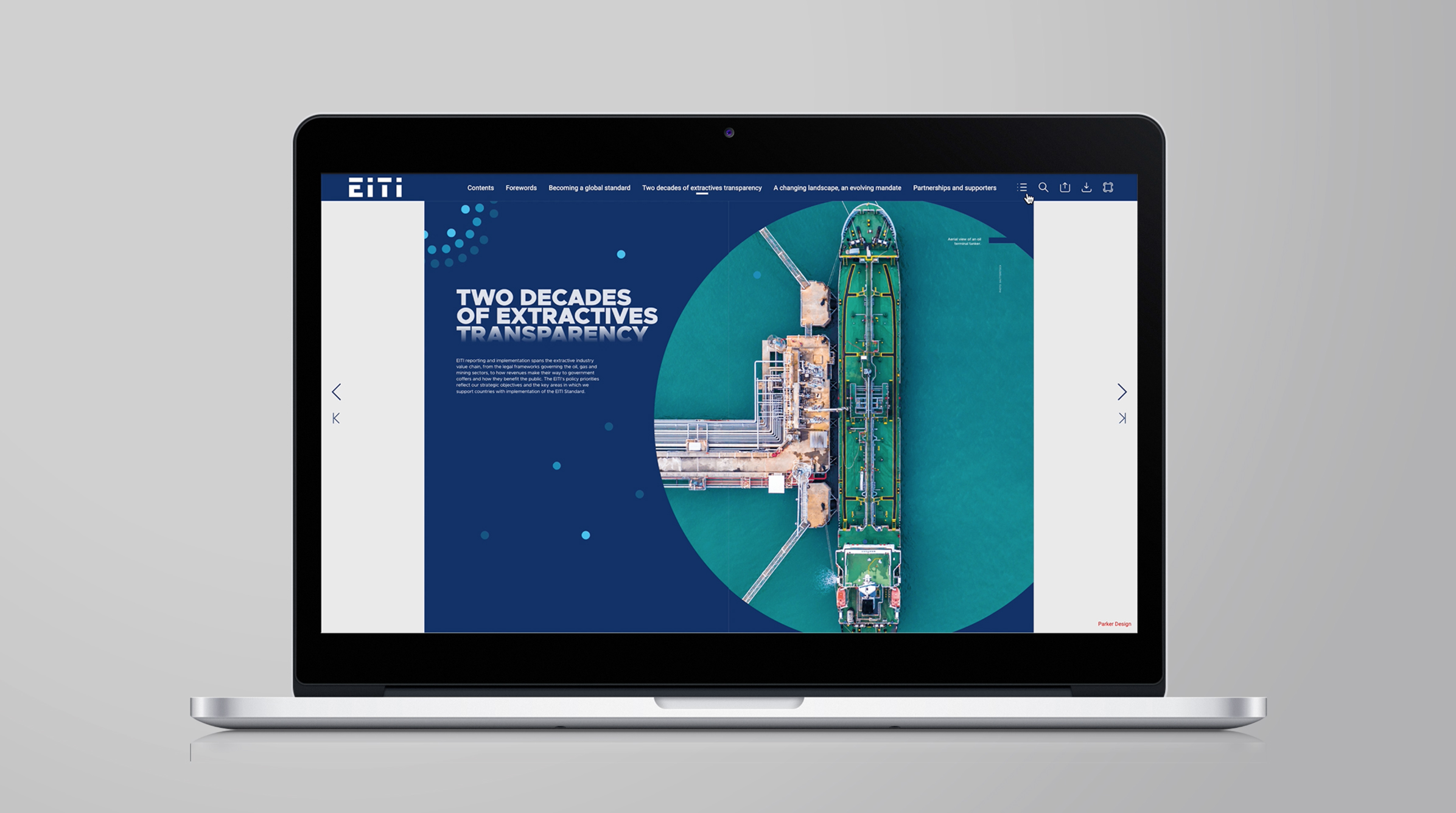
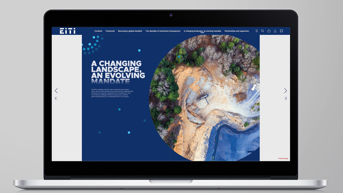
Our designer would also need to translate key design features from print to digital, adjusting layout structures, typography and imagery placement to enhance readability on screens. While the goal was to introduce interactive elements that would enrich the user experience, it was equally important to ensure that these features were subtle and intuitive, rather than overwhelming or distracting. Navigation was a key consideration, as digital readers often consume content differently from those engaging with a printed report.
Solution
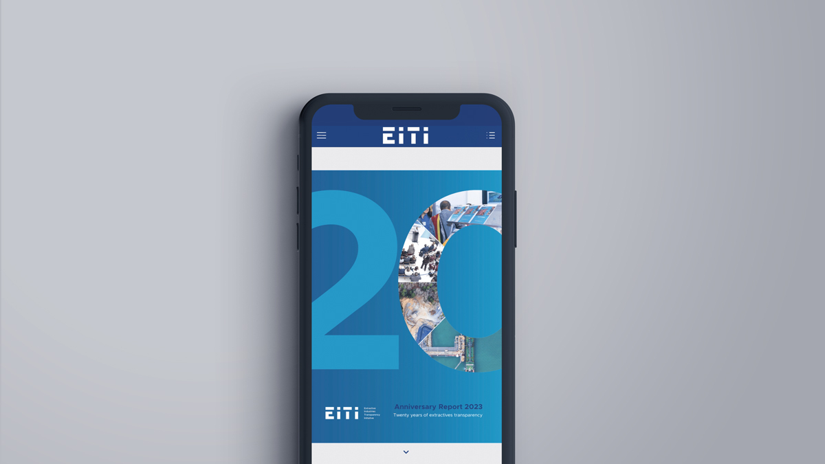
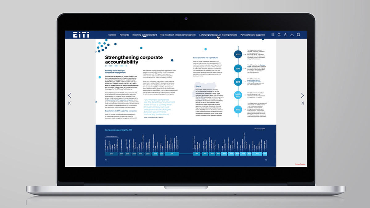
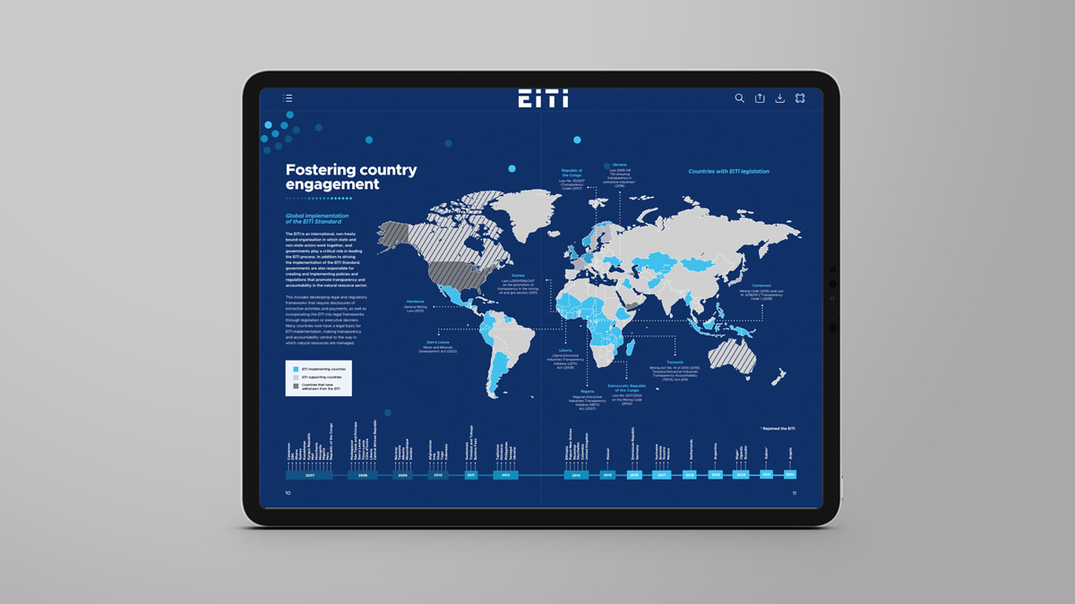
The digital anniversary report design, much like the printed version we also developed, is a carefully crafted visual representation of EITI’s two-decade journey. It showcases a striking canvas of blue tones, punctuated by a constellation of dots – a key element of the visual identity developed for EITI’s Global Conference, themed ‘Transparency in Transition.’ These 57 dots, each representing one of the EITI’s implementing countries, symbolise the collective effort of these nations as they work towards a shared goal of improved transparency and governance in natural resource management. The design conveys a strong sense of unity and movement, reinforcing the idea that these countries are all gravitating towards a common centre of accountability and progress.
The digital version is rich with data and statistics, designed to provide an immersive user experience that immediately engages the audience. The layout is structured to guide readers effortlessly through the EITI’s 20-year journey, offering key insights into its achievements, milestones and ongoing impact. While interactivity was an essential feature of the digital design, we were careful to strike a balance, ensuring that any animations, transitions or interactive elements enhanced the reading experience rather than distracting from the report’s critical content. The result is a seamlessly flowing, visually sophisticated report that is easy to navigate and engage with.
To further elevate the visual appeal, we integrated a blend of images, infographics and key data points, bringing a strong visual dimension to the report. These elements provide an engaging backdrop for the EITI’s achievements, making the wealth of information more digestible and memorable for readers. By structuring the content in a clear and visually engaging way, the report ensures that key facts and figures stand out, reinforcing the importance of transparency in the management of natural resources.
With a cohesive design across both print and digital formats, this anniversary report serves as a powerful storytelling tool, capturing the essence of EITI’s mission while celebrating two decades of progress.
In addition to creating the printed and digital formats, we partnered with our client to carry out a full proofreading service, ensuring that the content was clear, accurate and consistent across all versions. This meticulous attention to detail helped maintain the integrity of the report’s message, reinforcing EITI’s credibility as a leader in global transparency initiatives.
Looking for help with your project?
Feel free to give us a call to start a conversation,
our doors are always open.
Related projects

EITI
Multilingual report design

IFoA
Digital performance report

United Utilities
Annual performance report
