We used this effective hoarding board design to turn a construction site into an impactful way of communicating our client’s role in transforming the city of Manchester.
Background
As part of a tramline extension in the city centre, United Utilities had to service the Victorian sewers before the new rail links could be installed. Manchester is one of the busiest and fastest-growing hubs in the UK, so when we were approached to create a hoarding board design for a high-profile retail and business area, we knew our design had to generate the right kind of impact.
Challenge
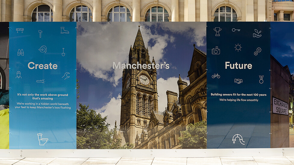
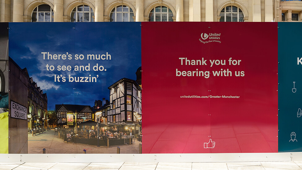
Maintaining the visual appeal of the area while the work was being carried out was extremely important. To make the site as attractive and interesting as possible for passers-by, we wanted to help the client create a positive connection with the community and generate awareness about the company’s role in transforming Manchester.
Solution
Our solution served multiple purposes: not only did the hoarding allow us to showcase our client’s new brand to a captive audience in a prime location, it was also a company pilot for the roll-out of future customer communications in other high-profile urban areas.
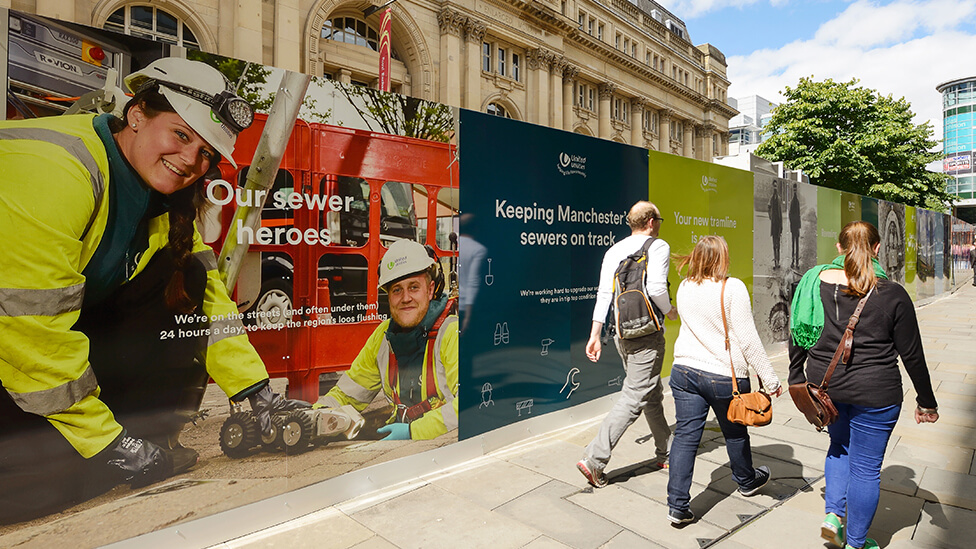
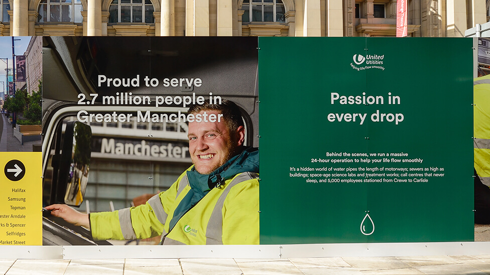
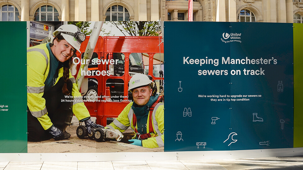
With a cleaner and more visual brand than its previous incarnation, we commissioned a series of impactful photographs featuring employees carrying out essential work for United Utilities’ customers. By highlighting the human element behind the actions, we helped our client tell a story of commitment to making a difference, rather than just focusing on the work going on behind the hoarding panels.
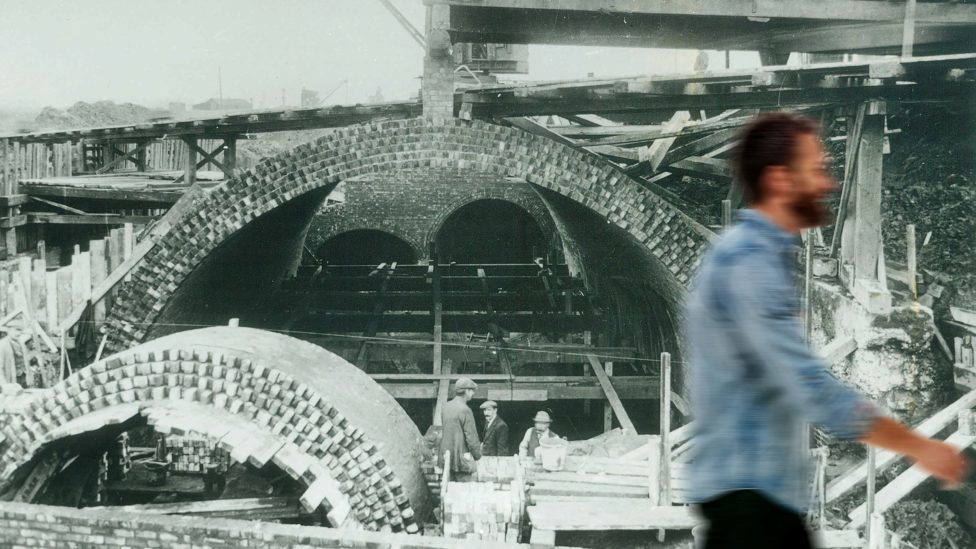
The hoarding board design was also dotted with the company’s own archive images, depicting the engineering feat of Manchester’s sewer men from a bygone era; this helped to give further meaningful context to United Utilities’ efforts.
Our hoarding board design included messaging that was in line with the refreshed brand positioning – a friendly, helpful and responsible investment to improve the network. United Utilities’ slogan of Helping life flow smoothly really comes across in the wayfinding and business as usual messages and illustrations we included as part of the project.
Both the design and overall management of the project were praised by our client. We also worked in close collaboration with Manchester City Council, adhering to a strict non-peak installation schedule to minimise disruption.
“I love it!
It’s simple and striking, again Parker Design have really pulled out all the stops and when briefed for something different and engaging, they delivered. It works an absolute treat!”
Communications Manager, United Utilities
Looking for help with your project?
Feel free to give us a call to start a conversation,
our doors are always open.
Related projects

United Utilities
Construction hoarding signs

Cheshire East Council
Urban regeneration hoarding

United Utilities
Public information hoarding design
