LEO Pharma
Pharma stand design
Following on from the success of exhibitions we had worked on in Europe, we delivered a pharma stand design to get US and international audiences flocking to the LEO Pharma space.
Expanding the vision to the US
Following the success of stands we had designed and built for LEO Pharma in Europe (Milan for the World Congress of Dermatology, Madrid for the European Academy of Dermatology & Venereology Congress and Paris for the Congress for the Skin Inflammation & Psoriasis International Network), our client referred us to colleagues in the LEO Pharma New York office as the US team were planning to attend the AAD Annual Meeting and Conference in Denver, Colorado.
After working with another exhibitions vendor for the past two decades, the New York team tasked us with delivering a pharma stand design that would bring their vision to the same high standards of the exhibition stands we had already delivered across Europe, albeit with a very strict budget for a considerably large plot (20 m x 30 m). Visual consistency between the different stands would also serve to communicate the idea of ‘One LEO’ across the world. The space would have to be divided equally between promotional areas, for licensed products and other established brands, and non-promotional, for products yet to be licensed (an R&D section and an Atopic Dermatitis area), all whilst transmitting that all make up ‘One LEO’. Most attendees would be US-based, but with our client also expecting a heavy international presence, we were asked to ensure visual consistency with the European stands we had previously designed and built. The LEO space would also have to include two separate Medical Information areas to comply with US and international regulations.
In line with local working practices, LEO’s New York team asked us to do a full pre-build of the booth in the warehouse, so that a physical inspection could be carried out by their brand owners and regulatory teams to ensure full compliance before the stand was moved to the exhibitions and congress centre in Denver.
Building trust through collaboration
Establishing a relationship with the US team was important, so we flew out to New York to present our initial design concepts in person.
Once we’d been awarded the project, we flew back to the US for a full day workshop with brand owners and stakeholders to discuss their ideas and specific requirements, which we worked through into the final design.
Evolving the concept into a cohesive space
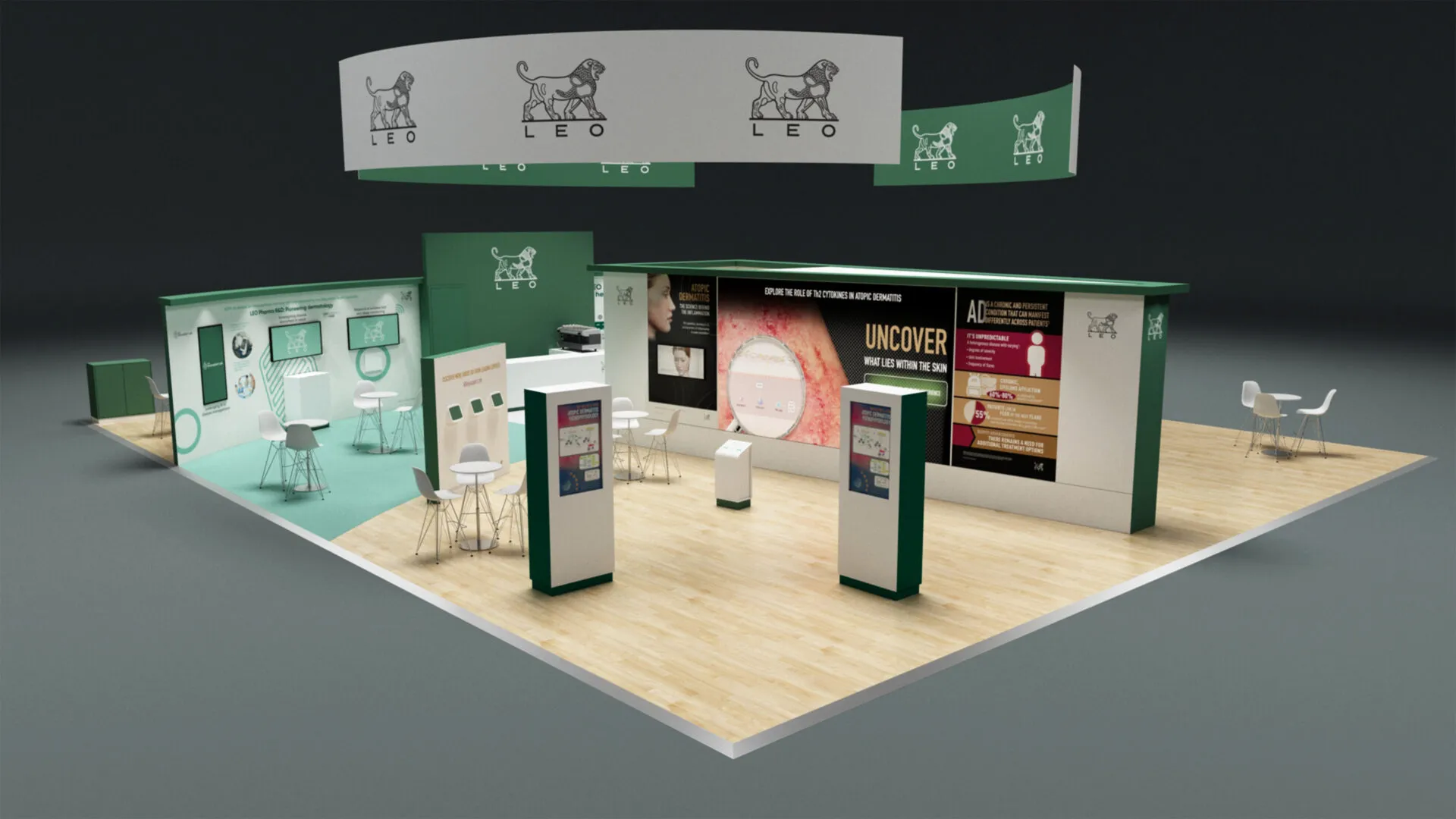
Following the second New York trip, the brief evolved slightly and we produced a third booth design concept, which features a wedged wall that acts as a partition between promotional and non-promotional areas and a central coffee and networking area creating a link between the two distinct spaces.
Floors and walls are purposefully curved to subtly encourage delegates to follow a predetermined route, whilst the wedged wall also serves as a storage area.
Cross-border collaboration with a hybrid design approach
Whilst the booth was designed and the entire project managed from the UK, we worked with our build partner in North America for the fabrication and production, enabling us to deliver maximum budget and time efficiencies. Once the design had been approved and the booth built, we flew back to North America, where our builders’ warehouse was located. Together with our client, we walked the floor to agree the precise positioning of the structural elements and make any final minor modifications, prior to loading up and transporting to Denver for the congress. This allowed us to verify that the various lines of sight between the different sections of the plot guaranteed full compliance with regulations on plots with a combination of promotional and non-promotional content.
To meet budget demands, we delivered a pharma stand design that was a mix between a cost-effective modular system (a skeleton metal structure which can be easily rebranded) and elements of bespoke structural design made of timber.
As with the stands we designed across Europe, a floating circular banner commands attention from all corners of the hall, whilst open space and touches of Scandinavian design in colour tones and materials for floors and furniture make for a welcoming space. Rather than making delegates step off and back on between the different areas within the LEO space, the delegate journey flows seamlessly whilst still adhering to regulations, allowing visitors to walk through into different areas of interest.
Balancing interactivity with informal networking
Within the branded area we included an element of interactivity with prominent touch screens in the middle of the space. As these are well-established brands, this part of the plot is light on content, with the focus being networking, facilitated by plenty of standing space as well as two seating options – tall tables and stools for quick meetings and a more relaxed area with soft seating next to the coffee area, which with its tall wall acts as an anchor point, a destination in the delegate journey.
The coffee area shares space with R&D, another clean and spacious section of the plot that is designed to encourage learning about new developments as well as informal conversations.
The wall behind the coffee counter houses a storage area that can be accessed through two different doors, one at the front and one at the back, giving LEO staff easy access to storage facilities without the need to walk the entire plot.
Focused storytelling through interactivity
Next to the R&D area sits another non-promotional space dedicated to showcasing our client’s developments against Atopic Dermatitis (AD). A giant seamless LED screen is connected to a central plinth with interactive buttons that feed content into it, making it a magnet for delegates. Double-sided interactive screens also add to the appeal of the space.
To signal a step change and allow delegates to see what lies beyond, we built a wall that is lower than the rest of the elements in the AD space, with built-in iPads that play video on demand. The AD section of the plot is complete as a visually engaging space that attracts delegates, and to increase dwell time, we opted for comfort and provided mono headphones for delegates to use when at the iPad stations.
Supporting private conversations across two dedicated spaces
As noted earlier, the stand required two separate Medical Information areas. The US section was designed at a larger scale to accommodate a higher volume of local visitors and to meet specific regulatory requirements. The International Medical Information area, while smaller, was carefully designed to offer a comfortable setting for private conversations. Both Medical Information areas included a screen displaying video content and a plinth that served as a reception point. The US Medical Information area included both a private meeting room and an open seating area. A storage room, positioned behind the private meeting room, was accessible from the rear of the stand as well as from behind the coffee bar. Lighting is a key feature of this space, benefitting from halo lighting, recess spotlights and also ambient lighting from the overhead circular banner.
As well as working with our local US fabrication teams, we also worked with US-based AV specialists, helping deliver budget efficiencies for our client and complying with US labour laws.
Supporting KOL interaction beyond the main stand
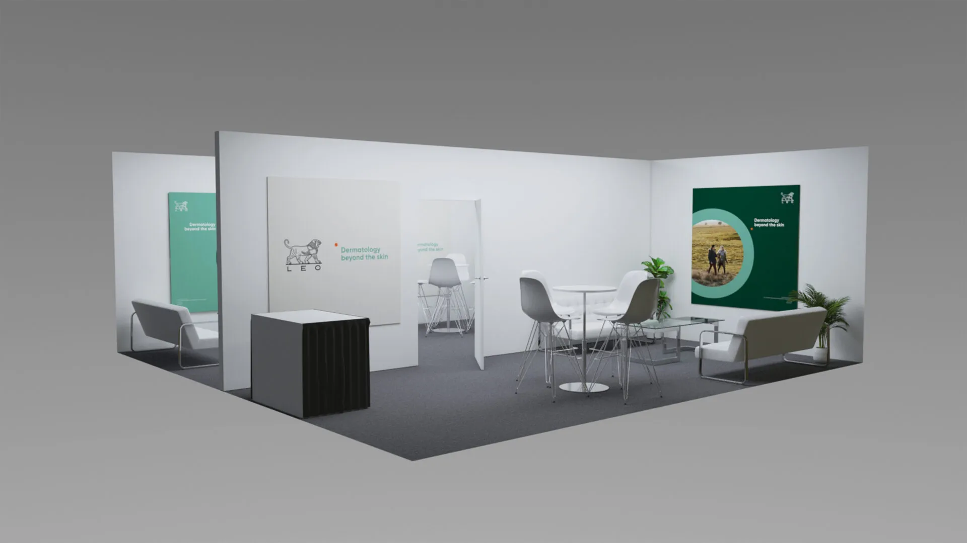
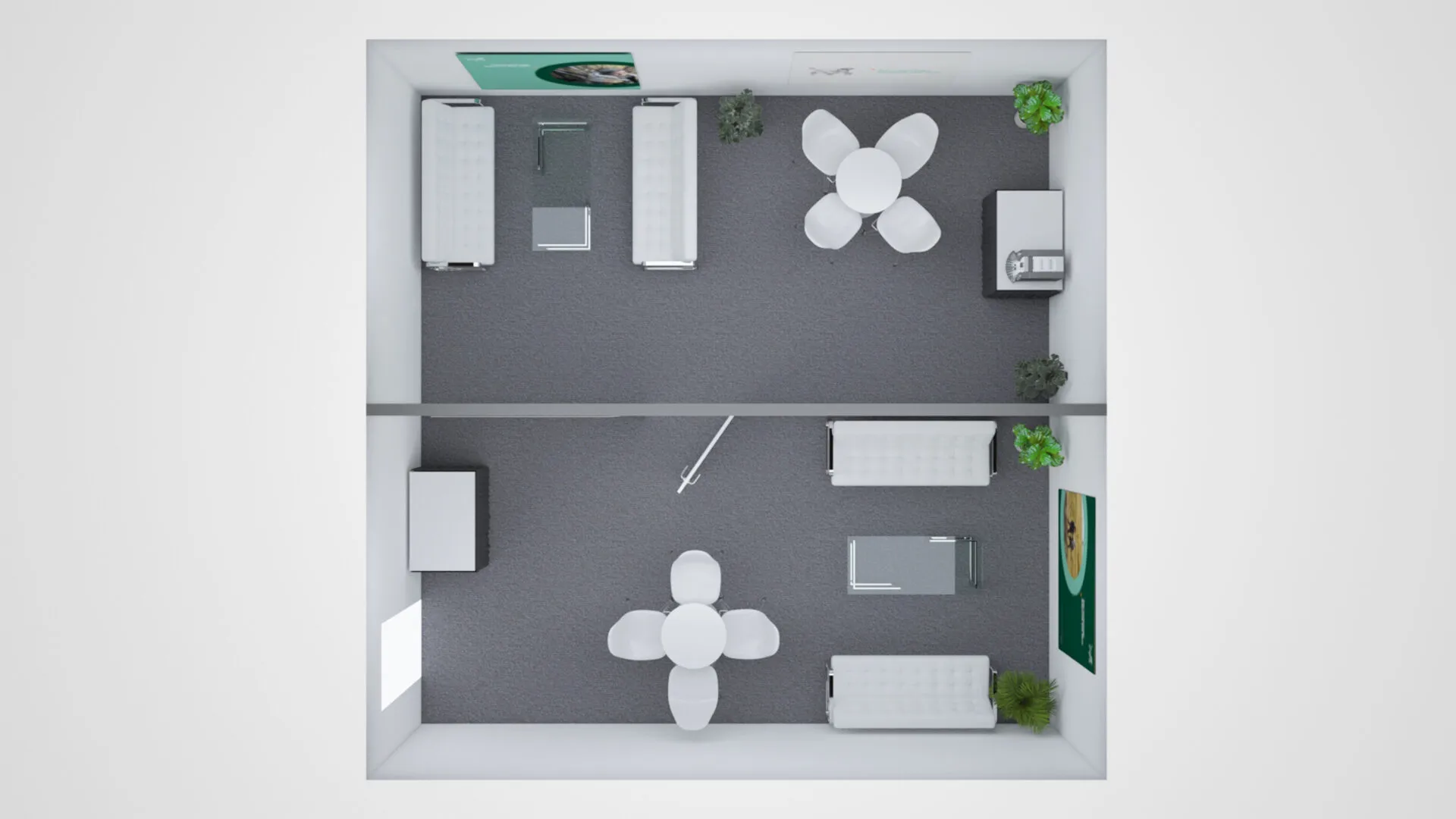
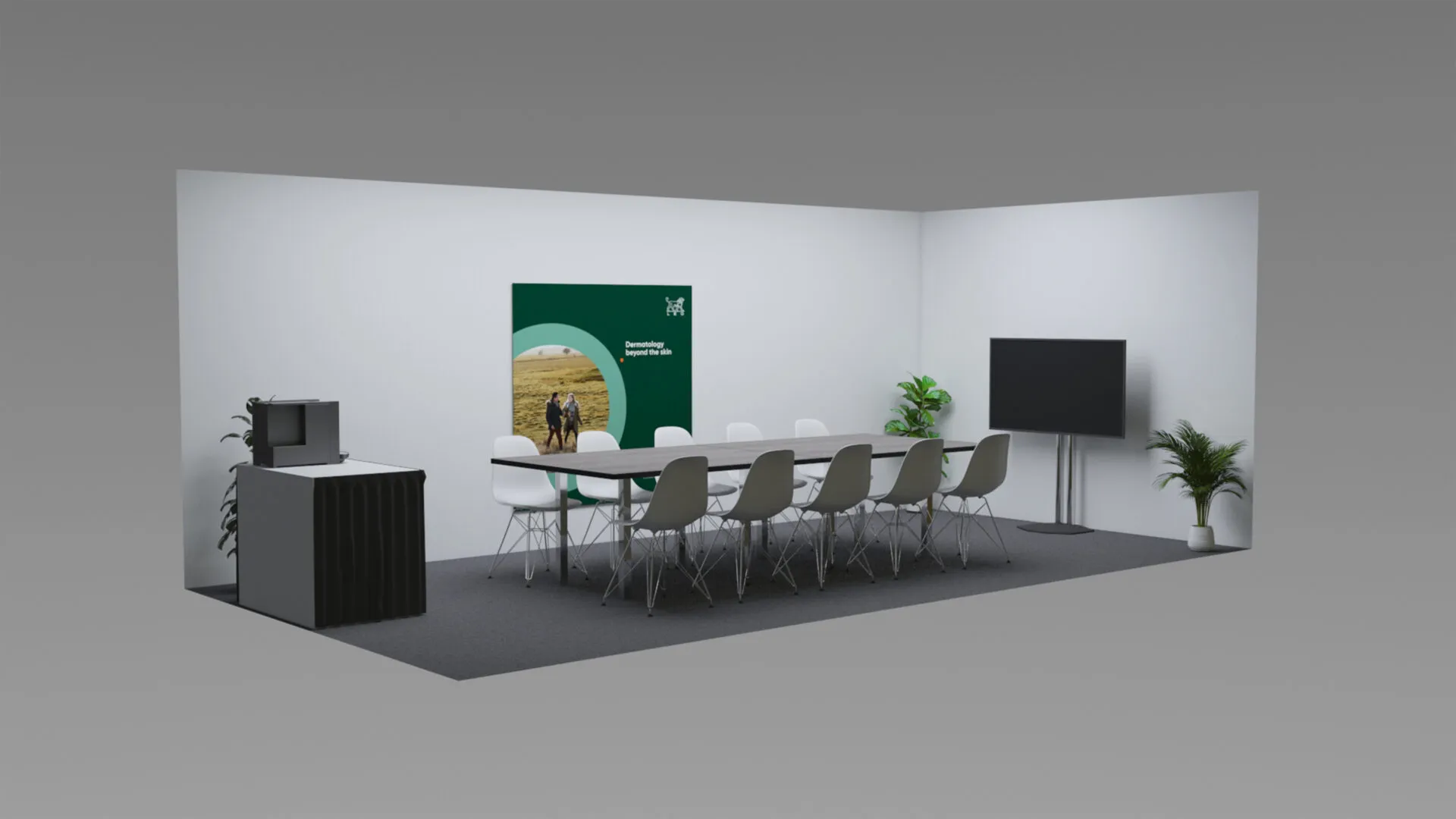
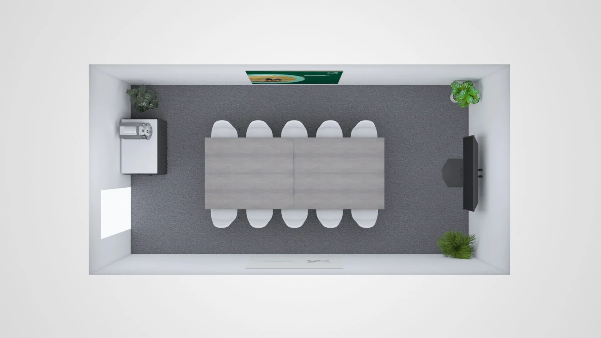
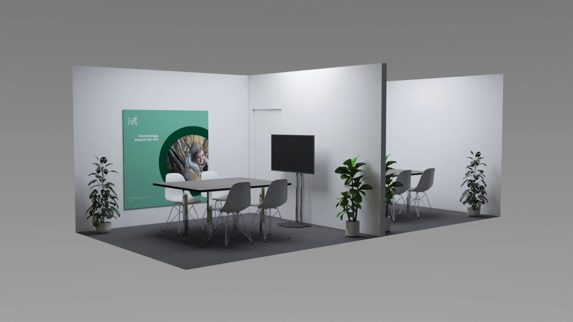
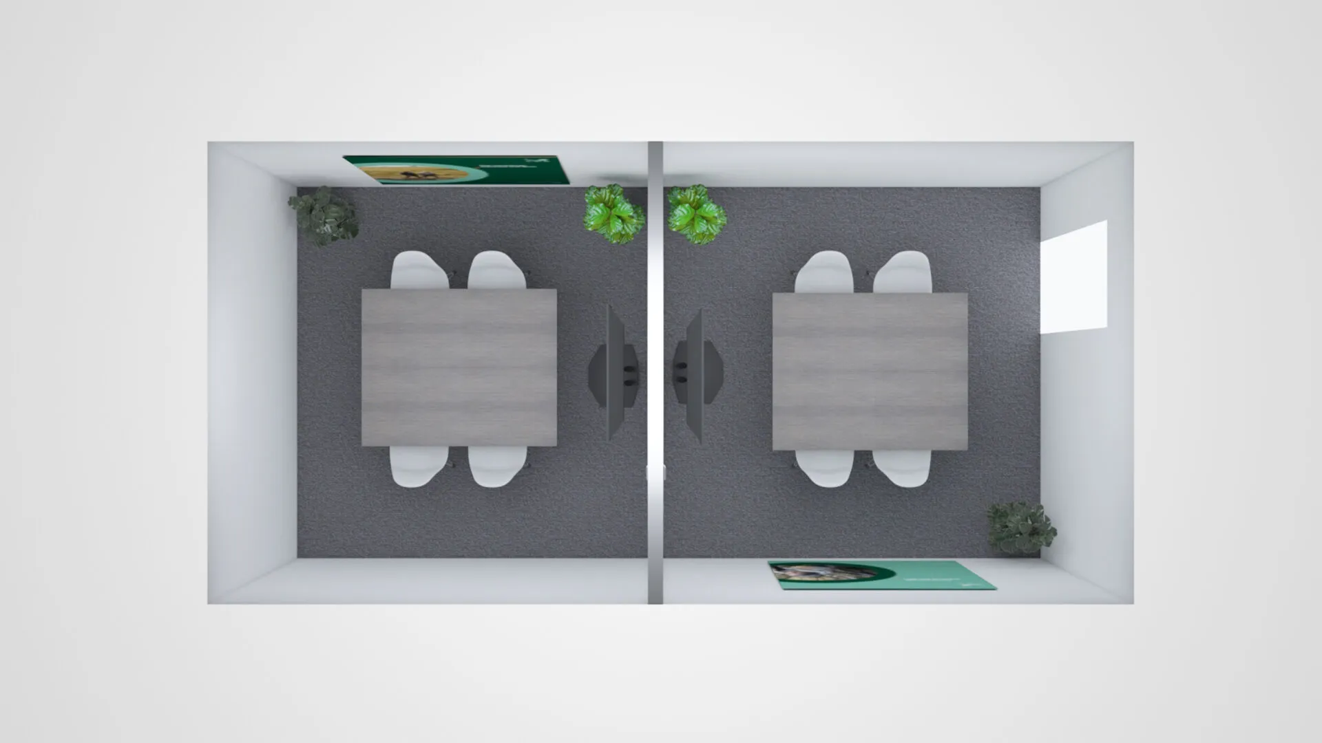
Away from the main exhibition hall, we delivered 7 meeting rooms for Key Opinion Leaders (KOLs) to engage in lengthier exchanges to those they may have had in the networking areas of the main LEO plot.
So it felt like a welcoming environment, far removed from the stark feel a characterless shell scheme would provide, we dressed the rooms with planting and graphics that add a touch of colour and freshness.
“Thank you so much Parker. Your professionalism and attention to detail – not just to deliver a stunning design that attracts the crowds, but that is also compliant with the strict pharmaceutical industry regulations – has really blown us away!”
30 years in pharma
stand design
We’re confident we can help, so why not drop us a message? We’d love to hear from you.
Take a look at other exhibition design projects
Sage
Exhibition stand design and build
Sandoz
Pharma exhibition booth
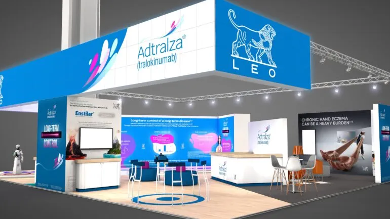
LEO Pharma
Pharma trade show stand
