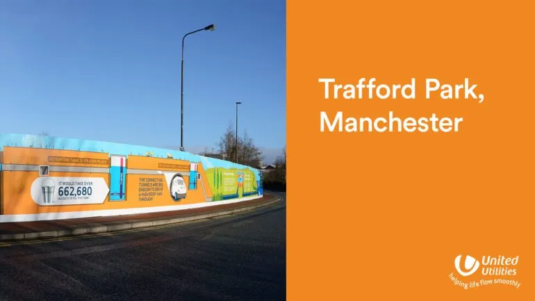
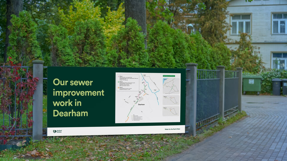
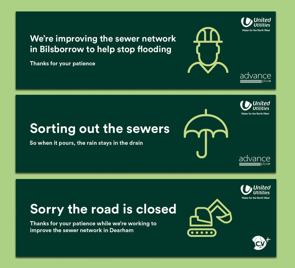
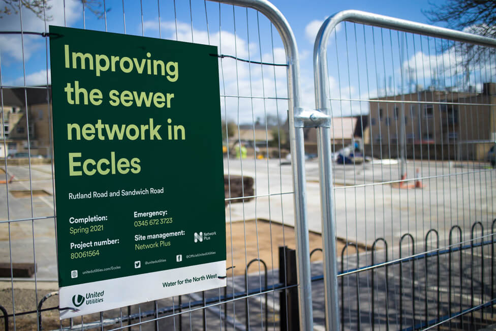
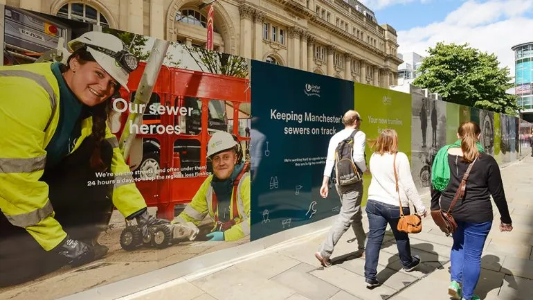
For this public information hoarding design, we focused on simplicity. The result is clean and direct, yet it still stands out across the varied settings where essential repair works take place, whether in rural landscapes or busy urban streets.
Background
Responsible for water and wastewater services in North West England, United Utilities delivers 1.8 billion litres of water every day to more than 3 million homes and businesses in the region. The company’s 5,000 employees manage a vast operation of hundreds of reservoirs, treatment works and pumping stations, all adding up to thousands of kilometres of water pipes and sewers.
Essential repair works have to be carried out regularly to guarantee a smooth operation and the high water quality our client is proud of. Customer service sits high on the agenda for United Utilities, so simply informing customers about ongoing works is not enough. Going further, and communicating with care and purpose, is central to our client’s approach.
Challenge
With this public information hoarding design project, our brief was to create a set of communications that spoke directly and honestly to customers about the need for the works. With some of the larger repair programmes lasting for months, the hoarding design needed to deliver durability while remaining flexible enough for use across different locations in the North West.
Throughout the project, we also worked to tight deadlines and managed last-minute location changes, so fast turnaround was essential.
Solution
For this public information hoarding design, we focused on simplicity to avoid distracting from United Utilities’ message to customers. The result is direct and easy to read, yet it still stands out across the varied locations where work has been taking place, whether rural or urban.
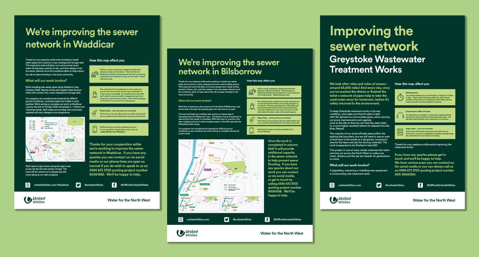
We also built versatility into the creative process, ensuring each hoarding design could be adapted quickly to suit specific locations without losing consistency.
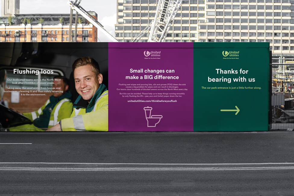
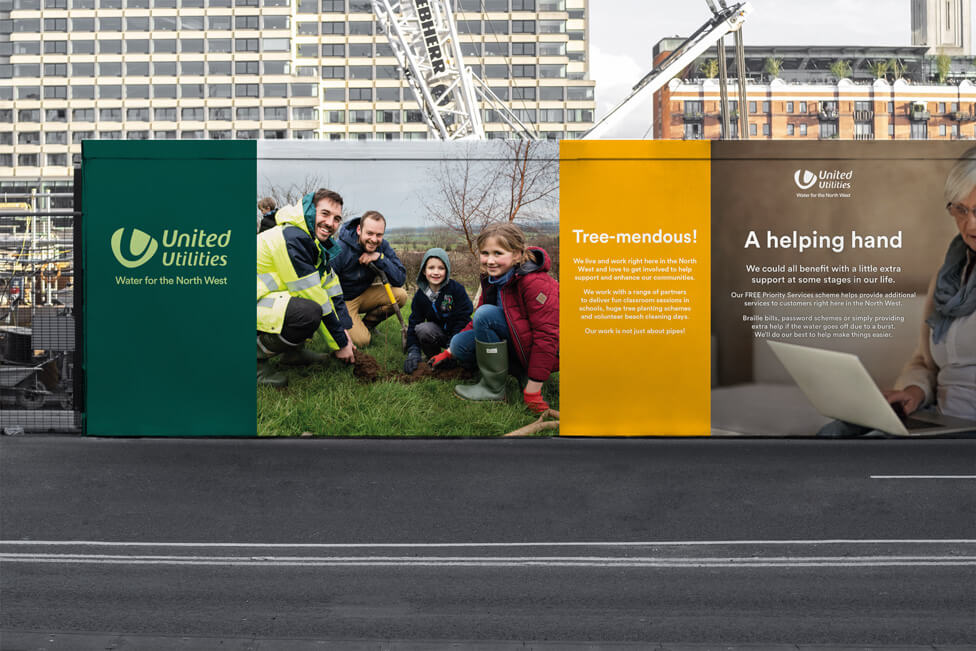
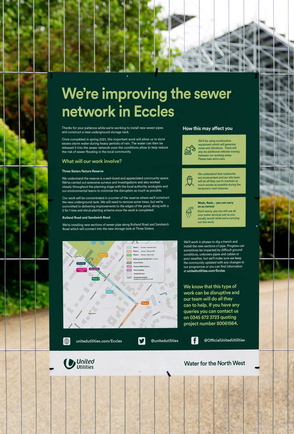
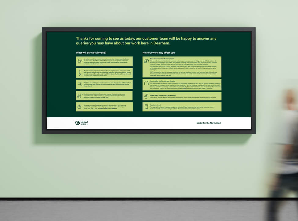
Big bold headlines, lifestyle shots of United Utilities customers and staff, a bright colour palette and an informative set of icons all contribute to turning the hoarding design into a set of customer communications that attract attention and immediately engage.
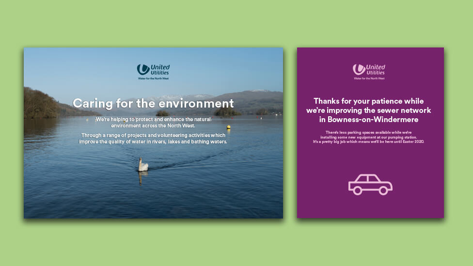
Tone of voice also plays an important role in communicating to customers why these works are essential despite the disruption they may cause. The language used is purposeful and keeps things simple, sharing key facts in conversational, every-day language. It’s helpful and positive, transmitting a sense of celebration of what the region means to locals as a special place to live, work and enjoy together, and how United Utilities work around the clock to maintain and protect the area and provide safe high quality drinking water.
The durability of the materials used was another area of focus for our hoarding design team, choosing Dibond for the flexibility and quality of finish it offers. This flexible plastic material is rigid, lightweight, and comes covered with a thin layer of aluminium and a high quality finish that guarantees printing quality, whatever the weather and regardless of duration of the works.
“I know I often say it, but I just wanted to drop you a quick note to say ‘Thank you’.
Despite the constantly changing situation and restrictions we’re all finding as our ‘everyday normal’, I think it’s important to acknowledge the support you provide to help me and United Utilities keep our communities updated.
It quite often requires a quick response and I do appreciate the uninterrupted service you provide.”
United Utilities Customer Communications Team
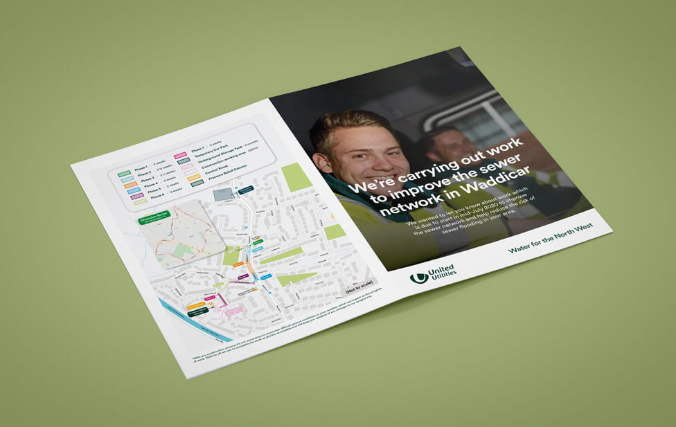
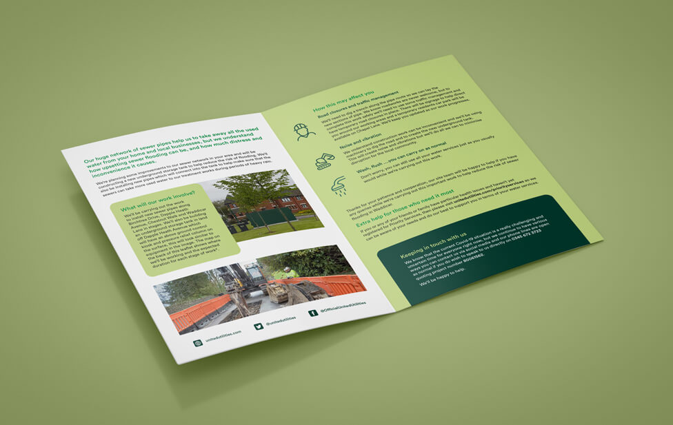
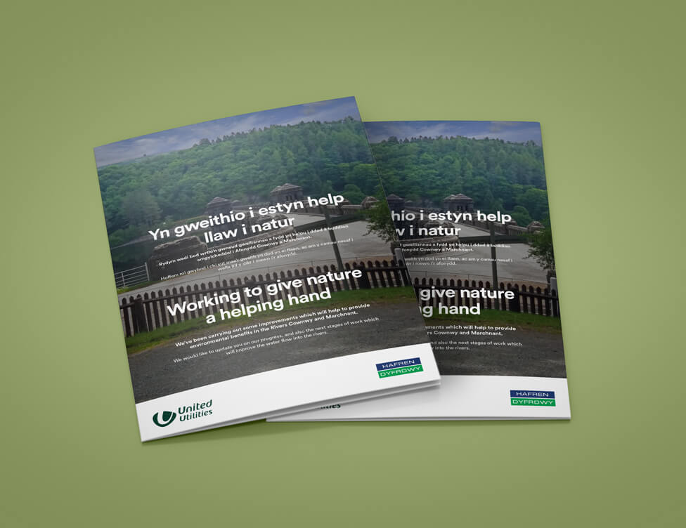
In addition to the hoarding boards, we completed the set of customer communications with a series of short size banners, posters, maps and leaflets, also available in Welsh.
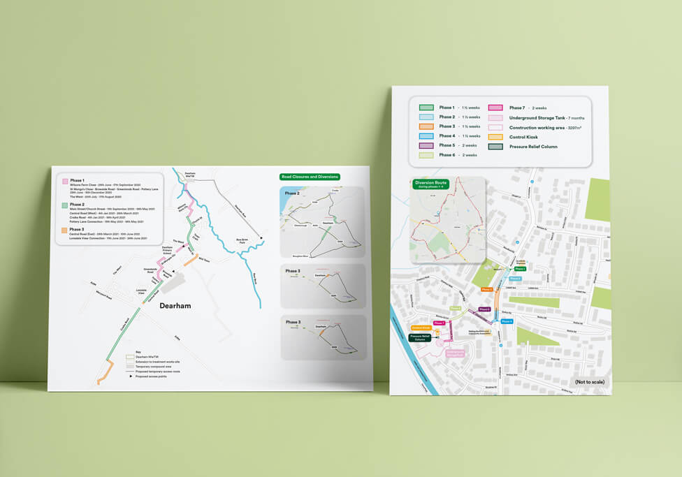
We downloaded and re-drew Google maps, colour-coding them to add to the customer-friendly experience.
Looking for help with your project?
Feel free to give us a call to start a conversation,
our doors are always open.
Related projects
United Utilities
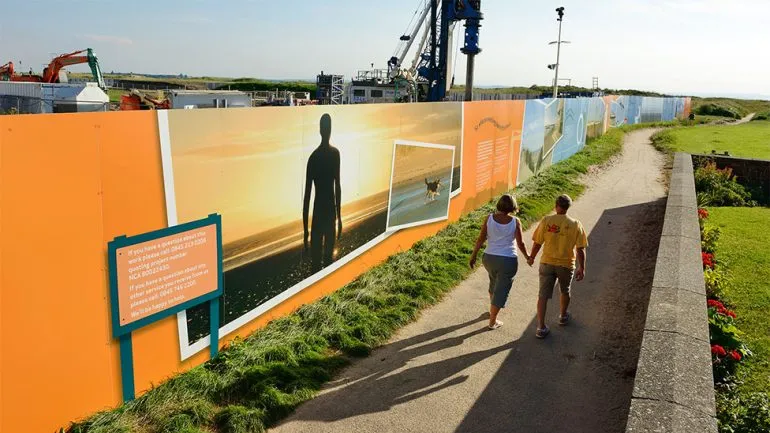
Construction hoarding signs
Cheshire East Council
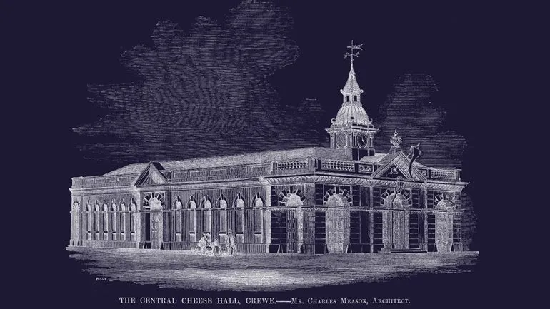
Urban regeneration hoarding
United Utilities
Hoarding board design
