Report Design – Make it count
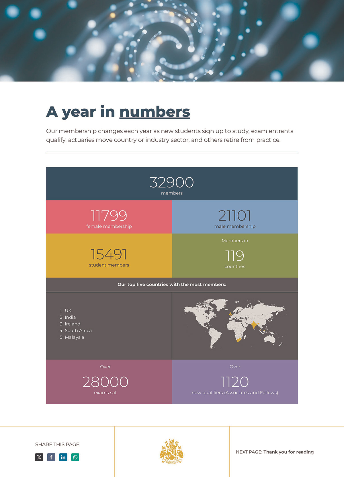
Report design – pages and pages of graphs and tables filled with black and white statistics? Perhaps that approach isn’t the most effective way to engage your audience.
To really bring your audience together around you and your team’s efforts, your annual report design – whether in print or digital format – must be an engaging and accessible read, and focus on celebrating your achievements.
And relying on beautiful, innovative and effective annual report design to communicate what your company has achieved will engage audiences and go beyond: an engaging visual and reading experience will reassure your audience – whether they’re customers or investors – that your company isn’t just proud of past achievements, but it’s also an organisation that looks forward and cares, that they’re in good hands.
Below are just a few tips on how to turn your annual report into an engaging and effective communications tool.
1 – Go public
Going digital with your reports immediately lets you reach a much wider audience, and lets them take control. Include video for added engagement.
2 – Make an impact from the start
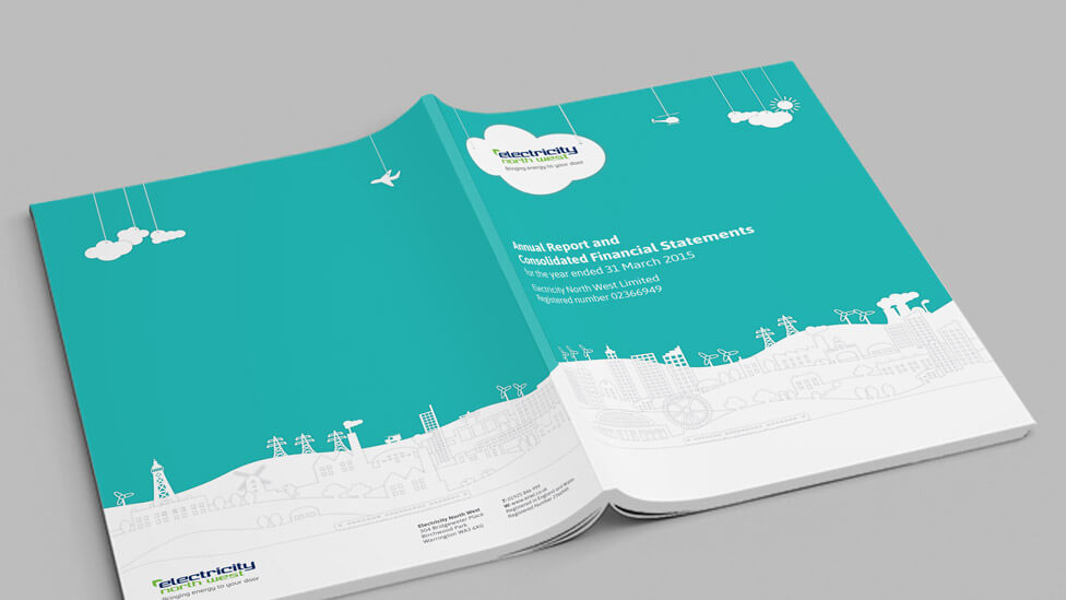
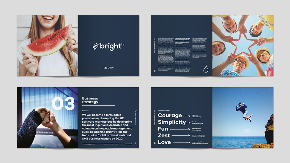
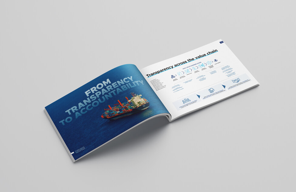
With report design, you can make an impact even before your audience have turned to page 1. So be bold from the start and lead with confidence.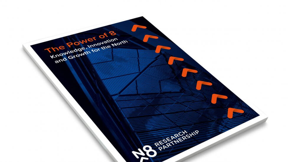 The covers on these reports act as strong hooks to entice audiences to find out more, thanks to unique visuals and formats that create intrigue and immediate empathy and engagement – in print or digital.
3 – Remember who you work for
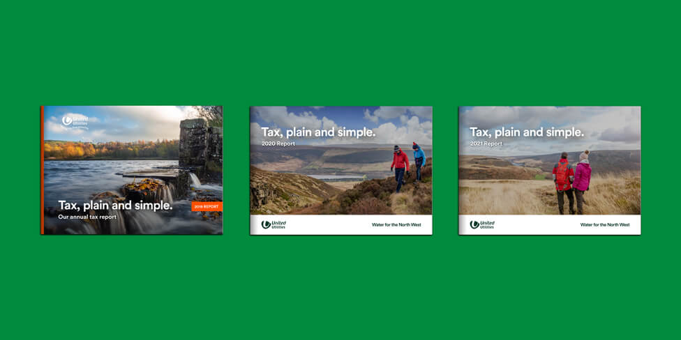
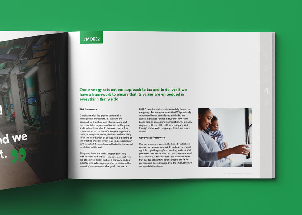
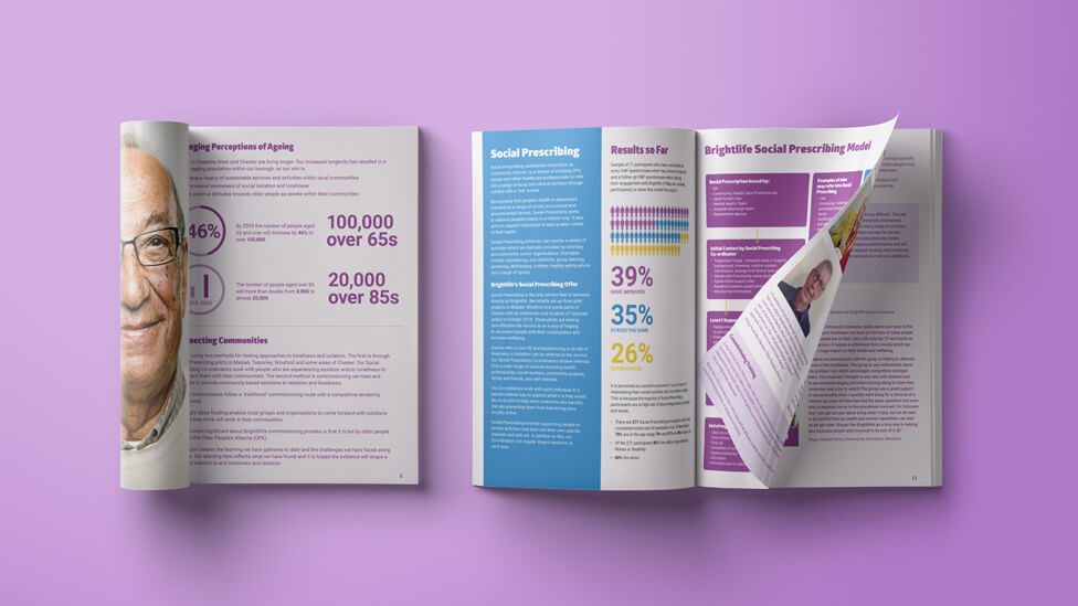
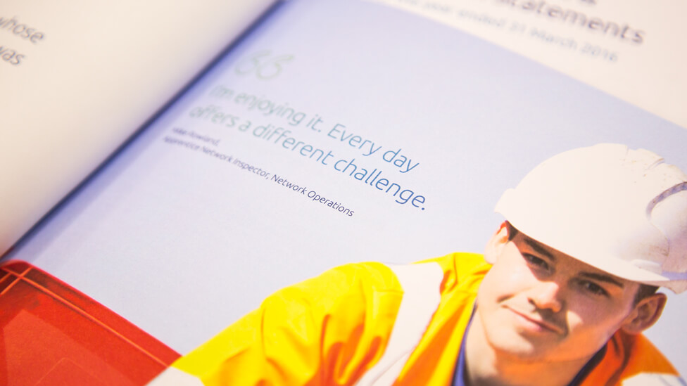
Create an emotional connection between your customers and shareholders by putting the communities you support first. Stock photography, images of real customers or the employees who serve them, or even a playful illustration can really enhance your report design.
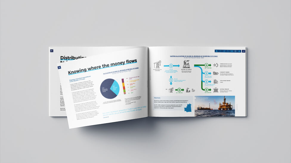
4 – Find interesting ways to visualise your data and processes
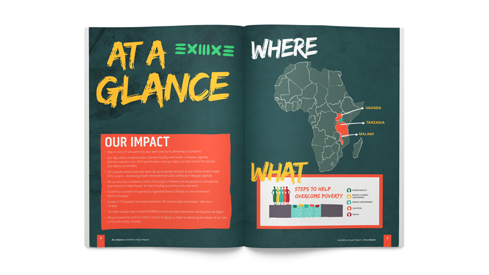
The personal touch of a hand-drawn illustration can be a powerful way of communicating your commitment to the communities you serve, and will really bring your message to life.
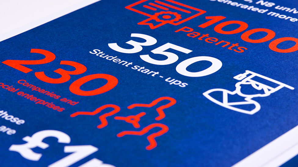
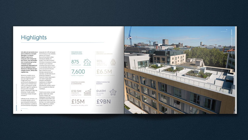
 With the human brain processing images faster than words, using infographics and icons will help you communicate key achievements in ways that will make the information more digestible and memorable for your audience.
5 – Remember the importance of structure
Finding the right way to combine colour, graphics, images and copy, and playing with font styles and sizes will turn your report into an uncluttered and effective communications piece, regardless of the amount of content that needs to be included.
6 – Give images as much importance as your statistics
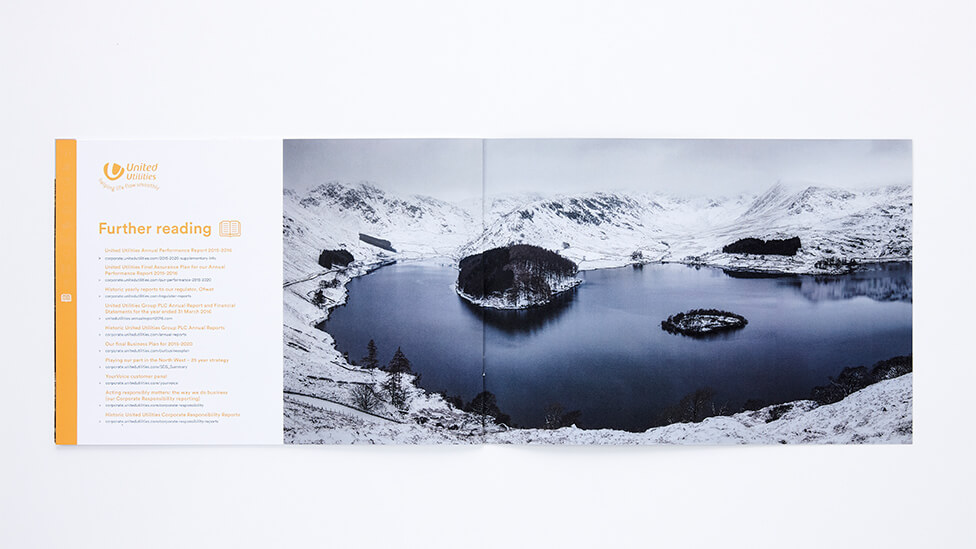
Striking images can speak volumes about your aims, achievements, and the scale of your efforts, so make sure they’re a key element in your report design.
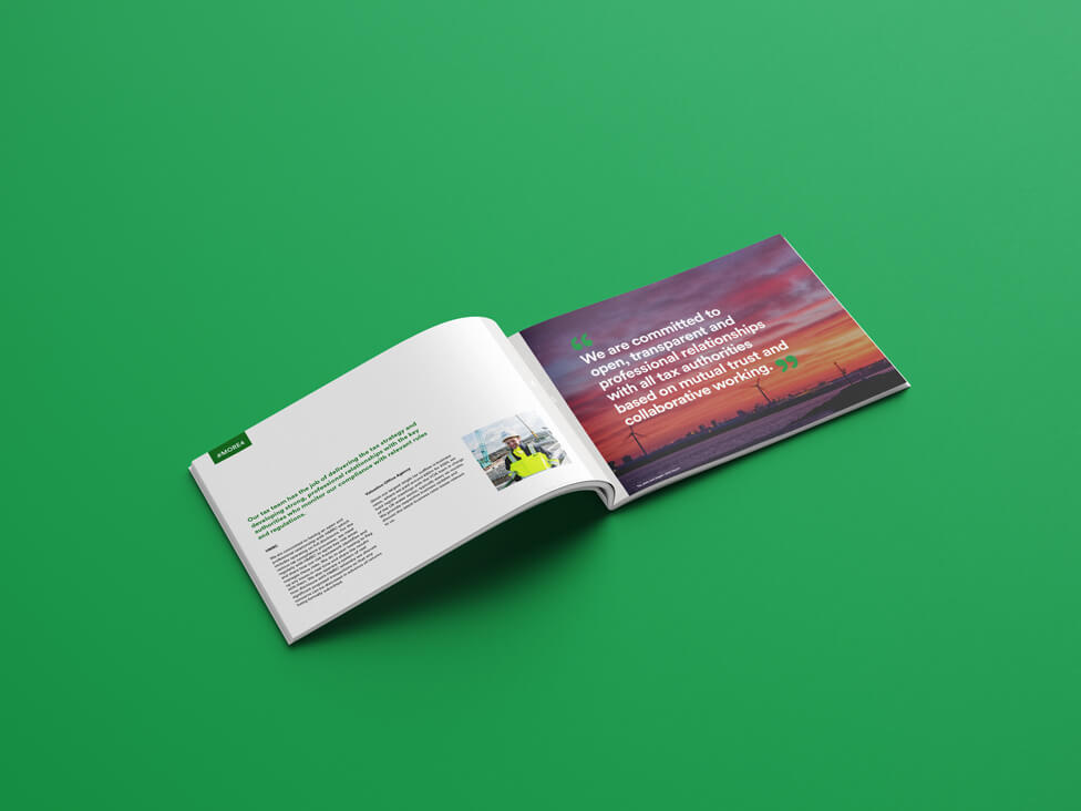
 You can also use images to “speak” directly to your audiences.
7 – Be playful
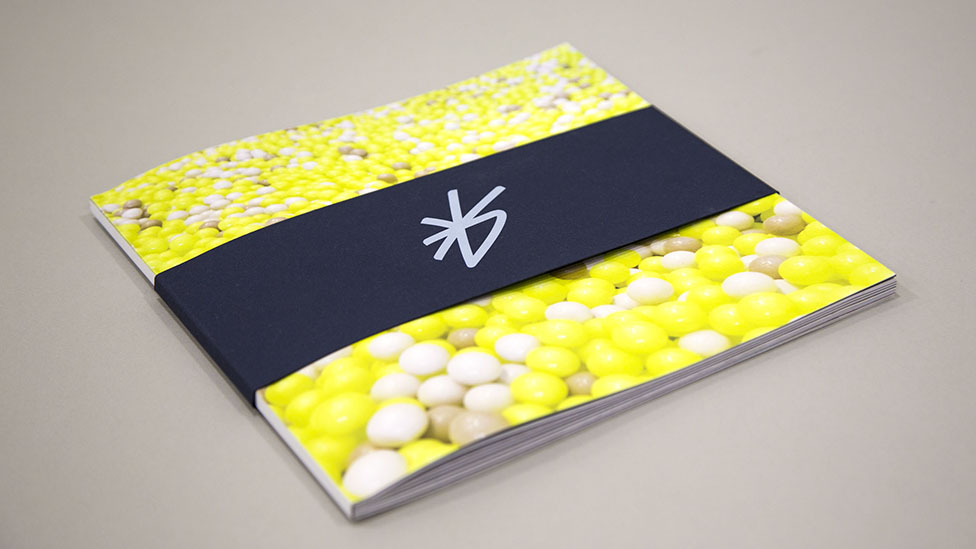
Adding a sense of fun to your report design will show your audience that you like to do things differently.
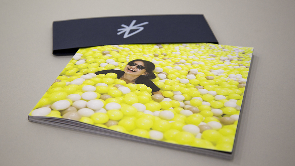
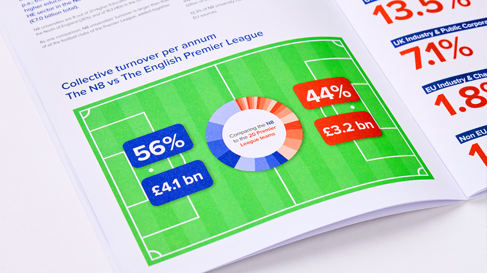
These are just some examples of how our report design expertise has helped clients in a wide range of sectors reach audiences in meaningful ways.
Have a look at our report design case studies in detail if you want to find out more, or get in touch.
LET'S COLLABORATE
Feel free to give us a call to start a conversation, our doors are always open.