#TwoDesigners – Classic branding
Two Designers is a feature in which two members of our creative team discuss a specific topic.
Designers Tom Yarwood and Tom Hubbard review three companies that have chosen to move their brand forward by embracing their past: NatWest, Co-op and Kodak.
What do you think about the Co-op’s decision to return to its original 1968 cloverleaf design?
 TomH: This is actually a great discovery for the Co-op’s design team. How often do you get to revisit a brand’s history and discover that they’ve already created perfection?
The simple configuration and sans serif type make this brand so timeless – it doesn’t age, which is great because that means the company will get more value out of it over time. Whether you’re familiar with the logo, or are experiencing it for the first time, this is a brand that appeals to everyone.
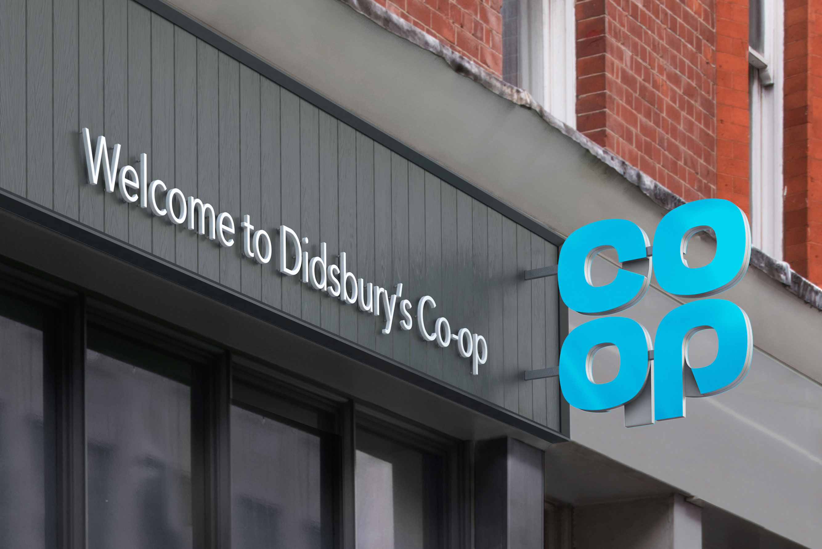
I also like how they’ve chosen to recreate the look of the wood cladding from the original stores – it looks so current. I think it takes balls for North Design to approach a client and say “You know, you really had it right the first time. Let’s bring this back.”
 TomY: I wasn’t familiar with the original Co-op brand, but I much prefer this over what they had previously. It’s clean and looks completely different from what other supermarkets are doing. It’s amazing that they have been able to use a logo that is nearly 50 years old in such a contemporary way.
The company has landed on something that is a step forward for the brand, especially in how they have rolled it out with this fresh colour palette.
You wouldn’t even think this was a supermarket brand.
NatWest is another brand that has refreshed its logo recently by revisiting its past. Is this design equally timeless?
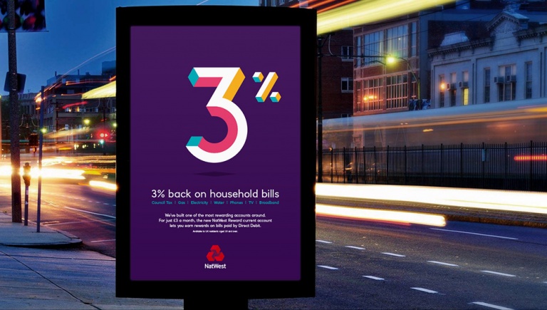
TomH: This brand feels more complicated with its gradients and cubes and I worry that it might age quicker than the Co-op logo.
The colour palette and geometric font are a nice complement though, and open the door to an image that’s younger and more playful – definitely softer than you’d expect to see from a bank.
Whereas the Co-op’s colour palette could be considered a bit cold, the design team’s choice of colours here gives NatWest a lot to play with and is a great platform for more playful graphic elements. The question is, will it stand the test of time?

TomY: It doesn’t feel like NatWest has done anything radically different with their brand here – they’ve just chosen to use the elements they have in a new way and introduced new visual elements that are more lighthearted and adaptable.
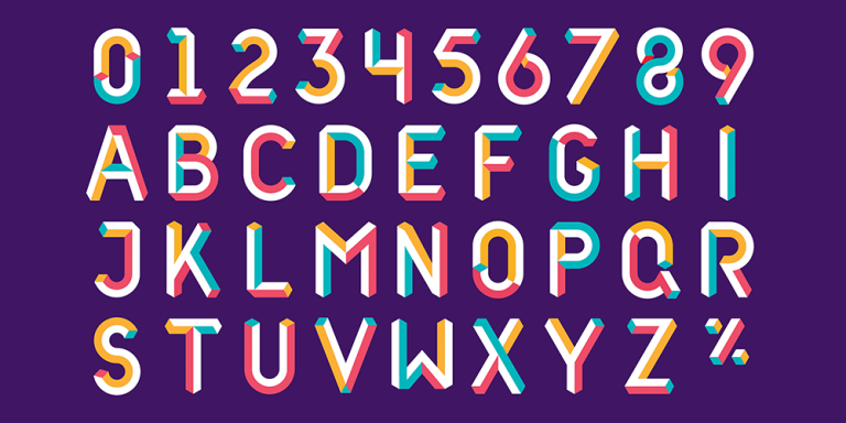
I can see this approach playing extremely well with younger audiences, but whether or not it will date quickly is a potential concern. The extended colour palette is something that you don’t expect to see, but it will be easy to recognise it as NatWest on the high street.
The brand is making an effort to connect with their audience in a more playful way – one that I like. It feels more like what you would expect a lifestyle brand to do.
A third iconic brand, Kodak, has recently re-imagined its look and feel based on a version of its logo first released in 1971. Is this an effective approach to classic branding?
TomH: You can see that Kodak is using its vintage credibility to pull in their core audience. I think trading on their legacy is a smart move in this case, as it immediately connects with people who are familiar with the brand, while simultaneously introducing it to a whole new generation of customers with the release of the Ektra smartphone.
This is a standout brand and though I don’t think it’s an example of a timeless logo design, the history behind this company and its products makes it iconic.
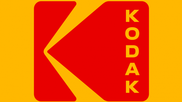

TomY: The treatment of this logo takes the brand back to when the company was at its peak. One look at the colours and you know right away what you’re looking at. It shows how effective a brand can be when it re-examines and embraces its legacy.
In my opinion, the 2006 version of the logo lost some of the brand’s personality and identity by going ultra simplistic. By coming back to the retro brand, the company is showing how it can readjust with the times.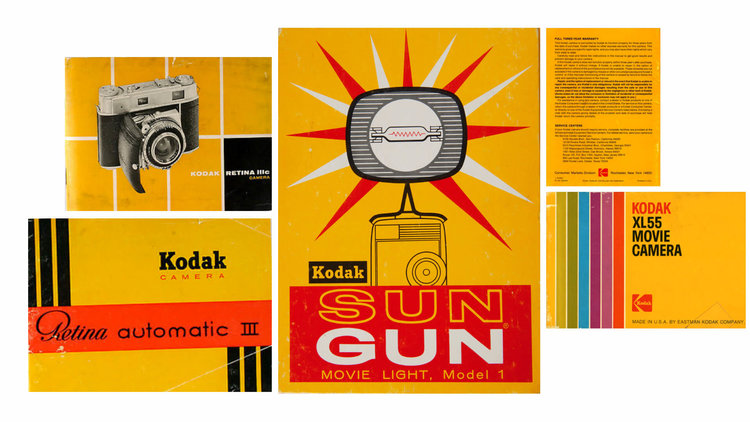
LET'S COLLABORATE
Feel free to give us a call to start a conversation, our doors are always open.