BrightHR
Exhibition stand design
BrightHR
Exhibition stand design
A vibrant exhibition stand design that effectively communicates BrightHR’s intention to create a brilliant new normal in the HR industry, demonstrating how the future will look.
Background
Our client, who offers a cloud-based human resources service, likes to do things differently. Their company ethos, internally and externally, is rooted in having fun and creating positive disruption. They’re firm believers in allowing everyone to be themselves, so they encourage their teams and customers to make their brand and product their own.
Challenge
We’d been helping BrightHR with their new brand strategy from the start. So, we were excited when they asked us to create a vibrant stand design to match their energy and goals.
The exhibition stand would serve as the stage to launch their new company name, new brand and new re-engineered product at the CIPD Annual Conference and Exhibition, the UK’s largest HR event.
Hundreds of professionals meet at CIPD every year for learning and networking opportunities, so we had to make sure our stand design maximised this exposure. The stand had to deliver a wow factor for BrightHR and their visitors. It had to embody our client’s vision and showcase the fun and vibrancy of the new brand and product.
Solution
We worked with our client from start to finish – from design of the stand, to build, installation, and breakdown.
The plot was positioned at the back, so we designed a stand that acted as a beacon and attracted visitors. We also made sure they stayed, engaged with the exhibit and told others about it.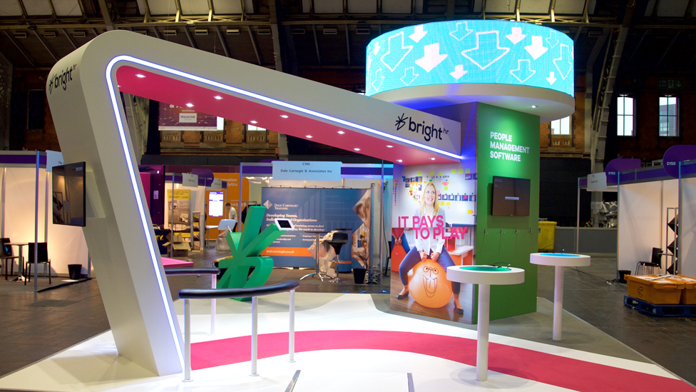
The stand had an open, welcoming feeling, and at the same time it allowed our client to share a vast amount of information and offer different fun elements to visitors.
In a limited 36sqm space, BrightHR asked us to generate excitement, footfall, and engagement with their new brand and product. We utilised the maximum height allowed by crowning the stand with a circular seamless LED screen that drew in the crowds from right around the hall.
“We challenged Parker Design to bring our five brand values to life. We’re driven by fun, simplicity, courage, zest and love, and this exhibition stand design enabled our team to demonstrate their passion, and BrightHR’s genuine culture, to the huge number of visitors who interacted with us at the show.
We commissioned a report called It Pays to Play, which was carried out by the UK’s leading academic in business psychology, Professor Sir Cary Cooper.
With learnings from the report – such as spontaneous fun in the workplace being used to attract, engage and increase the productivity of the best people – at the core of Professor Cooper’s keynote address, it was essential that visitors clearly recognised and associated our stand, and brand, with the topic.
Through the use of our highlighter-inspired brand colours, campaign messaging, games that encouraged people to get involved and a design that made us stand out from every other business at the CIPD’s annual conference and exhibition, we didn’t just announce the arrival of our new people management software, we effectively communicated our intention to create a brilliant new normal in the HR industry, demonstrating how the future will look.”
BrightHR’s Brand Marketing Manager
The soft angles and curves made the beacon a dynamic feature, evocative of the Xing – the brand identifier we had created as part of the new brand strategy. The Xing represents the company’s five guiding principles, and the “b” in Bright. It’s an exhibition stand design full of energy and confidence.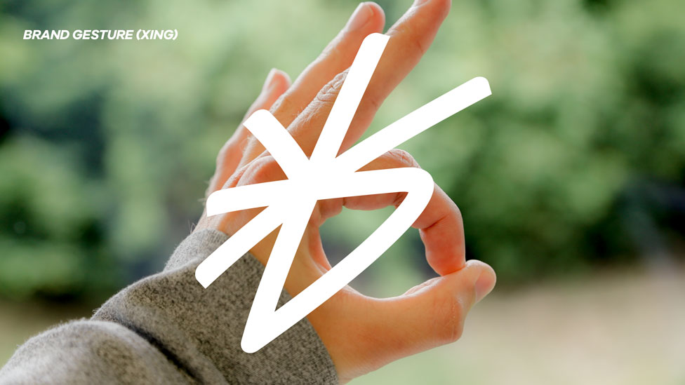
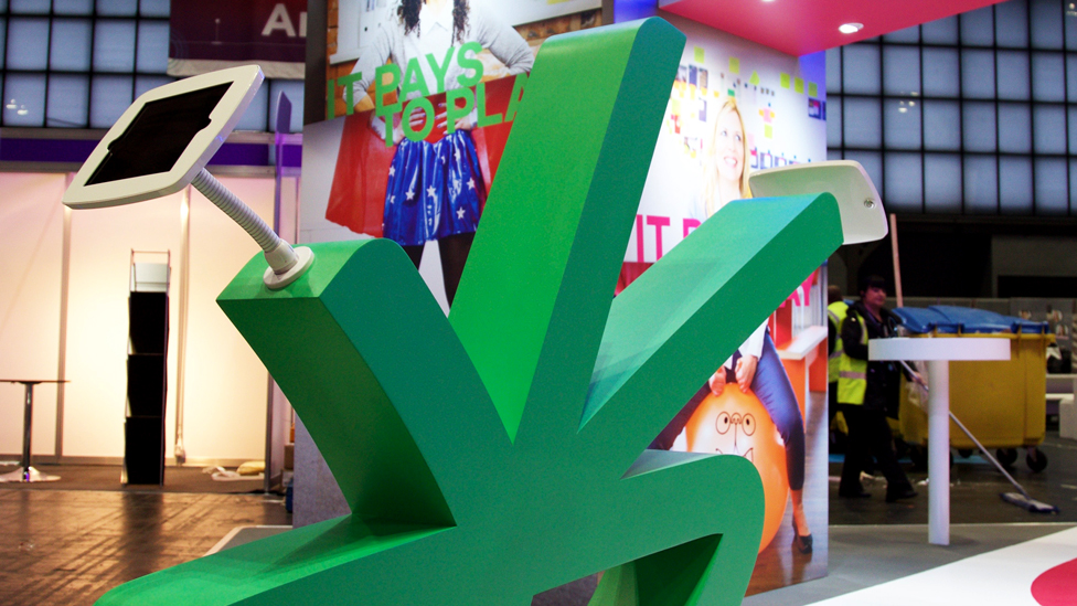
We built a 3D version of the Xing to take full advantage of the clear line of sight visitors had from the registration area. This wow feature generated curiosity in the busy exhibition hall, as well as in the network area. As visitors approached, LED and feature lighting subtly drew people in. Once in, we kept the overall exhibition stand design very simple to allow for details in the various features to really stand out, capture visitors’ imaginations and generate maximum engagement.
Phones, tablets and Apple Watches interacted with a 3D version of the Xing that featured mounted iPads, really bringing the new identity and product to life.
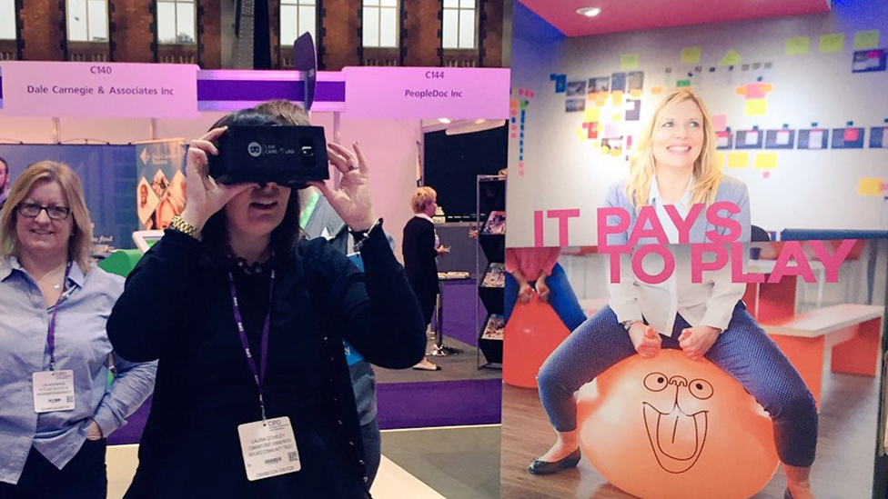
We created a dedicated area for visitors to play Google Cardboard games. A 42-inch screen relayed the games in real time, and a leader board maximised excitement and fun. A screen with impactful brand messages and an engaging animation added fun and movement, and helped tempt visitors from anywhere in the hall.
We also produced name badges, and helped with completing forms and dealing with the organisers. The stand included a store room and two demo stations for the new product.
Result
Great feedback from visitors and our client, and the design was awarded ‘Best Stand’ by the CIPD in association with People Management.