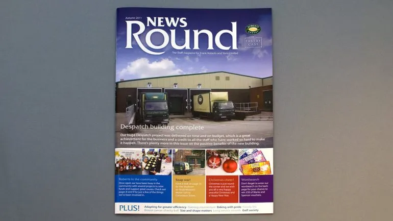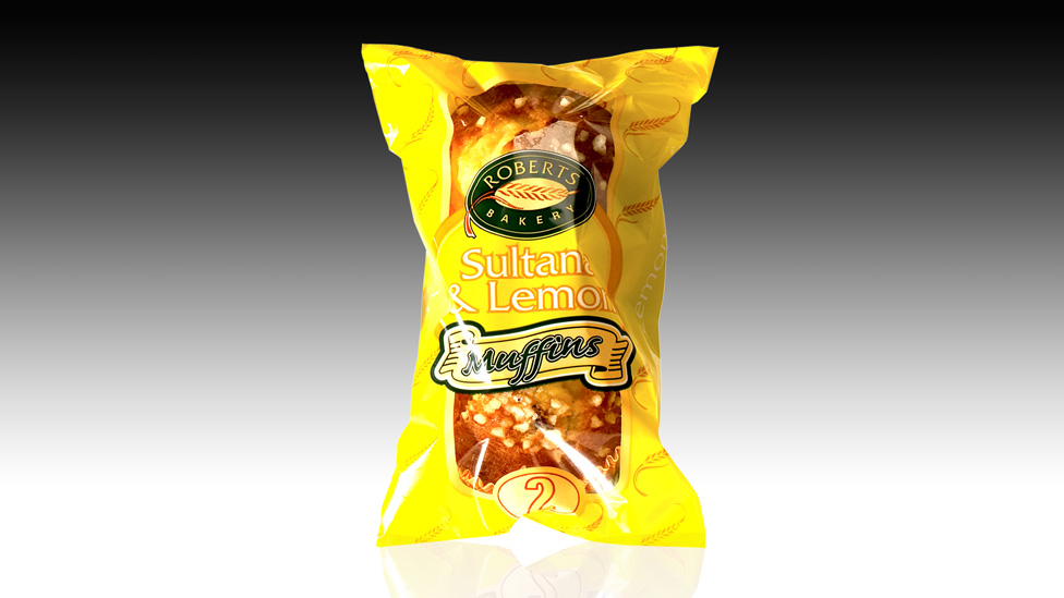
Roberts Bakery asked Parker Design to create a new bakery packaging design that would help their new range of muffins jump off the shelf.
Background
Great food packaging is all about shelf presence – the product needs to stand out and jump off the shelf. That’s why Roberts Bakery asked us to create a new bakery packaging design for their range of muffins.
Challenge
Renowned for the quality of their baked goods, the food packaging had to match customers’ expectations.
Solution
As part of a wider remit, we helped our client completely rethink their approach to packaging design, creating a much bolder and striking look.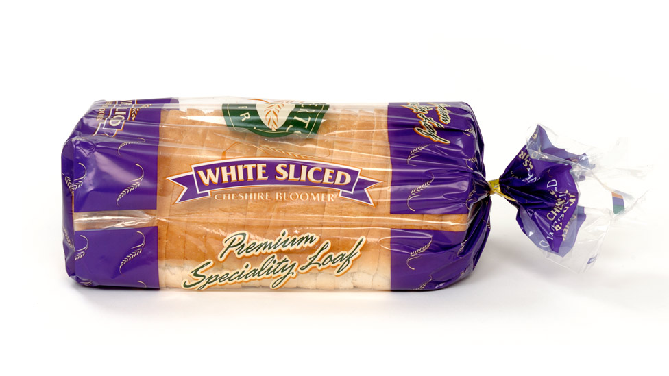
The muffin packaging was designed with a product “window” to allow customers to see the mouth-watering muffins inside. Picking up on the flavour of the muffins we developed a bright new colour scheme for the packaging design, yellow for the sultana & lemon muffins, blue for blueberry, and brown for the chocolate ones.
The solid expanse of colour was lifted thanks to a repeat pattern created from the iconic Roberts Bakery wheatsheaf graphic, and giving a much more prominent position to the Roberts logo. 
The new bakery packaging design was completed with a relaxed typography style suited to the product. The reverse of the packaging was carefully designed with all the statutory information such as nutrition ingredients, weight, best before date and barcode.
“Parker Design have helped us to update and harmonise our brand image through refreshing our product packaging design and promotional items.
They listened carefully to our design brief and, taking account of both our sales and production requirements, produced innovative, creative, and feasible ideas.”
Looking for help with your project?
Feel free to give us a call to start a conversation,
our doors are always open.
Related projects
Coultons Bread
Bakery packaging
Robert Andrew
Branding and packaging design
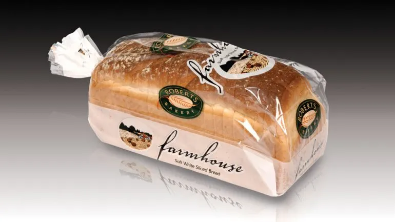
Roberts Bakery
Product packaging design
