
We helped Act4Africa spread their message of hope with a charity brand development solution that feels alive and celebrates the achievements of those helped by Act4Africa’s programmes.
Background
Act4Africa is an award-winning organisation known for making a positive impact on the communities they support. Helping to free women and girls from poverty, the charity focuses on promoting gender justice and equipping women and girls with the necessary life skills that will guarantee their future. Although the charity did have a logo and some existing collateral, these materials weren’t connecting with potential donors as effectively as they could.
Challenge
We needed to create a charity brand development solution that would communicate a feeling of empowerment and hope, while also treating a difficult topic with sensitivity. The visual style would need to feel alive, celebrating the achievements of those helped by Act4Africa’s programmes and emphasising the possibility of a more promising future.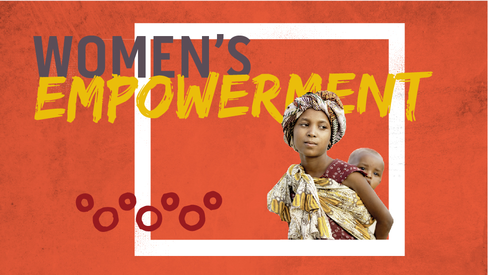
Solution
We knew that conveying positive energy would be key to developing the look and feel of the client’s brand. Not only did we want it to stand out from other charity messaging, we also wanted to share the pride and strength of the individuals in this part of the world.
We spent a lot of time speaking with Act4Africa about the communities where they work. Inspired by the culture of people from these areas, we selected a vibrant colour palette of reds, corals, greens and yellows. The beauty and versatility of the colours allowed us to bring the brand to life and apply it to different media.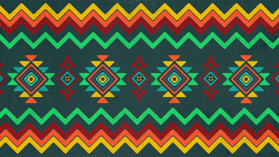
Our client shared examples of authentic African patterns with us, which allowed us to develop some beautiful graphical elements. The selection of reds and yellows gives the brand vitality and spirit, whereas dark green adds authority and gravitas, providing a perfect background for the brighter colours to stand out against.
Highlights
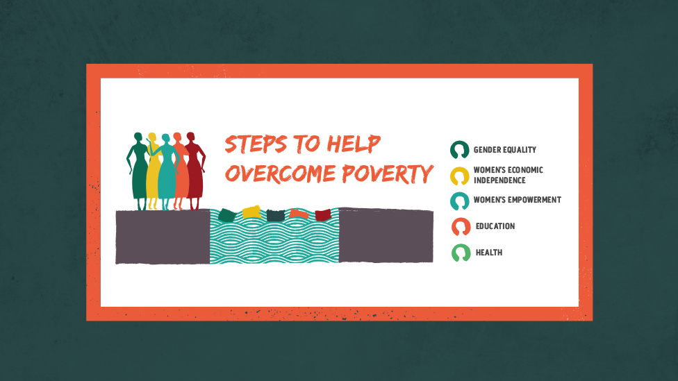
- We developed a colour coding system for each of the charity’s five impact areas (gender equality, economic independence, empowerment, education and health) which made it easier to develop clear and engaging themed infographics.
- We created hand-drawn illustrations to help create a more earthy, human appeal.
- The image layering, use of colours, typography and integration of patterns into the design helps add movement and bring photos to life. It also provides consistency with other brand materials, without being dull or monotonous.
- We used a brush strong font to help messaging convey strength and enthusiasm, while giving the brand a free and natural feel.
Looking for help with your project?
Feel free to give us a call to start a conversation,
our doors are always open.
Related projects
H&T Presspart
Branding strategy & development
ChargePoint Technology
Brand development

AMBS
Identity development and application
