INEOS
Company magazine design
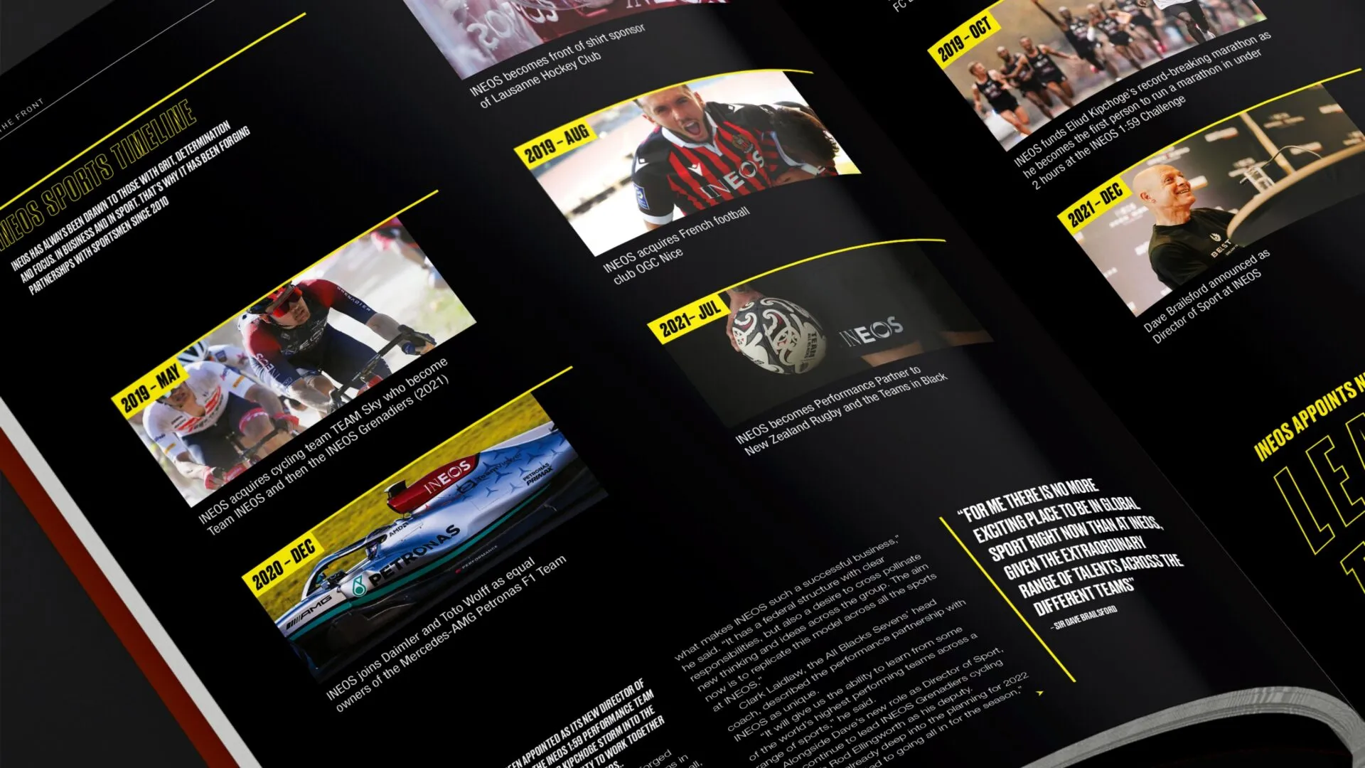
Now approaching its 30th edition, this company magazine design tells the story of the relentless determination and energy that fuel INEOS’s constant thirst for innovation.
INEOS has a story to tell…
Great editorial design transforms content into an engaging, memorable experience for readers. Through thoughtful layout, typography and imagery, editorial design enhances readability, guides the audience’s eye and emphasizes key messages, making complex information more accessible and enjoyable. Robust brand-centric design reflects the publication’s identity, capturing brand tone and purpose whilst building trust, engagement and knowledge both internal and externally. Whilst the magazine has a consistent flow, each article brings its own unique style.
Always pushing the limits of what a global petrochemical business can do and what’s expected of it, INEOS has confidently found its place among the world’s top companies, driven by constantly pushing for change and living their three core values: grit, rigour and humour.
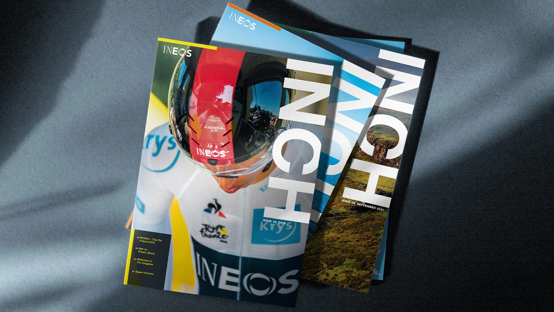
With every edition, our design highlights the big issues our client is tackling. We use photography, colour, typography, layout and graphics to keep the design engaging. The cover is especially important; it’s more than you would expect from a corporate magazine.
“Thanks all for a very nice piece of work, it looks very, very good. There is a lot of depth in the content and I’m confident we will be able to generate a lot of interest in the stories contained within it.”
Group Communications Manager at INEOS
Bigger, bolder, and better
INEOS is constantly aiming for bigger, bolder, and better, and that’s exactly what drives our design process. From acquisitions and global mergers to strategic partnerships, we needed to carefully strike the right visual balance to represent the business effectively.
Our design team and content writer dive into research for each article, exploring ideas and curating engaging imagery and editorial. It’s a truly collaborative process where they challenge each other’s ideas to make the content as impactful as possible.
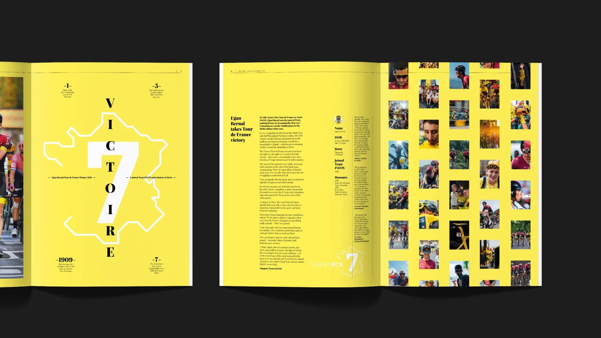
Creating a smooth flow throughout the magazine is essential. For articles that are more busy and more intense in content, we pare down the design features to keep things balanced. Shifts in colour and typography help signal the start of a new section, guiding readers seamlessly from one article to the next.
Working with photography from many different sources, with different levels of lighting and content framing requires a careful edit and adjustment to each chosen image to create a polished and cohesive look.
When images are unavailable we get creative to visually represent the story. We might use maps, or highlight uses of INEOS chemical products in our everyday lives. We may also add more space, add or take away elements or play with the contrast to achieve a more sophisticated appearance throughout.
Key priorities
Sustainability is a key priority for our client, and it’s a central theme in each issue of the magazine. Naturally, we share stories of INEOS’s commitment to meeting rigorous sustainability targets, using bold and engaging visual prompts integral to the story we are telling.
The energy of sport
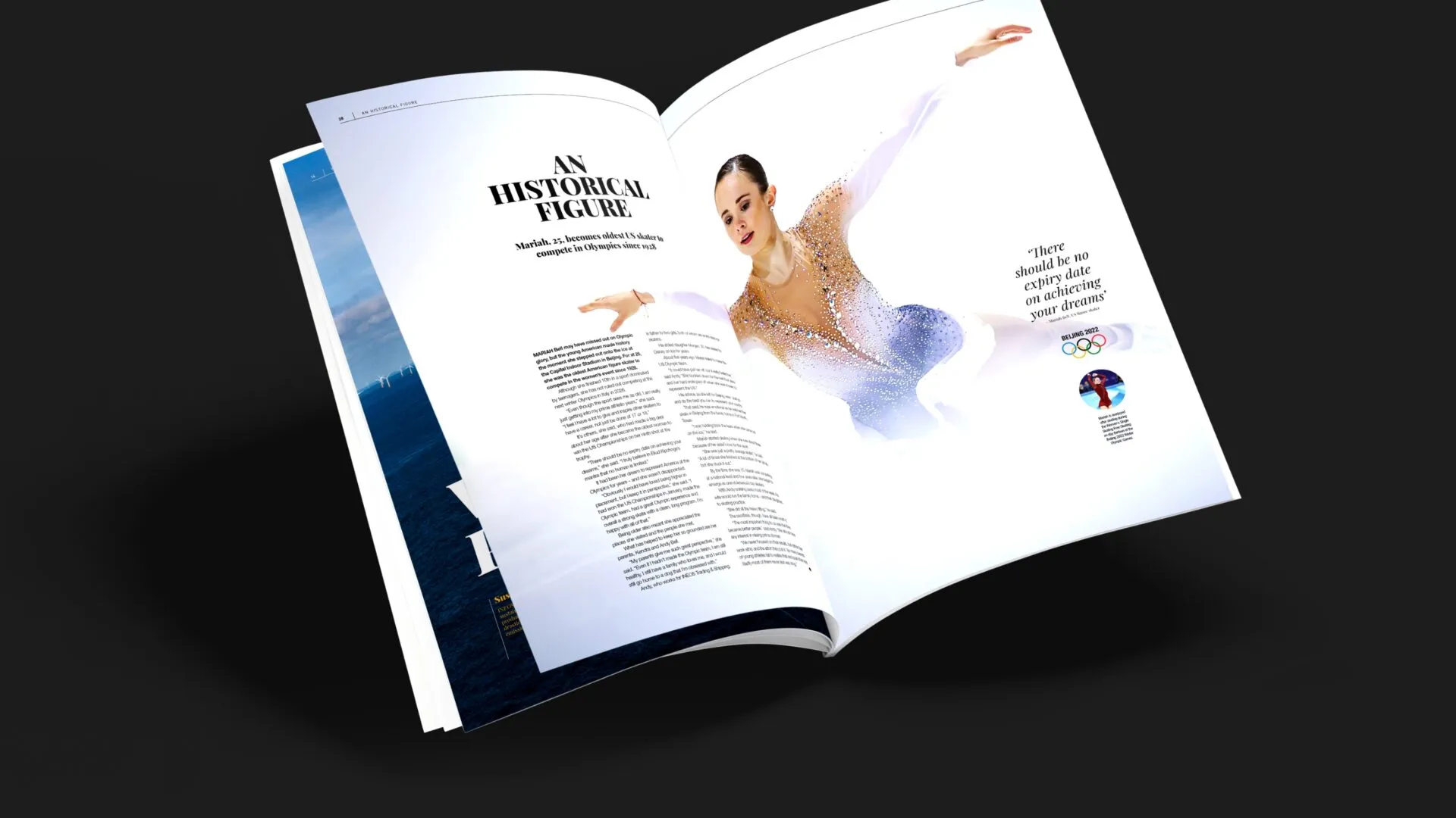
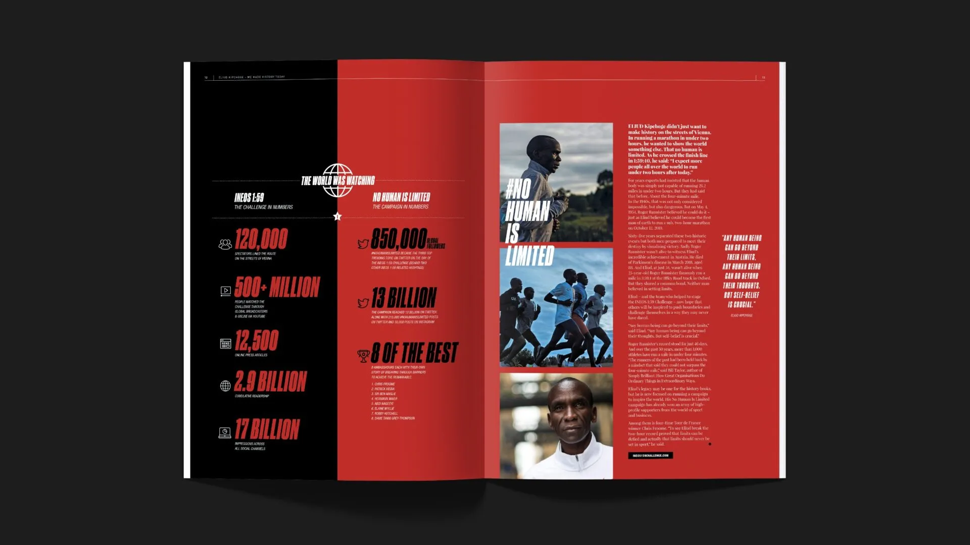
The sport section has its own unique visual style, with headlines and typography inspired by the energy, movement and passion of sports.
It’s about celebrating both individual achievements and team dynamics, underpinning the grit and rigour of INEOS as a business.
Unique styles
During the Covid pandemic, INEOS diversified and expanded into consumer markets by acquiring iconic brands like Belstaff clothing. The company even ventured into the world of automotive by creating and building exciting new vehicles from the ground up, the Grenadier 4×4 being one of them.
Each spread dedicated to one of INEOS’s consumer brands reflects its unique style, providing readers with an immersive and relevant visual experience.
Inspired magazine design
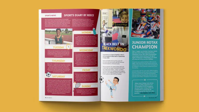
This section of the company magazine design shines a light on inspiring collaborative work with major institutions and other independent ground-breaking foundations. It’s also about the positive impact being made in local communities and charitable organisations where INEOS support is making a real difference.
Visual communication
Infographics are vital for effectively communicating complex information in a clear, visually engaging way. By combining text, imagery and data visualisation, they allow audiences to grasp key points quickly, making information accessible even for complex topics, and it gives us an important visual tool to further establish the brand look and feel of each issue.
Illustrating the point
Using illustrations, we break down complex processes and convey how the business operates in a way readers can easily understand. The use of white space keeps the layout clean and inviting.
Using bold choices, like highlighting CO₂ in yellow, creates a dramatic effect, making complex topics more appealing.
Designer’s pick
We can transform your
company magazine design
So drop us a message, we’d love to help.
Take a look at other magazine design projects
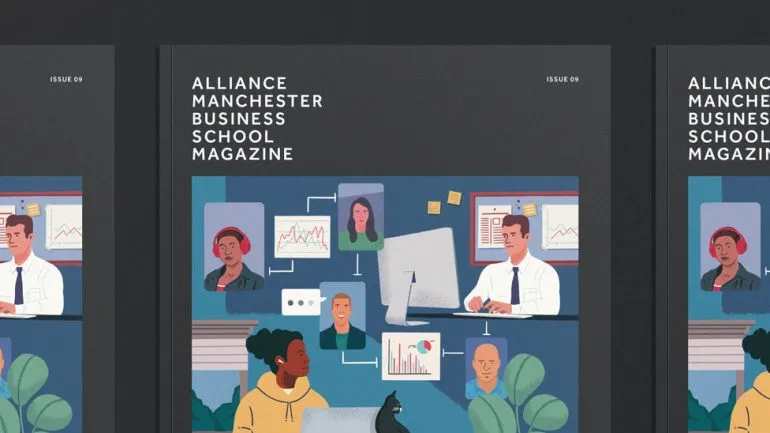
AMBS
Business school magazine design
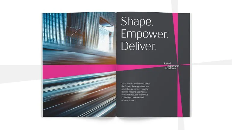
Statoil
Company newsletter
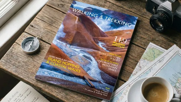
Exodus
Magazine design and content
