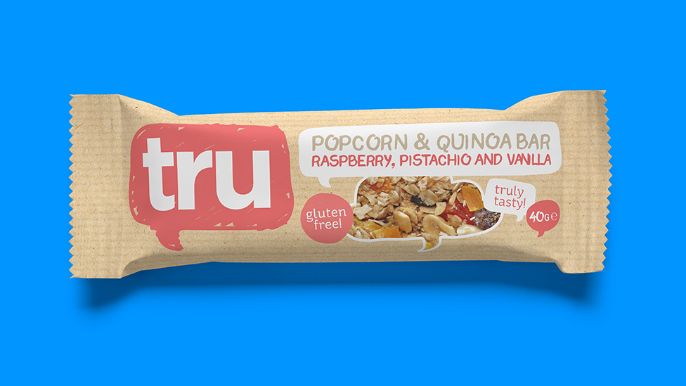
To launch Tru’s new popcorn and quinoa snacks, we created a vibrant food packaging design to sell its health benefits and make the product jump off the shelf.
Background
Tru, an innovative foods company, approached us to help them develop the identity for a new healthy snack. Identifying a gap in the market, our client wanted to introduce the UK’s first popcorn and quinoa snack bar. Though healthy snack options are widely available, the great taste, wholesome ingredients and gluten-free designation made this product a unique and attractive offering to health-conscious consumers.
Challenge
With a new product and little brand recognition, our client needed a food packaging design that would stand out on retail shelves and immediately advertise it as a wholesome and delicious alternative to sugary snacks.
Solution
Before work on the food packaging design could begin, our client needed a memorable brand identity. The name Tru had already been decided on because it encompassed both the wholesomeness of the ingredients and the client’s desire to share the “truth” about popcorn and quinoa snacks being both healthy and delicious.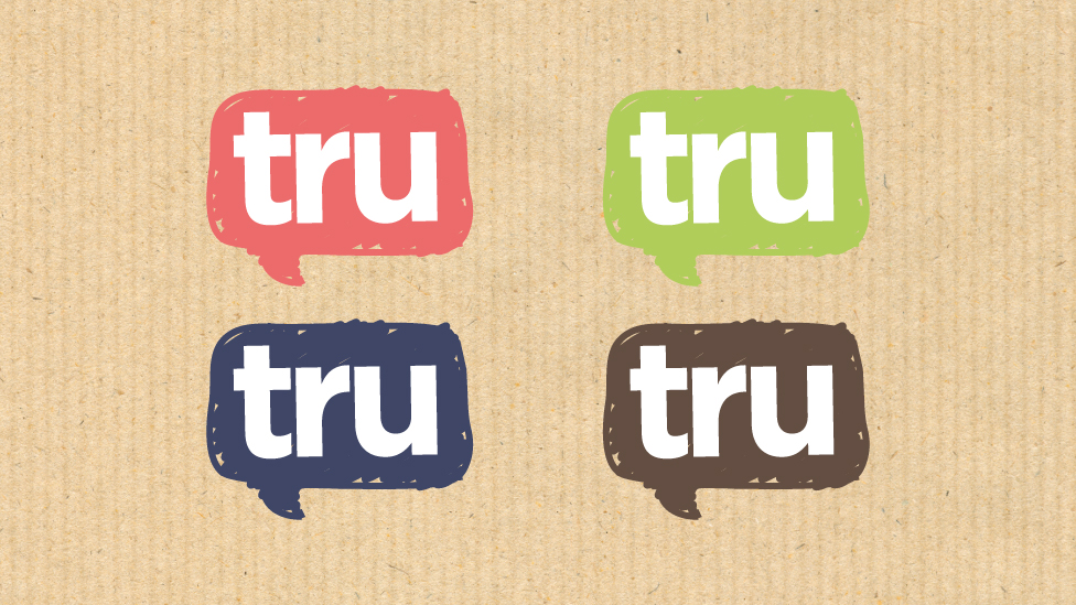
Following an in-depth brief with the client, we created a range of colourful logo options, including one version that included the product name in a colourful speech bubble. This was ultimately the logo design selected, as it perfectly summed up the brand’s desire to engage in a healthy dialogue with customers.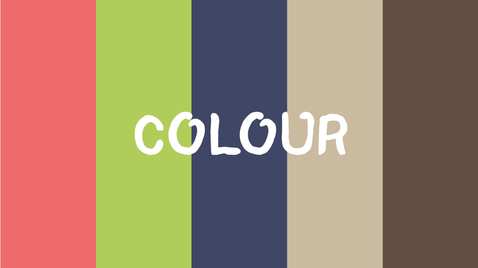
To complement the four flavour varieties available – raspberry, apple, blueberry and chocolate – we selected a natural yet vibrant colour palette, which would shift accordingly on the packaging design. 
Muted rose, purple, soft brown and green help the product stand out on the shelf, while also differentiating each flavour and hinting at the wholesome nature of the snack.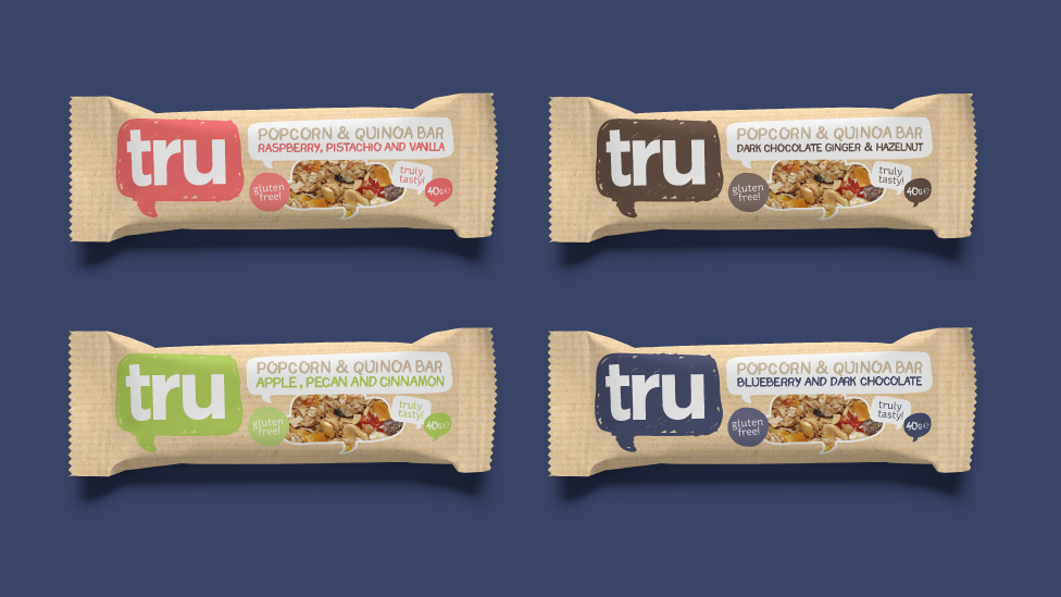
We included a window into each wrapper to showcase the quality of the natural ingredients.
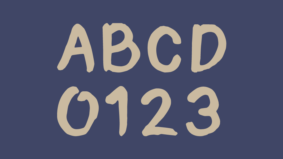
Our creative team helped the client select brown paper for the food packaging design to give the snack bars a more gourmet, homemade feel. Clean, but quirky typography feels authentic and organic, while making essential information easy to read.
Looking for help with your project?
Feel free to give us a call to start a conversation,
our doors are always open.
Related projects
Roberts Bakery
Bakery packaging design
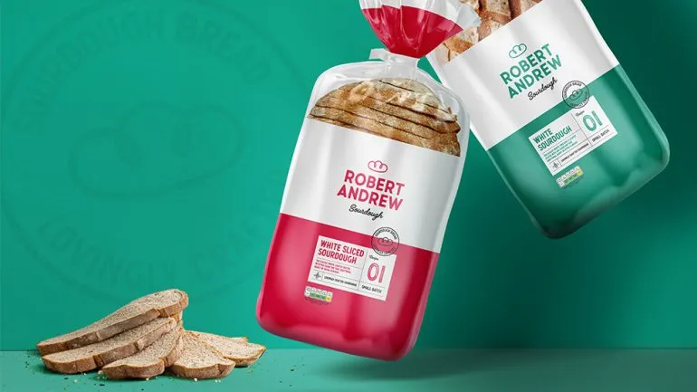
Robert Andrew
Branding and packaging design
Ocean Spray
Food industry report design
