This interim report design strikes a balance between presenting facts and figures and the highly emotional nature of what Brightlife does.
Background
Brightlife supports older people who may be suffering from social isolation and loneliness to enjoy more active and connected lives. The charity was formed by a group of public and third sector organisations led by Age UK Cheshire, as the regional partner for the Fulfilling Lives: Ageing Better programme, a National Lottery Community Fund initiative. In the words of the Head of Brightlife, “Nationally, loneliness is now recognised as a social epidemic. Let’s make sure that we are doing all we can to change this for the future.”
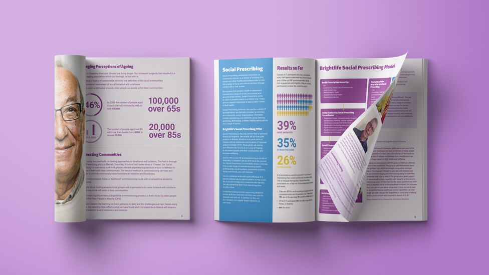
Brightlife uses two methods for testing approaches to loneliness and isolation: the first is through Social Prescribing (also known as ‘community referral’) pilots in a variety of locations, where co-ordinators work with people who are experiencing isolation and loneliness to re-connect with their communities. The second method is commissioning services and activities to provide community-based solutions.
Challenge
To deliver a report mid way through the project that would strike a balance between facts and figures and the deeply emotional nature of what Brightlife does. The focus of the interim report would need to revolve around the human story and the benefits which the efforts made by the organisation and its members bring to the community.
Solution
We created an interim report design that is both visually engaging and informative, highlighting achievements and appealing to the emotions.
Led by strong and confident images of the Brightlife personas we created for the social awareness campaign we had worked on previously, the interim report design makes for a thoroughly interesting read. Jim, Keith, Pam… are all bright and energetic over 50s who have a lot to offer to their communities, immediately generating empathy with the reader and helping strengthen the message the report is trying to convey.
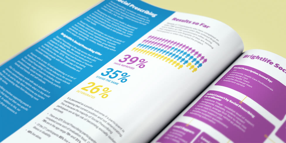
The use of colour carries a lot of weight in the interim report design and perfectly complements the simplicity of the design, adding a touch of dynamism. Colour is used in blocks to structure pages with a mixture of written and highly visual content, like highlighting key stats in infographic-style layouts.
Colour also plays a major part in more text-heavy pages, not just helping divide up content, but it’s also a key element in photography that is full of energy and positivity.
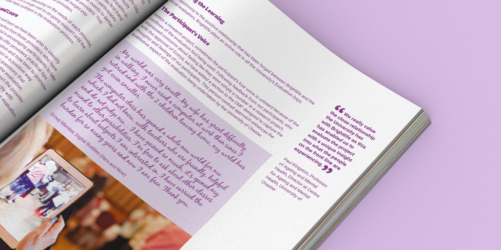
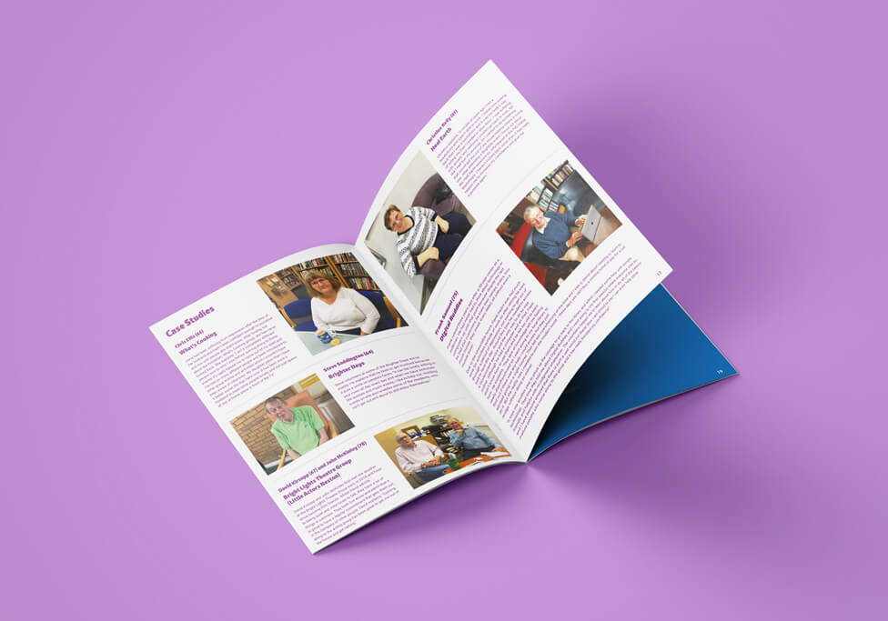
The report dedicates space to personal stories of people Brightlife has helped, in the form of highly personal testimonials with handwritten style fonts that speak directly to the reader, or detailed case studies.
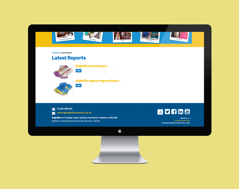
We also provided a pdf version of the report, which could be downloaded from the Brightlife website.
Looking for help with your project?
Feel free to give us a call to start a conversation,
our doors are always open.
Related projects

EITI
Multilingual report design

Dee Valley Water
Corporate report design

IFoA
Digital performance report
