Dynamic blue, and crisp black and white – the perfect combination to create a company logo and brand design style that is crisp, unique and characterful.
Challenge
Innovative product development company Zychem Ltd asked us to develop a logo and brand design that would reflect their origins as well as provide a style that offered increased longevity in the marketplace. Having used their start-up logo design to promote their products for over 21 years, the company’s Managing Director felt the time was right to freshen up the brand and sales and marketing collateral.
Solution
We created a range of logo and brand design concepts, and working closely with the management team we developed them into the new Zychem logo, featuring a chemical element-style treatment of the ‘Zy’ within the company name.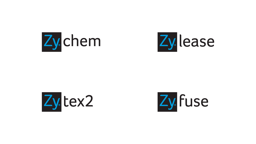
The company’s products rely on unique chemical reactions, so this was a relevant symbol to incorporate, and reflects the roots of the business, the team and planned future developments.
We selected a colour palette which perfectly represents the company and its products. The combination of the dynamic blue, with the crisp black and white supporting tones was the perfect combination. Coupled with a soft-edged, modern sans-serif font, the foundations for the brand were set.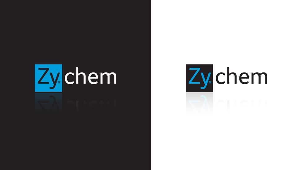
A sophisticated suite of stationery, with supporting presentation folders completed the printed materials, and we also worked closely with Zychem’s external suppliers to advise on brand consistency across all materials, such as product packaging, shipping containers, building signage and website.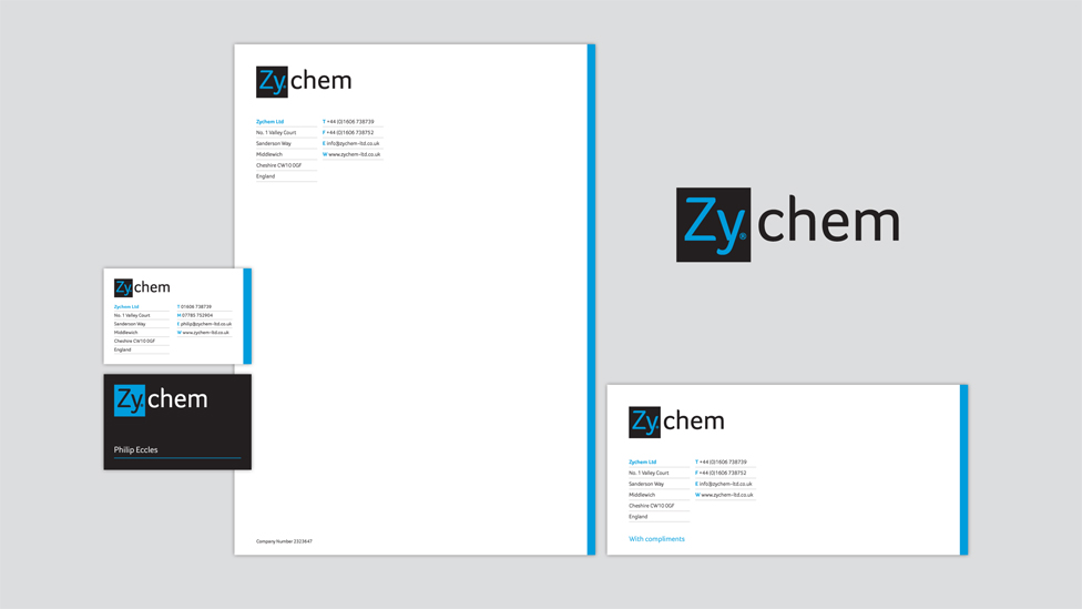
The resulting company logo and brand design style is crisp, unique and characterful. It reflects Zychem’s success to date, as well as offering a solid brand that is flexible enough to grow with the business.
“I would like to thank Parker Design for their excellent work in creating our new brand.
After 21 years supplying the same products we approached Parker Design with a brief outline of what we wanted to change, including a new logo, product images, exhibition banners, packaging, etc.
The new company image and materials have just been introduced to our customers receiving such feedback as “Wow! Classy!!”; “Very, very 21st century”.
Looking for help with your project?
Feel free to give us a call to start a conversation,
our doors are always open.
Related projects
H&T Presspart
Branding strategy & development
ChargePoint Technology
Brand development

AMBS
Identity development and application
