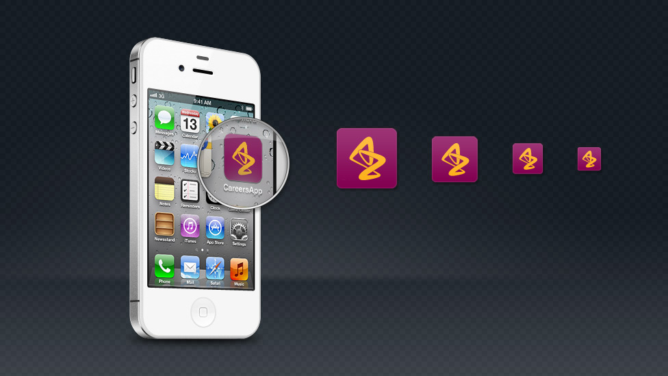
With this mobile application development project we helped AstraZeneca reach a wider and more diverse audience.
Challenge
AstraZeneca’s Information Services department commissioned Parker Design to design and develop a new graduate recruitment mobile application to extend their recruitment marketing across new digital channels and also to appeal to a diverse audience. The cross-platform mobile application requirements included the latest jobs available in the IS department, whilst at the same time giving a substantial background on the company in order to raise awareness of the key values and advantages of working for AstraZeneca.
Solution
Working closely with the IS team to define the content, we also identified the essential technical requirements for the app. These included compatibility with Apple and Android devices, the ability to consume content whilst in offline mode and strict compliance with brand guidelines.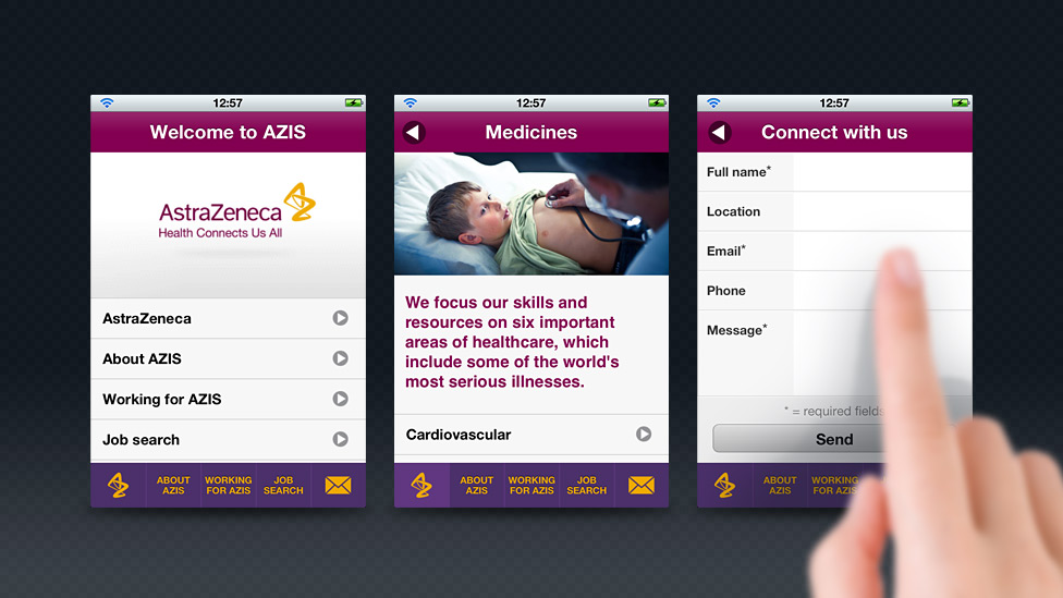
After researching native app and cross-platform mobile application development, our digital team chose Sencha Touch (now Ext JS) as the app development framework. This allowed us to develop the app using an MVC approach, using our years of expertise in web technology: HTML, CSS and JavaScript. This approach also meant that we were able to write the app once and deploy to both the Apple and Android platforms, saving time and development costs in the process.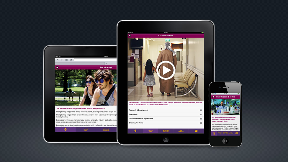
A set of wireframes ensured that the look and feel of the mobile application development received our client’s approval before the build went ahead. We incorporated a logo sequence as an animated gif. This technique meant that the animated logo looked as though it was video, displayed inline with other content (as opposed to video that takes over the display when played on a mobile device).
The main interface for the app followed established design patterns: drill-down lists, swipeable cards and navigation icons in a fixed footer docked to the bottom of the screen. We also managed to develop a method of including introduction text and images at the top of specific drill-down lists to be able to organise content appropriately.
Throughout the development and testing phases, we kept close contact with our client, and received very positive feedback in terms of design, functionality and responsiveness of the app on the various test devices.
“Working with the Parker team is a real pleasure. For them ‘going the extra mile’ is part of the service. Everyone is pro-active, provides creative solutions, and does whatever’s needed to meet tight deadlines and work within the agreed budget, to produce a quality product. I’d recommend them to anyone.”
Looking for help with your project?
Feel free to give us a call to start a conversation,
our doors are always open.
Related projects
AstraZeneca
Event management application
N8 Research Partnership
Asset management application
AstraZeneca
Talent development web app
