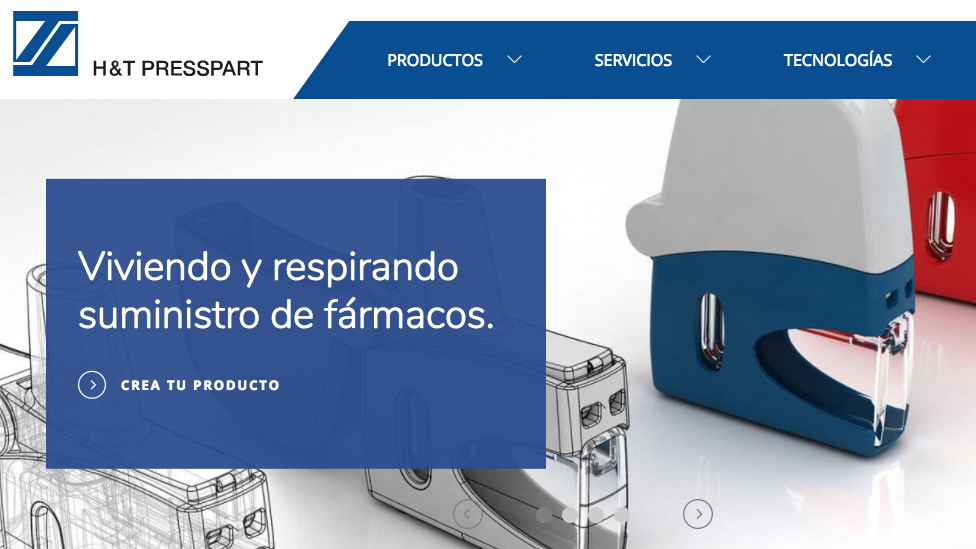
We created a clean and contemporary multi-lingual CMS and web design that presents H&T Presspart as a company at the cutting edge of innovation.
Background
H&T Presspart is a leading global supplier of components to the pharmaceutical sector, in particular those manufactured for respiratory drug delivery devices. Traditionally known as a specialist manufacturer, our client is also a leader in innovative products and technologies.
Challenge
With the healthcare industry ever evolving, our client needed a website design that would help them communicate that they’re more than a manufacturer: H&T Presspart’s expertise and passion for precision, quality and innovation make them a reliable partner to pharmaceutical companies developing new products and devices to improve the lives of patients.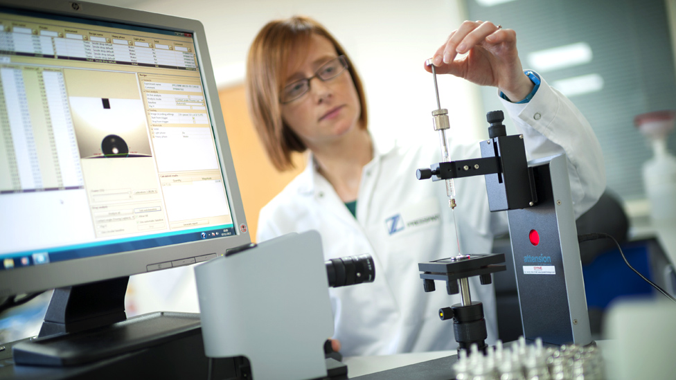
Solution
We created a multi-lingual CMS and web design that presents our client as a leader driven by their passion to innovate.
Moving away from conventional web design, the website includes two top navigation bars. This feature gives prominence to the four main areas in the client’s offering: the products and services that have built their reputation, and technologies and innovation – the two focus areas that reinforce H&T Presspart’s key role beyond manufacturing.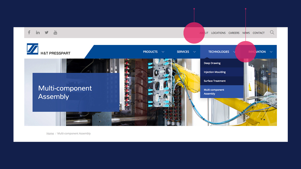
With large amounts of product information and images, we laid out the content in a variety of ways to strengthen our client’s message and keep visitors interested. A sliding carousel with striking product images and 3D renders of the recently launched PowdAir Plus inhaler, and engaging images of staff at work in the lab capture the attention of the audience straight away.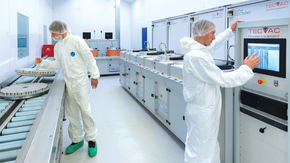
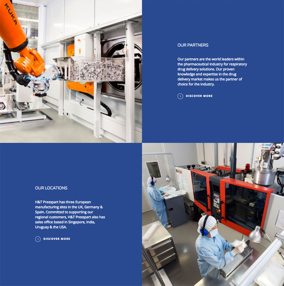
To maximise engagement, a modular grid layout offers a dynamic and interesting way of learning more about H&T Presspart, while a counter device – loaded at random with every page visit – highlights key achievements.
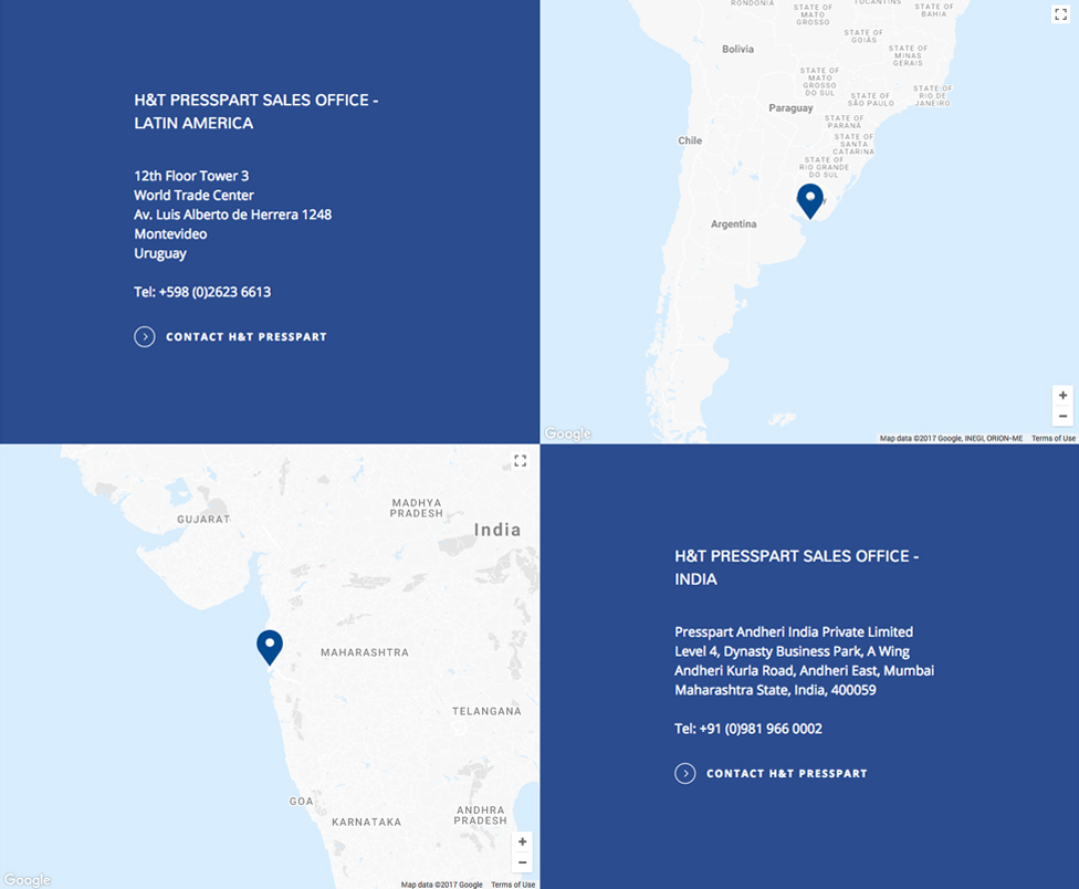
We opted for a rounded open font that perfectly complements the contemporary look and feel of the website.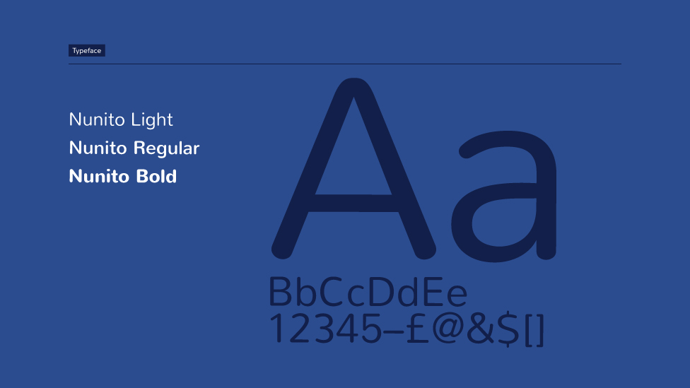 Interactive Google stylised maps reinforce our client’s global leadership.
Auto-complete search functionality provides better usability: root word recognition and predictive text improve the user experience by not only delivering search results with an exact keyword match, but internal tagging also enables related content suggestions, such as key product pages or the latest news and insight articles.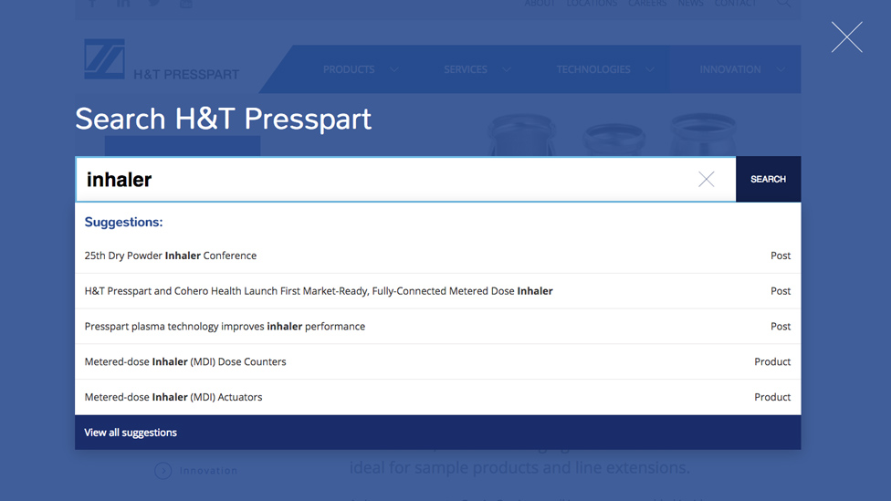
Mobile first design helps maximise SEO benefits: with users of mobile devices exceeding the number of people who own a desktop device, Google now treats the mobile version of a website as the primary page to index search results.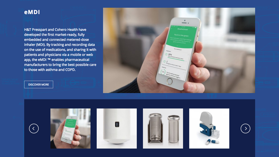
Media embedding and social sharing inject energy into the design and add an element of interactivity. Both features further enhance the online experience by encouraging users to engage with the content in a more personalised way.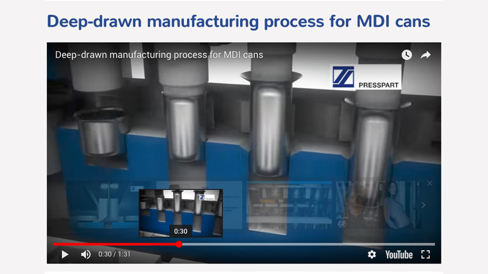
We have also produced translated versions of the website design for the German and Spanish markets.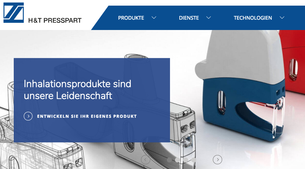
Highlights
- Hover animation on images adds a subtle dose of movement and draws visitors in to find out more.
- WordPress CMS allows client to adapt and grow content in line with business priorities.
- Ability to tag content and create product associations contributes to a seamless user experience.
- Multilingual support – localised versions are loaded automatically depending on geographical location.
“The team at Parker recently undertook a complete redesign and build of our company website, and they were brilliant.
They really understood our needs and what we were trying to achieve strategically with the new multi-lingual CMS and web design. They also took into account our strict corporate design guidelines, resulting in a slick, well designed, user-friendly and informative website.
I would not hesitate to recommend Parker Design for any website or general marketing needs. Great design, great communication, great company and most importantly great people.”
Marketing Manager, H&T Presspart
Take a look at other examples of website design.
Looking for help with your project?
Feel free to give us a call to start a conversation,
our doors are always open.
Related projects
Pascall+Watson
Hybrid stand design

Thomson Reuters
Multi-channel marketing campaign
LEO Pharma
Pharmaceutical stand design
