A new business logo design that helped our client appeal to a broad spectrum of customers.
Challenge
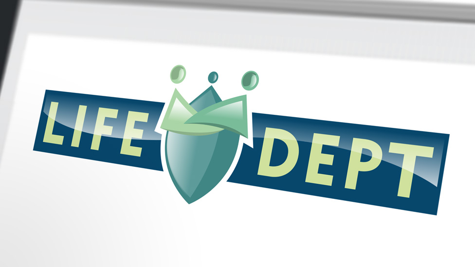
The Life Department is the brainchild of two former MoneySuperMarket Directors who, having worked with us on previous projects, wanted to discuss their new business logo design requirements. With the general public as the intended target market, the logo and branding needed to appeal to a broad spectrum of customers to help send the correct message about the business, and ultimately drive sales.
Solution
To begin, we got to know our client to discover the unique points of the new venture and generate a clear direction for the branding and logo design to follow. The outcomes – Protection, Family and Value – each developed as the key elements to the brand and became the starting point for the new logo design.
We worked up a number of concepts for the new logo design until we hit on the final concept. The chosen emblem was derived from a shield (signifying protection), three dots (heads-family) and the linking arms (nodding at the concept of value), all helping to emphasise the protection message.
A colour palette of light and fresh green hues with a strong base colour, and a modern typeface enclosed within the logotype, help the logo stand out when applied to a variety of digital media applications.
Looking for help with your project?
Feel free to give us a call to start a conversation,
our doors are always open.
Related projects

H&T Presspart
Branding strategy & development

INEOS
Company magazine design

AMBS
Identity development and application
