![]()
A fresh and contemporary colour palette of green tones, Nature as inspiration, and protection and sustainability are the key elements that helped make a success of this new logo design.
Challenge
Oakmere Lodge Country Park, set in the idyllic Cheshire countryside, were looking to update their image with a new logo design and marketing materials to satisfy their growing needs of their business, help drive awareness of the Park and uplift sales of their exclusive holiday lodge experiences. The new logo would have to transmit the essence of the rural location of the lodges as well as meet the high expectations of our Oakmere Lodge Country Park’s target audience.
Solution
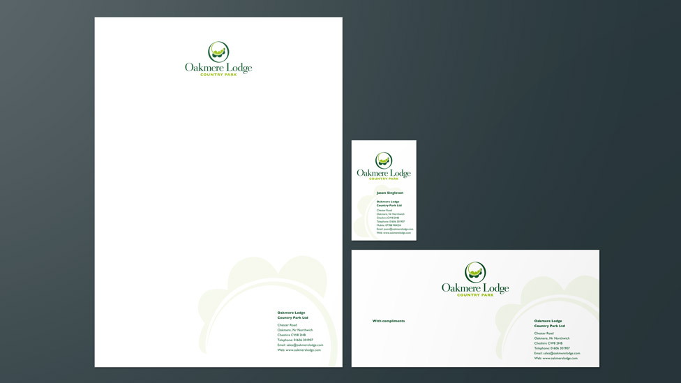
Inspired by the name of the Park, we created a logo design that is inspired by nature, where the shape of the letter ‘O’ is used to nod at the concept of protection. This, coupled with the addition of a colour palette of fresh green tones, helped bring the logotype to life, while also making visual reference to the idea of sustainability, a key element of the project.
The new logo design manages to perfectly combine the contemporary flavour of the lodges with a sense of classic tradition and comfort.
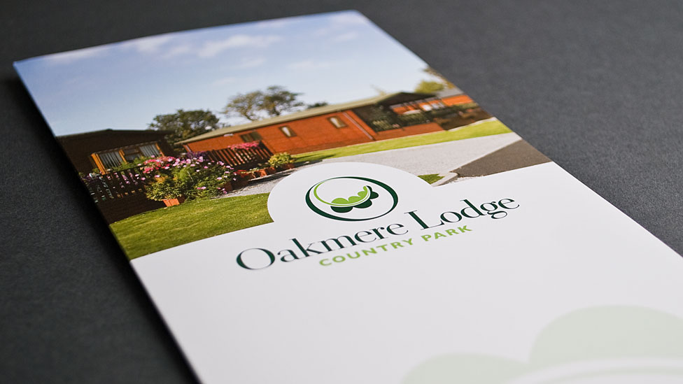
We carried through the logo design to a wide variety of sales and marketing collateral, such as promotional leaflets, outdoor signage and also stationery, guaranteeing a consistent visual experience for the customer at every touchpoint.
Looking for help with your project?
Feel free to give us a call to start a conversation,
our doors are always open.
Related projects

H&T Presspart
Branding strategy & development

Heat Pump Life
Interactive website design

INEOS
Company magazine design
