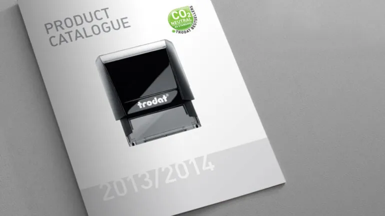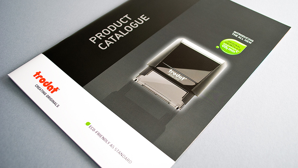
Inspired by Trodat’s innovative new products, we produced a distinctive and effective office catalogue design.
Challenge
We were asked to look at the company’s sales publication, produced annually to provide customers with a comprehensive and up-to-date list of our client’s offering. The office catalogue design had to feature a range of innovative climate-neutral products. By devising smaller, lighter stamps made up of 65% recycled plastic, Trodat had given themselves an even more competitive edge, something that needed to be a point of focus throughout the catalogue.
Solution
To achieve this we developed a green leaf icon to be used alongside product images. The colour and shape of the icon contrasts effectively with the red and black corporate colour scheme of the Trodat brand.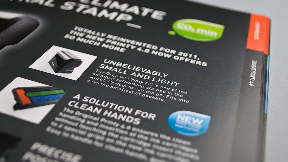
We also incorporated advert-style graphics dotted throughout the catalogue to highlight and promote the benefits of the new stamp.
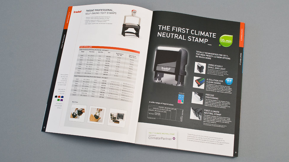
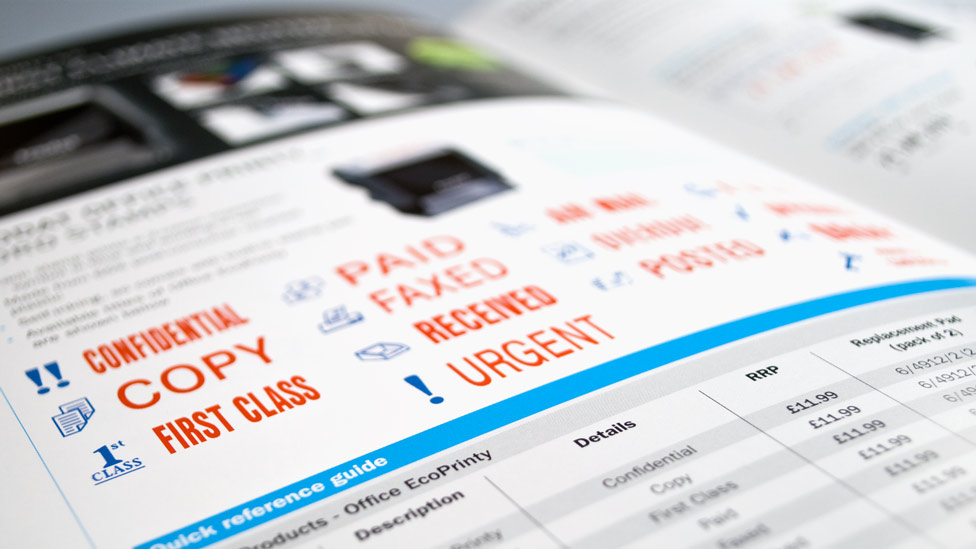 The supporting grid-based layout of the product photos and specification tables ensures a clear and legible office catalogue design. Included at the back of the catalogue are postable order forms for custom stamps, and a process walk-through graphic demonstrating how to order online.
“Parker Design are a friendly team of committed and reliable designers. They always listen to what we need and their creative ideas demonstrate a genuine understanding of our business and our customer base. The end results are always good quality and deadlines are always met.”
A black anti-scuff matte-laminate on the cover combined with the glossy effect of a Spot UV gives the office catalogue design a contemporary look.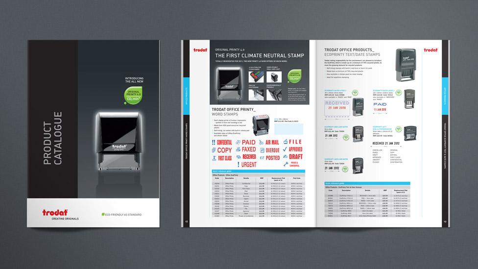
Have a look at other examples of effective catalogue design.
Looking for help with your project?
Feel free to give us a call to start a conversation,
our doors are always open.
Related projects
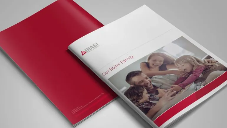
Biasi
Company catalogue design

United Utilities
Signage catalogue

Renray Healthcare
Product catalogue
