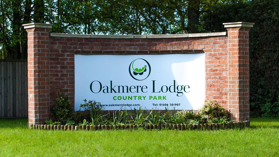
 We created a distinctive outdoor signage design that perfectly transmits the allure and exclusivity of the Oakmere Lodge development.
Background
Offering the perfect combination of peaceful and idyllic rural location in the heart of the Cheshire countryside, with a wide range of outdoor activities on offer, and its proximity to popular urban hubs in North West England such as Manchester, Liverpool and Chester, Oakmere Country Park boasts a selection of over 80 premium and exclusive holiday homes and lodges that enjoy breathtaking views of picturesque woodland and open fields.
Challenge
Our brief was to create a clean and crisp layout for the outdoor signage that would be just outside the Oakmere Lodge entrance, and it needed to be consistent with the corporate brand design we had recently created for our client.
Solution
To reflect the ethos of the park itself, we used modern fonts and a bright green colour scheme, while a bright white background ensures that the outdoor sign stands out against the foliage behind it, maximising visibility.
The signage design is large and clear to make sure it could be seen from the road it’s on. We ensured the contact details would take up minimum space on the sign to avoid distracting away from the logo itself as people drove past or approached the entrance to the park. We chose a substantial brickwork surround to reinforce the feeling of quality and presence which can be found inside the park, whilst durable materials were used for the sign itself to guarantee longevity and resistance to all weather conditions.
Looking for help with your project?
Feel free to give us a call to start a conversation,
our doors are always open.
Related projects

United Utilities
Signage catalogue
