LEO Pharma
Pharma booth design
A pharma booth design created to meet strict industry standards while delivering an engaging, interactive experience. The space showcased two licensed drugs, explored the science behind one in development, and captured delegate attention through AR and digital content.
A multinational research-based pharmaceutical company, LEO Pharma was founded in 1908 in Denmark and now has a presence in 100 countries. LEO’s global team of 6,000 people serves 92 million patients worldwide and specialises in dermatology primarily, as well as thrombosis and rare diseases.
As part of its promotional strategy, LEO Pharma was exhibiting in Milan at the World Congress of Dermatology (WCD), a truly global meeting with over 14,000 delegates coming from more than 140 countries.
Two products, one overarching brand
Our client had secured two adjacent plots in the exhibition hall, and our brief was to develop a pharma booth design to promote two different products: one a well-established brand, the other a fully licensed but newer offering that required greater promotional focus.
Whilst promoting both drugs as individual brands in their own right, we would also need to find a way to communicate to delegates that they were both part of the overarching LEO Pharma brand.
Also within the same exhibiting space, our brief was to help showcase LEO Pharma’s efforts to treat atopic dermatitis, a condition the company is developing a drug for. Currently in the initial stages of a clinical trial, the drug is therefore not yet licensed and, in line with the pharmaceutical industry strict regulations, not eligible for active promotional activity.
The plots also needed to contain a small area to promote 12 other well-established LEO Pharma drugs, as well as a space for a private medical information booth.
Another challenge when tackling this pharma booth design project was how to divide up the two plots our client had booked, and how to allocate floor space to the different promotional and non promotional areas, having to base our decision on the different budget allocations for each of the sub-brands and the new drug under development.
Planned to perform
We invested time at the start of the project on detailed drawings and the thorough planning of both plots, taking into account dimensions (20x6m and 15x3m), logistical considerations and Italy’s regulations on pharma promotions.
The project’s exhibitions design team flew to Milan for a day to carry out a site survey to establish key logistics information, such as the positioning of rigging points. The site survey also revealed that half of the space allocated for the pharma booth was positioned below an overhang of the top floor of the exhibitions hall, where delegate registration desks were located, and that there was a column right in the middle of the front plot, and which we would need to design and build around.
A visually cohesive space
Whereas traditionally each plot needed to be considered an individual area, physically independent from other plots, we asked for special dispensation from the exhibition organisers and created a walkway to join up both LEO Pharma plots, which we fully carpeted with a similar neutral on-brand tone to the flooring surfaces in the front and back plots, visually turning the two spaces into one.
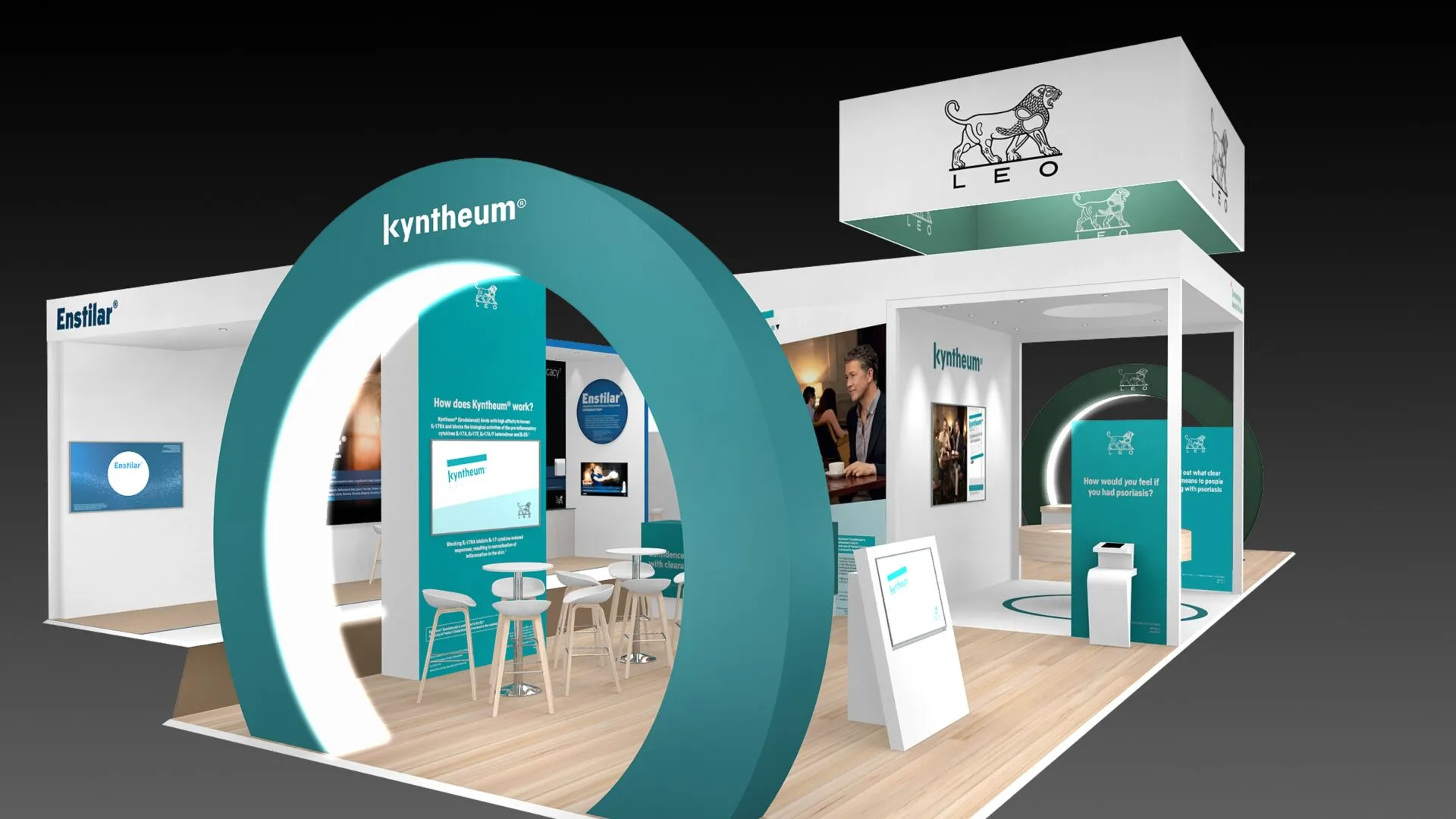
To further instil in delegates the idea that both were LEO Pharma spaces, we built two ‘bridges’ with lighting over the top to help create a unique and visually cohesive space.
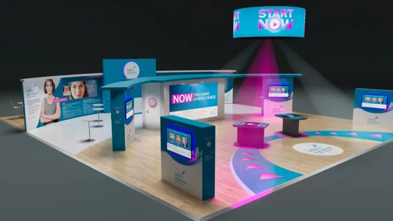
Stand renders
A focal point with emotional depth
In the prime promotional area, an AR (Augmented Reality) experience had delegates flocking.
A circular plinth with a white sculpture of a torso flanked by two iPads acted as a central focal point. With the LEO Pharma space being located on the edge of the exhibition hall, between the escalators, the torso generated immediate curiosity amongst delegates approaching the front of the stand. The iPads had been pre-programmed with AR software and, tethered to the torso, gave delegates the power to superimpose the image of a psoriasis-suffering swimmer onto the sculpture. Another iPad on a small bespoke console was also programmed to scan a delegate’s hand and project its equivalent live 3D model, but now affected by psoriasis. After virtually overlying psoriasis on their hands, delegates were able to alter the intensity of the condition via a +/- scale on the iPad’s touchscreen. This was a highly effective way of creating an emotional connection and putting delegates, the majority of them doctors, in the minds of patients, instead of focusing only on the drug from a pharmacological point of view.
The space also included a 90-inch screen for promotional messages, two smaller touchscreens, a large graphic taking over one of the walls, a coffee area for delegates to relax and network, two storage areas for collateral and coffee supplies, and a fridge. To conceal the column in the middle of the plot, we built one of the storage spaces around it, just behind the 90-inch screen.
The location of both spaces within the hall was also a key focus when developing the pharma booth design in order to maximise our client’s investment in the congress.
With the majority of delegates accessing the exhibition hall via an escalator just opposite one of the LEO Pharma plots, we capitalised on this and dedicated this prime spot to the promotion of the newer brand. Thinking of the delegate journey as visitors used the escalators to descend to the main exhibiting hall, and inspired by elements of our client’s brand, we built a circular structure that almost acts as a tunnel, funnelling in visitors as they step off the escalators. Internally illuminated, the imposing circular shape acted as a beacon of light in the hall, and also helped transmit the message of one unified and overarching LEO Pharma brand.
Shaping a unified experience
We subtly carried the circle theme across other areas of the exhibiting space, such as circular shapes on the floor and on some of the walls and props, tying up all elements together from a brand perspective. We also built another tunnel-like structure to welcome visitors to the non promotional section, dedicated to exhibit our client’s research in the treatment of atopic dermatitis.
Maximising the use of exhibiting space allowed above the plot (not exceeding 5 metres), we built a LEO-branded suspended canopy structure that helps visually demarcate the LEO Pharma space, crowning the pharma booth design and commanding attention from all corners of the hall.
Once within the stand, delegates had a wide range of content to engage with both licensed and non licensed products and the LEO teams.
Wise use of space
Our crew also built in a separate AV store area and worked carefully within the design and build parameters to utilise the space wisely, concealing all the cabling within the structure.
Having reached it through another archway at the other end of the front plot, mirroring the circular structure we had built, the atopic dermatitis area invites delegates to embark on a fact-finding mission which will help them learn about the new drug in development through interactive play.
As this was still in its early stages and not yet licensed or with its own brand, we branded the space in LEO Pharma’s generic dark green.
Technology to engage
Props in the shape of a magnifying glass were used to house mobile phones, with each of them giving visitors a set of instructions to follow.
For the mission to be completed successfully, delegates would need to use the mobile phone to hit various clue-revealing trigger points distributed across the exhibition space: on lightboxes, posters, podium… Once all information had been collected, the next stage of the mission was to lay the mobile phones on an interactive table which played a PowerPoint presentation revealing the drug’s MOA (mechanism of action).
This was not only an engaging way to learn about the drug under trial, but it also communicated our client’s focus on technology and innovation.
Beyond the spotlight
The smaller, less prominent plot at the back of the pharma booth included an area for private conversations, a collateral storage unit and promotional screens. Also within the smaller plot at the back was a small medical information area, semi-confined and separate from the rest to comply with pharma industry regulations in Italy.
Throughout the duration of the conference, our technical team remained on site to ensure everything worked seamlessly, guaranteeing the best results for delegates and our client.
Pharma booth design
solutions, tailored to you
We’re confident we can help, so why not drop us a message? We’d love to hear from you.
Take a look at other pharma booth design projects
LEO Pharma
Pharma trade show stand
Sandoz
Pharma exhibition booth
LEO Pharma
Pharmaceutical stand
