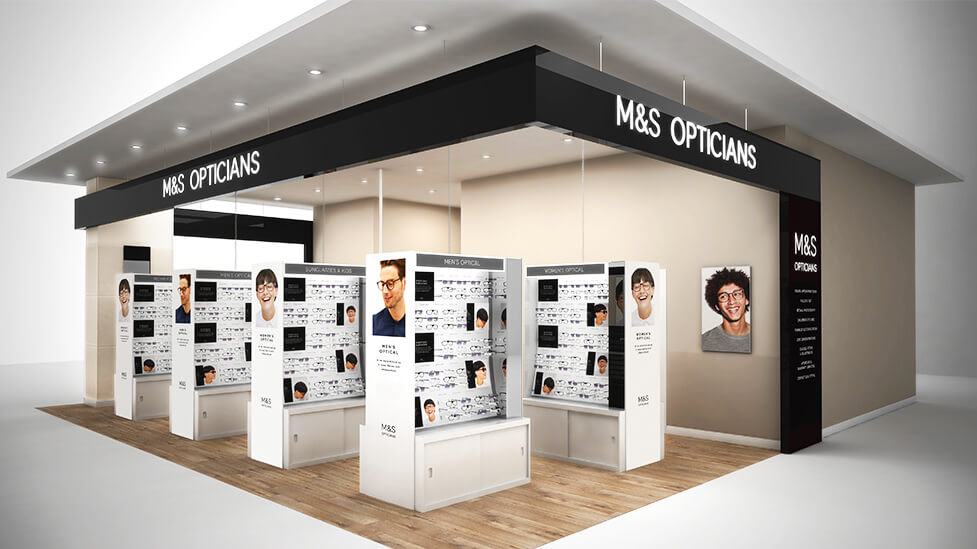
Visually striking in its simplicity, this M&S-branded retail display design transmits the essence of the brand – forward-looking, premium, affordable quality that lasts.
Background
How do you create a real point of differentiation between online retail, its continually growing power over consumers, and traditional bricks and mortar retail? You offer an experience, one that allows customers to comfortably interact with products before they buy, in spaces which attract and engage from afar.
Challenge
Marks & Spencer had teamed up with our client – expert clinical and retail optometrists who specialise in creating white label in-store opticians – as part of a new initiative. The project would see them embark on a trial of M&S-branded opticians across five flagship Marks and Spencer stores, with a view to roll out nationwide.
For each of the five stores we had a fairly tight footprint to work on, as well as different configurations and locations within each M&S shop floor – some of the new opticians spaces may have been next to the M&S Café, others next to Womenswear, perhaps Beauty, Food, or Furniture. And that’s why our retail display design had to be fully adaptable without losing impact, regardless of floor space available or where in the store it would be located.
Solution
Keeping within M&S’s strict brand guidelines on types of materials, lighting fixtures and general fit-out standards, we produced a number of different retail display design concepts for our client to include in their proposal to M&S.
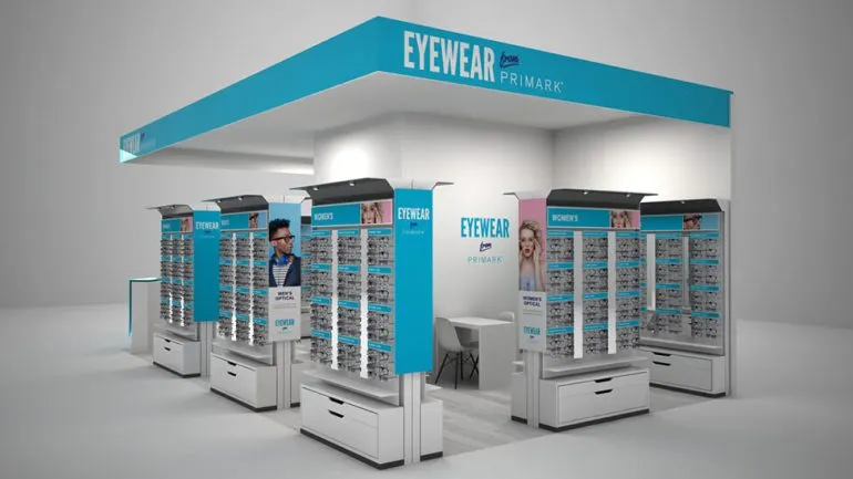
We provided our client with CGI visuals to make the decision-making process as easy as possible. The realistic renders helped boost our client’s proposal, allowing them to present M&S with a set of ideas that would easily integrate in any of the trial stores. 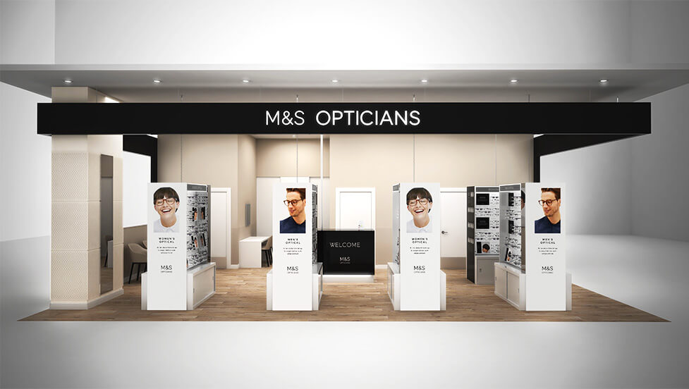
The modern, crisp units are the perfect reflection of the M&S brand – premium yet within reach, fresh and also robust – hinting at the affordable quality M&S is renowned for.
The M&S brand really stands out thanks to high level signage and back-lit illuminated signs, perfectly integrating with the rest of the store.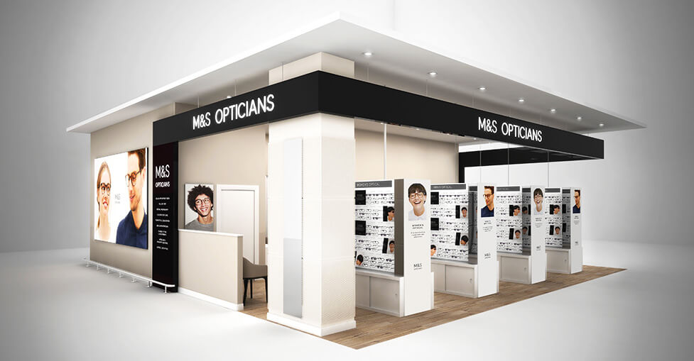
We went a step further – as well as CGIs we provided realistic visualisations of the M&S-branded opticians spaces set within real stores.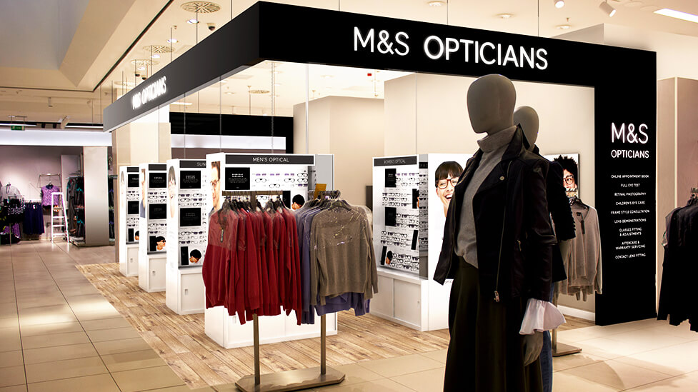
After organising a photoshoot in each of the five trial stores, we retouched and superimposed the new retail display design concepts onto the photographs. The resulting images gave M&S visual confirmation that both existing and new spaces would work in harmony, with the new retail areas feeling like an integral part of the overall M&S in-store experience.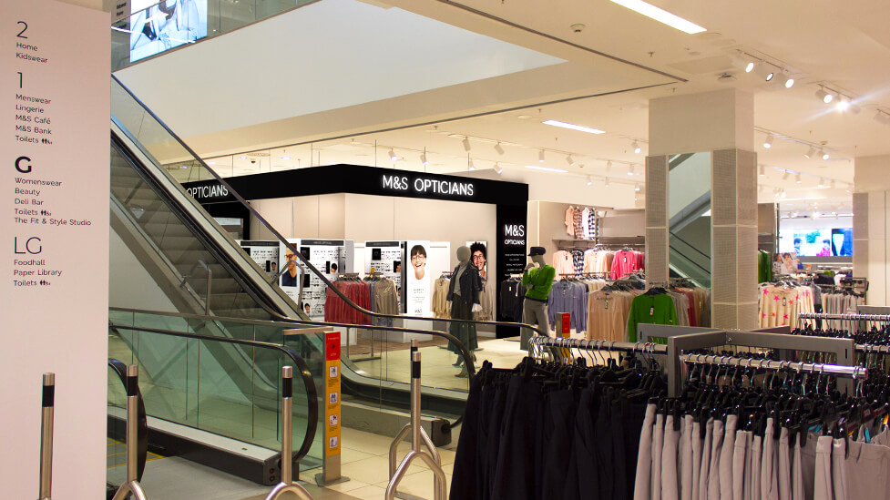
When producing the in-store visuals, we considered different lighting options to ensure they integrated seamlessly with existing lighting fixtures. We also worked closely with our client on naming conventions for the exclusively-designed frames, as well as name cards, paying special attention to how to showcase them on the display units.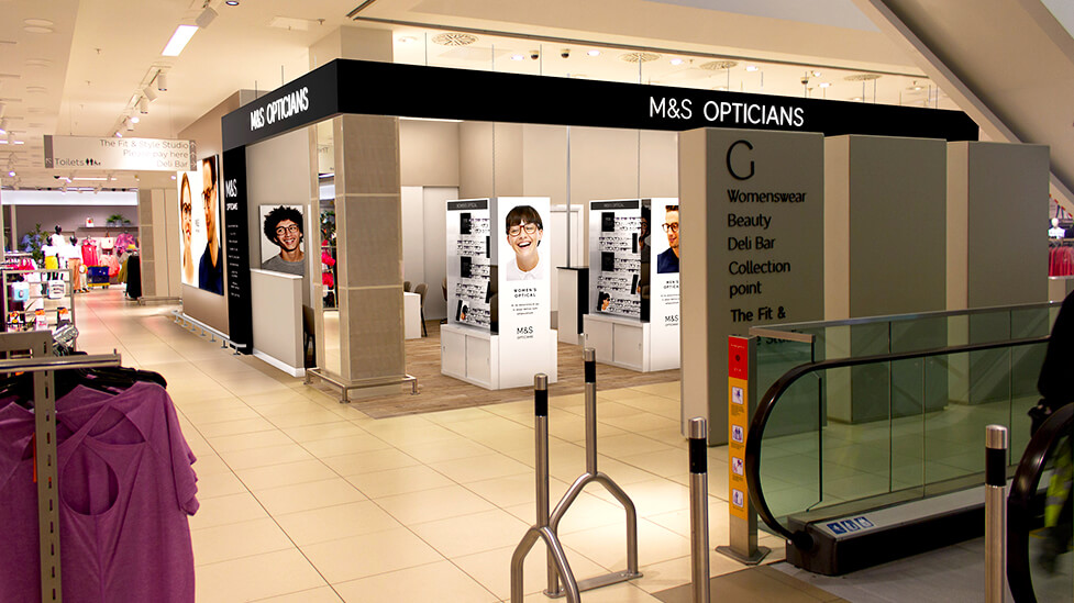
Looking for help with your project?
Feel free to give us a call to start a conversation,
our doors are always open.
Related projects

Aldrich Group
Commercial landlord pack design
Air Products
Retail brand design
In-store Opticians
Retail POS design
