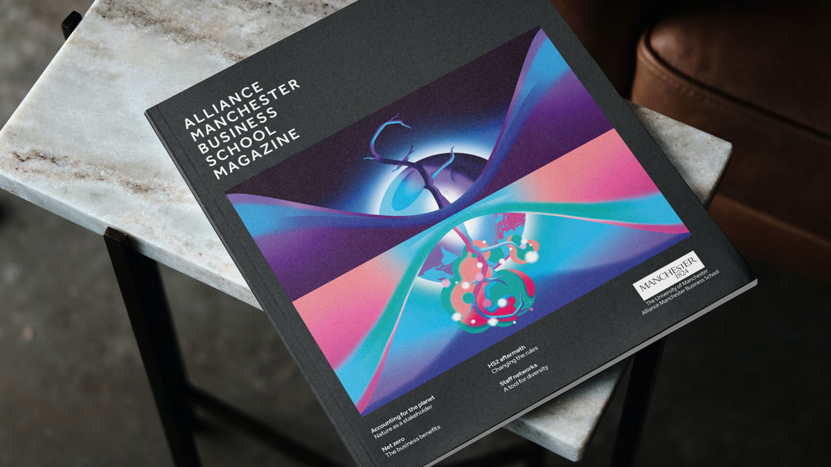
The fourth time we’ve collaborated with our client on a printed magazine design, this edition opens with a striking conceptual illustration to trigger a sense of intrigue in the audience.
Background
Alliance Manchester Business School alumni, staff, corporates and academics, make up the target audience for the School’s quarterly magazine. Filled with interviews and thought leadership articles, the magazine is now in its 12th edition.
Challenge
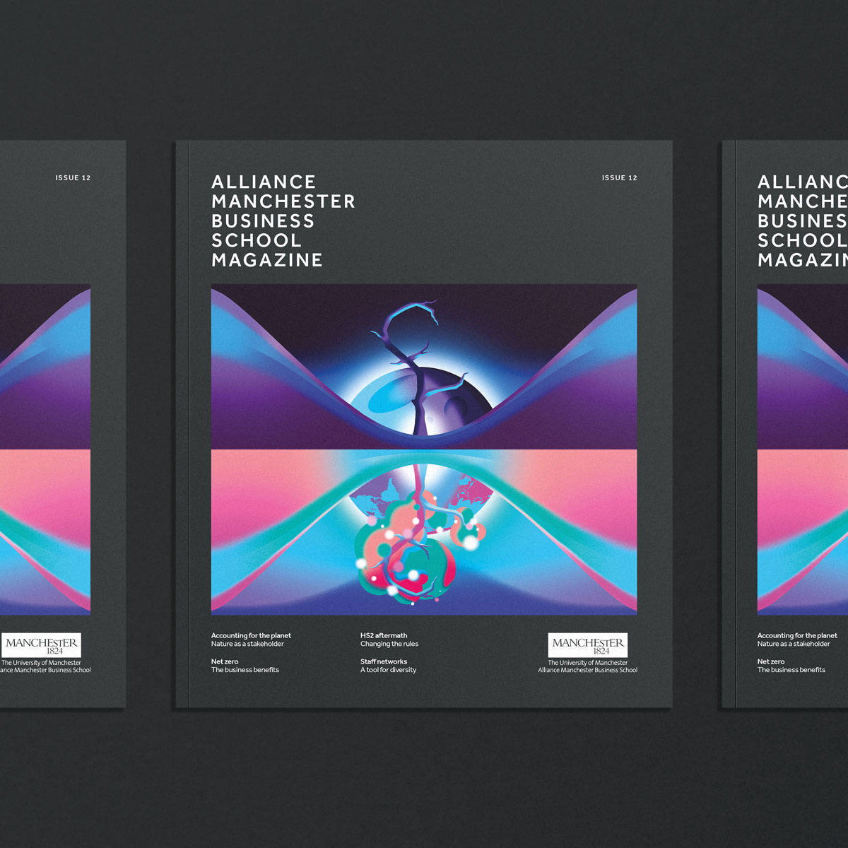
Like with the previous magazine we had also designed, the brief again specified that the magazine design should help it stand out on its own, deviating from other AMBS collateral whilst still applying the same colour palette and typography.
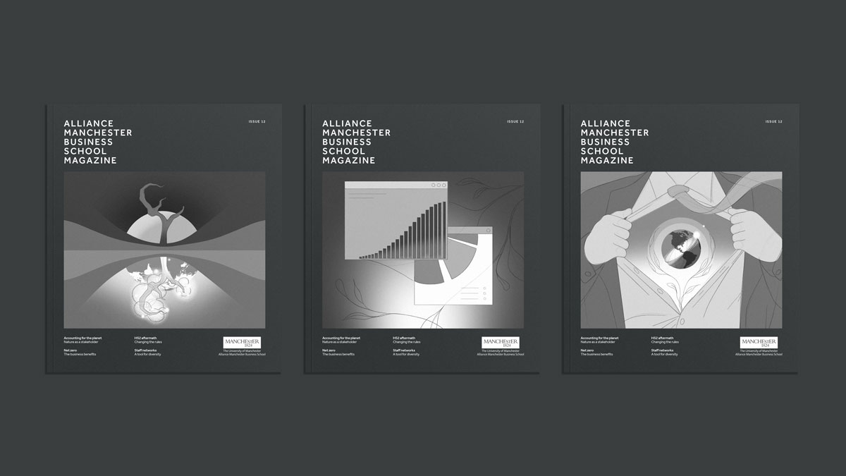
For immediate audience engagement, the cover is one key element of the magazine that our client pays special attention to, relying on the use of illustration since Issue 09, when we started collaborating with our client on the design of the magazine. For this edition, our client was open to the idea of a totally new approach for the cover, with the complex topics that are covered in the magazine requiring a highly creative and conceptual illustration style.
Our client was specific on requirements for the cover illustration: with a strong connection to Manchester, the illustrator should visually represent the idea that, as demands on our planet continue growing, there is a consensus that Nature must be considered an active stakeholder, with some even arguing that Nature should have a place on the board, a suggestion that goes far beyond traditional ways of approaching corporate social responsibility.
The brief continues: the cover illustration should convey that currently businesses are not held accountable for the cost implications and the impact their activities have on the environment, on wildlife, and on our communities. The argument is that this would not be the case if Nature was classed as a stakeholder.
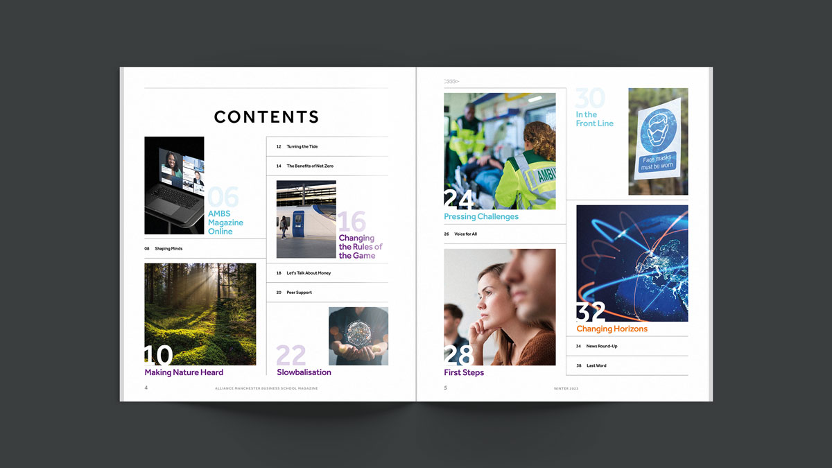
Regarding the design of the magazine beyond the cover, the overall structure and page layouts should consider the large amount of complex content they would need to fit comfortably.
Solution
Starting with the cover illustration, we commissioned Manchester-based Ollie Hirst. With a natural affinity to highly complex subjects such as technology, science, health and the human experience, the award-winning conceptual illustrator was the perfect choice to tackle and create a visual summary of what it means to consider Nature as a stakeholder, the lead story in this edition.
Split into two halves, the illustration shows the consequences of adopting change vs. doing nothing to turn the tide. In the top half, the tree and its branches take the shape of a £ symbol, a clever way of linking the well-used graphic device for sustainability and nature – a tree – to the business landscape.
Below, the three initial concepts presented by the illustrator.
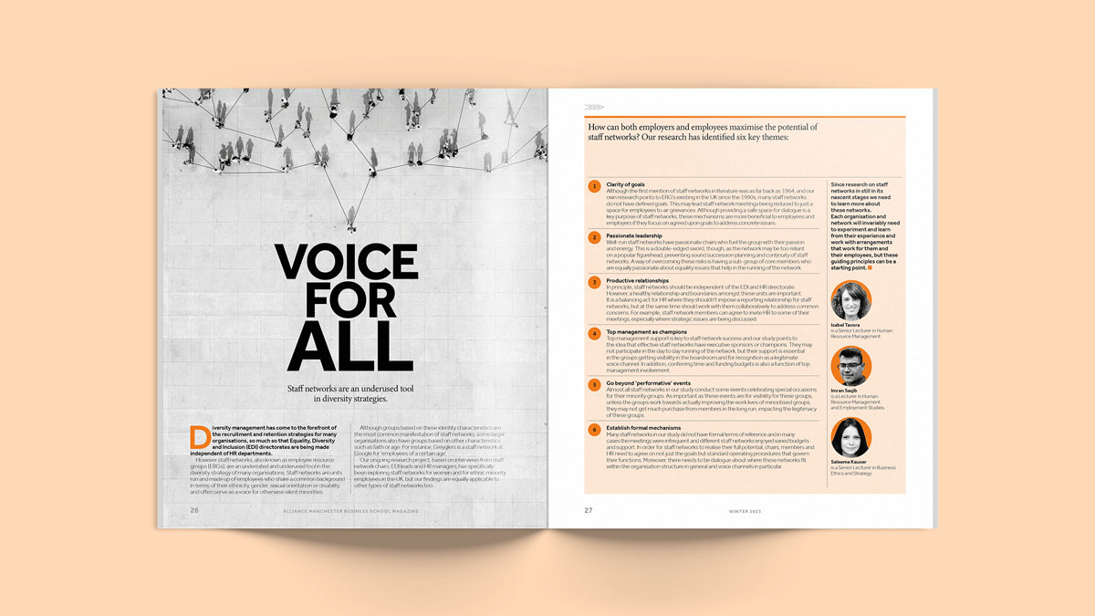
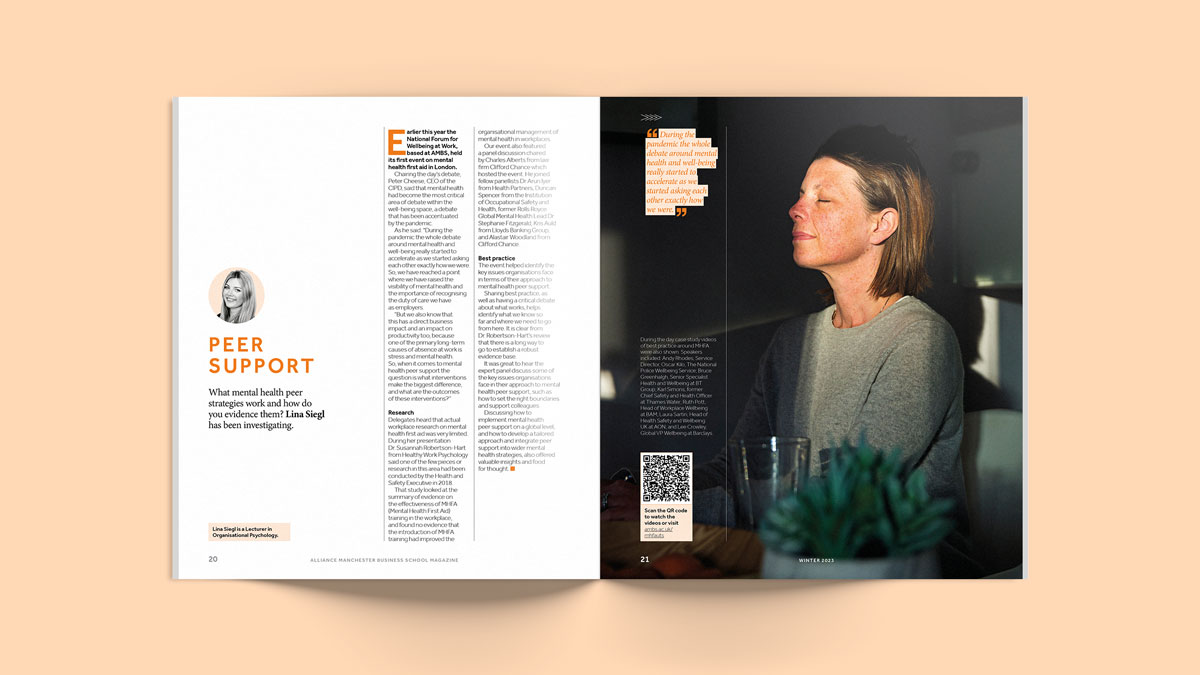
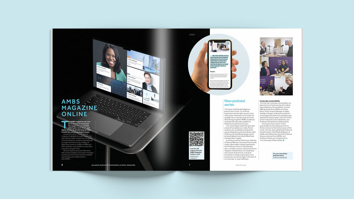
Following our client’s direction, the design of the pages of the magazine stands out from other AMBS printed collateral. The manageable bespoke format, which we introduced in Issue 09, turns the magazine into a unique and attractive piece that audiences are eager to pick up, and find difficult to put down. Colours and typography respect the brand’s look and feel, but are given their own treatment adding to the magazine feeling like an independent entity.
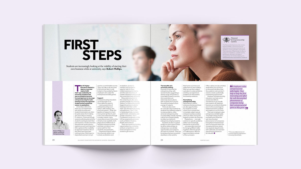
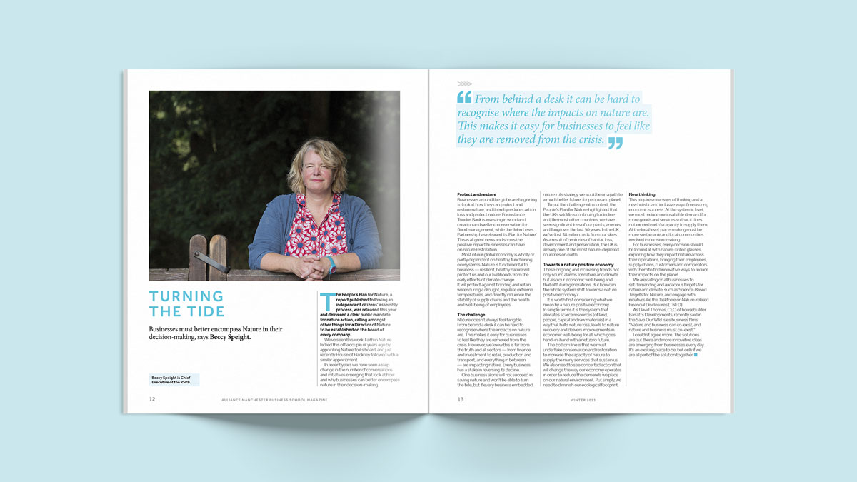
Large fonts and upper case headings introduce the articles, and colour highlights give prominence to quotes. Photography, all sourced by us, is a combination of conceptual and editorial style images that make a mark in the mind of the reader.
We managed the print on FSC-approved paper of a 500-volume run, and in line with the magazine’s sustainability focus, this edition served to launch the online version, which we also designed for our client.

Looking for help with your project?
Feel free to give us a call to start a conversation,
our doors are always open.
Related projects

Abbey Gate College
School magazine design

Exodus
Magazine design and content

AMBS
Online magazine design
