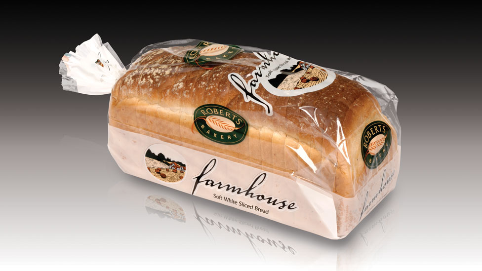
We created an effective and adaptable packaging design that allowed shoppers to appreciate first-hand the product quality – to almost feel it and taste it – acting as a trigger to purchase.
Background
With over 200 individual product lines sitting on the shelves of major supermarkets and independent retailers, Roberts Bakery understand the direct impact great product packaging design has on sales figures.
Challenge
With a wide range of loaves ranging from traditional staples such as white and brown sliced bread, to bloomers, wheatgrains, or cranberry loaves, it was essential to suggest a design formula that could be rolled out across the entire range, allowing each to be distinctive, yet easily identifiable as a Roberts Bakery product. The design also had to offer flexibility to be adapted to a wide range of morning goods, such as rolls and muffins.
Solution
We established that the reason behind our client’s success is the quality of their products, so we introduced a ‘window’ on the packaging design.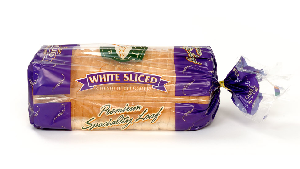
This allowed shoppers to appreciate first-hand the quality of the product – to almost feel it and taste it – acting as a trigger for purchasing.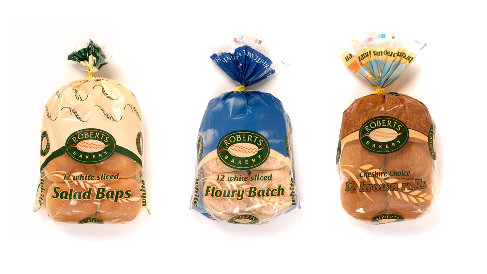 To ensure visual consistency across the whole Roberts Bakery range, particularly around the positioning of the Roberts brand, we placed the logo in the same prominent area on each design, giving it maximum exposure and tying the full range together.
We also developed a bright and distinctive colour palette, giving each product its own personality and presence on busy supermarket shelves.
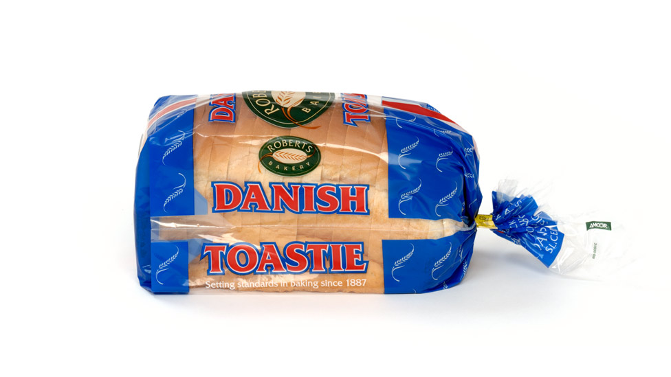
Taking the iconic wheatsheaf graphic featured in the Roberts Bakery logo, we used it as a subtle repeat pattern on each of the product packaging designs adding an extra element of branding.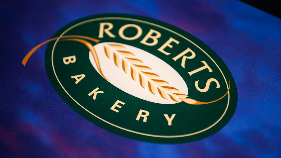
Choice of typography played a major part in the success of the design, requiring just the right style to complement the product.
The refreshed packaging design gave the entire range a lift and now matched the high quality of the product inside. The brand positioning was elevated considerably too by the vastly improved use of the Roberts logo, giving them a much better shelf presence and increased customer awareness.
“Parker Design have helped us to update and harmonise our brand image through refreshing our product packaging design and promotional items.
They listened carefully to our design brief and, taking account of both our sales and production requirements, produced innovative, creative, and feasible ideas.”
Looking for help with your project?
Feel free to give us a call to start a conversation,
our doors are always open.
Related projects
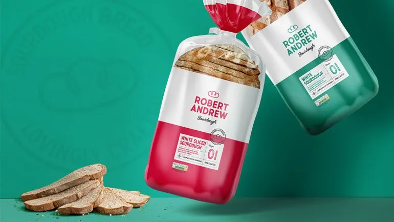
Robert Andrew
Branding and packaging design
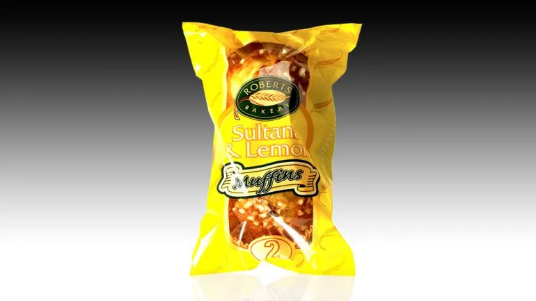
Roberts Bakery
Bakery packaging design
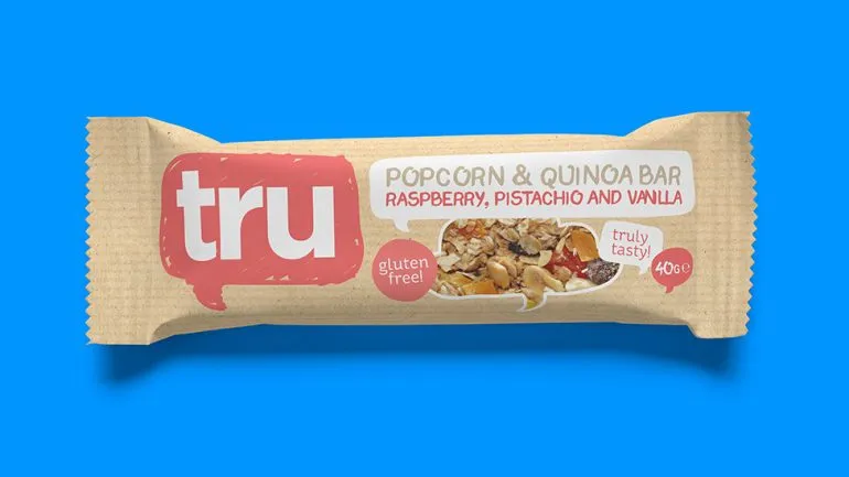
Tru
Food packaging design
