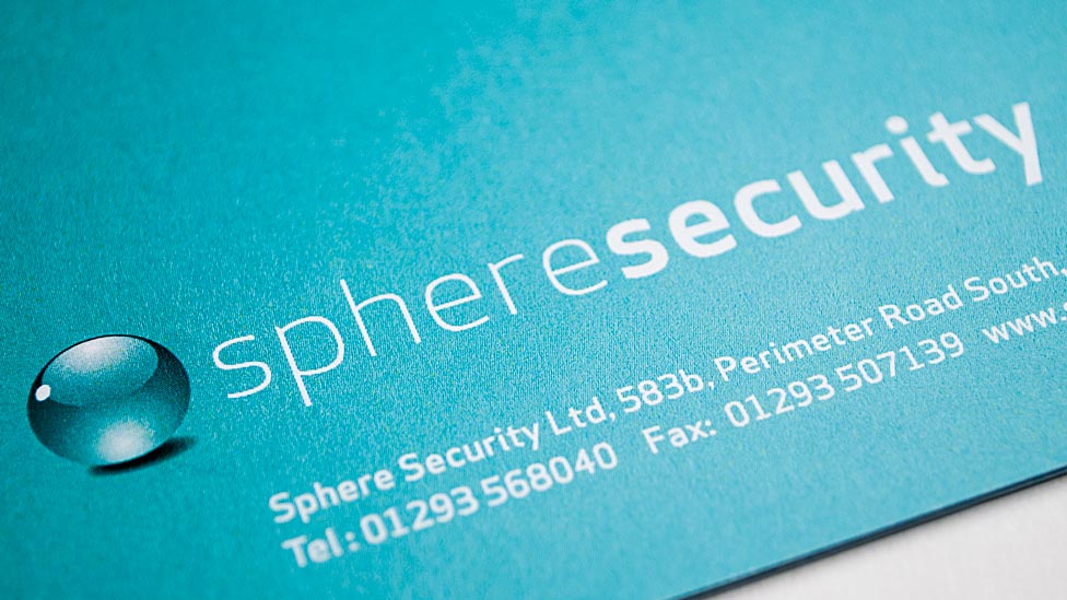
We developed a distinctive colour palette of black and aqua green, which when complemented with contemporary crisp typography, gave our client a fresh and memorable security logo design.
Challenge
To be able to remain relevant in an extremely competitive sector, our client Sphere Security needed a brand new identity, so creating a new logo was the central part of our brand development project.
As technology-focused security specialists, Sphere’s security logo design needed to look modern and sharp, reflecting the services they offered and creating the right impression.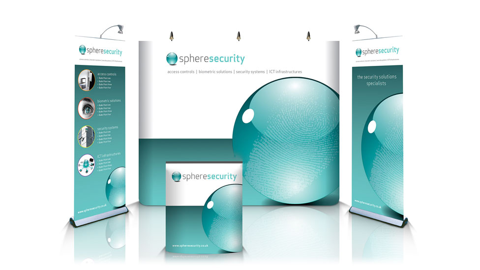
Solution
A highly polished translucent glass sphere hints at the highly technical nature of our client’s products. As well as evoking the company name, the glass sphere represents strength, solidity and clarity – a nod to what audiences expect of a security company.
Staying away from navy blue and grey tones commonly associated with security companies, we developed a distinctive colour palette comprising of black and aqua green, making Sphere highly visible instead of just blending in. 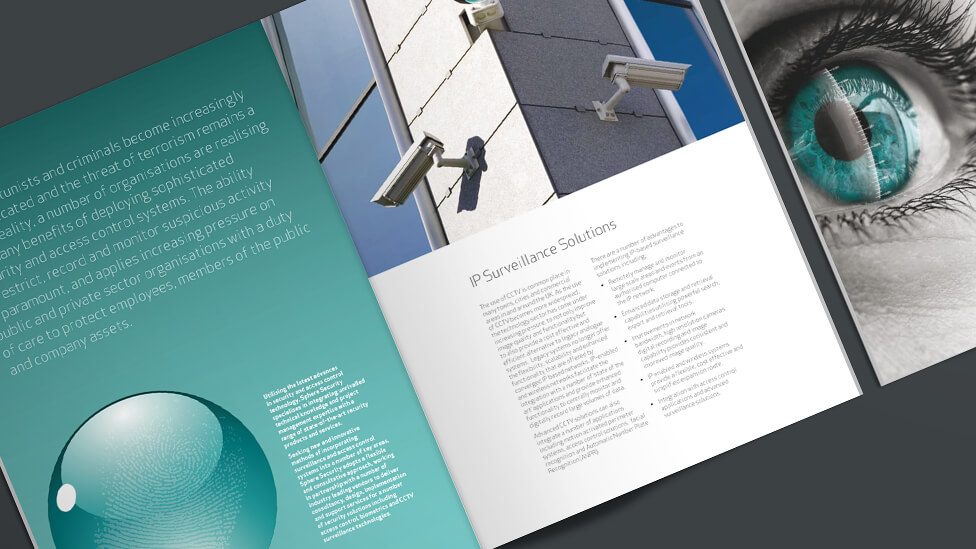
Complemented with contemporary crisp typography, the new security logo design is fresh, memorable and really helps our client rise above competitors. The new identity increases credibility in a competitive market, as it transmits an air of solid professionalism, yet fluid and dynamic at the same time.
Looking for help with your project?
Feel free to give us a call to start a conversation,
our doors are always open.
Related projects
CuraTeQ
Healthcare website design
H&T Presspart
Branding strategy & development

Ventient Energy
Corporate cyber security video
