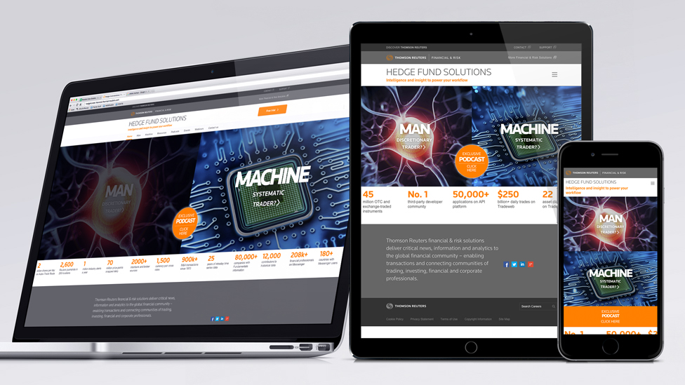
This effective web design captured the attention of hedge fund managers through a sophisticated and engaging digital strategy, and resulted in an 81% increase in monthly website traffic.
Background
The UK is the centre of the hedge fund industry in Europe, managing over four fifths of all hedge fund investments for the continent.
Seeking to tap into the complex psychology of traders, Thomson Reuters asked Parker Design to deliver a web design and digital strategy that would promote the performance benefits of Eikon, its analytics software.
Challenge
Hedge fund managers typically fall into one of two very different trading categories: Systematic and Discretionary.
While “Systematic” traders tend to value algorithmic models and historical data to inform their investment decisions, “Discretionary” traders are guided by their instincts and knowledge of the market.
The website design had to incorporate these two very different styles while demonstrating Eikon’s performance benefits.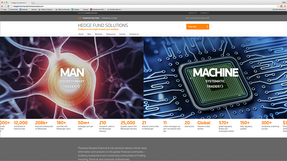
Solution
We conducted research that revealed where and how traders consume media, which helped establish the basis for our design and strategy: ‘Man versus Machine’ – focused on the microsite and driving traffic to it from a variety of digital and offline channels.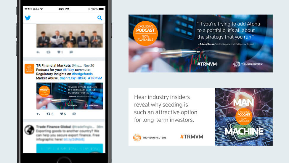

Digital Strategy Components
Microsite – to act as a central anchor for campaign traffic and encourage traders to find out more about the product
Programmatic Digital Banner Campaign – used to target the hedge fund community through prospecting on relevant websites and retargeting thereafter
Podcast Series – we produced six episodes of the Man v Machine podcast featuring industry experts speaking about key issues. These were housed on the microsite
Email Campaign – six emails were developed to coordinate with the direct marketing material to drive traffic to the microsite and promote the latest Man v Machine podcast episode
Social Media – we developed social content to engage the audience and generate interest in the latest podcast episodes, driving traffic directly to the microsite.
One of the six emails was developed to work in tandem with the direct mail element.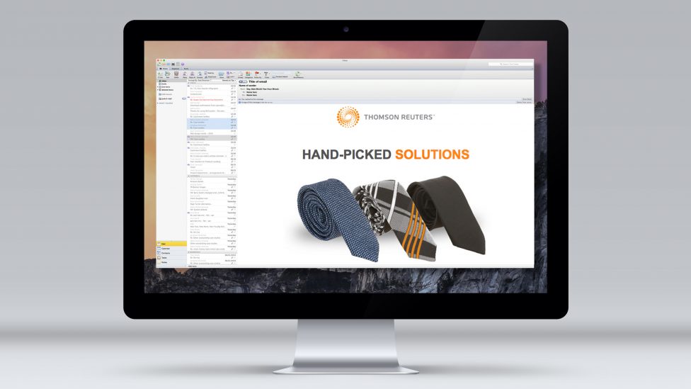
The creative treatment hints at Eikon’s tailored approach, based on two different trading styles.
The Man versus Machine campaign also included a Direct Mail element. The tailoring theme runs through it: spools of thread double up as web keys that link through to engaging content. 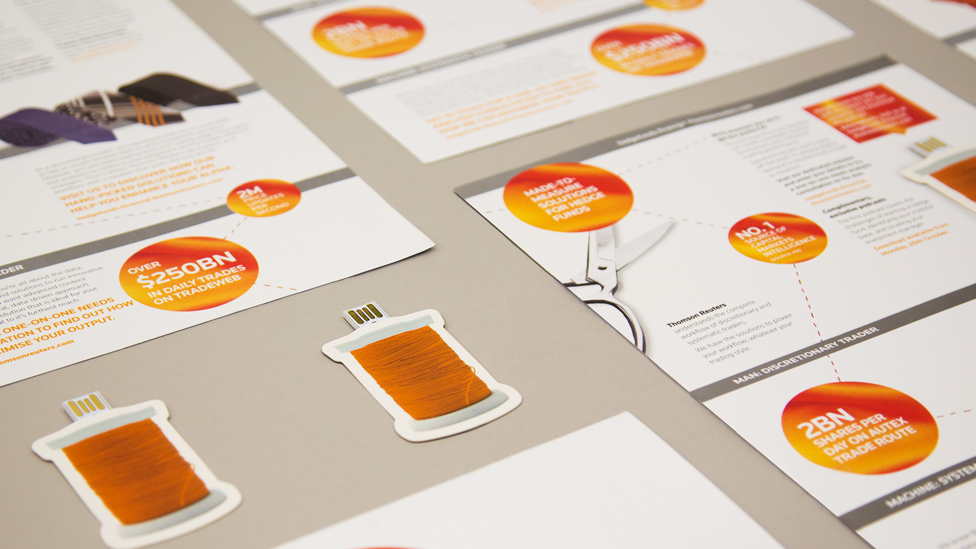
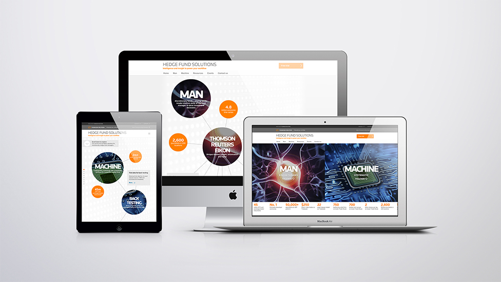
For the website, we built on the concept of “Man versus Machine” and developed two distinct user experiences online.
To encourage immediate engagement, our team split the home screen between the two options with high quality graphics and pushed visitors towards the hedge fund content that matched their preferred trading style. Based on their selection, traders could scroll through a unique infographic with insights and interactive content that spiralled out as they moved through the site.
The website also offered in-depth product information to highlight Eikon’s key features and encourage traders to participate in a free trial.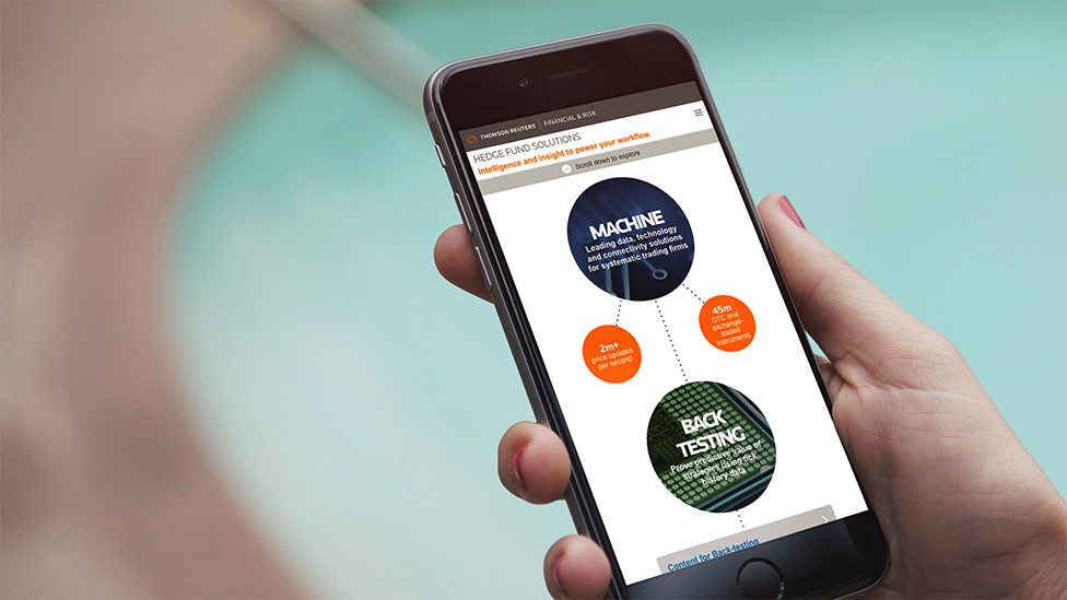
By using a parallax web design, our creative and digital teams were able to develop an interactive experience for viewers that helped trigger increased engagement among their target audience and promote the product features that best fit their investment needs and preferences.
The website also offered high-level or in-depth information, depending on what users wanted and coordinated visual components with the existing company to reinforce the client’s status as a financial industry thought leader and innovator.
Campaign results
81% uplift in monthly website traffic throughout the campaign.
9.5% click-through-rate from web keys and direct traffic to the microsite via URL.
Click-through-rate of 0.07% (above benchmark) and a 7% average conversion rate for digital banners.
LinkedIn impressions: 624,866
Podcasts 349 unique plays.
Looking for help with your project?
Feel free to give us a call to start a conversation,
our doors are always open.
Related projects

Robert Andrew
Brand launch and marketing strategy

European Diesel Card
Web development and digital strategy
The GTC Group
Company brochure
