Infographic Design – 10 infographics to engage your audience
We’re exposed to more content than ever, so making an impact quickly is crucial. That’s where visuals excel. With our brains processing images up to 60,000 times faster than text, and more than 90% of the information we take in being visual, strong design is essential for clear and effective communication.
That’s why infographics are such a valuable tool for businesses, marketers and internal teams alike. To show how effective they can be, we’ve pulled together 10 real examples of how our clients have used infographics to connect with their audiences, whether to educate, persuade or inspire.
1 – Spark a conversation
Whether you’re running a campaign, gathering feedback or encouraging internal discussions, a well-crafted infographic is a powerful way to initiate conversation. Designed to reflect your message and tone of voice, it can be structured to prompt interaction and create a lasting impression.
A custom approach ensures the design aligns with your brand identity while clearly communicating your message. Whether used in a social media poll or to pose thought-provoking questions to your team, the right visuals can break the ice and keep your audience talking.
“A well-crafted, custom infographic exudes professionalism and credibility. For businesses aiming to build authority or thought leadership, investing in distinctive, high-quality visuals helps convey credibility and attention to detail – boosting the impact and perceived value of the message.”
Pete McMonagle, Art Director
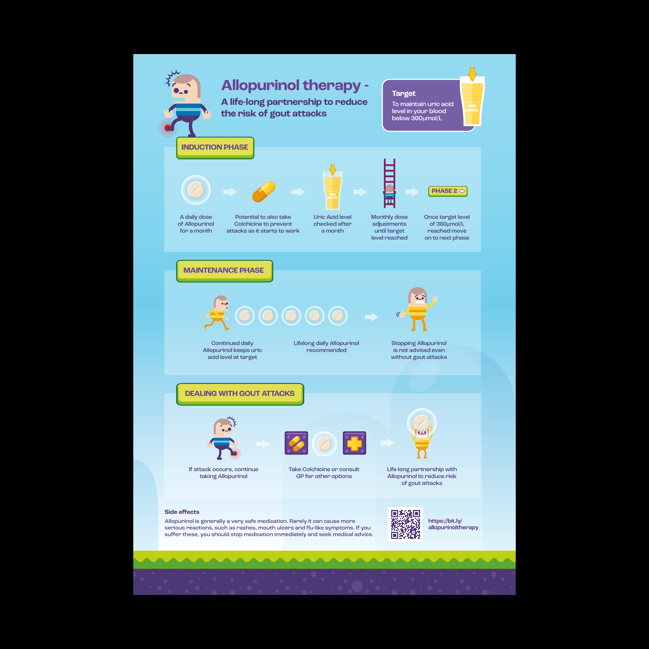
2 – Educate to show you care
When traditional communication methods failed to resonate with patients, Professor Patrick Kiely at St George’s Hospital needed a new solution. We delivered it through a carefully tailored infographic and animation – visually distinctive and inspired by the nostalgic charm of 1980s arcade games.
This wasn’t just about looking different, it was about engaging patients in a way that was meaningful. The design supported the message clearly and memorably, showing how a well-thought-out visual can deliver education with empathy.
Multi-dimensional storytelling
A custom infographic can be tailored to suit multiple platforms – from social media and print to presentations. Adding digital interactivity can create a more immersive experience, boosting engagement, while motion graphics transform data into compelling visuals that capture attention.
3 – 2, 1… Launch!
Launching a product or service means translating complex information into something engaging and easy to understand. That’s where infographics excel. For Kheiron Medical, we developed a suite of visuals that made technical detail accessible and memorable, helping drive interest in their AI tool for early breast cancer detection.
The tailored design ensured visual clarity, boosted engagement and reinforced their message at a critical industry moment, showing how strategic infographic design can power a successful launch.
4 – Create impact to drive engagement
When Deloitte wanted to bring visibility to a team that often works behind the scenes – their IT department – we crafted a custom visual narrative that transformed raw data into a compelling story. It wasn’t just about making stats look good, it was about giving meaning to the numbers.
The infographic design helped employees connect with the content emotionally, strengthening internal alignment. The result: a more engaged workforce and a stronger sense of purpose across departments.
5 – Tell your story a different way
Shipowners’ Club needed a way to share their 160-year history that felt engaging and interactive. A timeline-style infographic brought the story to life, combining historical images with nautical-inspired design.
Custom design enabled us to tailor every element to their story – from layout to motion – turning a company milestone into an immersive digital experience. The result: an informative and personalised way to connect past, present and future.
6 – Demonstrate your authority
Infographics are a powerful way to communicate authority. For HRonline, we designed a vibrant and information-rich visual that explained the real cost of absenteeism. The balance of bold visuals and expert insights made it an effective sales tool, showcasing how HRonline’s solutions can help businesses better manage absenteeism.
Every detail, from colour palette to data hierarchy, was curated to align with HRonline’s identity. This type of tailored design strengthens credibility and reinforces thought leadership in a highly competitive market.
Infographics in numbers
- 65% of people are visual learners.
- Content with visuals gets 94% more views than text alone.
- Infographics are 30x more likely to be read than a full article.
- 80% of people remember what they see vs. only 20% of what they read.
- Infographic usage in content marketing has grown by 67% since 2015.
- Social media posts with infographics get 3x more engagement than text-based posts.
7 – Defy expectations
One of the most effective ways to engage your audience is by challenging their expectations and inviting them to interact with your content, especially when your message is complex.
That’s exactly what we achieved for Thomson Reuters. We reimagined traditional Financial Services direct marketing by transforming it into a tactile, fold-out infographic that stood out from the norm. The double-sided concertina format, complete with 3D elements and clever fold-out mechanisms, invited exploration and multiple uses, making it not just engaging, but something to keep and refer back to again and again.
Every design detail was carefully tailored to deliver useful content in a playful and visually rich format. The result: a piece that was not only informative, but also memorable, distinctive and fully aligned with Thomson Reuters’ brand.
8 – Enhance your customer experience
In a high-traffic environment like an airport terminal, where distractions are constant and dwell time is limited, clarity and engagement are everything. The large-scale retail infographic wall we created for one of Manchester Airport’s busiest terminals delivered both, cutting through the noise with a bold, visually engaging experience.
This custom-designed piece served a dual purpose: it seamlessly guided passengers toward the departure lounge and promoted the terminal’s wide range of facilities and services. Lighthearted illustrations and a playful script font created a welcoming feel, while the vibrant colour palette ensured standout visibility.
The infographic didn’t just provide directions, it became part of the journey. By transforming a functional tool into an immersive brand experience, it helped make the holiday feel like it had already begun.
9 – Let design tell your story
DAI needed a brochure that could connect with blue-chip clients and internal teams across the UK and Europe. We used infographic design as the foundation for telling their story, ensuring the content was clear, engaging and consistent across all audiences.
At the heart of the concept was a hexagonal shape, transformed into a cohesive infographic pattern that symbolised structured teamwork in manufacturing. This visual thread ran throughout the design, supporting the narrative and reflecting DAI’s identity.
By combining infographic-led content with bold graphic elements, structured layouts and carefully curated typography, the final brochure delivered both clarity and impact, helping DAI communicate their expertise with confidence and visual consistency.
10 – Support transformation through design
Our client, operating in over 35 countries, was going through a major strategic shift. They needed to communicate change in a way that fostered unity and clarity. A custom infographic helped them do just that.
Translated into nine languages and designed with a relaxed, approachable tone, the infographic made the new direction feel inclusive and accessible. It was carefully crafted to reflect both local nuance and global ambition – a balance only possible with a bespoke design.
In the end, it’s about clarity
Infographics bring together text, data and visual storytelling to transform complex information into content that’s clear, engaging and memorable. Whether you’re outlining a process, comparing results or sharing insights, they help your audience absorb the message quickly, and retain it.
From marketing and sales to internal comms, reports, education materials and social media content, the benefits are universal. Infographics don’t just make information easier to digest – they bring clarity, consistency and creativity to every part of your communication.
Looking for help with infographics?
Feel free to give us a call to start a conversation, our doors are always open.
Studio Favourites

H&T Presspart
Branding strategy & development

AMBS
Identity development and application

AstraZeneca
Global employee referral campaign
