Altona Diagnostics
Brand and collateral design
Altona Diagnostics
Brand and collateral design
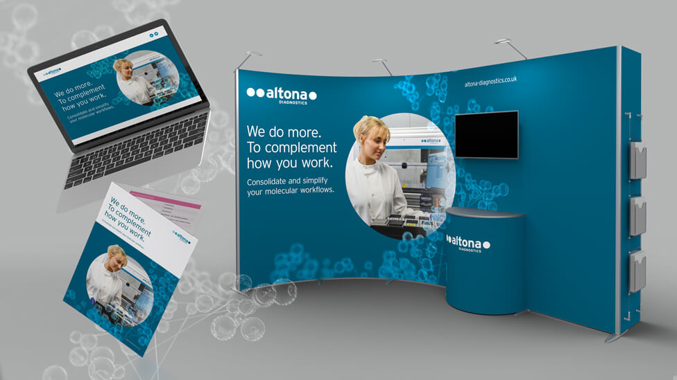 This refreshed brand and collateral design delivered an exciting toolkit of marketing resources that Altona’s sales team would be able to use at the IBMS Congress and beyond.
Background
Altona Diagnostics develops and manufactures in-vitro diagnostic tests for the PCR-based detection of pathogens such as parasites, bacteria or viruses like COVID-19. With headquarters in Altona, a borough of Hamburg, Germany, the company employs over 350 people worldwide. Our client has been in the molecular diagnostics business for over two decades, selling its registered products to clinical and private laboratories all over the world through a network of subsidiaries and over 40 distribution partners.
The company also offers an automated workflow solution that comes complete with instrumentation, nucleic acid extraction chemistry and a dedicated software package.
Challenge
Preparing to attend the IBMS (Institute of Biomedical Science) Congress – the UK’s largest, free attendance biomedical science exhibition – Altona saw this as the perfect opportunity to carry out a collateral and overall brand design refresh to maximise their presence and investment in the show.
As the world was slowly leaving behind the darkest times of the Covid pandemic, the market was saturated with PCR tests, one of Altona’s leading products, so it was time to take control of the UK market and diversify by promoting the company’s whole product range, and also the state-of-the-art equipment and expertise with a renewed look and feel, and a fresh set of marketing materials to go with it.
The brief for this brand and collateral design project also specified that the refreshed look and feel should be respectful of the existing brand, which Altona would still use in Germany, but we would also need to create something distinctive and befitting the UK division and which would look to the future.
We would also need to produce a sales and marketing toolkit, including a microsite, and all this with a very tight deadline to meet to be ready for the IBMS Congress.
Solution
We developed a toolkit of marketing resources, a library of exciting materials that our client would be able to use at IBMS and beyond, including a 4-page printed and digital brochure.
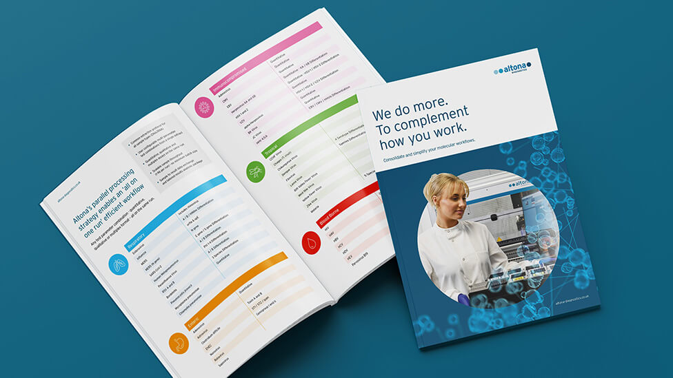
Starting with the refreshed look and feel that would bring the new collateral to life, we took the existing logo as a starting point and fleshed out a new brand system that immediately looks more contemporary thanks to bringing the existing secondary colours – a less traditional colour palette – to the fore.
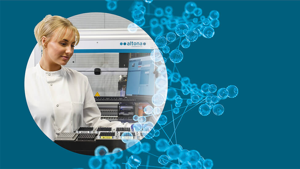
To create visual interest, we looked at different visual patterns that would attract attention and would stick in the mind of the target audience, such as molecular structures and circular DNA, and we then applied creative crops of those visual devices to create a more dynamic and highly stylistic visual that adds another dimension to the refreshed design.

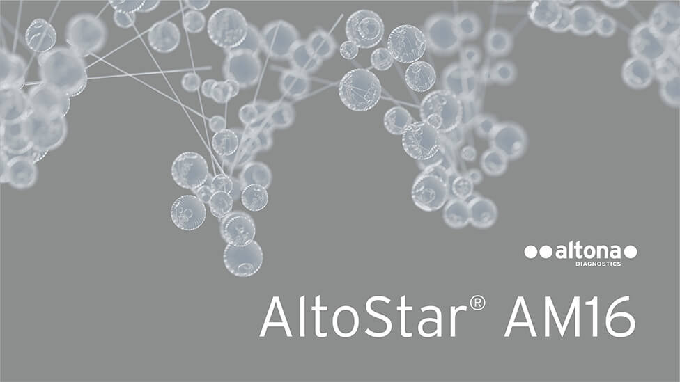
We created a 3D model as a hero graphic that we have full control over,
allowing us to deliver different configurations to add variety.
For the IBMS Conference and Exhibition, we provided a flexible display system, a more robust structure than what our client had previously used.
We did a full demo of the portable display combination at our client’s site, which showed them how much flexibility the system offers and would allow them to build and take it apart themselves, for the first congress as well as future smaller venues – a practical and economical solution that would help stretch their budget.
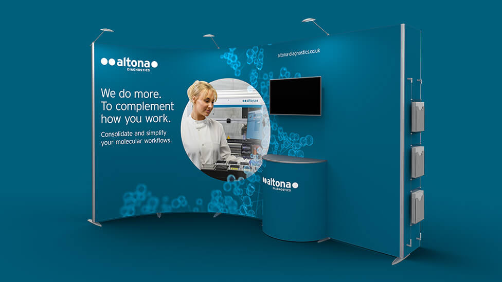
The exhibition system can be easily reconfigured to different footprints, and it includes a TV screen, pockets for literature and a semi-circle counter.
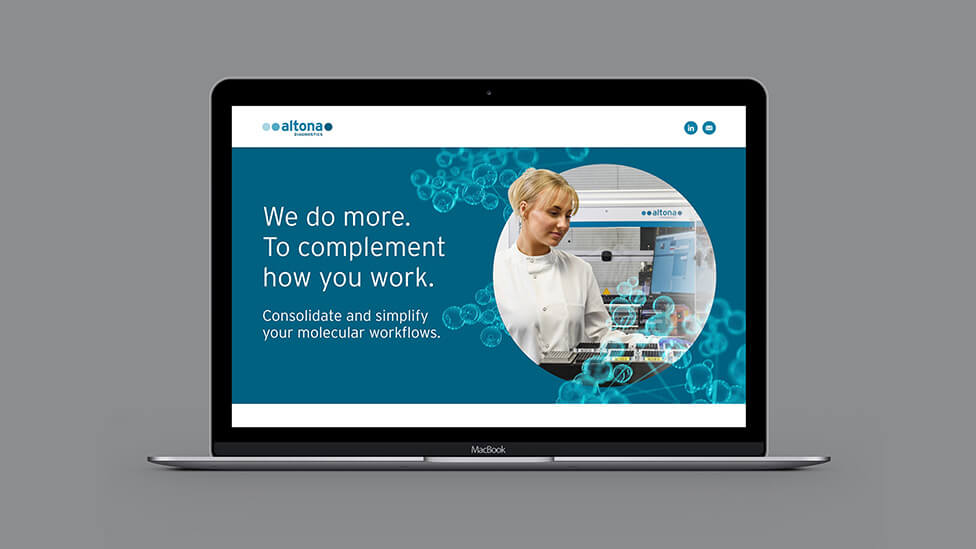
We also designed and developed a microsite for the UK arm of the business, a simple digital form with data capture functionality built in to be used at the congress, and which in the near future we’ll be transforming into a fully fledged website.
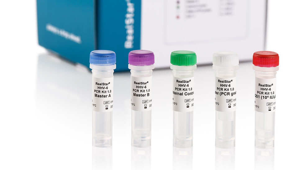
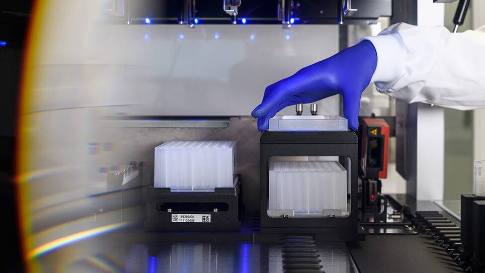
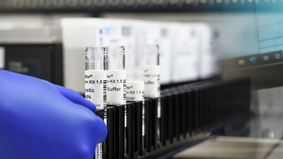
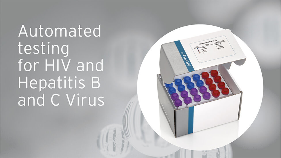
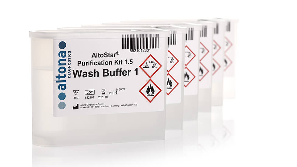
As part of the brand and collateral design refresh exercise, we also suggested updating the corporate image bank, to deliver a more versatile image library that showcases our client’s technical as well as human expertise. We organised two photo shoots: one studio-based for multiple product shots that could be used in sales presentations, the other on location at one of Altona’s customer facilities showing products as part of the workflow.
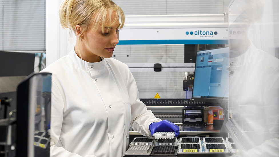
Both photo shoots resulted in a set of highly creative shots that manage to not forget their main purpose: to act as a strong sales tool. Consideration of depth of field, and clean and crisp product shots combined with creative blur effects add a new and dynamic feel to the photographs.
We also suggested the creation of data and product sheets as part of the brand and collateral design work, plus an animation, which we’re currently working on.