![]()
We developed a bold brand refresh for Smart Money, giving the company a more refined identity and reinforcing its position within a specialised market.
Background
After experiencing significant business growth, Smart Money, a specialist financial broker, approached us for a brand refresh that would better reflect their evolving position in the industry. Operating within a niche B2B market, the company recognised the need for a stronger, more sophisticated identity that would set them apart from competitors and reinforce their credibility and expertise.
Challenge
The brand refresh needed to strike a careful balance, giving Smart Money a more refined and contemporary look while ensuring that it remained recognisable and familiar to its existing customer base. Since the company had built a strong reputation and loyal following over the years, it was crucial that the new identity reflected growth and modernisation without alienating the long-standing clients who had played a significant role in its success.
We aimed to create a sleek and sophisticated visual identity that aligned with current industry trends while maintaining the trust and credibility that Smart Money had already established. The refresh had to be subtle yet impactful, ensuring that the company’s values and strengths remained intact and easily recognisable.
Solution
Building on the existing brand design as a foundation, we developed a refined yet distinctive identity that positions Smart Money as an established and trustworthy organisation. The updated branding reflects the company’s ability to adapt to evolving market conditions while remaining aligned with the needs and expectations of its audience. By modernising the brand while preserving its recognisability, we created a seamless transition that strengthens Smart Money’s presence in the financial sector.
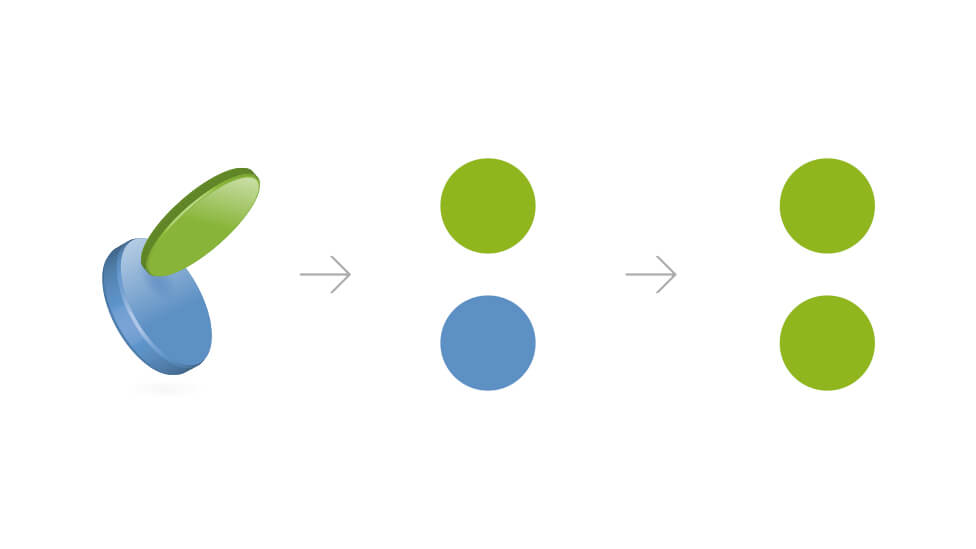
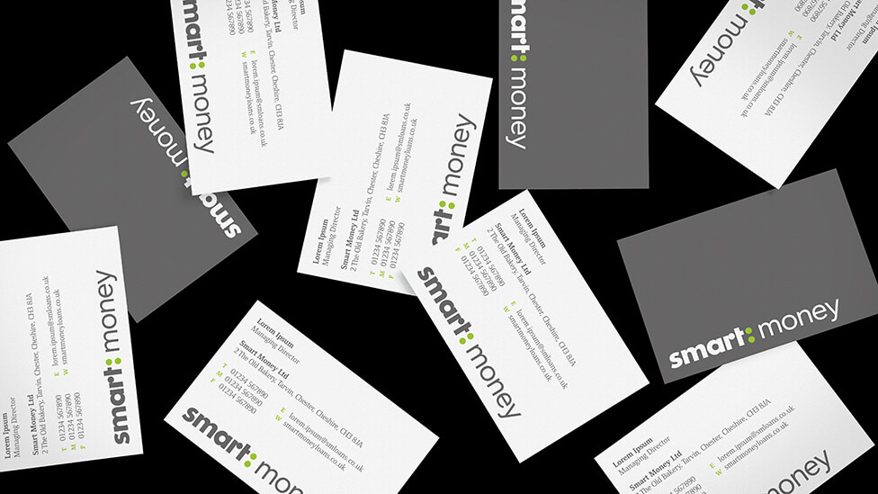
A key part of this transformation was the redesign of the company’s logo. The original version featured a three-dimensional illustration of falling coins, which we reimagined into a cleaner, more impactful visual element. We replaced the coins with two full circles, strategically placed to split the company name into two distinct parts. This subtle yet effective change created a stronger visual identity, reinforcing clarity and professionalism.
By turning the coins into a colon, we introduced a bold and confident typographic element that adds emphasis to the brand name. To further enhance this effect, we applied contrasting font weights to each word, striking the perfect balance between modern sophistication and established credibility. These design choices work together to create a clear, confident and memorable identity that effectively communicates Smart Money’s expertise, stability and adaptability.
![]()
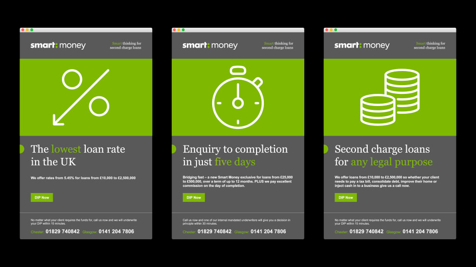
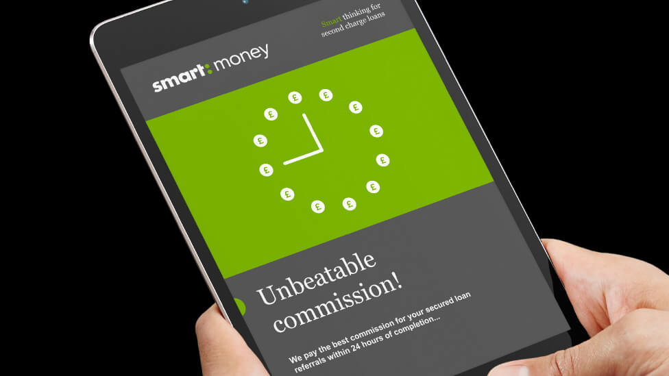
To further develop and refine the brand, we designed a cohesive set of icons that seamlessly align with Smart Money’s new identity. Maintaining a consistent circular theme, these icons were carefully crafted to visually represent the various financial products and services the company offers. Each icon was designed with simplicity and precision, ensuring that it remains visually striking and easy to interpret. By incorporating a unified design approach, the icons contribute to a stronger, more recognisable brand presence while ensuring clarity and ease of use across different marketing materials.
![]()
To further refine the brand’s evolution, we introduced a new colour palette that effectively conveys Smart Money’s commitment to expertise and innovation. We carefully selected the refreshed colour scheme to create a modern yet professional look that resonates with both existing clients and new prospects. By striking a balance between sophistication and approachability, the new palette strengthens brand recognition while reinforcing Smart Money’s position as a trusted financial broker.
Beyond aesthetics, the new colour scheme plays a functional role in the brand’s communication strategy. The palette was structured to support visual hierarchy, making it easier for audiences to navigate information, differentiate services and engage with content. Whether used in icons, infographics or promotional materials, the refreshed colours bring a sense of consistency and purpose to every aspect of the brand.

The grey tones in the new colour palette reinforce Smart Money’s identity as a stable, trustworthy and dependable financial enterprise. By incorporating these muted tones, the brand conveys a sense of professionalism and reliability, essential qualities for building confidence among clients and stakeholders. Grey serves as a neutral foundation, ensuring the overall aesthetic remains sophisticated and timeless, reinforcing Smart Money’s established position within the financial sector.
In contrast, the vibrant green introduces a fresh, dynamic and forward-thinking energy to the brand. This lively colour embodies innovation and growth, aligning with Smart Money’s progressive business mindset. The use of green reflects optimism and adaptability, positioning the company as a modern and agile player in the financial industry. By balancing these two contrasting tones, the new palette creates a harmonious blend of stability and energy, allowing the brand to appeal to both long-standing clients and new prospects.
To seamlessly integrate these values into the visual identity, we applied a duotone effect to lifestyle images. This technique not only ensures consistency across all brand materials but also enhances the visual impact of the imagery. The duotone treatment reinforces the fusion of trust and innovation, ensuring that every element of the brand – whether digital or print – communicates a unified and compelling message. The result is a distinctive and memorable visual identity that sets Smart Money apart in a highly competitive market.
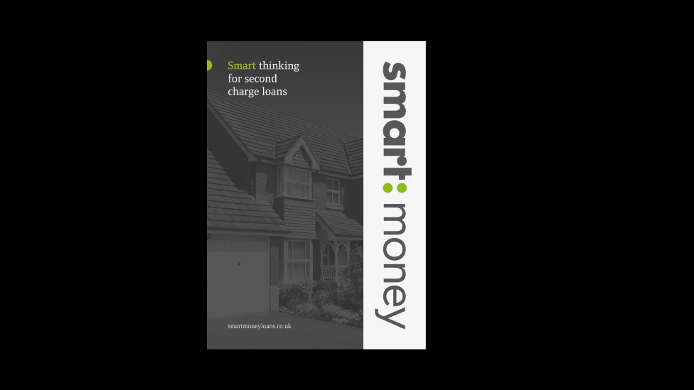
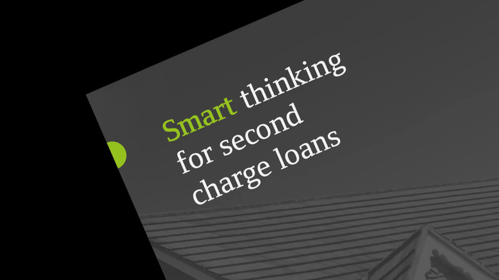
The brand refresh was designed to be highly adaptable, ensuring consistency across a wide range of media and marketing collateral. By applying the updated branding to various print and digital materials, we created a cohesive identity that strengthened Smart Money’s presence across multiple platforms and helped reinforce its market positioning.
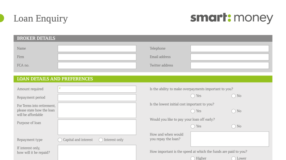
To support sales and lead generation, we developed a simple yet impactful trifold brochure and a practical A4 folder with an integrated application form. These materials were designed to increase product awareness while also streamlining the customer journey, making it easier for the sales team to capture leads and drive conversions.

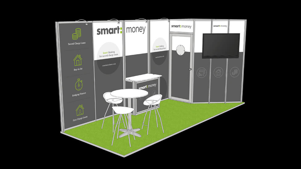
The new branding extended to industry trade shows, where we designed a versatile and cost-effective shell scheme exhibition stand. The stand not only helped increase brand awareness but also played a key role in supporting sales efforts at major industry events. To boost visibility and engagement, we introduced an accent colour on the carpet, which contributed to a simple yet striking design that successfully attracted high visitor numbers and generated strong interest.
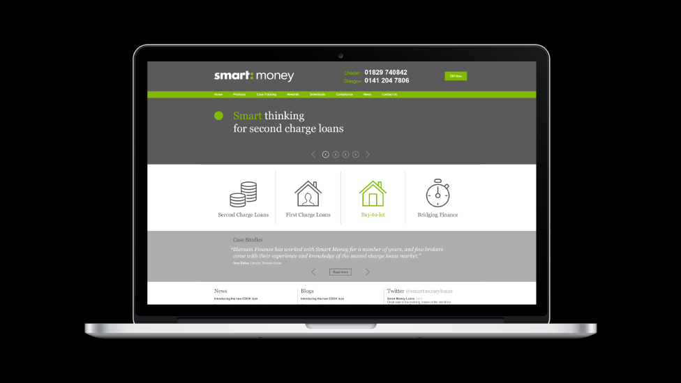
In the digital space, the refreshed brand was rolled out to a fully responsive website and an online application form, providing a seamless user experience across different devices. This digital upgrade contributed to a noticeable increase in applications, further demonstrating the impact of the rebrand on business growth.
To support ongoing marketing efforts, we also created a custom email template that could be easily tailored by Smart Money’s internal team. This flexible template allowed the company to adjust messaging in line with business priorities, ensuring that campaigns remained relevant, engaging and aligned with strategic goals.
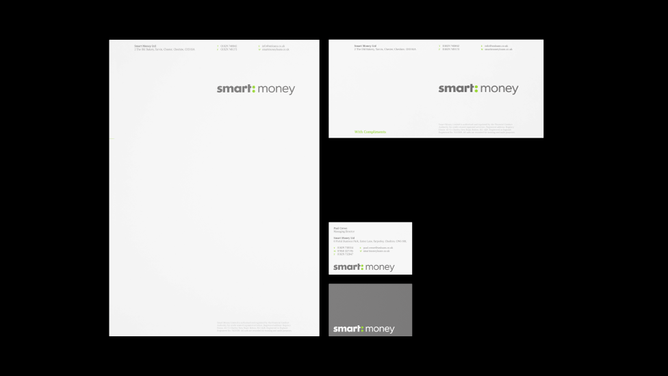
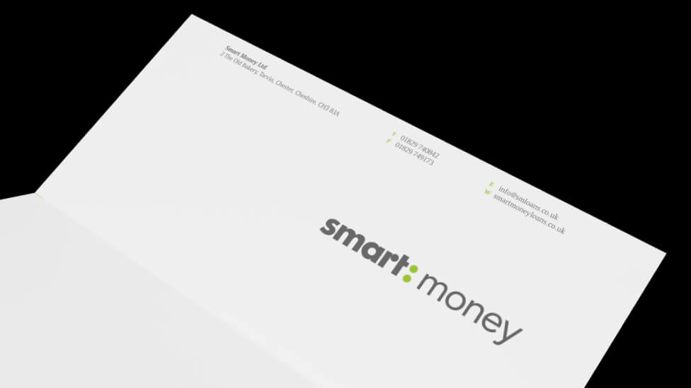
To establish a professional and polished look, we redesigned the company stationery with a clean, minimalist style that placed emphasis on the new logo. This approach helped enhance brand name recognition, ensuring that every touchpoint with clients and partners reflected Smart Money’s refined identity.
Looking for help with your project?
Feel free to give us a call to start a conversation,
our doors are always open.
Related projects

H&T Presspart
Branding strategy & development

ChargePoint Technology
Brand development
Polecat
Branding development
