
A branding and website design exercise that helped guarantee a strong launch for a new ambitious company driven by a network of expert leaders.
Background
With decades of international biopharma experience gained at leading organisations such as Takeda, Merck Serono, Pfizer, Bayer and AstraZeneca, as well as small biotech companies and startups, Insider Group was born to be ‘the Next Generation Pharma Advisory Service’ – a group of consultants that provides expertise and advice in strategy, business, regulatory, access and commercialisation. With its strong track record, Insider Group is perfectly placed to help clients navigate the increasingly complex and challenging biopharma environment, from early inception to market entry and beyond.
Challenge
With an existing company name, logo and presentation deck, our client sought our help to create a new branding and website design. With a self-funded, modest budget, our remit was to find a cost-effective way to amplify their brand and guarantee a strong launch to market.
Solution
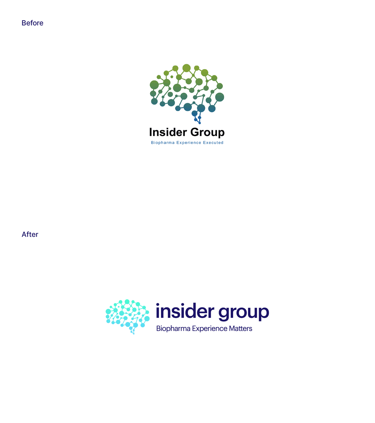
Guiding our client on what priorities to focus on for launch, we started by refreshing the logo: the choice of lower case makes it harmonious with the brain graphic next to it, also made up of interconnecting points. With a new font and rounder pointer on the “i”, the new logo design looks both fresh and approachable, established and confident.
The next step was to refresh the look and feel of the presentation deck, which helped us consolidate our overall approach, influence the new tone of voice and flush out other elements that would be included as part of the new brand development, including a graphic depicting a network of interconnecting points as a nod to the company’s origins and how it operates.
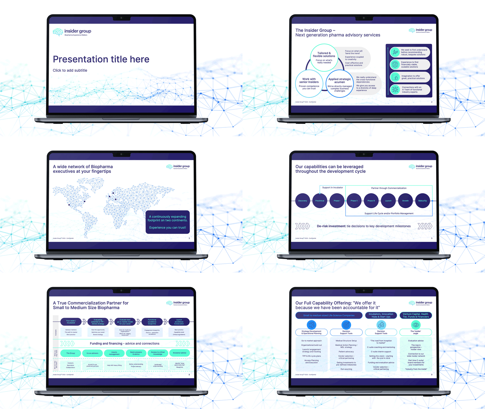

Our suggestion to bring the network graphic to life as an animated element was very well received – the wave-like motion can easily be repurposed for different brand assets.
Moving on to their online presence, and always considering the budget limitations, we recommended a one-page scrolling website as a minimum viable proposition, guaranteeing a robust online user experience at a fraction of the cost.
We worked together with our client to accommodate large amounts of content and helped streamline it before it made it onto the website, built in a user-friendly WordPress CMS (Content Management System).
The website, both on desktop and mobile devices, has a minimalist look, letting the content – often in animated or infographic form – carry the weight for maximum audience engagement.
As part of the branding and website design process, we polished and finessed icons and tweaked the existing colour palette, making it more vibrant and limiting the amount of colour, allowing it to breathe. The result is a lighter, brighter, fresher, digital-first brand, that also offers the flexibility of applying darker tones later on, depending on the specific target audience.
Developing a new photography style, and providing styling guidelines for consistency throughout, was also a key consideration to ensure the new branding spoke in a way that is meaningful and relevant to the audience at all touchpoints.


The launch was a success: by creating a solid brand system and applying it to some key pieces, our client was able to make use of a toolkit that offered a simple yet powerful solution for launch and beyond into the near future, now ready to progress to the next stage in the company evolution.
Looking for help with your project?
Feel free to give us a call to start a conversation,
our doors are always open.
Related projects
CuraTeQ
Healthcare website design
H&T Presspart
Branding strategy & development
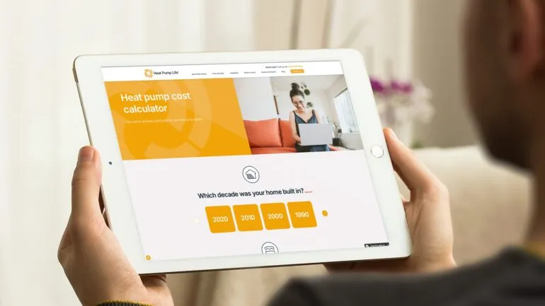
Heat Pump Life
Interactive website design
