![]()
We introduced H&T Presspart’s innovative capsule-based dry powder inhaler with a branding design that strategically positioned it for developing pharmaceutical markets.
Background
As one of the leading global manufacturers of metered-dose inhalers and respiratory drug delivery components, H&T Presspart had the opportunity to launch a dry powder inhaler for asthma/COPD patients, particularly in developing markets. Working with Hovione Technology to improve their existing device, H&T Presspart wanted to launch its enhanced dry powder inhaler, PowdAir Plus, at a major pharmaceutical conference.
Challenge
To successfully drive demand for the product, we needed to develop a distinctive and easily recognisable brand design that would stand out in the competitive pharmaceutical industry. The goal was to create a strong visual identity that would instantly resonate with pharmaceutical companies and position the product as a reliable and innovative solution. Given the nature of the industry, the brand needed to convey professionalism, trust and efficiency, while also being visually engaging and memorable.
A crucial aspect would be to ensure that the branding design aligned seamlessly with the product’s unique selling points (USPs). As simplicity was a defining characteristic of the product, it was essential that this sense of clarity and ease was also reflected in the branding design itself. The design had to be modern, intuitive and highly effective, ensuring that pharmaceutical companies could immediately grasp the value of the product at a glance.
Solution
With the product name already decided, we took the next step by leading a comprehensive brand workshop with our client. This session was designed to identify their specific needs, marketing objectives and brand positioning within the pharmaceutical sector. Our goal was to develop a cohesive and recognisable brand identity that would differentiate the PowdAir Plus inhaler while ensuring that it aligned seamlessly with the company’s existing product range.
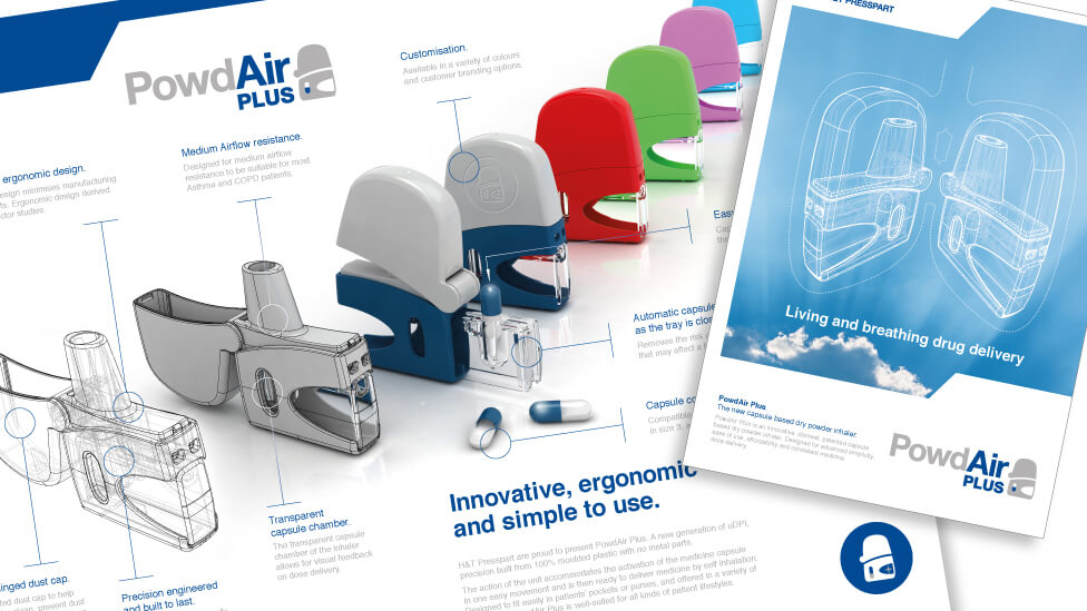
Having already designed the brand identity for the company’s eMDI device, we needed to create a distinctive visual identity for PowdAir Plus while maintaining a sense of brand consistency across the product family. This balance was essential in establishing brand recognition, especially in a highly competitive market. To achieve this, we started by using the same font family, ensuring a visual link between both products. Using simple typography to anchor the product name, we simplified its unique shape to create a supporting icon. This allowed us to make the branding design more memorable increasing name recognition and encouraging audiences to mentally associate it with a visual of the product. Additionally, we worked within the existing blue and grey colour palette, reinforcing the brand’s professional and clinical appearance while allowing PowdAir Plus to stand out in its own right.
![]()
One of the most defining features of the PowdAir Plus inhaler was its simplified design, consisting of only four plastic parts. This streamlined manufacturing process made the product highly cost-effective and durable, particularly appealing for emerging markets. In many developing regions, access to respiratory medicines is increasing, yet traditional inhalers with complex mechanisms can be prone to breakage or too expensive to produce and distribute. The simplicity of PowdAir Plus addressed this challenge head-on, making it a practical and scalable solution for healthcare providers in cost-sensitive markets.
To visually capture the product’s simplicity, we designed the brand identity with clean and structured typography. The product name was anchored using simple, bold lettering, making it easy to read and remember. We also developed a supporting icon, which was based on the distinctive shape of the inhaler itself. This minimalist yet effective approach ensured that PowdAir Plus was easily identifiable while reinforcing brand recognition. The icon visually represents the product’s function, giving healthcare professionals and consumers an instant understanding of how the device works.
We deliberately eliminated unnecessary complexity in the branding process, focusing on clarity, functionality and impact. The final result was a structured, polished aesthetic that allowed the product’s benefits to take centre stage while ensuring maximum market appeal.
Highlights
- The simplified yet effective icon visually communicates how the device works, accurately identifying where the medicine is located within the inhaler.
- Strategic use of colour in the branding improves pronunciation of the product name, making it easier to remember.
- The branding design served as the first phase of a broader product launch campaign, which also included a detailed product video, brand collateral, a 3D sales demo and exhibition materials.
By combining a clear brand strategy with thoughtful design execution, we successfully created an identity that not only differentiated the product from competitors but also ensured long-term recognition and recall within the pharmaceutical industry. The result was a brand that was as practical and effective as the product itself, seamlessly supporting marketing efforts and enhancing demand among potential clients.
Looking for help with your project?
Feel free to give us a call to start a conversation,
our doors are always open.
Related projects

Prism Healthcare
Internal branding design

TUI
Retail branding design

Invosys
Branding design refresh
