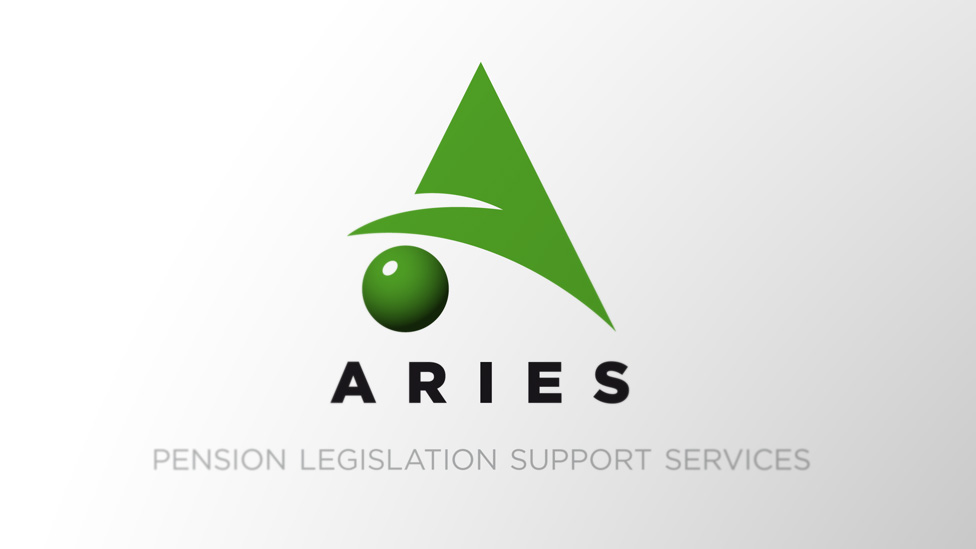
We helped Aries Pensions stand out in a very competitive market with an effective business logo refresh.
Background
The process of evolving a business logo is not a new concept, with companies such as Shell, IBM and BMW, to name but a few, redesigning their logos on average every 10 years to ensure they are constantly looking modern and fresh. It is essential that a logo stays looking fresh and forward-looking to represent the ethos of the organisation, whilst maintaining a visual association with the original.
Challenge
Aries Pensions required a significantly updated and modernised version of their business logo, as they felt their their long-standing mark no longer represented what the company stands for.
Solution
The Aries logo development naturally progressed from their original design featuring a yellow triangle with a green sphere in the middle, and which we used as the basis for our new logo design. Taking the iconic triangle and sphere, we stylised the shapes, creating an ‘A’ with the sphere supporting one side.
It is important that a business logo is flexible and can be used across a wide variety of media. The style we created for Aries takes this into account, and the final logo can be scaled up or down. We also made provision for the logo to be used as a one-colour and black and white mark to ensure it is consistently seen in the best light.
Looking for help with your project?
Feel free to give us a call to start a conversation,
our doors are always open.
Related projects

INEOS
Company magazine design

H&T Presspart
Branding strategy & development

AMBS
Identity development and application
