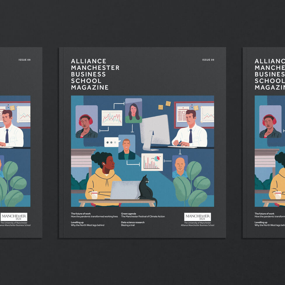
This refreshed business school magazine design comfortably brings together the informal energy of illustration and relaxed people photography with the weight of the issues affecting business in a post-pandemic landscape.
Background
Alliance Manchester Business School’s magazine is a quarterly publication that features insightful thought leadership pieces and interviews from academics as well as research students. Past issues have delved into topics as varied as the North/South divide, shared parental leave, global warming, or the future of banking, to name a few.
Challenge
After eight issues, our client felt it was time for an overhaul of the magazine to keep momentum and the interest of the target audience, made up of AMBS alumni, corporates and academics, staff at AMBS and the wider University of Manchester, and delegates at business speaker events. The timing of the release of the refreshed look and feel for the magazine was particularly poignant at a time when society was slowly leaving behind the effects the pandemic had had on individuals and businesses.
Our client was open to the idea of a totally new approach for the cover, and our brief also specified that the business school magazine design should look different from the other brand collateral, e.g. brochures, but the design should still use the basic elements, colours and typography. We would also need to come up with a defined style for charts and graphs for maximum engagement.
Solution
Designed to a bespoke size to ensure stand out and differentiation against other printed materials reaching the target audience, the business school magazine is a manageable format publication that immediately generates interest to pick it up and browse through 40 pages filled with engaging articles that address a variety of topics currently impacting the business landscape.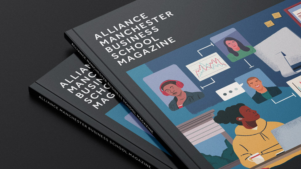
The way we implemented the colours and typography is what helps give the magazine its own identity, whilst still being in keeping with the overall brand look and feel. We used the charcoal colour as a canvas for the cover illustration, a true departure from the previous look and feel of the magazine.
Bold, fresh and colourful, the illustration perfectly depicts the current work landscape, with a mixture of people working from home or in the office. Framing the illustration, rather than taking over the whole front cover, adds focus and acts as a template to ensure visual consistency for future issues.
Precisely because of focusing on consistency, despite initially also discussing new names for the magazine with our client, in the end the consensus was to stay with Alliance Manchester Business School Magazine, a descriptive title that transmits a sense of familiarity to readers.
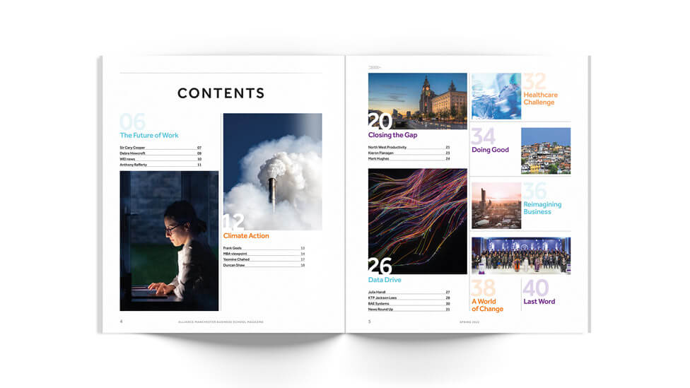
The magazine opens with a first section dedicated to “The Future of Work”, and how the pandemic has transformed how people work, with the increased focus on health and wellbeing. The choice of blue tones in both copy and photography depicting relaxed work-from-home environments perfectly complement insights on the new ways of working.
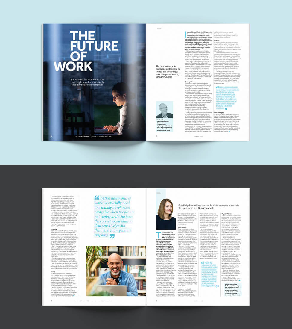
Page structure and content layouts allow for the large amount of content to comfortably fit in the pages without overwhelming readers.
Page after page, reader interest and engagement are maintained thanks to a variety of ways to present and organise written and visual content: large fonts for article headings, all in upper case, quotes highlighted in colour, different colour backgrounds, striking leading photographs, beautiful conceptual imagery and relaxed people photography, where everyone’s smiling and looking directly at the camera (the reader) – all these elements help make the business school magazine an engaging read to look forward to every quarter.
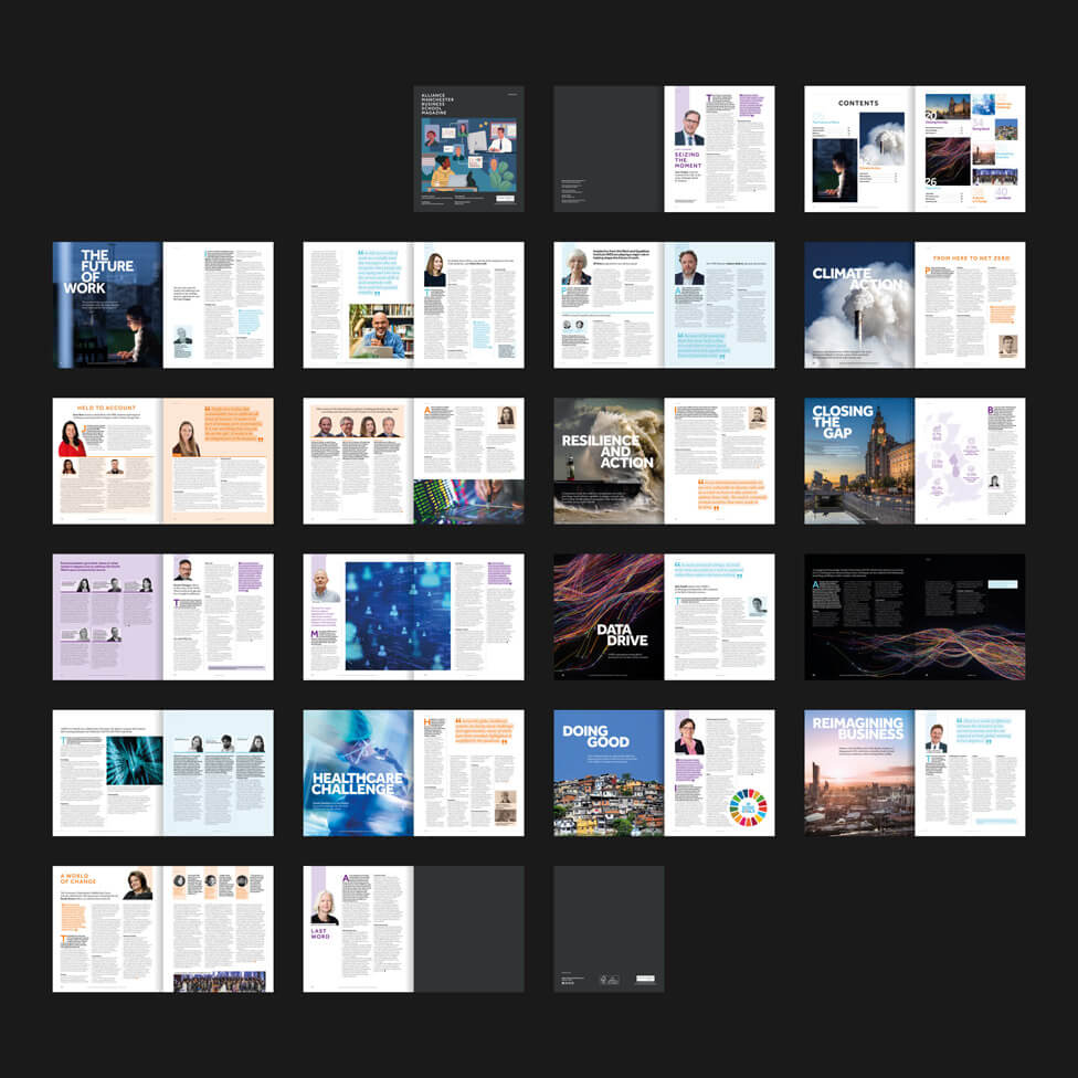
Though dynamic, energising and filled with exciting content, the magazine style stays within the boundaries of a publication that presents insights and ideas by business experts for business experts.
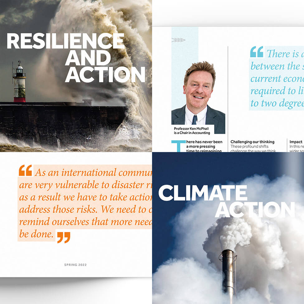
We sourced all the images used in the magazine, a mixture of strong editorial style photographs and striking and memorable conceptual images.
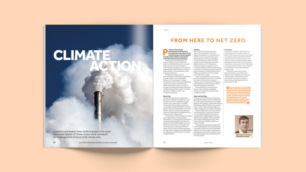
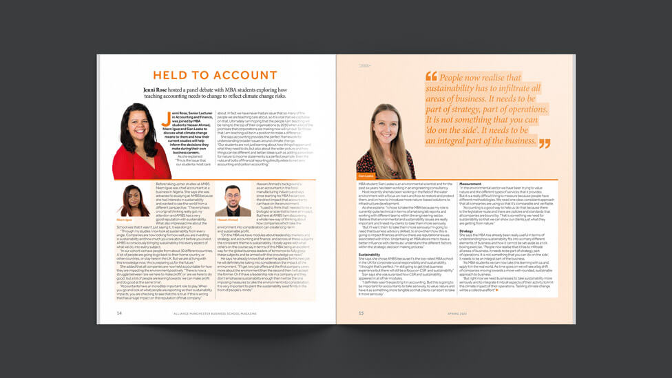
People photography received different treatments depending on the type of section or article, with a mix of colour, B&W or a colour tint adding to the visual structure.
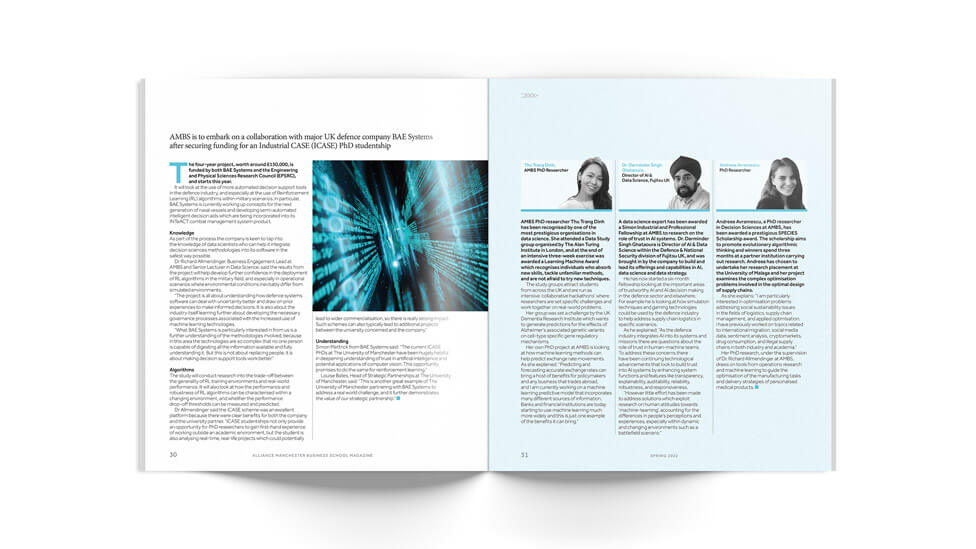
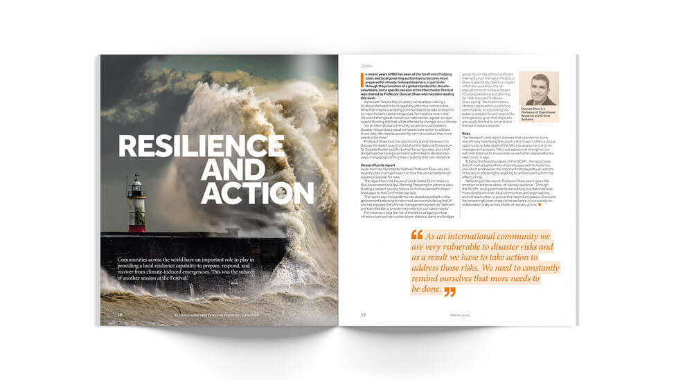
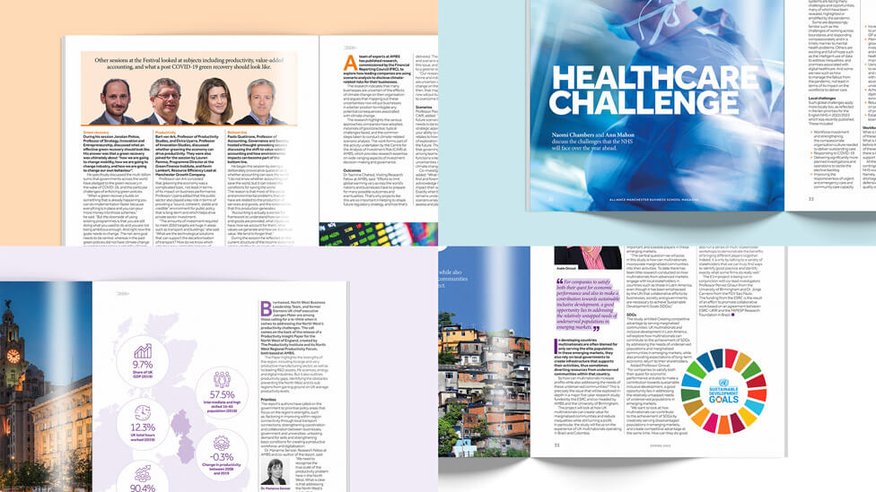
As we also needed to provide a digital version of the magazine, we made sure that, except for highly conceptual images, photographs were not spread across two pages so they were not cut through in the digital version.
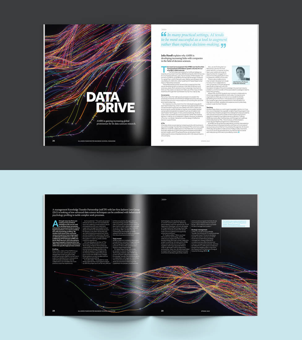
As well as creating the new business magazine design, we also managed the print – a total volume of 500 copies printed on FSC-approved paper.
The new magazine design was really well received by our client and the target audience, and we’re already working on the latest issue.
Looking for help with your project?
Feel free to give us a call to start a conversation,
our doors are always open.
Related projects
INEOS
Company magazine design
AstraZeneca
Interactive employee magazine
DAI
Business brochure
