Original, visually impactful and easily memorable, this collateral design refines and simplifies the complexity behind supply chain and logistics, maximising our client’s investment in a wide range of trade shows at home and abroad.
Background
DAI – leaders in business critical software systems in Supply Chain and Logistics – regularly attend trade shows as one of the most effective ways to promote their products and services. Exhibiting puts our client in front of audiences in the thousands, and also hundreds of competitors, so it’s vital that the time, budget and human effort invested lasts long after the show’s over.
Challenge
To maximise our client’s presence at several major international industry shows, they asked us to design an exhibition collateral suite that would ensure that their brand and products were front of mind long after delegates had left the exhibition hall. The trade show collateral had to be the opposite of a second thought after the exhibition stand had been designed and built.
Solution
With supporting materials that complement each other and speak to specifically targeted audiences, visitors leave armed with a strong marketing collateral kit that inspires them to take action.
One of the collateral design pieces is a brochure, available in both English and Chinese.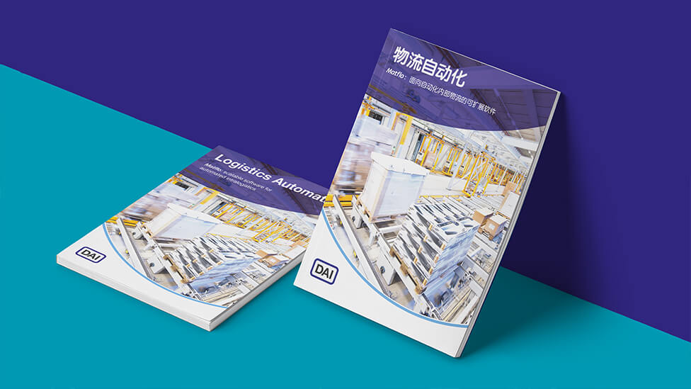
Nodding at the concept of an effective supply chain, hexagonal shapes organise content within the brochures.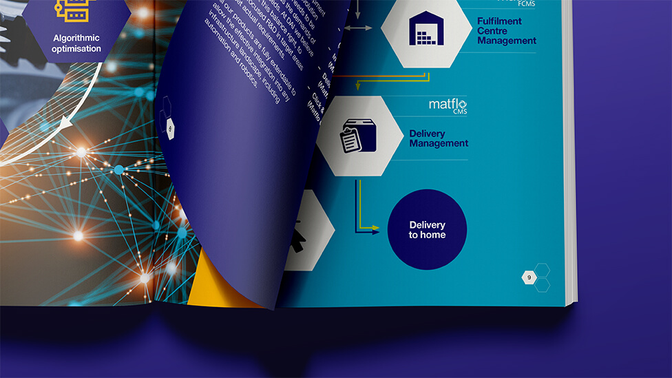
In contrast, a curve acts as another way to lay out the pages.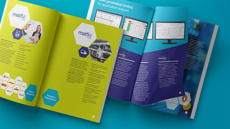
In the localised version, the Chinese characters are allowed to breathe – it’s a piece of collateral that reads naturally to the target audience.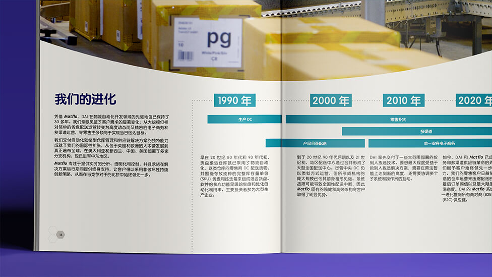
To strengthen the connection between our client and their audiences, some of the photography was also adapted to appeal to the Asian market.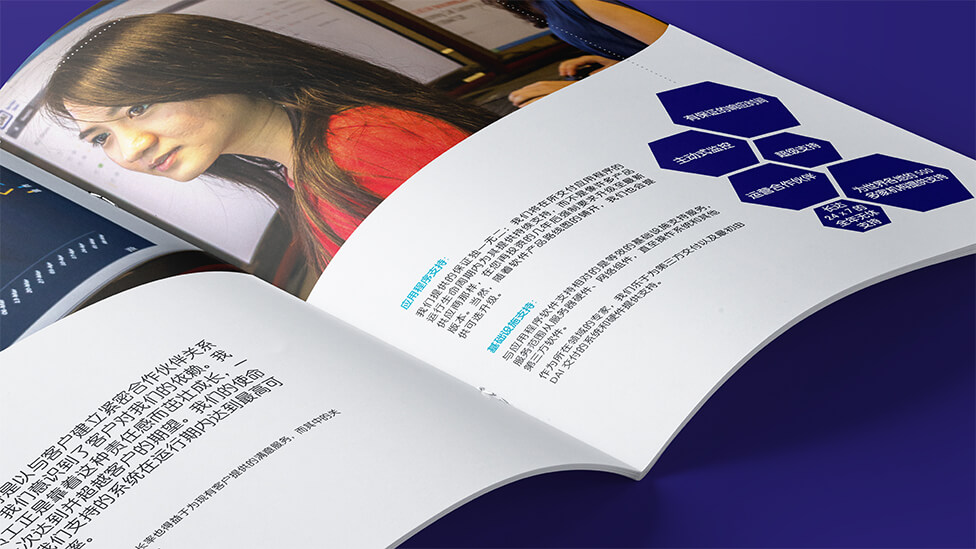
Playful illustrations and icons introduce the concepts of movement and energy – vital in the sector.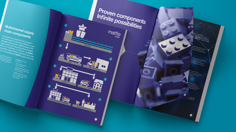
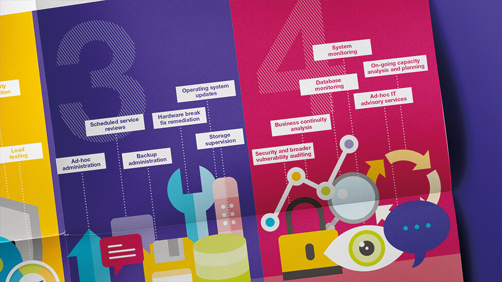
Moving away from traditional collateral design formats such as a flyer or a leaflet – which may be easily lost or quickly discarded – we also designed two A4 booklets that become A2 posters as soon as delegates, intrigued, start interacting with them. A contemporary colour palette, playful visuals and strong photography help carry our client’s message with authority.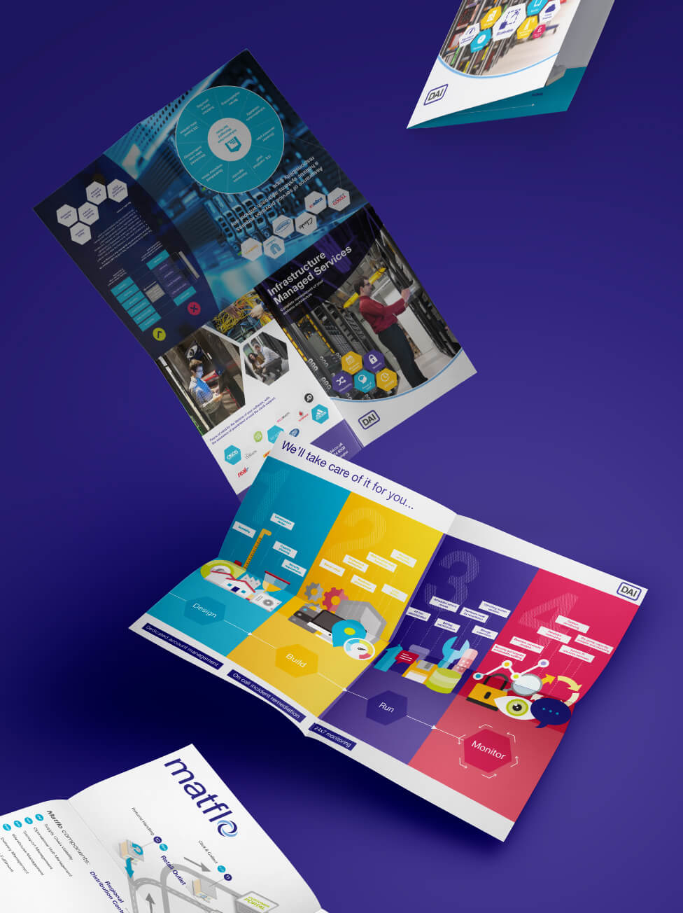
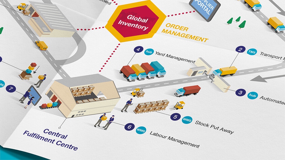
Engaging content spills out of the double-sided posters, helping start conversations while still in the exhibition hall, and acting as useful reference material after the show.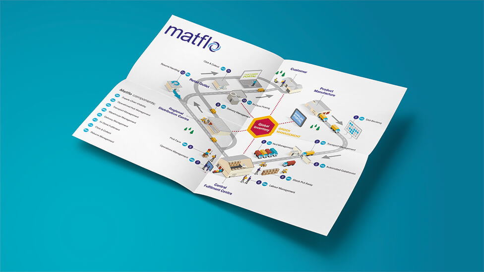
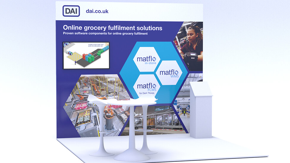
Despite our client’s relatively small plot size, we maximised their presence and investment in the trade shows with a graphics wall that included a built-in screen. For maximum impact, the wall relies on strong quality photography and engaging animated content that plays on loop. The wide range of elements interacting with each other in the animation – vibrant, colourful, memorable and educational – manages to catch the attention of delegates from the distance.
We produced two complex animations that look simple to the viewer.
The two animations are filled with illustrations that come to life thanks to an animation style that helps communicate the complexity of our client’s processes in a playful, smooth and memorable way.
We also created two big process maps, with a looping effect every eight seconds. We then “zoomed in” on details using functionality within Adobe After Effects to add realism.
Have a look at other marketing collateral design ideas that have helped clients of all shapes and sizes reach their goals.
Looking for help with your project?
Feel free to give us a call to start a conversation,
our doors are always open.
Related projects
Altona Diagnostics
Brand and collateral design
AstraZeneca
Roadshow collateral design

Nuriss Skincare and Wellness
Marketing collateral design
