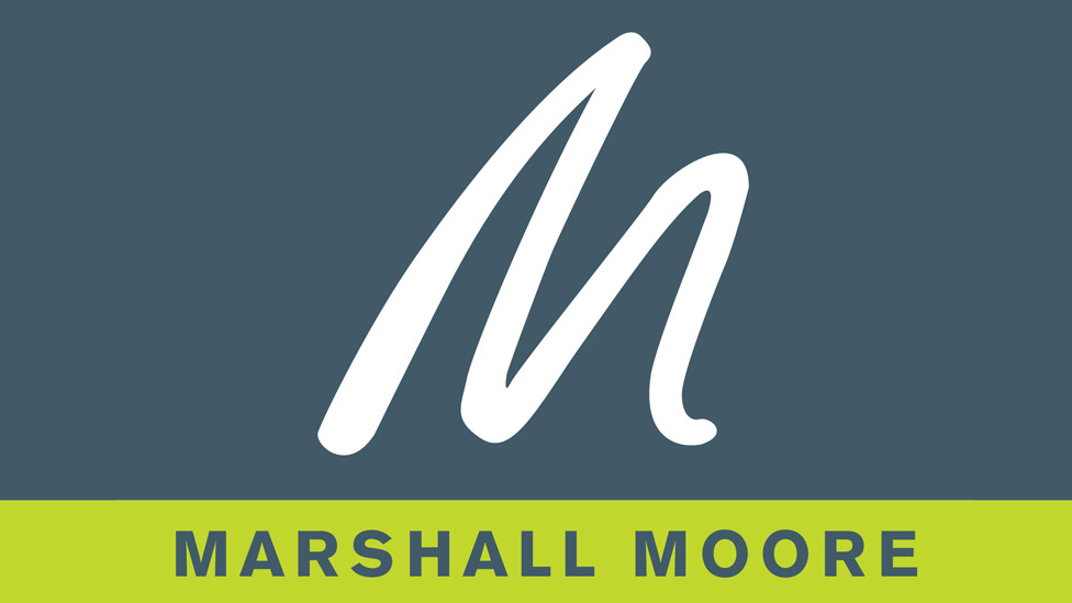
Following a period of growth, Marshall Moore had decided to move to larger city centre-based offices – the perfect opportunity to refresh their company logo design.
Challenge
Successful financial recruitment consultants Marshall Moore had been using their previous logo for quite a number of years, and following company expansion, they felt it was time for a refresh. As a vibrant city centre business, the company needed a new colour scheme to match – a fresher, more dynamic palette than the existing one.
Solution
We set up a meeting with the company directors and the rest of the team to get a real feel for the business, and to understand where it was heading. This would allow us to create a logo that would truly represent who they are and how they’d like to be perceived by their audience.
The hand-drawn ‘M’ had always featured in the company’s logo, and Marshall Moore were keen to retain it as part of the new company logo design. We too felt that it was important to keep a link back to the previous logo for consistency and brand recognition. The new logo would attract new audiences, without alienating existing ones.
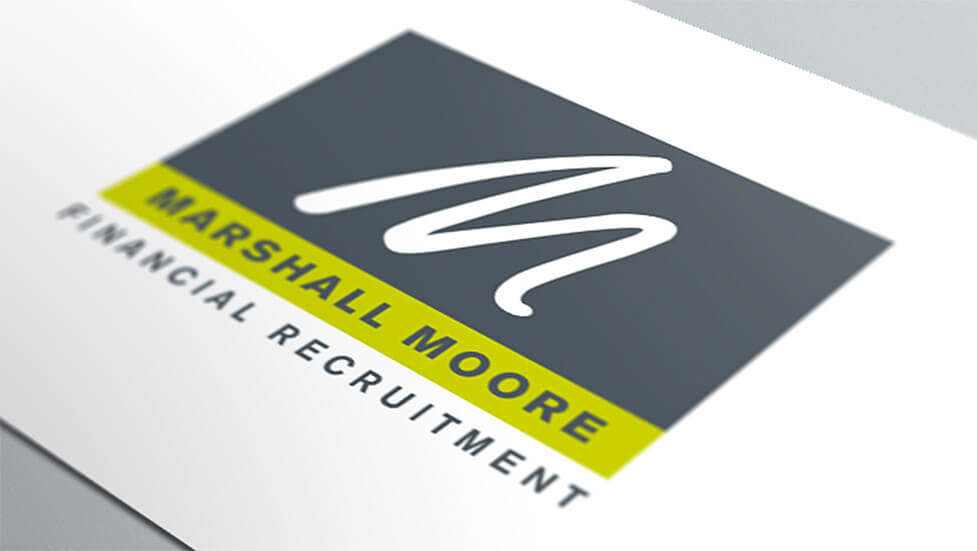
With Marshall Moore operating in the financial sector, we created a colour scheme with a solid, reliable and professional feel. To achieve this balance we developed the deep, rich petrol blue/grey as the primary colour and accented it with a vivid lime green. These colours were then matched for web use and printing to ensure they remained consistent.
We developed the new company logo design in a square format so it could be easily used across all media – print, web or signage.
Looking for help with your project?
Feel free to give us a call to start a conversation,
our doors are always open.
Related projects
H&T Presspart
Branding strategy & development
INEOS
Company magazine design
Heat Pump Life
Interactive website design
