Branding strategy
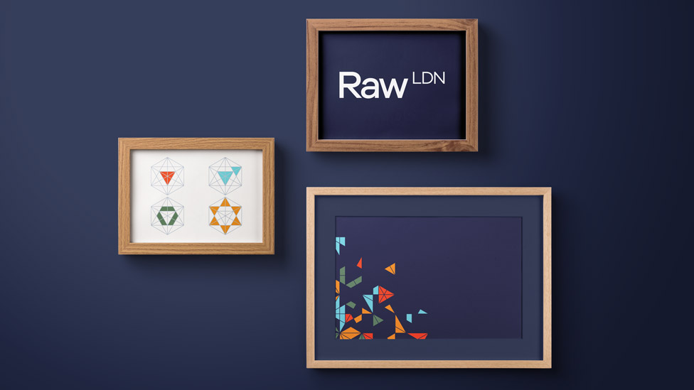
Experts in changing perceptions, Raw needed a successful branding strategy to help them transition from a traditional video production house to a specialist branded content agency.
Background
Keen to become a specialist branded content agency known for producing projects that changed perceptions, Raw realised that they needed a new company name and overall branding strategy.
Challenge
With a shift in business strategy and the goal of becoming famous for changing the way people think about brands and organisations, our brief was to create a new brand identity to represent this new vision.
Solution
We worked closely with Raw to gain a deep understanding of their approach and culture; our findings can be summed up in two short sentences:
“Your approach is as strategic as it is multi-faceted.
Your mindset is curious, playful, can-do and honest.”
Work on the company new branding strategy started by researching into things that successfully changed perceptions, and also reading deeper into the meaning of perception.
 With a wall full of inspiration and experimentation, something that really stood out was a diagram that illustrated how the points of a hexagon could be connected – transforming a hexagon into basic three-dimensional shapes.
 We developed this idea into the new marque. As the eye focuses on the interconnecting lines and coloured triangles, new 2D and 3D shapes start to reveal themselves, transforming the marque from a hexagon to a multi-faceted object. We named the marque ‘The Paradigm’, inspired by the definition of a paradigm shift.
“Paradigm shift:
a time when the usual and accepted way of doing or thinking about something changes completely”
 This definition fit really well with the changes that Raw were going through, and also what they set out to achieve with every piece of content they produce.
The Paradigm proved to have legs early on in the new branding strategy process: by colouring different segments within it, we created a set of bespoke icons. Each icon represented a step in Raw’s unique methodology: Assess, Plan, Create and Reach. Alongside the creation of icons, we began to develop a colour palette, heavily influenced by the words curious, playful, can-do and honest.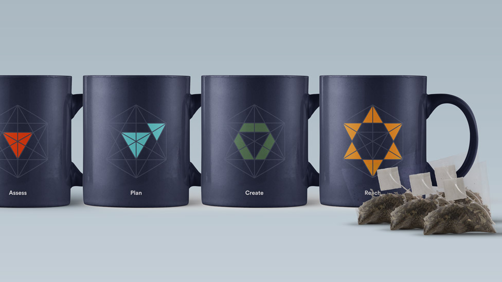 We constructed a simple and clean logotype, with a conscious decision that there wouldn’t be a lock-up featuring both The Paradigm and logotype, to allow them to breathe and to give each its own identity and meaning.
While looking at the company name ‘Raw London’ in various typefaces, we decided to abbreviate London to LDN. This approach improved the balance and created a logotype that could be easily updated in case of future company expansion.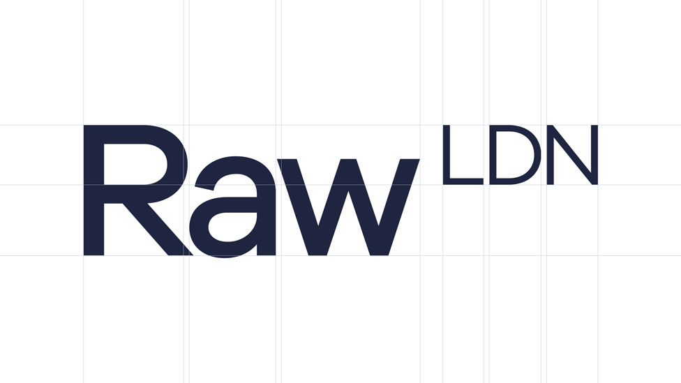
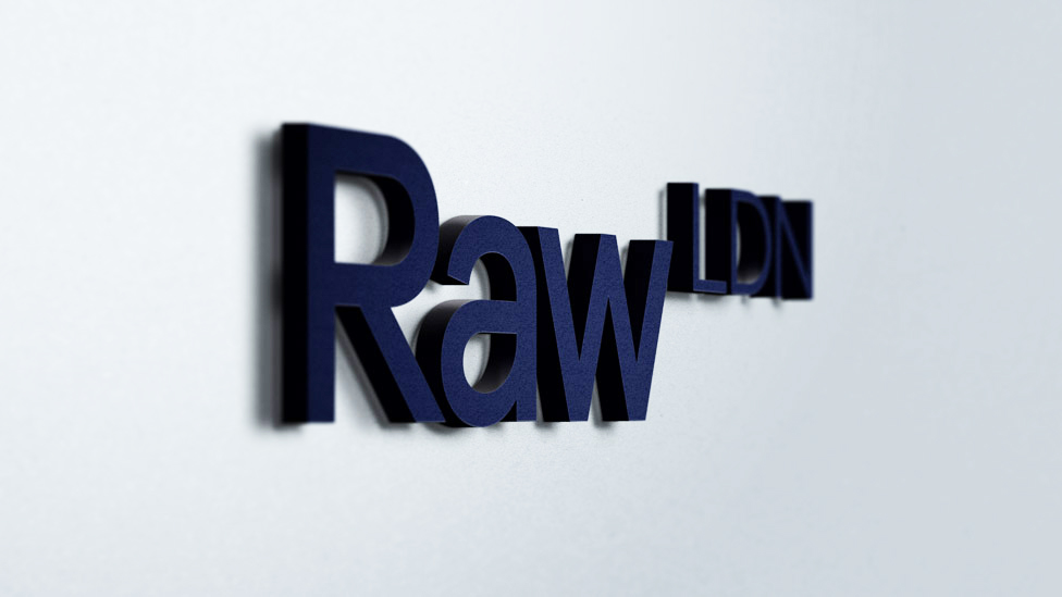 It was decided that the logotype would be in a vertical format where possible – a nice little nod back to the concept of changing perceptions.
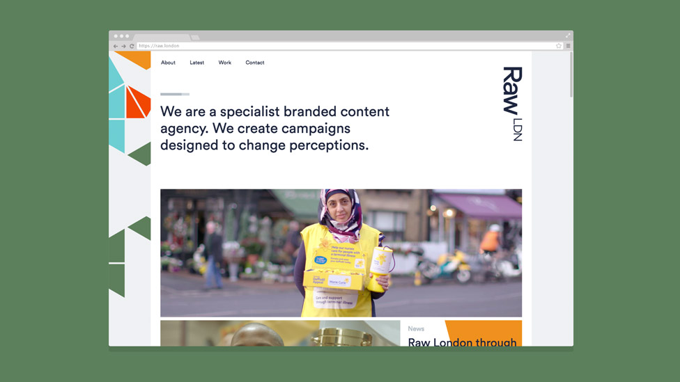 After experimenting with the application of The Paradigm, we created the shard illustration – produced by tiling The Paradigm together and then colouring random segments.
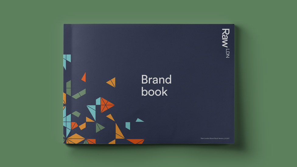
![]() The shard illustration became the hero graphic for Raw’s company rebrand featuring on all outcomes.
The shard illustration became the hero graphic for Raw’s company rebrand featuring on all outcomes.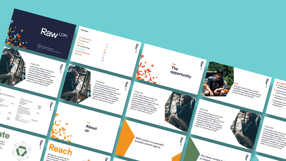 The presentation template we designed serves as an effective and engaging tool and ensures that Raw and its work are presented in a consistent and professional manner.
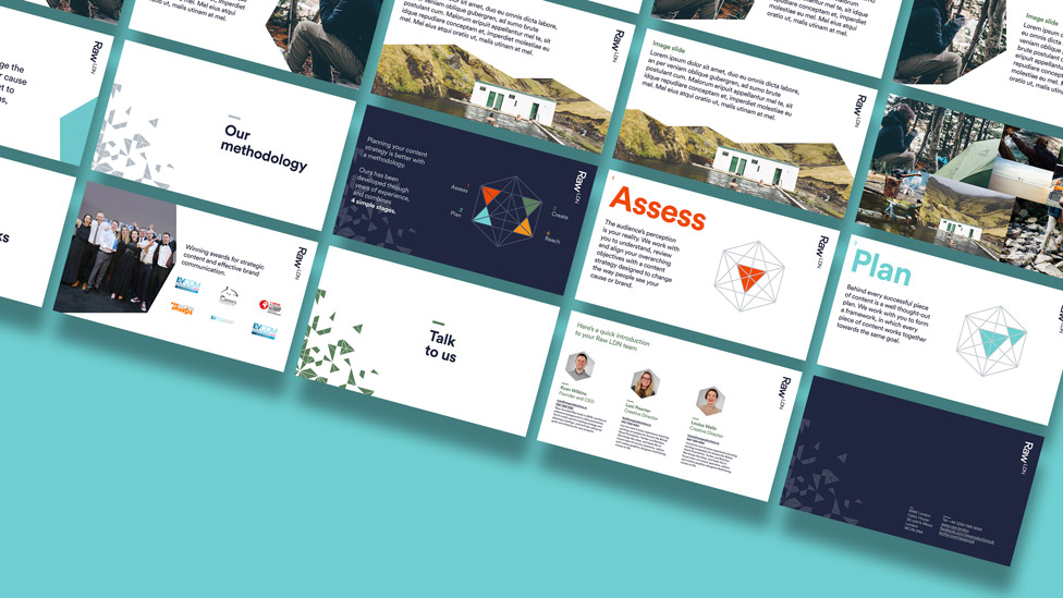 The new brand fills Raw’s proposal documents with equal doses of energy and gravitas.
  The dark blue on the cover offers a solid base for the flow of exciting ideas that follow.
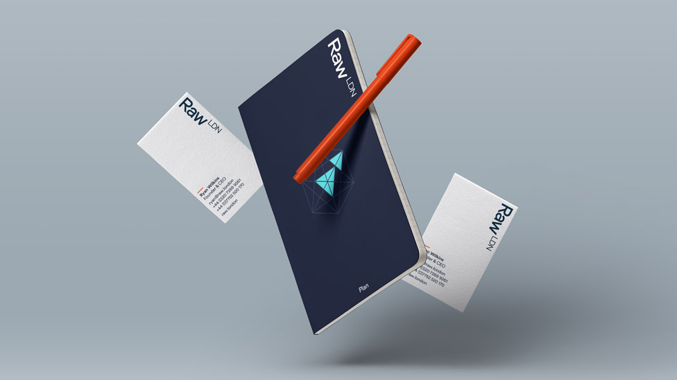 Notebook and business cards exude personality and confidence.
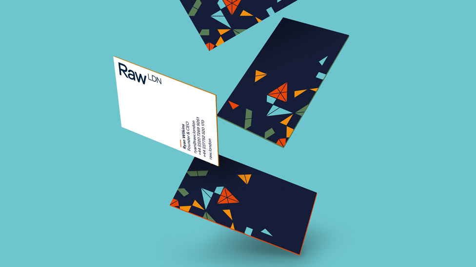 As part of the company rebrand we also produced a detailed and engaging brand book which serves as a reference point for Raw to help keep future communications consistent.
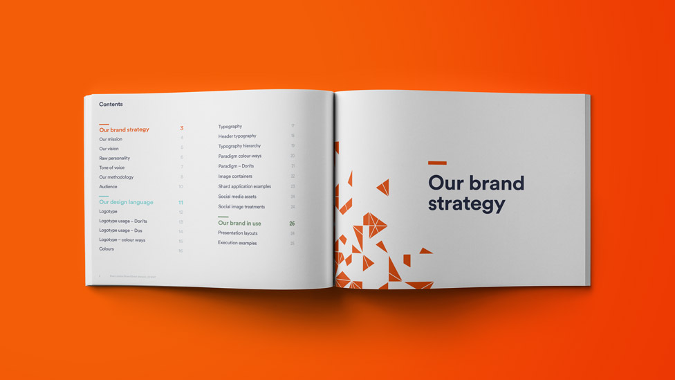
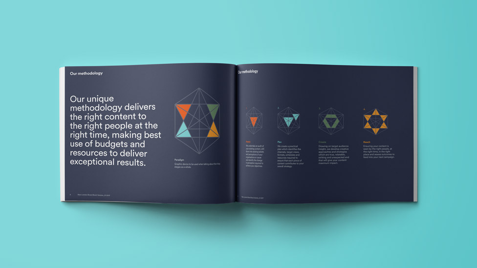
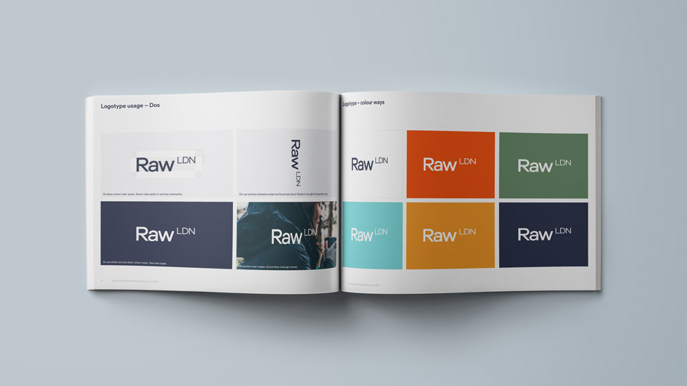
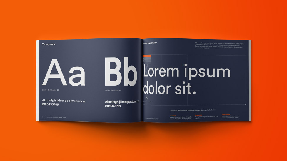 The new brand adapts well to a variety of formats.


Looking for help with your project?
Feel free to give us a call to start a conversation,
our doors are always open.
Related projects

AMBS
Identity development and application
H&T Presspart
Branding strategy & development

BrightHR
Brand strategy and development
